Updated June 12, 2023

How to Create Interactive Excel Dashboard
Most of us probably rely on our trusted MS Excel dashboard for the day-to-day running of our businesses. Still, like many, we struggle to turn that data into something that will interest people and want them to know more about it. So how do you attain this seemingly impossible goal? It is where the Interactive Excel dashboard comes in. The first question we must answer before we delve into the depths of it is what an excel Dashboard is. A dashboard may be a visual display of the vital information an individual needs to convey to the client to achieve one or more objectives that can fit entirely on a single computer screen and allow monitoring at a glance.
It is a comprehensive and complete visual report or analysis of your project, which you can share with other people concerned. Creating an Excel dashboard can be tedious, time-consuming, and difficult if you do not have the proper knowledge about how to do it. But fret now; that’s where we enter.
Dashboards are not native to Excel; one can also create them on PowerPoint. Excel Dashboards offer a more dynamic approach to presenting data than PowerPoint Dashboards’ more linear and unmoving nature. An interactive dashboard in Excel is a visualization slice that enables your data to tell a story. A dashboard is only helpful if it is dynamic, easy to use, and compatible with your PC. Before making a dashboard, you must consider the end user’s decisions based on the data, look, and feel. You will also need to remember how familiar they are with the data and its context. For example, a monthly report for your boss, who is already familiar with everything, will look very different from the one you make to pitch a new idea to a potential client.
Another thing to remember is that the data should be the star of the Excel dashboard. There is no need to clutter the screen with unnecessary components, so keeping it simple is best. You will also want to strike a perfect balance between making it look striking (to hold your audience’s attention) and not so stylized that it takes away from the presented data. When we tell a story, we must always consider the tastes and distastes of the audience and adapt our presentation accordingly. For example, if you are presenting to a formal organization, keep the Excel dashboard as simple as possible without compromising subdued attractiveness.
Armed with the proper knowledge about how to go on about creating a stunning Excel dashboard, you can create an Excel dashboard of your own without it being tedious or difficult! We provide you with a step-by-step analysis below:
1. Bringing in Data
Sure, Excel is beneficial and flexible. But to create an Excel dashboard, you cannot just paste some data and add a few charts. You need to maintain, update, and impose some structure on that data. Usually, you don’t have to enter the data into the spreadsheet. You can copy-paste the data, but the best option is to bring in data via an external source. You can use it to connect your Excel dashboard to Access or Oracle. A good practice is to limit the amount of data you bring in. As we’ve seen, buying data comes with two basic structures: a flat file and a pivot table. A flat file is generally smaller, whereas a pivot table is a large file (As a thumb rule). Both have pros and cons, which one must figure out only through experience.
2. Select a Background
Select an appropriate background that will make your Excel dashboard appear attractive without focusing away from the data. Your data should be the star. You can use subdued shades like blue, grey, and black or take it up a notch like orange, green, and purple. It is your choice, but remember the audience to whom you will be presenting it. I suggest you stick to subdued hues if it is for official purposes.
3. Manage your Data and Link it to your Excel Dashboard
If you are using a pivot table, use the GETPIVOTDATA function. If you use a flat file, there are several formulae you can use, like DSUM, DGET, VLOOKUP, MATCH, INDEX, or even a dew math formula like SUM, SUMIF, etc.
But be careful here, do not punch in the formula after the formula. Fewer formulas mean a safer and more reliable Excel dashboard which is also easier to maintain. You can automatically reduce the formula number by using pivot tables.
Also, another essential point is that you should name all your ranges. Always, always document your work. Simplify your work by making your Excel dashboard formulas cleaner.
4. Use Dynamic Charting
Dashboards that a user can’t interact with don’t make much sense. All your Excel dashboards should have controls enabling you to change the markets, product details, and other nitty critters. What is most important is that the user must be able to be in complete charge of their own Excel dashboard and make changes whenever and wherever they want.
If you are creating interactive charts, you will need dynamic ranges. You can do this by using the OFFSET() function. You can also add a few cool things to your Excel dashboard, like greeting the user and selecting the corresponding profile when they open the Excel dashboard. Macros can do all this. You only need to record a macro and add a FOR NEXT or a FOR EACH loop. If you have never recorded a macro before, many sites online give you perfectly tailored macros as per your needs.
Creating a macro is easier than it seems. To do so, you much click right anywhere on the Ribbon. Click Customize Ribbon. In the drop-down menu that opens up, select primary tabs. Check the Developer check box. Click OK. You can now find the Developer Tab next to your last tab on the Ribbon. Now click on the Developer tab – Insert. In the ActiveX Control, click on the Command Button. Drag this button to your active cell.
This is all you have to do, most of the time:
- Define what cells should be selected using the RANGE function;
- Use a variable (i) instead of a row number;
- Add a loop.
It may seem like it could be more complex, but it is not rocket science, either. You need not be a programmer to know Excel macros. Search the internet, and you will find it. Suppose you want your Excel dashboard to display a particular set of content when a specific user accesses it; you can use a set of special macros for the same.
5. Design your Excel Dashboard Report
If you are still using Excel 2003 or 2007, their default charts could be more attractive, so I suggest you avoid them like the plague but make sure to use acceptable formats. Excel 2010 and 2013 are much better, but they still need work. Remember, a chart discovers actionable patterns in the data, and you should do your best to bring out most of it. It also means you should remove all the jazzy, glittery stuff that adds no value to your Excel dashboard. Instead, you can create a hierarchy of focus and contextual data that is relevant and develop a form of essential interaction, if not much.
6. Dashboard Storytelling
Storytelling which is pregnant with data is the best kind. We can recover many data types with better access to data and better tools to make a point. However, even though data is good, it is excellent, but you must keep all of it private. When deciding how to make an Excel dashboard, start by reviewing the purpose of the said dashboard. The goal shouldn’t be to overwhelm the audience with data but to provide data in such a form as to give them the insight you want. It is valid for all data-based projects.
Let your audience explore the data independently by offering their filters and controls. It is where interactive visuals come into the picture. If you are a newcomer to interactive Excel dashboards, you can still spot trends and learn how to build a stunning dashboard. If you are a pro, you can drill deeper into the data for better charts.
7. Select the Right Kind of Chart Type
Before we decide which chart to use in our Excel dashboard, let us review all the charts used in dashboards and when to use what.
1. Bar Charts
Bar charts, as we all know, are bars on the x-axis. One of the most common misgivings about Excel dashboards is that the more is better; the truth is, that is seldom true. Bar charts are simple and very effective. They are handy for comparing one concept to another and trends.
2. Pie Charts
Create these charts carefully and sparingly. Well, no matter how you feel about pie charts, you should only use them when you need a graph representing the proportions of a whole. Use with extreme frugality.
3. Line Charts
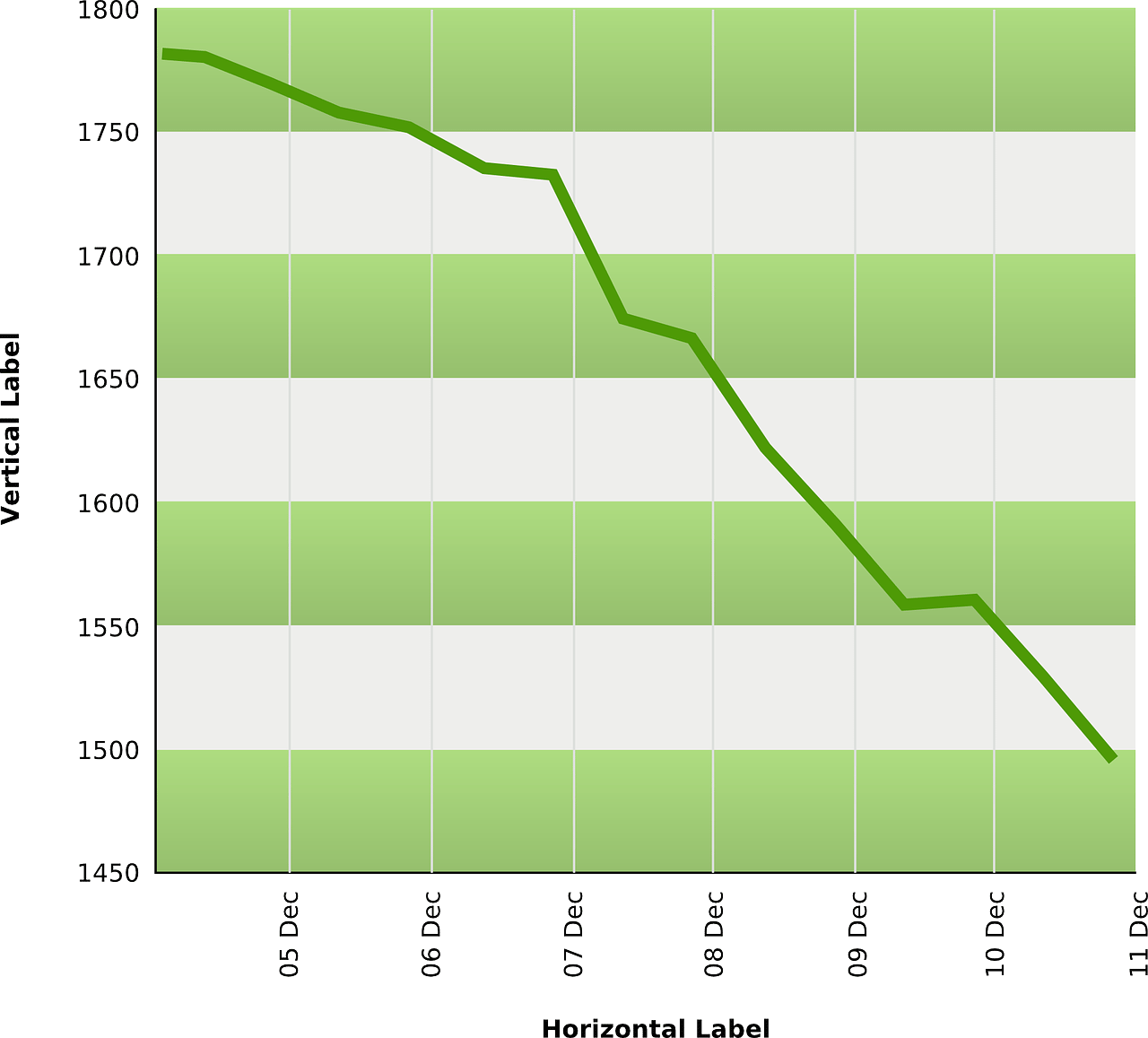
These are one of my favorites. They are so simplistic. These charts include a series of data points connected by a line. These are best used to show developments over a certain period.
4. Tables
Tables are great if you have detailed information with different measuring units, which may be difficult to represent through other charts or graphs.
5. Area Charts
Area charts are very useful for multiple data series, which may or may not be related to each other (partially or wholly). They are also useful for an individual series representing a physically countable set.
So choose wisely, and you will be good.
8. Colour Theory
I love colors. Who doesn’t? Colors in an Excel dashboard make it livelier than the drab and overused grey, black and white. I could write an entire book on color theory, but that’s already fine. You must know which colors work together and which do not. For example, you cannot pair bright pink and red together unless you want an assault on the eyes. While selecting a color coding, you must remember that 8% of men and 0.5% of women are color blind.
Most people can perceive color but cannot correctly distinguish between two shades of the same color. These people can sense changes in brightness, though, just like you and me. Avoid having shades that overlap, like the example I gave above. That would look ugly and be utterly useless for the users we discussed above.
9. Dashboard Design
So now you know how and when to use each chart and the colors to pair them with. But one more critical thing is where you place everything on the Excel dashboard. Place everything strategically. Arrange the data that you want to compare with that in mind.
10. Have Fun and Let Your Creativity Flow
Once you understand your target audience and your Excel dashboard’s purpose and select the correct charts and designs, you should be good. By the end of this step-by-step informative article, you can go from a blank spreadsheet to a fully functional spreadsheet with stunning interactions. So go ahead and give it a try. Good luck!
Recommended Articles
Here are some articles that will help you to get more detail about Create Interactive Excel Dashboard, so go through the link.


