Updated August 7, 2023
Introduction to HTML Search Bar
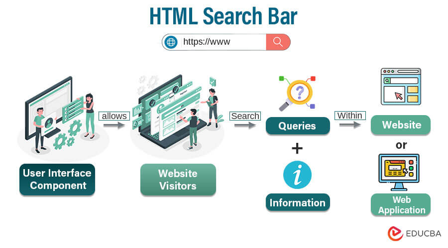
An HTML search bar, also known as a search input field, is a user interface component that allows website visitors to enter search queries and search for particular information within a website or application. It is usually a text input box with a search button or an icon. As a crucial element of user experience, an HTML search bar allows individuals to input keywords, phrases, or queries, initiating a search process that leads to the discovery of relevant content or resources.
Designed to seamlessly integrate into the layout and design of a web page, an HTML search bar consists of a combination of HTML, CSS, and potentially JavaScript code.
Table of Content
Search Bar in HTML is a text field for searching the content if we know the keyword in between the actual sentence. Generally, the search box is always added within the navigation bar. We can also add buttons, drop-down lists, and anchors in the navigation bar as per client requirements and the search box. It is generally put on the top of the page for easy navigation. It will be created by <input class= “form-control” type= “text” placeholder= “Search”>. Based on client requirements, the design color varies.
- Real-Time Scenario: Nowadays, almost all websites using navigation bars have the same.
- Example: https://www.educba.com/; from this website, you can see below the search bar.
Importance of Search Bars in Web Design
- Efficient Content Discovery: Search bars provide a quick and efficient way for users to find specific information, products, or content within a website. Instead of browsing through menus and categories, users can enter keywords or phrases related to their interests.
- User Convenience: Search bars cater to users with a specific goal who want to find information quickly. This convenience can increase user satisfaction and engagement, reducing frustration associated with navigating complex menus or sifting through large amounts of content.
- Complex or Deep Websites: Search bars simplify finding relevant information for websites with extensive content or intricate hierarchies. Users can avoid getting lost in layers of navigation and instead go directly to the content they seek.
- Mobile-Friendly Design: Screen space is limited on mobile devices, making navigation menus less accessible. A search bar provides a compact and effective way for users to interact with the website’s content without extensive scrolling or tapping through menus.
- Accessibility and Inclusivity: Incorporating search bars can enhance accessibility for individuals with disabilities and those who depend on assistive technologies. Combining search input and label elements improves usability for screen readers and keyboard navigation.
- Time-Saving: Users appreciate websites that respect their time. A well-implemented search bar can significantly reduce the time it takes for users to locate specific information, leading to a positive user experience.
- Enhanced Engagement: When users can quickly find what they’re looking for, they are more likely to engage with the website’s content, explore, and potentially convert (e.g., make a purchase, or subscribe to a service).
- E-Commerce and Product Search: Search bars are crucial for e-commerce websites where users often have specific products in mind. Quick access to a search feature can lead to higher conversion rates as users find products and purchase more easily.
- Branding and Design Integration: Search bars can be designed to align with the overall branding and design of the website. They can be customized to match colors, fonts, and styles, creating a cohesive and visually appealing user interface.
- User Behavior Insights: Search bar data can provide insights into user behavior, preferences, and popular search terms. This information can be valuable for improving content, optimizing website structure, and refining marketing strategies.
Creating a Basic Search Bar
To make a basic search bar with the input element, follow these steps:
Form (<form>): At the core of the HTML search bar is the <form> element. This container establishes the context for the search functionality, encompassing the input field and search button. The form’s action attribute specifies where the search query will be sent upon submission, and the method attribute determines whether the data is sent using GET or POST.
Define the <input> Element: Start by using the <input> element and set the type attribute to “text” or “search” to indicate that it will be a text input field for searching.
Specify the name Attribute: Assign a meaningful name to the search input field by setting the name attribute. This name will be used to identify the input when processing form submissions.
Add Placeholder Text (optional): Include a placeholder attribute in the input field to offer a prompt or example search query text. This assists users in determining what they can search for.
Implement a Submit Button (optional): Include a submit button next to the search input field to execute the search operation. This button can be created using the <input> element with type= “submit.”
Examples of HTML Search Bar
Below are different examples of creating a search bar in html.
Example 1: Using Simple HTML
Code:
<!DOCTYPE html>
<html>
<head>
<title>Simple Search Bar Example</title>
</head>
<body>
<form action="/search" method="GET">
<input type="text" name="query" placeholder="Search...">
<button type="submit">Search</button>
</form>
</body>
</html>
Output:
Explanation: When a user types a search term into the text box and clicks “Search,” the form will be submitted to the “/search” URL using the GET method. The search term will be included in the URL as a parameter named “query.” For instance, if the user searches for “apple,” the URL will be “/search?query=apple”. When a search query is submitted, the server uses this information to find and display the most relevant results on the webpage.
Remember that this is a simple example, and in a real-world scenario, you would typically have a server-side script that handles the search query and interacts with a database or an external API to retrieve and display search results. Additionally, style the search bar and the button to match the design of your website.
Example 2: Using CSS
Creating an HTML search bar and styling it using CSS is common in web development. Here’s a step-by-step guide to create a simple search bar and styling it using CSS:
HTML Code:
<!DOCTYPE html>
<html>
<body>
<div class="search-container">
<input type="text" name="query" placeholder="Search..." class="search-input">
<button type="submit" class="search-button">Search</button>
</div>
</body>
</html>
CSS Code:
.search-container {
display: flex;
align-items: center;
}
.search-input {
padding: 10px;
border: px solid #ccc;
border-radius: 6px;
font-size: 20px;
width: 200px;
}
.search-button {
background-color: #0B749C;
color: white;
padding: 18px 20px;
border: none;
border-radius: 8px;
cursor: pointer;
}
.search-button:hover {
background-color: #26222C;
}
Output:
Explanation: This code defines a simple search bar with CSS styles applied to the search container, search input field, and search button.
The provided code creates a visually appealing search bar with a flexible container, a rounded input field, and a stylish search button that changes color slightly when hovered over. It’s essential to understand that CSS styles can be modified and customized further to match the design requirements of your website.
Example 3: Using Javascript
HTML Code:
<!DOCTYPE html>
<html>
<head>
<title>HTML Search Bar Example</title>
<link rel="stylesheet" type="text/css" href="styles.css">
</head>
<body>
<h1>EDUCBA</h1>
<H3>Asia’s Largest Online Learning Platform
</H3>
<p>We provide excellent courses to enhance your knowledge.</p>
<form onsubmit="searchFunction(event)">
<div class="search-container">
<input type="text" id="search" name="q" placeholder="Search Here for Courses.....">
<button type="submit">Search</button>
</div>
</form>
<script src="script.js"></script>
</body>
</html>
styles.css
body {
font-family: Georgia, sans-serif;
margin: 50px;
background-color: #93CBDF;
}
h1 {
color: #0B042E;
}
.search-container {
display: flex;
align-items: center;
max-width: 400px;
margin: 30px auto;
background-color: #7D7C83;
border: 1px solid white;
border-radius: 10px;
padding: 3px;
}
input[type="text"] {
flex: 1;
padding: 8px;
border: none;
border-radius: 5px 0 0 5px;
}
button {
padding: 8px 15px;
background-color: #228211 ;
color: #fff;
border: none;
border-radius: 0 5px 5px 0;
cursor: pointer;
}
button:hover {
background-color: #658E5E ;
}
script.js
function searchFunction(event) {
event.preventDefault();
const searchTerm = document.getElementById('search').value;
// You can perform further actions with the search term, like sending it to a server or processing it locally.
console.log('Search term:', searchTerm);
}
Output:
Explanation: The searchFunction is a JavaScript function that handles the form submission for the search bar. It prevents the default behavior of the form submission from handling it programmatically. It retrieves the user’s search query from the input field, stores it in the searchTerm variable, and logs it to the console for debugging purposes. In a real-world scenario, you can replace the console.log() statement with other functionality, such as sending the search term to a server for processing, filtering content on the page based on the search term, or displaying search results.
Example 4: With an Animated Search bar
Html Code:
<!DOCTYPE html>
<html>
<head>
<title>Search Bar</title>
</head>
<body>
<h1>Search the Content with Search Bar</h1>
<div class="top">
<form method="get" action="#">
<div class="tableBar">
<div class="tableDivision">
<input type="text" placeholder="Search Here" required>
</div>
<div class="tableDivision" id="myID">
<button type="submit">
<div id="myCircle"></div>
<span></span>
</button>
</div>
</div>
</form>
</div>
</body>
</html>
CSS Code:
h1 {
text-align: center;
color: brown;
}
* {
outline: none;
}
html, body {
height: 100%;
min-height: 100%;
}
body {
margin: 0;
background-color: grey;
}
.tableBar {
display: table;
width: 100%;
}
.tableDivision {
display: table-cell;
vertical-align: middle;
}
input, button {
margin: 0;
border: 0;
background-color: transparent;
color: green;
font-family: sans-serif;
padding: 0;
}
.top {
position: absolute;
top: 50%;
border-radius: 20px;
transform: scale(0.6);
margin: -83px auto 0 auto;
background-color: light blue;
left: 0;
right: 0;
width: 550px;
box-shadow: 0 10px 40px , 0 0 0 20px black;
padding: 35px;
}
form {
height: 96px;
}
input[type="text"] {
font-size: 60px;
line-height: 1;
width: 100%;
height: 96px;
}
input[type="text"]::placeholder {
color: brown;
}
#myID {
padding-left: 35px;
width: 1px;
}
button {
width: 84px;
height: 96px;
cursor: pointer;
position: relative;
display: block;
}
#myCircle {
height: 43px;
margin-top: 0;
border-width: 15px;
position: relative;
top: -8px;
border: 15px solid #fff;
background-color: transparent;
border-radius: 50%;
left: 0;
width: 43px;
transition: 0.5s ease all;
background-color: transparent;
border-radius: 50%;
}
button span {
position: absolute;
top: 68px;
border-radius: 10px;
transform: rotateZ(52deg);
transition: 0.5s ease all;
width: 45px;
left: 43px;
display: block;
height: 15px;
background-color: transparent;
display: block;
}
button span:before, button span:after {
content: '';
position: absolute;
background-color: #fff;
border-radius: 10px;
bottom: 0;
right: 0;
transform: rotateZ(0);
transition: 0.5s ease all;
width: 45px;
height: 15px;
transition: 0.5s ease all;
}
#myID:hover #myCircle {
top: -1px;
width: 67px;
height: 15px;
border-width: 0;
background-color: #fff;
border-radius: 20px;
}
#myID:hover span {
top: 50%;
width: 25px;
margin-top: 3px;
left: 56px;
transform: rotateZ(0);
}
#myID:hover button span:before {
transform: rotateZ(52deg);
bottom: 11px;
}
#myID:hover button span:after {
bottom: -11px;
transform: rotateZ(-52deg);
}
#myID:hover button span:before, #myID:hover button span:after {
right: -6px;
width: 40px;
background-color: lime;
}
Output:
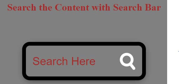
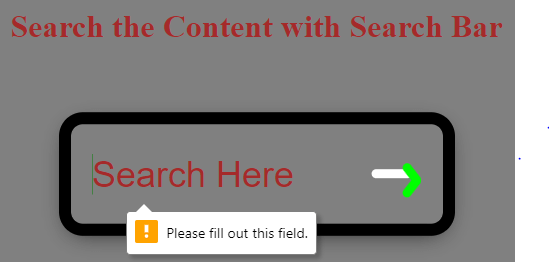
Explanation: The result is a visually appealing search bar with an interactive magnifying glass icon that transforms into a search button when hovered over. Here is an example of using CSS to create attractive and interactive UI components for a website.
Example 5 – Animated Search Bar with Some Content
Html Code:
<!DOCTYPE html>
<html>
<head>
<title>Search Bar</title>
</head>
<body>
<h1>Animated Search Bar with Some Content</h1>
<div class="topDiv">
<div class="searchTop">
<input type="text" class="searchBar"
placeholder="Enter some text to search?">
<button type="submit" class="searchButton">
<i class=""></i>
</button>
</div>
</div>
<div class="main">Almost all the websites are using navigation bars having HTML search bar.</div>
</body>
</html>
Css Code:
@import url(https://fonts.googleapis.com/css?family=Open+Sans);
body {
background: black;
font-family: fantasy;
}
h1 {
color: Brown;
text-align: center;
}
.main {
border: solid 2px brown;
font-size: 20px;
color: pink;
width: 600px;
margin: 150px;
}
.searchTop {
width: 100%;
display: flex;
position: relative;
}
.searchBar {
width: 100%;
border: 3px solid navy;
height: 20px;
border-radius: 5px 0 0 5px;
border-right: none;
padding: 5px;
outline: none;
color: Dark blue;
}
.searchBar:focus {
color: purple;
}
.searchButton {
width: 40px;
height: 36px;
font-size: 20px;
text-align: center;
color: Black;
border: 1px solid gray;
border-radius: 0 5px 5px 0;
cursor: pointer;
background: Dark green;
border-radius: 0 5px 5px 0;
cursor: pointer;
}
.topDiv {
width: 30%;
top: 50%;
left: 50%;
transform: translate(-50%, -50%);
position: absolute;
left: 50%;
transform: translate(-50%, -50%);
}
Output:
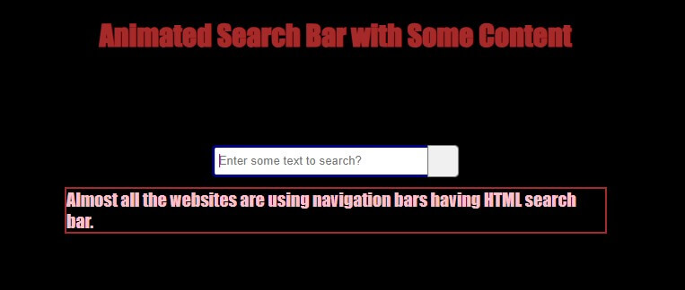
Explanation: The result is an animated search bar with rounded corners and some content below it. When you focus on the search input field, the text color changes to purple. The button has a green background and changes appearance on hover. The search bar is located at the center of the page. The content in the .main section describes the usage of navigation bars with HTML search bars on websites.
Example 6 – Animated Search Bar with Radius
HTML Code:
<!DOCTYPE html>
<html>
<head>
<title>Search Bar</title>
</head>
<body>
<h1>Animated Search Bar with radius</h1>
<div class="topDiv">
<input class="searchBar" type="text" name="" placeholder="Search">
<button class="button" href="#">
<i class="material-icons"> search </i>
</button>
</div>
</body>
</html>
CSS Code:
h1
{
color: Cherry;
text-align: center;
}
body {
background-image: linear-gradient(to right, #10928f, #ABE7FE);
}
.topDiv {
position: absolute;
top: 50%;
left: 50%;
transform: translate(-40%, 40%);
height: 40px;
border-radius: 40px;
padding: 10px;
background: #2f3640;
border-radius: 40px;
padding: 10px;
}
.topDiv:hover>.searchBar {
width: 250px;
padding: 0 5px;
} .topDiv:hover>.button {
background: white;
color: Navy Blue;
}
.button {
color: black;
float: right;
height: 45px;
border-radius: 50%;
background: yellow;
width: 45px;
justify-content: center;
align-items: center;
transition: 0.35s;
display: flex;
align-items: center;
transition: 0.35s;
}
.searchBar {
border: none;
background: none;
float: left;
padding: 0;
color: white;
outline: none;
transition: 0.4s;
line-height: 40px;
font-size: 16px;
width: 0px;
line-height: 40px;
padding: 0;
color: white;
}
@media screen and (max-width: 630px) {
.topDiv:hover>.searchBar {
width: 160px;
padding: 0 5px;
}
}
Output:
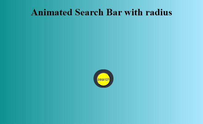
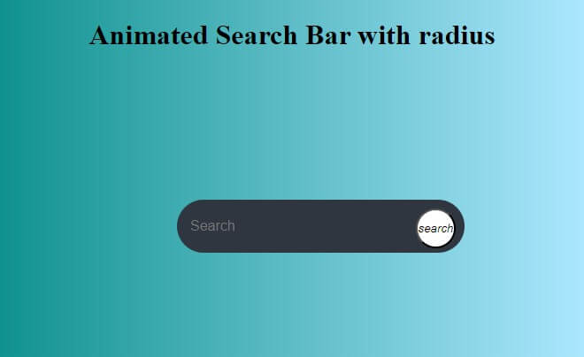
Explanation: This code snippet creates an animated search bar with rounded corners. The search bar expands when hovered over, revealing the input field and a search button. The background changes from a gradient to a solid color upon hovering. The design is responsive and adjusts for smaller screen sizes.
Advanced Search Bar Features
Here are some advanced search bar features that you can consider implementing:
- Autocomplete Suggestions: As users start typing in the search bar, provide real-time autocomplete suggestions based on popular or relevant search terms. This helps users quickly find what they’re looking for and can improve the accuracy of their queries.
- Filters and Facets: Users can refine search results using filters and facets. These could include options to filter by categories, date ranges, locations, or other relevant attributes. This feature can be beneficial when handling a substantial amount of data.
- Search Operators: Implement search operators or syntax that allow users to create more specific and complex queries. For example, you could allow users to use “AND,” “OR,” “NOT,” and parentheses to combine keywords.
- Instant Search Results: Display search results in real-time as users type, without needing to submit the search form. This provides instant feedback and helps users find the right content more quickly.
- Search Suggestions: Offer search suggestions or related searches based on the user’s input. This can help users discover alternative search terms they might not have considered.
- Thumbnail Previews: Display thumbnail previews of search results (such as images or previews of documents) alongside the search results list. This can give users a visual preview of the content before clicking on a result.
- Voice Search: Enable voice search functionality, allowing users to express their search inquiries verbally instead of manually typing them. This is particularly useful for mobile users and those who prefer hands-free interactions.
- Recent Searches and Search History: Give users the option to see their recent search history or saved searches. This can help them quickly revisit previous searches without having to retype the query.
- Location-Based Search: If applicable, allow users to search for content based on location or provide location-based suggestions.
- Spell Check and Correction: Implement a feature that corrects spelling mistakes and suggests corrections, ensuring that users still get relevant results even if they make typos.
- Wildcard and Fuzzy Search: Support wildcard characters (e.g., *) and fuzzy search capabilities to accommodate variations in spelling or phrasing.
- Dynamic Result Sorting: Allow users to change the sorting order of search results (e.g., by relevance, date, popularity) to find the most relevant content.
- Pagination and Infinite Scroll: When displaying search results, consider implementing pagination or infinite scroll to manage and load many results effectively.
- Search Analytics: Implement tracking and analytics to gain insights into user search behavior, popular queries, and frequently used filters. This data can help you optimize your search functionality over time.
Accessibility Considerations of Search Bars
When designing search bars, it’s important to consider accessibility for users with disabilities to use the search feature efficiently. This involves:
- Input Labels: It provides descriptive labels using the <label> element to associate the search input field with its purpose.
- Keyboard Accessibility: It allows users to navigate and interact with the search bar using their keyboards, including the Enter key, to activate the search function.
- Assistive Technology Compatibility: Providing proper announcements and information for search bar components to ensure compatibility with screen readers and other assistive devices.
- Contrast and Visual Indicators: Maintaining sufficient contrast between the search bar elements and using visual indicators, such as focus outlines, to aid users with visual impairments.
- Alternative Text for Images: Include relevant alternative text (alt attribute) to describe the content of any images used in the search bar.
- Testing and User Feedback: Employing manual testing, automatic tools, and input from users with disabilities to assess the accessibility of the search bar regularly and take immediate action to solve any issues.
Conclusion
Implementing an HTML search bar on your website provides users with a familiar and intuitive method to navigate through extensive data, find relevant information, and interact with your platform. As you enhance this search bar with advanced features like autocomplete suggestions, filters, voice search, and real-time results, you elevate its utility and make it an even more indispensable tool for your users.
Remember that the effectiveness of an HTML search bar lies not only in its technical implementation but also in its alignment with user needs and the overall design of your website. Regular optimization, user feedback analysis, and thoughtful design adjustments will help you create a search bar that meets user expectations and contributes positively to overall user satisfaction and engagement on your website.
FAQ’s
Q1. How can I make my search bar accessible for users with disabilities?
Ans: When creating a search bar, it’s important to consider accessibility. To create an accessible search bar, use proper HTML semantics, provide a clear label for the search input, ensure it is compatible with assistive technologies and keyboard accessible, maintain sufficient color contrast, and test it with screen readers and other assistive devices. Adhering to these guidelines will ensure your search bar is usable for all users.
Q2. How can I enhance the performance of my search bar?
Ans: To enhance the search bar’s speed, optimize the search algorithm, use server-side caching, reduce unnecessary network requests, and utilize efficient data retrieval techniques. By implementing these optimizations, you can provide users faster and more responsive search results.
Q3. How can I test and debug my HTML search bar?
Ans: Enter different search queries and submit the form to test your search bar. Check that the search results displayed match your expectations. Inspecting HTML and CSS, debugging JavaScript code, and checking cross-browser and device compatibility can be done using browser developer tools.
Recommended Articles
We hope this EDUCBA information on the “HTML Search Bar” benefited you. You can view EDUCBA’s recommended articles for more information,
