Updated April 1, 2023
Introduction to HTML Table Layout
The layout of your table in an HTML document can be set using the width property, and in-process restricting the width of the table, unchanged, making it fixed no matter how long the contents are inside the cells or what browser display settings are. OR we can use an HTML property known as table-layout.
The table-layout property is such that it helps define a set of instructions for the browser that the browser should use while laying out your table, and your table’s cells and columns.
So, in short, a table-layout property can be said to contain an algorithm that is given to the browser to follow, to layout your table. A table-layout property has various values to be set to, but it entirely depends on the user’s choice. The browsers do apply some rules automatically, defining how the cells and the columns will be laid out, if there is no use of the table-layout property. These rules are also applied when the table-layout property’s value is set to ‘auto’.
Syntax :
Below is the simple syntax of the table-layout property.
ObjectName
{
table-layout: auto|fixed|initial|inherit;
}
HTML Table Layout Values
The values to be used for table-layout property, as discussed above, entirely depends and vary according to a programmer’s choice of design and taste. The following are the values that can be used along with the table-layout property.
1. auto
‘auto’ is the ‘by default’ value of the table-layout property. That is, even if the programmer does not define the table-layout property, the browsers use the ‘auto’ constraints for defining a table and table’s cells and columns layouts. The width of the table and table’s cells depends on the content inside the cells, that is, the table’s width is adjusted according to the largest content in the cells, keeping is unbreakable.
Below is an example showing table-layout with ‘auto’ as its value.
Example
This example shows a table with table width as 100% and the table-layout value is set to ‘auto’.
Code:
<body>
<h2>The <code>table-layout</code> property demo</h2>
<table>
<thead>
<tr>
<th>table-layout demo</th>
<th>table-layout demo</th>
<th>table-layout demo</th>
<th>table-layout demo</th>
</tr>
</thead>
<tbody>
<tr>
<td>This text is much bigger content for the demo. Adding more text here. More text being added here.</td>
<td>table-layout demo</td>
<td>table-layout demo</td>
<td>table-layout demo</td>
</tr>
<tr>
<td>table-layout demo</td>
<td>table-layout demo</td>
<td>table-layout demo</td>
<td>table-layout demo</td>
</tr>
</tbody>
<tfoot>
<tr>
<td>table-layout demo</td>
<td>table-layout demo</td>
<td>table-layout demo</td>
<td>table-layout demo</td>
</tr>
</tfoot>
</table>
</body>
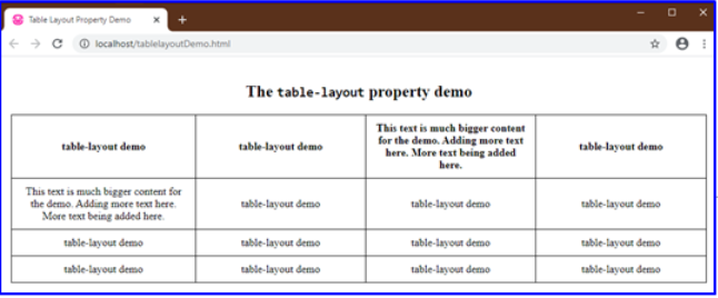
Output:
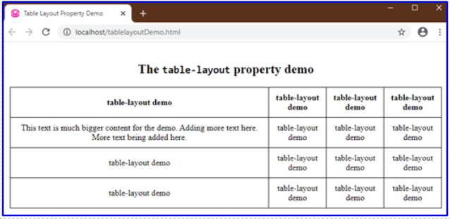
Note that, the table, has its width adjusted according to the content in the cells, the first column is being adjusted according to the large content in the second row-first cell. While other columns are divided equally since they contain the same worded content.
2. fixed
‘fixed’ value as the name suggests defines the table and its column’s width according to the predefined widths of the col elements (if any) and the width of the table. This property with value as ‘fixed’ can also be determined by the width of the very first row of cells of the table. The rest of the cell’s width does not matter or affect the table’s widths.
We will need to give the table’s width, some value instead of ‘auto’ (a default value). In the below examples, the width is set to 100%.
Example #1
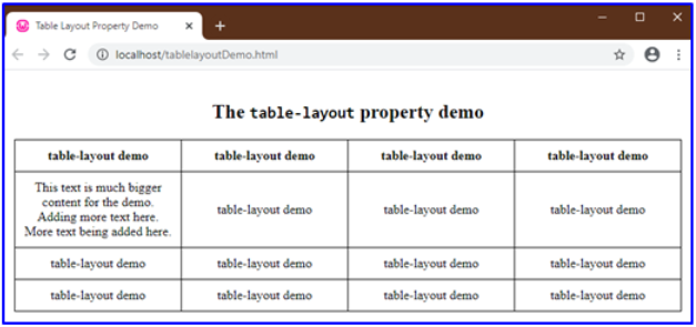
Using the same table created above, but setting table-layout to ‘fixed’ value and table width as 100%. CSS values as defined in the program are given below, HTML code is the same.
Code:
table {
width: 100%;
margin: 10px auto;
table-layout: fixed;
}
Output:
Example #2
This example shows how a fixed width of a cell matters and has its effects while using table-layout as fixed property.
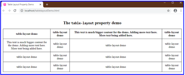
Here we set the first cell’s width to 400px for demo purposes to exaggerate the difference of display. Now observe that the property value, ‘fixed’ has no effect on other cells since every other cell has the same content.
Example #3
Now observe the below example. This table is the same as above with a much larger content in one of the other cells and width set to 250px.
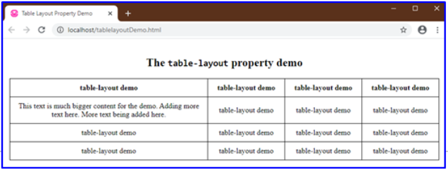
Note if the property was set to auto;
table {
width: 100%;
margin: 10px auto;
table-layout: auto;
}
Output:
But here, when the ‘fixed’ property is used, it toggles the table accordingly.
table {
width: 100%;
margin: 10px auto;
table-layout: fixed;
}- It does not touch the fixed width of the first cell.
- Divides the rest of the table equally, no matter the content.[Text Wrapping Break]
There are two more values that are Global Values.
- initial: This value when used, sets the property to the default initial value.
- inherit: You can also inherit a table layout design or property from a parent element.
Since when we use the ‘fixed’ table layout algorithm or layout method, your complete table gets rendered as soon as the browser receives the table’s first row and analyzes it. If the table is really large, users will only be able to see the table’s top row if the ‘fixed’ layout method is used which puts up a good effect on users, giving them the impression that the table is getting loaded faster.
Recommended Articles
This is a guide to HTML Table Layout. Here we discuss the Values of HTML Table Layout along with the examples and outputs. You may also have a look at the following articles to learn more –
