Introduction to InDesign newspaper template
InDesign Newspaper Template can understand as designing of newspaper layout in this software with the help of its advance and very helpful features. Here we can use number of design elements with the text content for arranging all the content of news in editorial way. There are number of features in this software that involves in designing of newspaper template such as divide area of document page into columns for proper text content adjustment, good sense of using appropriate text font and style and so on. We use images as elements of design of newspaper for making news attractive to readers and for that we can edit images in Photoshop also and then use it in InDesign.
How to Create Newspaper Template in InDesign?
For creating a newspaper template we should analyzes some of the famous newspaper layout design and get idea about how those have different sections in their design for proper organization of news content. Here in this article I will give you an overview so that you can understand how you can use different element and feature of this software for designing of newspaper template in your own way.
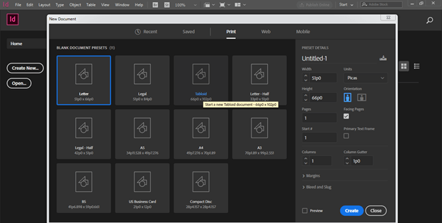
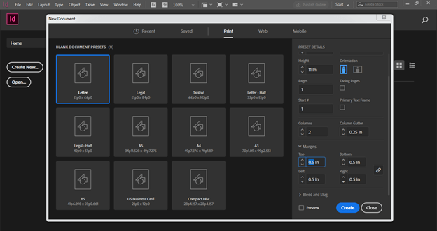
Let us first have a standard document size of newspaper which is Tabloid. So I will click on Print tab of New Document dialog box and choose Tabloid size.
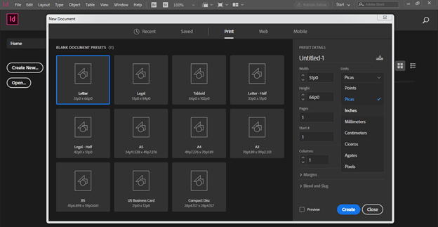
Change the unit to the Inches from the drop down list of Units option.
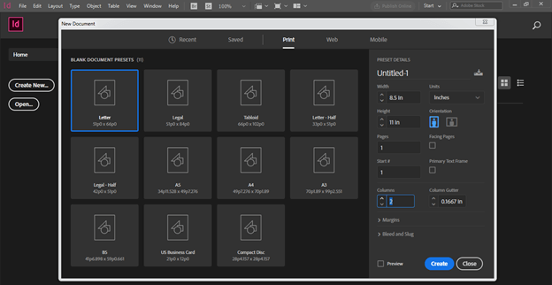
Disable facing option of this dialog box and I want 2 columns in my design layout so I will enter 2 as column value here in the column option.
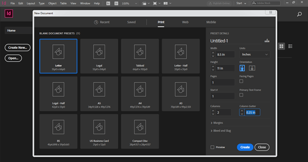
I will take 0.25in for gutter value of column.
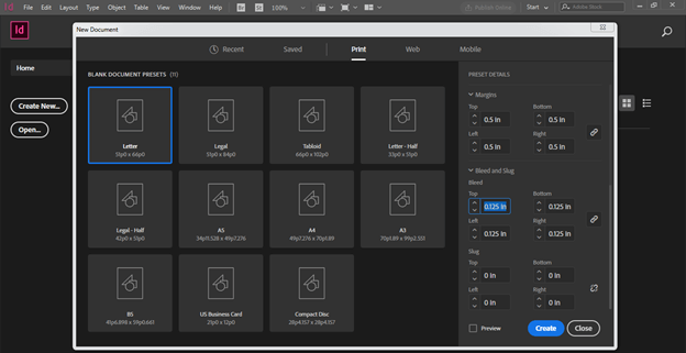
Now I will give 0.5in for Margins of this document page. I will have same margin for all side of the page but if you want you can have different margins on all side as per your choice.
I also take bleed value because newspapers are for printing purposes so it is necessary that we take bleed value. I will take 0.125in as bleed value then click on Create button of this dialog box.
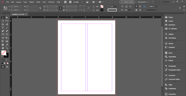
Now we have this type of document layout.
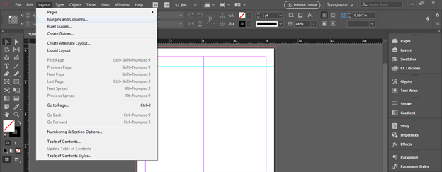
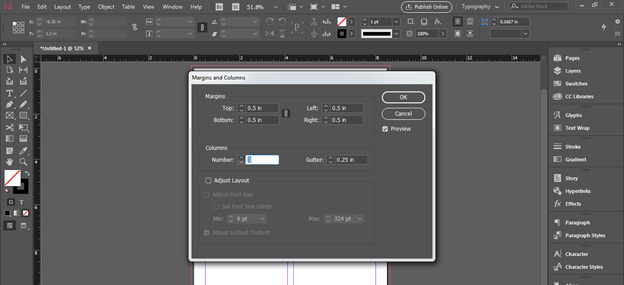
Now I want three columns in my design so don’t worry about that you can add column at this time also and for that go to Layout menu and click on Margins and Columns option.
And from its dialog box we can add more columns.
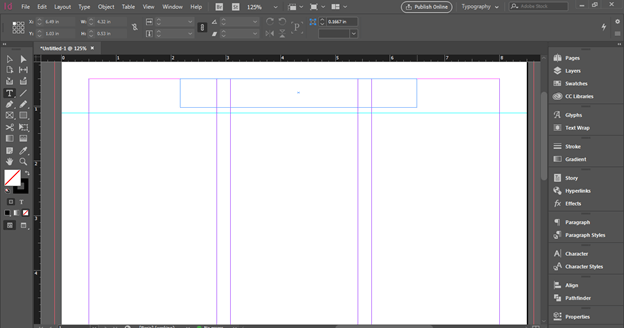
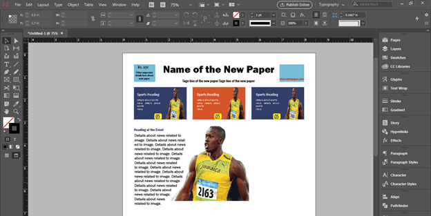
Now I will add name of the newspaper at the top of the document page so for that I have taken a horizontal guide line for having base of this text. For this guide line I have drag a guide line from the horizontal ruler which is at the top of the document page. After that I have taken a Type tool and draw a text frame here like this.
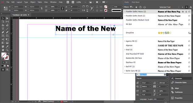
Now type name of the newspaper. So I will type this text here and choose this font from the Character panel of this software.
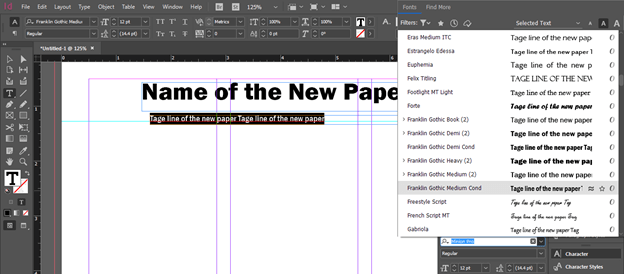
Next I will add one more text frame and here you can write tag line of this newspaper.
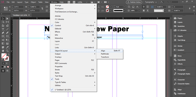
Now I want to align both texts at the center of the page so I will go to Align panel and we can find this panel in the scroll down list of the Window menu.
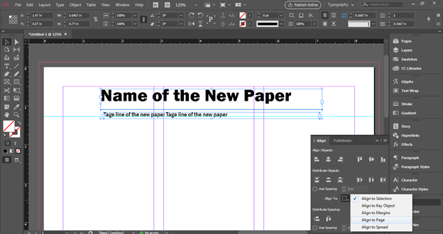
Choose Align to Page option in from the list of ‘Align to’ option of the Align panel.
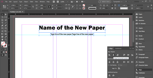
Now I will adjust the size of text frame and select both texts then align them.
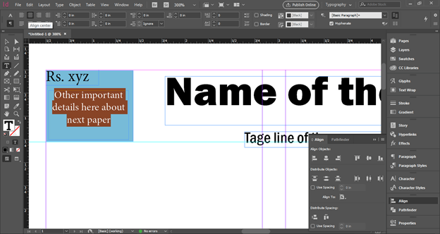
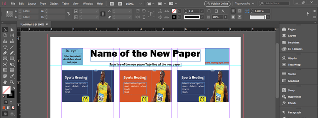
At the left side of the name of the newspaper you can add price of the newspaper and some other important details like this. I have also added a rectangle behind the text so you can add design elements also with text.
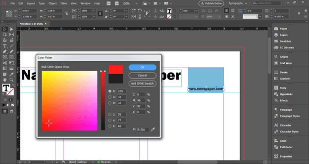
At the right side you can add contact details of newspaper such as website detail, social media platforms and so on. You can also change the color of text if you want.
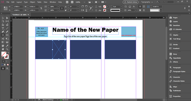
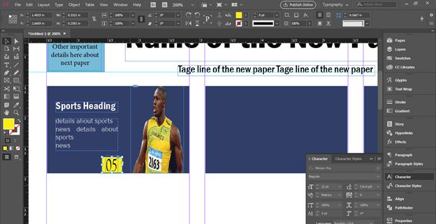
Now I will create rectangular sections like this and these will we background of the header of the first page of newspaper. After that I will take Rectangular Frame tool from tool panel and draw a frame like this.
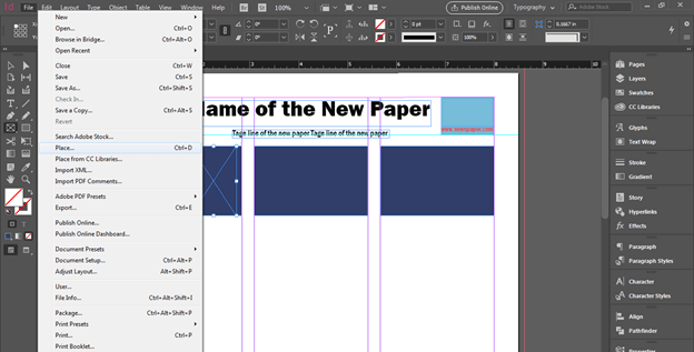
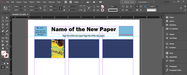
I want to place an image in this frame so I will go to File menu of menu bar and choose Place option from this list or you can press Ctrl + D buttons of keyboard.
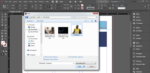
I will choose this image from its saved location.
You can see it is not perfectly fit in this frame.
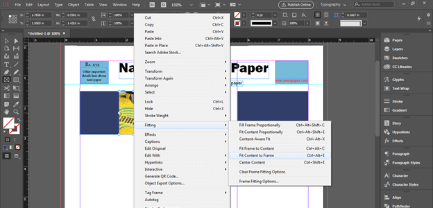
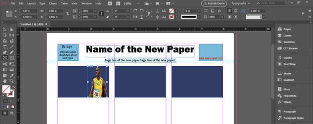
So for fitting it into frame make right click on it then go to Fitting option of the scroll down list and choose ‘Fit content to frame’ option from the new scroll down list.
Now it is perfectly fit.
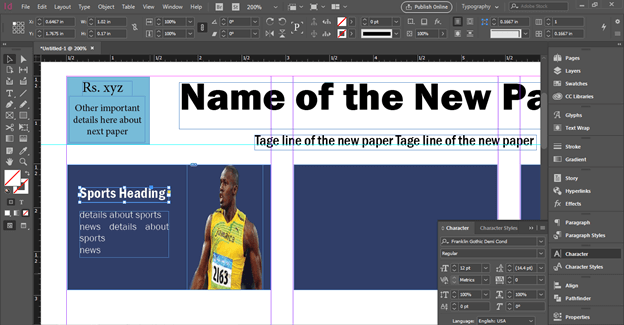
Now add heading of the news here like this and below this I will add some initial details about this news.
Mention the page number of the newspaper on which full news related to this content is available.
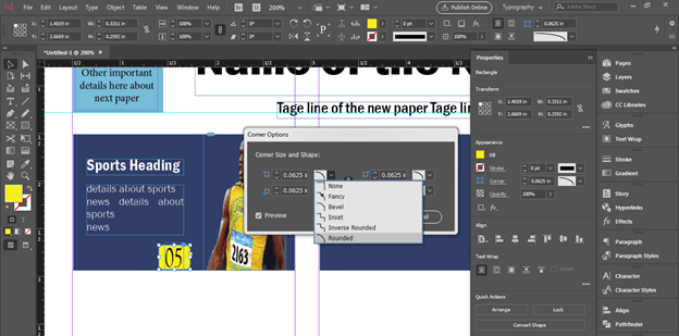
I have added rectangle behind this page number and want to round its corner so I will click on Corner option of Properties panel then choose this Rounded option from its panel.
And you can arrange the header of the news here like this.
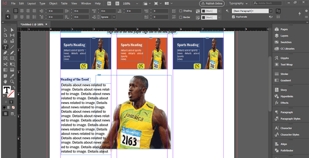
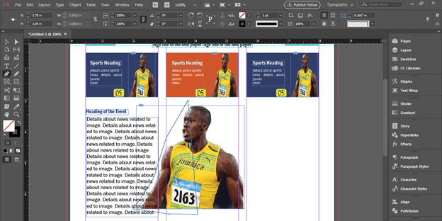
Now if there is text content with the image like this and you want to adjust the text along with image.
Then take pen tool and draw a shape around this image at the side of text content.
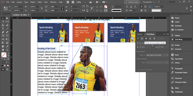
Now select both and choose this option from the Text Warp panel.
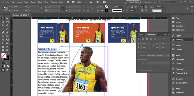
And it will wrap around the shape.
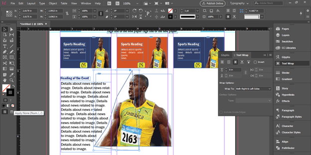
You can off the stroke of this path.
This way you can create a newspaper template according to text content.
Conclusion
Here I have told you about the basic functions and feature that involve in the techniques for creating newspaper template design. Now you have enough idea about how you can use things of this software for creating newspaper template design so you can practices on it and try with your own ideas.
Recommended Articles
This is a guide to InDesign newspaper template. Here we discuss How to Create a Newspaper Template in InDesign along with the steps. You may also have a look at the following articles to learn more –
