Introduction to Inkscape Dark Theme
Inkscape Dark theme can be defined as the presentation of the User interface of this software into a dark working environment to its user which means you can manipulate the user interface screen into dark color so that it can be comfortable for your eye to work with this software because during our work it takes a lot of hours some times to finish work so user interface should be eye-friendly in my point of view and I like dark theme most in comparison with other themes. With screen color, you can also have command on the Icons colors as well as the size of the icon of tools of tool panel and other features of the user interface.
How to Create and work with Dark theme?
Today we will have a good discussion on the aspects of a User interface for having good knowledge around it and learn how we can change to the dark theme. These features of Inkscape are not available in an older version of it so make sure to play with this theme you should have the latest version.
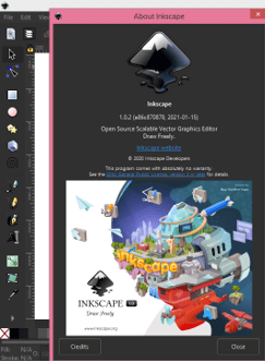
I have a 1.0 version of this software.
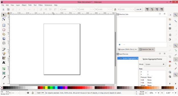
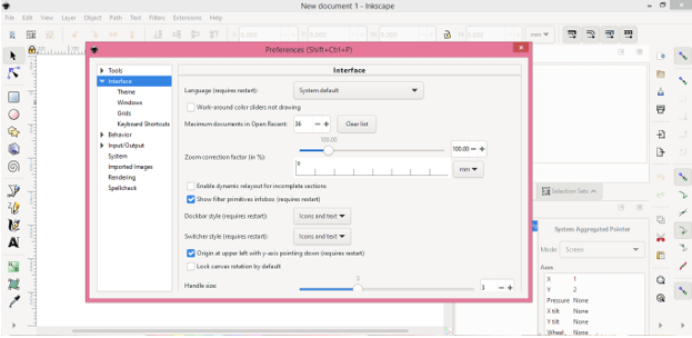
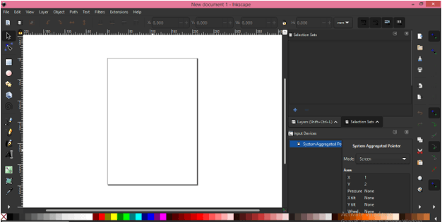
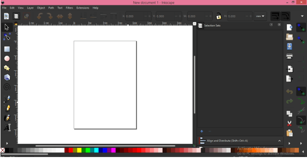
This is a default User interface of Inkscape which is a normal theme. Let me tell you all sections of this Interface so that you can have an idea about terms that i will use throughout this article and getting connected with my words become easy for you. The first bar of this software is the Menu bar which is below the Icon of Inkscape. This menu bar has different menus such as File menu, Edit menu, Layer menu, and some others. These menus help us in making different types of changes in features of this software as well as we go through this menu during designing work. Below this bar behave control panel in which you will have parameters of active tool or object. Next to this panel, you will see User interface is divided into three sections in which on the left side we have a tool panel in vertical column, at the center, we have a document area, at the right side, there is some other tool that helps tools of tool panel in their working. At the button, there is a color panel and some other sections.
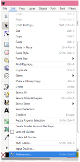
Now let us change this theme to a dark theme and for that, we have to navigate to the Edit menu and you know where you will find this menu that menus you will have this menu in the Menu bar so click on it. At the bottom of the scroll-down list of this menu, you will find the Preferences option and its shortcut key is Shift + Ctrl + P keys of the keyboard.
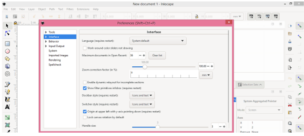
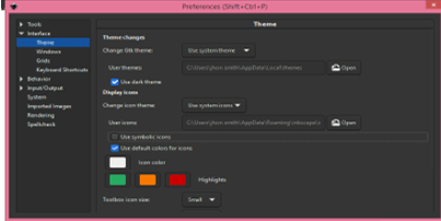
Once you click on this option a dialog box will be open which is the ‘Preferences’ dialog box and here we have a number of parameters regarding making changes in the User interface and for other important settings.
Now click on the arrow key of the Interface option of this box and a drop-down list will be open.
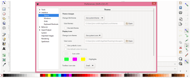
Click on the Theme option of the drop-down list and we will have the parameters box of the theme in this preferences dialog box.
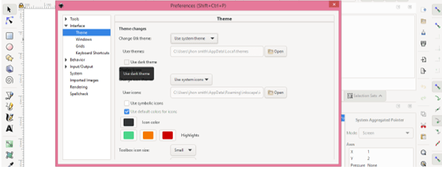
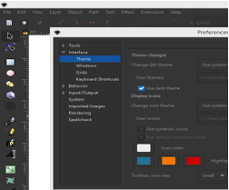
For dark theme enable the Dark theme option of the theme box by making click on the check box of this option.
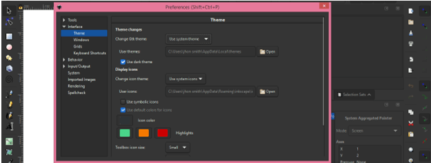
And once you click on it, this theme will change into dark color like this.
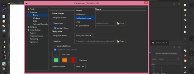
We have one option which is the name as Gtk theme. You can choose any one option from its list for having variation in interface color. Some of the options is not compatible with dark theme so choose according to your requirement. If i go with HighContrastInverse then it will have more contrast between the background color and icons colors.
And our dark theme is ready.
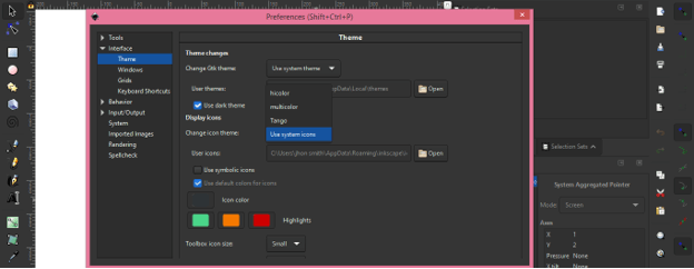
Now you can adjust tool icons’ features for making them more compatible with a dark theme. Again open the Preferences tab in the same way as we have been done above. In the ‘Change Icon theme’ option of this dialog box, we have the following option and with the ‘Use system icons’ option, it will set the tools icon with default settings.
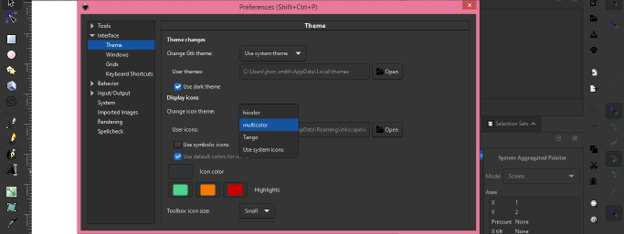
But if I will click on the ‘Multicolor ‘option of this list.
Then tools icon will change in this color.
We also have an option in this box through which we can change icons of the tool into a symbol icon. So for changing those into symbol icon enable the ‘Use Symbolic icons’ option by clicking on the check box of this option.
And our icons of the tool in tool panel will change like a symbol which represents each tool as per its working.
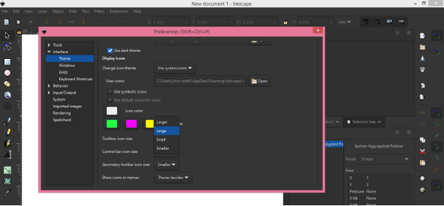
You can also adjust the color of icons by changing their color from these color boxes. These boxes are white color box which is the base color of icons, Green color box, orange color box, and red color box.
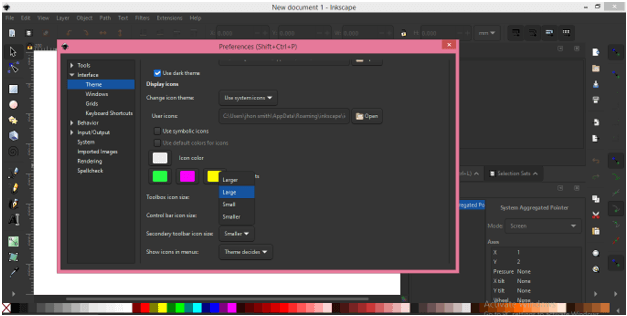
You can also change the size of the icon as per your choice and for changing it choose size from the list of scroll down options of ‘Control bar icon size’. I will click on the Large option of this list for having a large icon but you can see there is no change on the icon because it will update after restarting Inkscape.
I will change all options to Large for showing you the result of it.
And now I have started my Inkscape again. You can see icons of my user interface have been changed according to settings I have done in the Preferences tab of this software. You can switch to a smaller size icon any time by changing them again from the Preferences tab.
Here i have been taken you through the User interface of this software and also tell you all sections of the user interface in which you can make changes according to your suitability for having a dark theme.
Conclusion
Now I am sure Dark theme is no more a big deal for you and you can do this with your software for having ease in your work. Now you also know how you can manipulate icons’ presentation, colors as well as their size as per your requirement so that handling of them becomes easy for you throughout your work.
Recommended Articles
This is a guide to Inkscape Dark Theme. Here we discuss the Introduction, How to create and work with Dark theme?. You may also have a look at the following articles to learn more –
