Introduction to Inkscape Logo
Inkscape Logo can understand as designing of logo in this software with the help of different type of designing tools and features of it. Logo designing is very vast concept and it depends on the imagination of one person and that imagination should express the concept and purpose of that logo because logo is the iconic representation of something. Being vector graphics software we can create a logo in this software very easily. You just have a good concept in your mind for create a logo and after that you can follow some of the techniques for proper execution of your work. So let us discuss this topic in a very interesting way of learning.
How to create a Logo in Inkscape?
Before we start our discussion about how to use this logo maker, I will make some settings in the software’s user interface so that it will be easy for us to use the different tools and features while working on it.
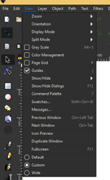
First of all I will set its view to Custom view and for that i will go to View menu and enable Custom option by clicking on its radio button.
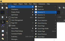
Now set Zoom as 1:1 preset from the same menu of menu bar.
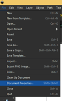
Now go to Document Properties option of drop down list of File menu.
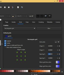
And in the dialog box of this Document Properties i will add a New grid to the document area. I am creating this grid because I will use it as guide during design my logo.
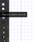
Now i will take Ellipse tool from tool panel which is at the left side of working screen. You can press E as short cut key of it.
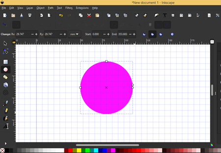
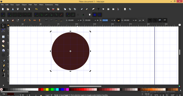
And draw a free hand circle like this.
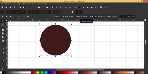
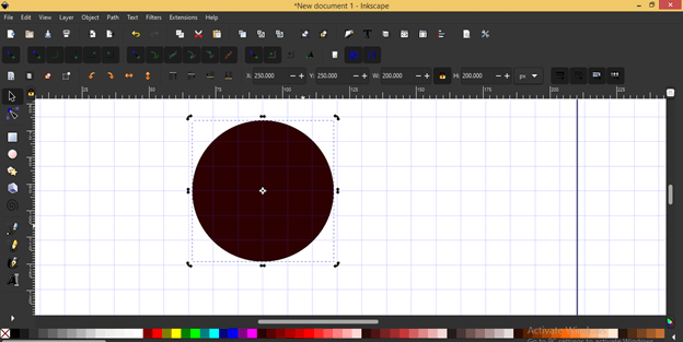
And I change its size as 200 x 200 pixels. I have taken pixel as unit of this logo. I will change its color into some dark shade.
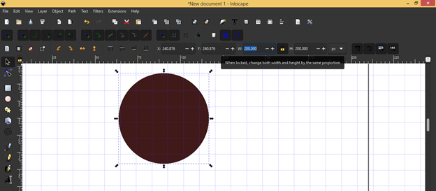
If you want to change size proportionally then click on this lock icon and when you change any of the dimensions of your selected object, then second dimension will change automatically in same proportion.
Now i will set its center at the crossing point of grids.
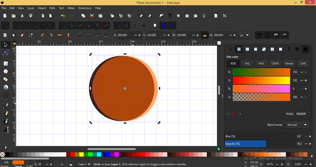
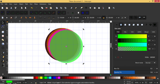
Now i will press Ctrl + D for making a duplicate copy of it.
And change its color then i will go to Fill and Strokes panel and decrease its opacity so that i can see the lower object which is behind it.
Now i move it like this with the help of arrow keys of keyboard or you can move your object with the help of mouse and it is automatically snap to the grid lines. You just have to set parameters of grid lines according to your design.
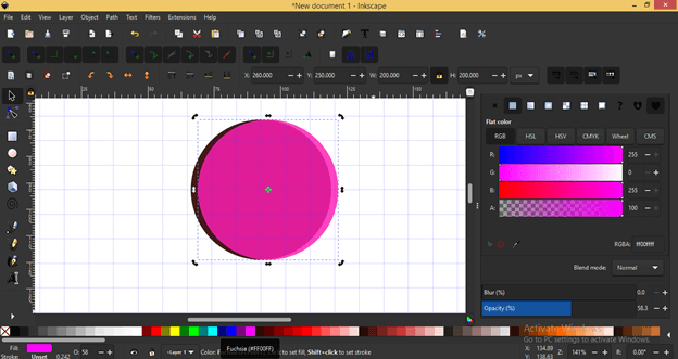
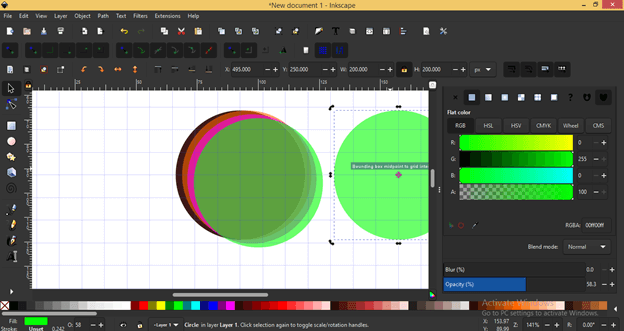
I will make a copy of top object by the same way as we have made previous object and change its color again.
I will move it with the same distance as i moved last circle and then make a duplicate copy of this one too.
I will place a copy of top circle aside for future use.
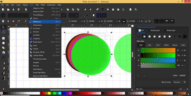
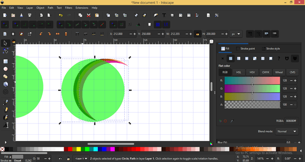
Now make a copy of top green circle and select it with the lowest circle (brown one). For selecting both at a time i will first select green circle and then hold shift key of keyboard then click on the brown circle. After selecting them i will go to Path menu and click on Difference option. You can press Ctrl + – as its shortcut key.
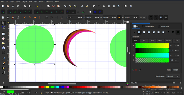
I will repeat the same procedure with other to circles that means again make a copy of green circle and then select second lower circle with duplicated green circle and do the difference. After doing this with all three circles i will get this shape.
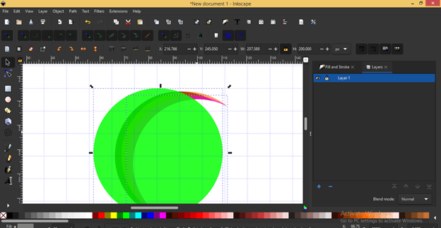
Now i will place one the green circle on the top of this created shape.
And place other green circle on it or you can make duplicate copy of the same green circle then i will select one of the created shapes with green circle.
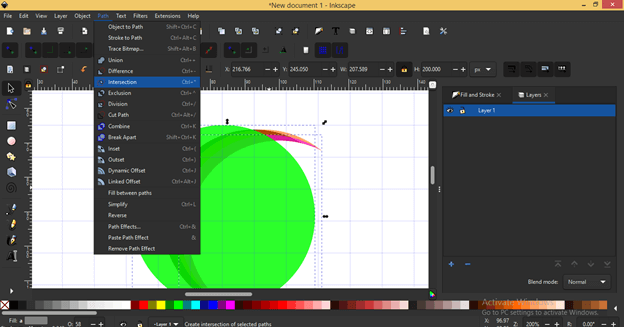
And this time i want to have intersections part of selected object so i will click on Intersection option of scroll down list of Path menu.
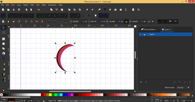
Do the same with other two shapes and i will get this shape for my logo.
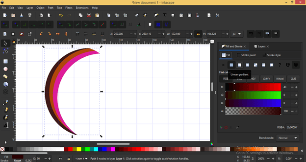
Now i will go to Fill panel which is at the right side of working screen.
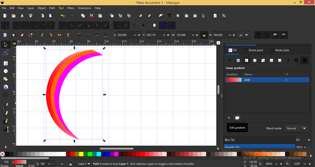
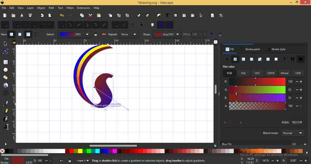
And apply gradient to first selected shape.
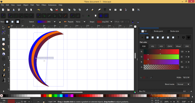
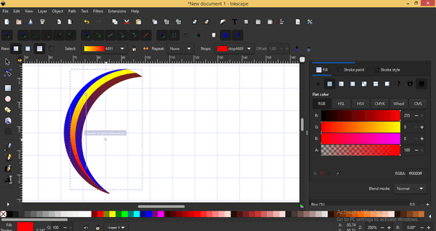
And choose this color as gradient colors. I will use this gradient on both front and back shape of this designed part of logo.
For the center part of this design i will take this gradient.
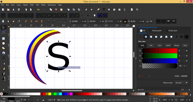
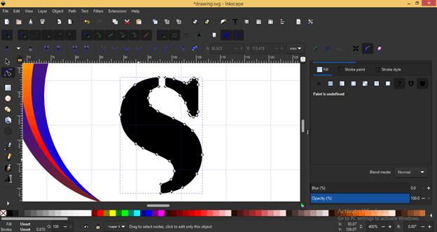
This shape will be work as tail of letter S so i will type a Letter S with the help of Text tool.
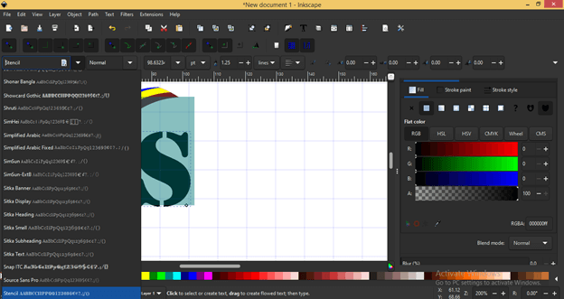
And i will choose Stencil as a font type from Font type list.
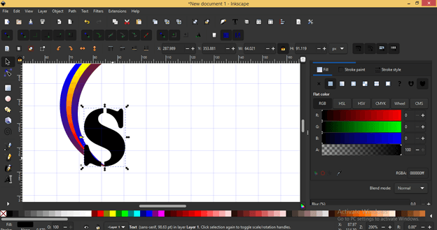
And i will adjust it at proper place so that my designed part will connect with it as tail.
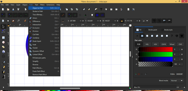
Now i will convert this text into path so that i can edit it as per my choice and it will be not more a text. For converting it go to Path menu and click on Object to Path option.
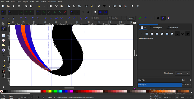
Now it is editable with node tool so I will select these lower nodes and delete them because i don’t want that part in my logo design.
I will do the same with the upper part and adjust the nodes of lower curve of this S for proper alignment of it with designed object.
And after align i will apply same gradient effect to this letter S also.
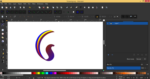
And our logo is ready.
Conclusion
You can do more and better with the above created logo and it was just for explaining to you how you can make a good start and what are the basic concepts for starting a logo design in Inkscape? For having the effective design of logo you just have a good command of the features and techniques of this software as well as the tool of tool panels
Recommended Articles
This is a guide to Inkscape logo. Here we discuss the basic concepts for starting a logo design in Inkscape and how you can make a good start. You may also have a look at the following articles to learn more –

