Updated March 31, 2023

Introduction to Ionic List
Ionic List is an Ionic UI Component that can be used in Ionic Framework to display a list of Options or Contents one below other similar to HTML List. Ionic List consists of a column of rows that may be interactive or static depending on requirements. The static list is a list of items with no action on clicking those items whereas the Interactive list is once on click of which some action is to be performed. The list is used mainly where similar data needs to be represented in a vertically scrollable manner. Interactive Ionic List consists of clicking items, swapping items to right /left, hovering, overflow-menu, etc. The List of Items can consist of Texts, Images, Avatar, Icons, Tabs, etc.
Syntax:
<ion-list>
List of Items either static or interactive using
</ion-list>
How does List Components work in Ionic?
The way it is triggered is by including the <ion-list> tag. This tag defines the start of the list which further contains several items. Using this tag, Ionic just creates an empty list based on attributes defined in that list
Listed below are different attributes which can be used with ion-list
Lines
Meaning – This attribute decides on the type of border that should be applied at the end of every item. Used when the developer needs to give border and styling to each element of the list
Values – inset | full | none
Inset
Meaning – These attributes give margin to the entire list along with rounded corners. Used when the developer needs to give margin and styling to the entire list
Value – true | false
It needs items inside this list to display each content. This can be done by using <ion-item> attribute which should be child component to <ion-list> always.
Talking about ion-item, ion-item is each item within the list which can consist of different data types like Text, Images, Avatar, items with Header, Icons, Buttons, Toggles, details with the arrow icon, etc. Ionic Item plays a key role in List as they are the ones with the content in them. Ionic Items can vary from the sliding item, Items with icons, buttons, images, toggle, to items with floating action buttons, checkboxes, etc.
Interactive Items with the sliding feature can be achieved using the ion-item-sliding attribute. Ion-item-sliding tag should always be a child element of ion-list then only the sliding features can be applied to the application, else it will be displayed as Basic Static List with different options. Ionic Single can vary from Single-Item list to multiple item lists based on requirements.
Ionic Items can also have a hover property where when the item is pressed it gets highlighted making the user know that the item is selected/pressed.
Examples of Ionic List
Here are the following examples mention below
Example #1 – Sliding Ionic List
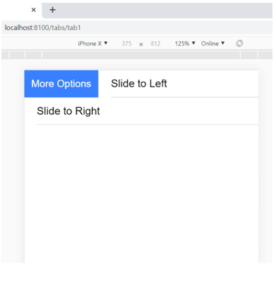
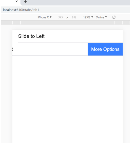
Ionic List has a sliding feature where, when item slides from Right to Left or Left to Right can be achieved using an ion-item-sliding tag in Ionic. This tag can further contain labels, slide options, avatars, and images. This feature is generally seen in many mobile applications, where slide to delete, slide to snooze, slide right to archive, etc. features are used. Ion-item-options have an attribute side that provides the ability of slide to start or end as per requirements.
Code:
<ion-app>
<ion-list>
<ion-item-sliding>
<ion-item>
<ion-label>Slide to Left</ion-label>
</ion-item>
<ion-item-options side="start"> <!--side="start" attribute denotes which side to slide-->
<ion-item-option>More Options</ion-item-option>
</ion-item-options>
</ion-item-sliding>
<ion-item-sliding>
<ion-item>
<ion-label>Slide to Right</ion-label>
</ion-item>
<ion-item-options side="end"> <!--side="end" attribute denotes which side to slide-->
<ion-item-option>More Options</ion-item-option>
</ion-item-options>
</ion-item-sliding>
</ion-list>
</ion-app>
Output:
Examples #2 – Details List with Arrow
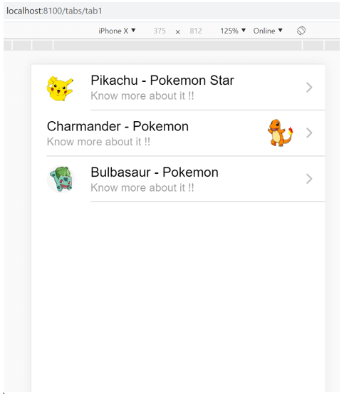
Ionic Items with Detail arrow to the extreme right of the ionic item can be achieved by using the detail attribute on the ion-item Ionic tag. If the developer needs to add some other icon instead of the default arrow icon, then attribute detailIcon can be used to give a custom icon in each item. The below example explains how to use an avatar along with an item list to make the UI look more attractive. Ion avatar also has the additional property to decide whether the avatar will be at the start of the list or to the end based on the attribute slot
Code:
<ion-app>
<ion-list>
<ion-item detail> <!--detailattributegivethearrowtoitem-->
<ion-avatar slot="start"> <!--slot="start"attributepositionstheavatartostart-->
<img src="https://www.pngarts.com/files/3/Pokemon-Pikachu-Transparent-Background-PNG.png">
</ion-avatar>
<ion-label>
<h2>Pikachu - Pokemon Star</h2>
<p>Know more about it !!</p>
</ion-label>
</ion-item>
<ion-item detail>
<ion-avatar slot="end"> <!--slot="start"attributepositionstheavatartostart-->
<img src="https://encrypted-tbn0.gstatic.com/images?q=tbn%3AANd9GcT_rGeHJhrVrPWcvTh2R-_PHFJFNx6PZOy0SQ&usqp=CAU">
</ion-avatar>
<ion-label>
<h2>Charmander - Pokemon</h2>
<p>Know more about it!!</p>
</ion-label>
</ion-item>
<ion-item detail>
<ion-avatar slot="start">
<img src="https://www.pngitem.com/pimgs/m/130-1306788_bulbasaur-pokemon-png-transparent-png.png">
</ion-avatar>
<ion-label>
<h2>Bulbasaur - Pokemon</h2>
<p>Know more about it !!</p>
</ion-label>
</ion-item>
</ion-list>
</ion-app>
Output:
Conclusion
Ionic List is one of the most popularly used Ionic UI components which Makes Mobile Applications look segregated and focused on Each Content in the list items making it Easily readable content & User Friendly. Using List is very simple and comes along with many more additional features that just need understanding on each attribute, CSS styling, and using them as per the requirement of your application. The more you use these lists and their properties the more you will explore and get to know what wonders it does with just a few lines of code.
Recommended Articles
This is a guide to Ionic List. Here we discuss How List Components Work in Ionic and Examples along with the codes and outputs. You may also have a look at the following articles to learn more –


