Updated March 10, 2023
Introduction to jQuery Popover
The popover in jQuery is defined as a pop-up box that appears when we click on any HTML element. We can say popover is just like a tooltip. The difference between popover and tooltip is tooltip can hold more content than popover. To include popover functionality in our application, we must include the js plugin on the HTML page.
Real-Time Example:
Suppose an e-commerce website like Flipkart, Amazon, Myntra, etc., must show more products in less space. If they provide all the item details below, the product will occupy a lot of space. So, instead of providing a button and showing the product information when we click the button without opening the page. It will save space and display product information. In such a case, we used popover functionality.
Advantage:
Overcome space complexity.
How Does Popover Work in jQuery?
It can be worked based on the data-toggle=”popover” attribute to the element from Bootstrap code. For example, we can specify the title to popover by using the title attribute and specify the text inside the popover box using a data-content attribute from Bootstrap Code.
Syntax:
<a href="page link" data-toggle="popover" data-content="Specify required content inside popover" title="Title of the Popover" >Popover Demo Example</a>Popover functionality will work after initializing the popover () method inside jQuery.
Syntax:
<script>
$(document).ready(function(){ //calling inbuilt ready function
$('[data-toggle="popover"]').popover(); //calling popover function
});
</script>
Positioning Popovers:
1. The popover will be displayed on the right side of the HTML element.
2. For Positioning popovers, we used the data-placement Available values for data placement are
- Top
- Bottom
- Left
- right
Examples of jQuery Popover
Different examples are mentioned below:
Example #1 – Default Popover
Code:
<!DOCTYPE html>
<html lang="en">
<head>
<title>Popover Example</title>
<meta charset="utf-8">
<!-- include bootstrap alignment -->
<meta name="viewport" content="width=device-width, initial-scale=1">
<!-- include bootstrap CSS libraries -->
<link rel="stylesheet"
href="https://maxcdn.bootstrapcdn.com/bootstrap/3.4.1/css/bootstrap.min.css">
<!-- include jQuery library -->
<script
src="https://ajax.googleapis.com/ajax/libs/jquery/3.4.1/jquery.min.js"></script>
<!-- include bootstrap JavScript library -->
<script
src="https://maxcdn.bootstrapcdn.com/bootstrap/3.4.1/js/bootstrap.min.js"></script>
<script>
$(document).ready(function() {
$('[data-toggle="popover"]').popover();
});
</script>
<!-- CSS styles -->
<style type="text/css">
div {
border: 1px solid silver;
}
h1 {
text-align: center;
color: gray;
}
.container {
text-align: center;
}
p {
color: teal;
font-size: 20px;
}
</style>
</head>
<body>
<!-- class="container" gives you default bootstrap alignment -->
<div class="container">
<h1>jQuery Popover Example</h1>
<p>We can specify the title to popover by using title attribute
and, also can specify the text inside the popover box by using
data-content attribute from Bootstrap Code.</p>
<a href="#" data-toggle="popover"
title="This is header Section"
data-content="This is content body section">Popover Action</a>
</div>
</body>
</html>
Output:
Explanation:
As you can see in the output, the Popover Action link shows a pop-up called a popover.
Example #2 – Popover Buttons
Code:
<!DOCTYPE html>
<html lang="en">
<head>
<title>Popover Example</title>
<meta charset="utf-8">
<!-- include bootstrap alignment -->
<meta name="viewport" content="width=device-width, initial-scale=1">
<!-- include bootstrap CSS libraries -->
<link rel="stylesheet"
href="https://maxcdn.bootstrapcdn.com/bootstrap/3.4.1/css/bootstrap.min.css">
<!-- include jQuery library -->
<script
src="https://ajax.googleapis.com/ajax/libs/jquery/3.4.1/jquery.min.js"></script>
<!-- include bootstrap JavScript library -->
<script
src="https://maxcdn.bootstrapcdn.com/bootstrap/3.4.1/js/bootstrap.min.js"></script>
<!-- including jQuery file -->
<script>
$(document).ready(function() {
$('[data-toggle="popover"]').popover();
});
</script>
<!-- CSS styles -->
<style type="text/css">
div {
border: 1px solid purple;
}
h1 {
text-align: center;
color: maroon;
}
.container {
text-align: center;
}
p {
color: navy;
font-size: 20px;
}
</style>
</head>
<body>
<!-- class="container" gives you default bootstrap alignment -->
<div class="container">
<h1>Popover Buttons Example</h1>
<button  class="btn btn-primary" href="#" title="Bank Details" data-toggle="popover"
data-content="You can provide your bank details in this section">Bank
Details</button>
<br>
<br>
<button class="btn btn-success" href="#" title="Login Details" data-toggle="popover"
data-content="You can Login From Here">Login</button>
<br>
<br>
<button class="btn btn-info" href="#" title="Register" data-toggle="popover"
data-content="You can register from Here">Register</button>
<br>
<br>
<button class="btn btn-warning" href="#" title="Instant Account" data-toggle="popover"
data-content="You can get your instant account within 2 minutes">Instant
Account</button>
<br>
<p>The Popover in Bootstrap defined as a pop-up box will appear
when we click on any HTML element. We can say popover is just like a
tooltip.</p>
</div>
</body>
</html>
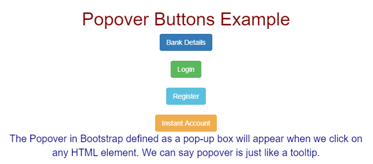
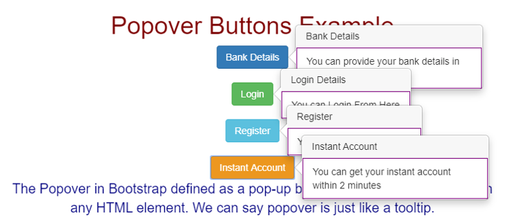
Output:
Example #3 – Popover Positions
Code:
<!DOCTYPE html>
<html lang="en">
<head>
<title>Popover Example</title>
<meta charset="utf-8">
<!-- include bootstrap alignment -->
<meta name="viewport" content="width=device-width, initial-scale=1">
<!-- include bootstrap CSS libraries -->
<link rel="stylesheet"
href="https://maxcdn.bootstrapcdn.com/bootstrap/3.4.1/css/bootstrap.min.css">
<!-- include jQuery library -->
<script
src="https://ajax.googleapis.com/ajax/libs/jquery/3.4.1/jquery.min.js"></script>
<!-- include bootstrap JavScript library -->
<script
src="https://maxcdn.bootstrapcdn.com/bootstrap/3.4.1/js/bootstrap.min.js"></script>
<!-- including jQuery file -->
<script>
$(document).ready(function() {
$('[data-toggle="popover"]').popover();
});
</script>
<!-- CSS styles -->
<style type="text/css">
div {
border: 1px solid green;
}
h1 {
text-align: center;
color: olive;
}
.container {
text-align: center;
}
p {
color: purple;
font-size: 20px;
}
</style>
</head>
<body>
<!-- class="container" gives you default bootstrap alignment -->
<div class="container">
<h1>Popover Buttons Example</h1>
<button class="btn btn-warning" href="#" title="EDUCBA"
data-placement="top" data-toggle="popover"
data-content="EDCUBA is online training platform for IT courses">EDUCBA
Platform</button>
<br> <br>
<button class="btn btn-info" href="#" title="Login"
data-placement="left" data-toggle="popover"
data-content="EDUCBA Login Page">Login</button>
<br> <br>
<button class="btn btn-success" href="#" title="Register"
data-placement="right" data-toggle="popover"
data-content="EDUCBA Register Page">Register</button>
<br> <br>
<button class="btn btn-primary" href="#" title="Buy Course"
data-placement="bottom" data-toggle="popover"
data-content="Now you can buy all online courses within low cost from EDUCBA">Buy
Courses</button>
<br>
<p>The Popover in Bootstrap defined as a pop-up box will appear
when we click on any HTML element. We can say popover is just like a
tooltip.</p>
</div>
</body>
</html>
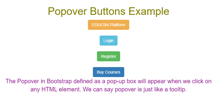
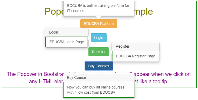
Output:
Recommended Articles
This is a guide to jQuery Popover. Here we discuss the popover in jQuery used for displaying element content on the top, left, right, or bottom. You may also look at the following articles to learn more –


