Updated July 6, 2023

Introduction to JToolBar
Amongst many other finely usable components of SWING Package, it is yet another added sugar on the top. As its name suggests, it is used to implement a toolbar for windows supporting a group of components, for example, drop-down menus, buttons, etc. It is also drag-able by the user. It allows the programmer to group several components like buttons or only their icons, row-wise or column-wise. It is best if you want to display a component that can provide actions, buttons or controls to the user. Usually placed under the menu bars, the toolbar acts as a container for other components like, as discussed, buttons, combo boxes, and menus, etc. The toolbar is added at the top of the frame behaving as a selection tool for the user, allowing them to access the application’s features more quickly. Toolbars contain buttons for commonly used actions or commands in an application.
How to Create JToolBar?
Let us discuss how to create JToolbar:
- Using a JToolBar component, a toolbar can be placed at any of the four sides or edges of our frame or panel. As discussed above, a toolbar through it can be made drag-able and the user can drag the toolbar out, into a separated panel by setting a property called, ‘floatable’ to True.
- In the program, we can use JButtons and passing icons as parameters. Also, we can add a ‘rollover’ property for the icons that will change the icon when the mouse rolls over the toolbar.
- When creating a toolbar, we use a class from Swing Package called, ‘JToolBar’ class. This class supports horizontal and vertical orientations. For the vertical and horizontal orientations, it uses BoxLayout which helps in arranging components in either direction. The alignments can be adjusted by using setAlignmentY () and set alignment () for each component.
- The creation of the components, either horizontally or vertically is ordered and this order is indexed using integers, internally, that is, the first added component is determined with index zero and so on.
Program to implement JToolBar in Java
Following is a simple example of a toolbar created using the JToolBar class of the Swing Package:
Example #1
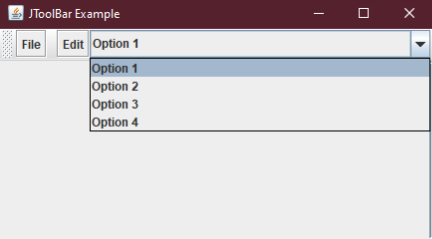
We will create a simple toolbar with two buttons and a combo box with some options under it. See the source code for this example.
Code:
import java.awt.BorderLayout;
import java.awt.Container;
import javax.swing.JButton;
import javax.swing.JComboBox;
import javax.swing.JFrame;
import javax.swing.JScrollPane;
import javax.swing.JTextArea;
import javax.swing.JToolBar;
public class Java_JToolBar
{
public static void main(final String args[])
{
//creating frame object
JFrame F = new JFrame("JToolBar Example");
//setting exit on close property
F.setDefaultCloseOperation(JFrame.EXIT_ON_CLOSE);
//adding tool bar object
JToolBar TB = new JToolBar();
TB.setRollover(true);
//creating a button with text as File
JButton button = new JButton("File");
//adding our File button
TB.add(button);
//adding a separator
TB.addSeparator();
//adding another button named Edit
TB.add(new JButton("Edit"));
//adding a combo box with three options
TB.add(new JComboBox(new String[]
{"Option 1","Option 2","Option 3","Option 4"}));
Container contentPane = F.getContentPane();
contentPane.add(TB, BorderLayout.NORTH);
JTextArea textArea = new JTextArea();
JScrollPane P = new JScrollPane(textArea);
contentPane.add(P, BorderLayout.EAST);
//setting frame size and frame visibility property
F.setSize(450, 250);
F.setVisible(true);
}
}
Output:
- This was just a simple program, let us add something interesting to it. In our next example code, we will use icons instead of text for our buttons.
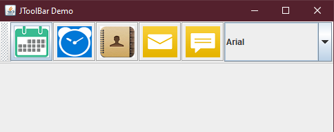
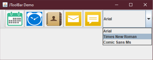
- In the following example, we have added five general use actions and a combo box having sub-items under it. The output of this program looks more elegant and beautiful. Take a look.
Example #2
Source Code for the example program.
Code:
import javax.swing.*;
import java.awt.*;
class demo
{
//constructor being used
demo()
{
//creating our Frame object
JFrame frame = new JFrame("JToolBar Demo");
//creating out tool bar object
JToolBar toolbar = new JToolBar("Applications");
//adding button icons instead of text
JButton btnCalendar = new JButton(new ImageIcon("src/images/Calendar1.png"));
JButton btnClock = new JButton(new ImageIcon("src/images/Clock1.png"));
JButton btnContacts = new JButton(new ImageIcon("src/images/Contacts1.png"));
JButton btnMail = new JButton(new ImageIcon("src/images/Mail1.png"));
JButton btnMessages = new JButton(new ImageIcon("src/images/Message1.png"));
//creating combo box object
JComboBox fonts=new JComboBox();
//adding combo box items
fonts.addItem("Arial");
fonts.addItem("Times New Roman");
fonts.addItem("Comic Sans Ms");
//adding combo box and buttons to our tool bar
toolbar.add(btnCalendar);
toolbar.add(btnClock);
toolbar.add(btnContacts);
toolbar.add(btnMail);
toolbar.add(btnMessages);
toolbar.add(fonts);
//setting properties for the Frame
frame.setLayout(new BorderLayout());
frame.getContentPane().add(toolbar, BorderLayout.PAGE_START);
frame.setDefaultCloseOperation(JFrame.EXIT_ON_CLOSE);
frame.setSize(500, 200);
frame.setVisible(true);
}
public static void main(String args[]) throws Exception
{
//calling our class
new demo();
}
}
Output 1:
Output 2:
Constructors
There are several constructors that are used along with our main class, JToolBar. Apart from JToolBar () default constructor, the following are other constructors that can be used as well:
- JToolBar (): This constructor creates our toolbar with a default orientation. It is oriented to HORIZONTAL.
- JToolBar (int orientation): This constructor creates a new toolbar with an orientation specified by the programmer. It aligns our toolbar specifically towards the side mentioned by the programmer.
- JToolBar (String name): This constructor is used when we need to provide a specific name for our toolbar. Thus this constructor creates the toolbar with a specified title using a parameter.
- JToolBar (String name, int orientation): The constructor that allows the programmer to create a new toolbar with a specified name or title using a parameter, as well as the orientation of the toolbar, is specifically mentioned in the code itself.
Common Methods
There are several methods that can be used in conjugation with our JToolBar class. Some of the prominent ones are listed below:
- JButton add (Action a): This method helps to add a button that will initialize a specified action.
- void addSeparator (dimension d): To add a separator to a group of related components in the toolbar, we use this method which appends a separator to the end of our toolbar. The dimension of the separator is defined by the parameter passed in this function.
- void addSeparator (): This method works in a similar manner to addSeparator (dimension d). The difference is, instead of specifically giving the dimension parameter here the dimensions are by default.
- Component getComponentAtlndex (int index): This method returns the component at an index given by the programmer using the parameter.
- int getComponentindex (Component c): This method returns the index of the component that is being specified using the parameter.
- void remove(Component c): This method simply removes the component being specified using the parameters from the toolbar.
Thus, above were the methods among others like setUI () or getUI () or setOrientation (), that can be used along with our JToolBar class if needed.
Conclusion
We saw how to create toolbars using the JToolBar class of the SWING package. These toolbars are used to display the actions or controls commonly used by the user. JToolBar from SWING provides components that allow the programmer to easily tame commonly needed actions like alignments, orientations, font change and etc.
Recommended Articles
This is a guide to JToolBar. Here we discuss creating toolbar, examples with codes and outputs, constructors and some methods of JToolBar. You can also go through our other related articles to learn more –


