Updated May 31, 2023

Introduction to Kibana Alternatives
The following article provides an outline for Kibana Alternatives. Kibana is a powerful data visualization tool that helps the company respond to various factors. Kibana is a part of the ELK stack that mostly comes with Elasticsearch. But Kibana is not the only tool in the market to visualize data of Elasticsearch. There are also several tools available: some are paid, and some are open-source, which we can use in the place of Kibana. Kibana is the best in the market, but some features of Kibana are also not available open-source. To use all features we also have to pay for this. So we can see some alternatives to that so that we can find the best tools for data visualization and decision-making.
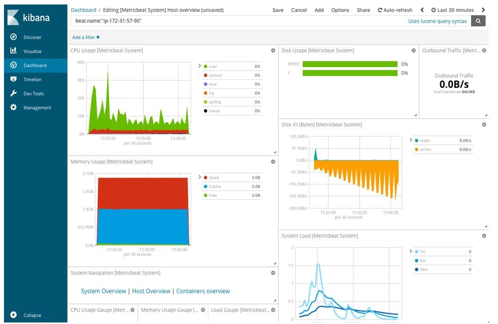
Kibana Dashboard:
Best 6 Kibana Alternatives
There are several best alternative data visualization tools available in the market that we can use instead of Kibana. But we feel the 6 most famous tools for data visualization can use instead of Kibana.
1. Grafana
Feature: It’s an open-source tool.
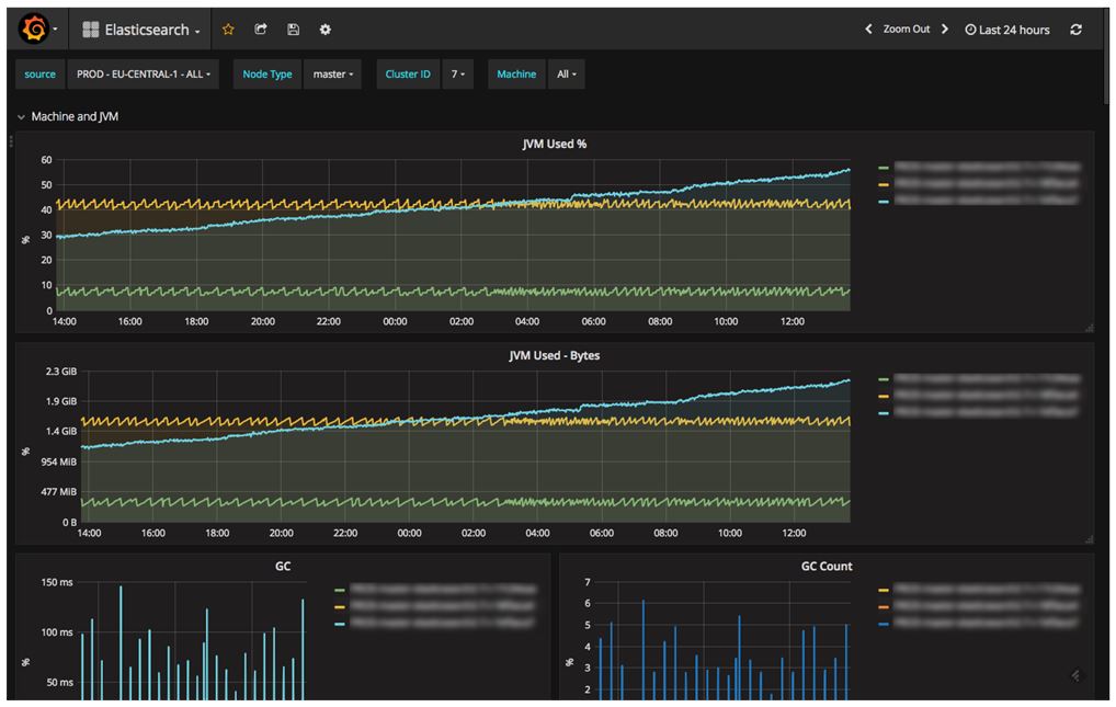
Grafana is an open-source data visualization tool like Kibana. Still, unlike Kibana, we can use this tool with the top different kinds of data, but most commonly used with Graphite, InfluxDB, and Elasticsearch. Another feature of Grafana is giving more support for metrics than Kibana.
Grafana has more feature that helps to replace Graphite-web, which helps users to create very easy dashboards. In Grafana visualizations, we call panels; in each panel, we can show different types of data visualization, making it more beautiful. Grafana can help with graphs, single sat, tables, heatmaps, and free text panel types.
Like Kibana, Grafana also offers customization options that help the users to slice and dice data in any way they want. Users can also play with colors choice, labels, the size of the panels, etc.
2. Graylog
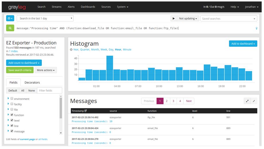
Graylog is another open-source tool for data visualization. It works as a log management platform where all the data comes inside a centralized system. Graylog can transfer huge terabytes of data daily, start processing all huge data, and store it for future processes according to user requirements. The web bonding of the Grafana allows interacting with data to extract all data information in less than milliseconds and arrange the data into useful visualization methods like charts, tables, etc.
The Grafana is currently available in three types of the license agreement:
- Open-source (Limited features but unlimited data)
- Free Enterprise (All Enterprise features but data limited to data/day)
- Commercial License (In this, all features of product availability and data provide according to the price choice)
3. Databox
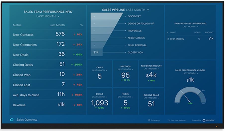
Databox is a tool that is used for business analytics purposes. This platform pulls all your data in one place so the user can easily track all data and discover insights in real time. The best thing about Databox is that we can mix and match data from different sources in one dashboard to get more control over that data for better analytics performance. They offer many integration methods to directly use Google Analytics, Salesforce, Facebook, Shopify, and many more.
Report Features:
- Customizable Dashboard
- Data Source Connectors
- Drag & Drop
- Drill Down
- Financial Reporting
- Forecasting
- Marketing Reports
- OLAP
- Report Export
- Sales Reports
- Scheduled / Automated Reports
Business Intelligence:
- Ad Hoc Reports
- Benchmarking
- Dashboard
- Key Performance Indicators
- Performance Metrics
- Predictive Analytics
- Profitability Analysis
- Publishing / Sharing
- Scorecards
- Strategic Planning
- Trend / Problem Indicators
- Visual Analytics
4. Looker
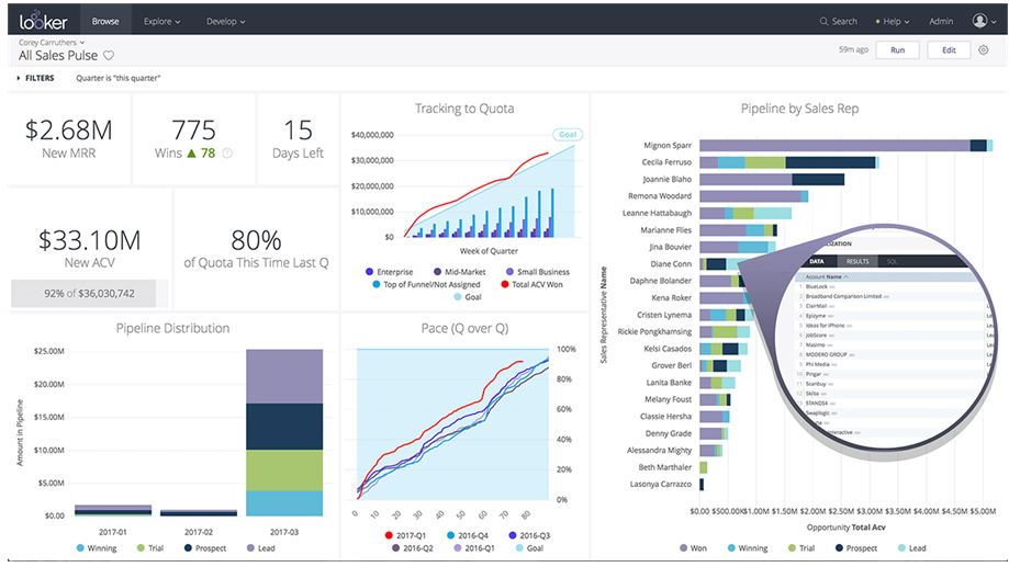
Looker Business Intelligence is a comprehensive data analytics tool with real-time data analysis for real decisions. Lookers provide users full control to select different types of visualization tools, and they can create a custom visualization panel on the dashboards to control more on the decision-making. Some common examples of visualizations in the library are charts, chord diagrams, web charts, word clouds, heatmaps, etc.
Looker also provides features of analytics programming method blocks where users can use SQL queries, patterns, and data models. Even blocks of the Looker visualization tools are built-in, but still, they provide custom methods to customize the dashboard blocks according to the user requirements. Looker also provides data transfer features from one program software to another for better data control.
Lookers also provide Big data integration for huge data analysis. Looker is not a free version.
5. Tableau
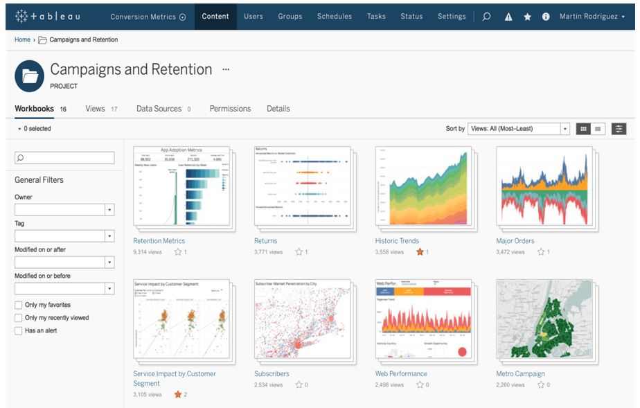
Tableau is the best visualization of data tool in the market. It provides the best visualization front-end facility that gives visibility to all kinds of data that would otherwise remain as separate, useless data points. It provides a more interactive way to visualize data using a visual query language (VizQL). The best thing about Tableau is that it can create a data visualization of both structured and unstructured data. Other features of Tableau include storyboarding and the Spatial File Connectors, which extract geospatial data.
Tableau server provides secure access to data sources and analysis of business information in more detail. They also have features to compare your organization’s performance to competitors and industry standards, which we call Benchmarking. It also has the features of the future predicts possibilities so businesses and the industry can make the proper decisions to grow their company.
Tableau can also fetch data from different databases like SQL for data analysis. This feature makes Tableau more extensive because using database technology is its ability to use cross-database technology.
This allows collecting data from different sources and analyses at once all data together instead of coming data from a single database.
Tableau has the features to send data reports outside the world from the software in PDFs, spreadsheet files, images, crosstabs, and more.
6. Klipfolio
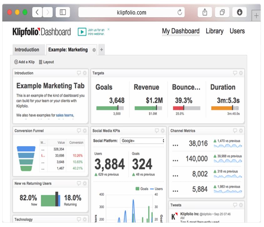
This tool directly interacts with your data for instant decision-making and to determine how your business performs. It compares this month’s data to last month’s or the same period last year within a single click.
This tool adds more features, like drop and drag options for data visualizations from the palette, to start assembling your custom dashboard. Like others, tools also have visualizations like charts, bullet charts, and scatter plots. Or we can also use our dashboard result on the web using inject custom HTML into your dashboard. This Klipfolio is not fully open source.
Conclusion
Several data visualization tools are available in the market, and only some are fully open-source; most provide free licenses but not full features. As shown above, we must review the license or monthly plan to get all those features. But if the organization is small and only wants analytics, we can choose free open-source. After that, we can use Python or R studio for further analysis because startup companies or individual business people cannot pay per month as the price is in dollars. So better if we use Python or R Studio for further results. It will take some time, but we do not need to pay extra for analytics results.
Recommended Articles
This is a guide to Kibana Alternatives. Here we discuss the introduction and the best 6 alternatives of Kibana with detailed explanations. You may also have a look at the following articles to learn more –
