Updated February 28, 2023
Introduction to Kibana Visualization
Visualize helps us to visualize the elasticsearch indices data in the proper format to understand data and also that we can use it in the dashboard for analysis purposes. Kibana visualizes the data on behalf of the elasticsearch queries. We can use different aggregation methods to extract and process the data and visualize that information in different charts and pie, etc.
Kibana Visualization Data
In the Visualize application, we can shape our data in different formats using a variety of visualization tools like charts, tables, and maps, and more. In this blog, we are going to explore visualization tools which are given below:
- Bar chart
- Pie chart
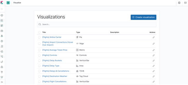
There are a lot of options available for the visualization in the kibana like Map, Markdown widget, etc. But we focus on these two which are commonly used. If we understand these two tools, others will be similar kind. To open the visualize tools, first, we have to click on the visualize tool on the left-hand side visualize an image and it will be open a new window as given below:
1. Pie Chart
To use the pie chart option for visualization below are the process:
- Click on the visualization graph on the left-hand side of the kibana and it will display a window like the above image.
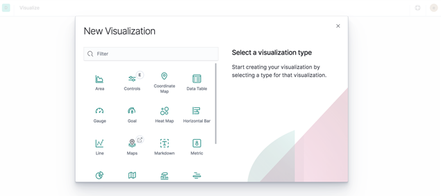
- Then click on the create visualization tab on the right-hand side and we will see like below new window.
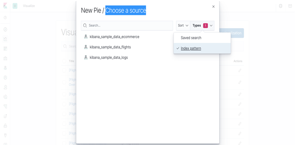
- Now click on the pie option and it will open a new window like below shown:
- Now from the above window of choosing a source, select index pattern from the drop-down list of types.
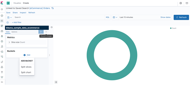
By default, the pie will show data in a single slice because the default search matched all the documents. If we want to filter which slice has to show in the pie, we can use elasticsearch bucket aggregation. This aggregation method will display in results only those documents which match with the queries. Even we also have to show buckets in different range and for that, we use the bucket pane filter which details are given below:
So if we want to show the data in the pie of a particular field, then we have to do the following steps:
- First, choose any dataset from the source and index pattern.
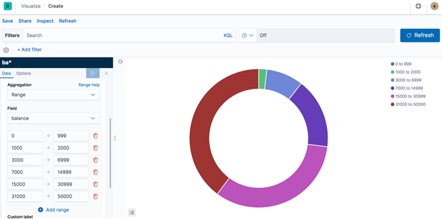
- Then click on the Bucket pane and choose Add > Split slices as shown in the image.
- Then click on the Aggregation and choose range. We can add as many ranges as we want.
- In the field drop-down list choose your attribute field name.
- At the last click Apply Changes and we will see like below result:
2. Bar Chart
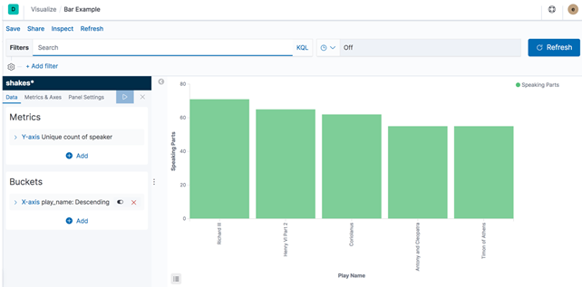
Bar chart steps are the same as above explain in the pie chart. When we choose a vertical bar chart from the creative visualization, then bucket pane some features will be changed as shown in the below image.
In the above image, left bucket pane there we have to choose the x-axis and y-axis. When we choose an option, it will show the next option automatically and at last same we have to click on the Apply changes and we will get the above image.
Inspect Visualization
Kibana visualization also allows us to inspect our data through the inspect option. We can get inspect option in the bucket pane window at the top of the screen (Save Share Inspect Refresh).
1. Click on the inspect option.
2. To download data in CSV, click on the download and then it will show two options:
- Formatted CSV: This format downloads the data in table format.
- Raw CSV: This downloads the data as provided in the dataset.
We can also see requests for collecting data from the options Requests which is available in the view dropdown.
Save Visualizations
If we want to see visualization results in the dashboard, then must we have to save them.
- In the kibana top, there is a Save option. Click on the Save option.
- After that, it will show to write the title of the visualization and Description which is optional. And at last click on the Save the detail to visualize in the dashboard.
Read-Only Access
Some times we don’t have permission to save visualizations and we can check it from the below displayed and then Save option will not be available.
Share Visualization
- When you finished your all visualization of the data, then we can share it outside with the help of the Share menu.
- We can either create a direct link of visualization or either generate a PDF and PNG report.
Kibana Architecture with ELK
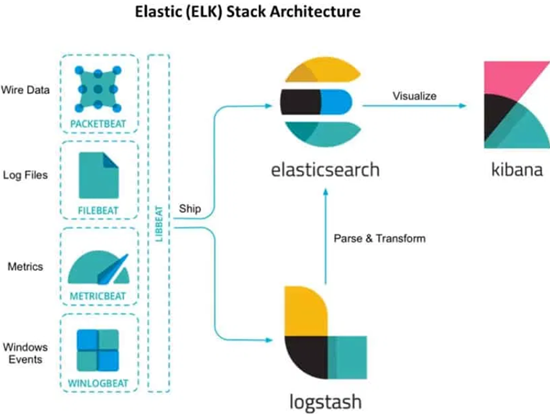
Kibana comes along with the ELK stack and it’s most of the architecture is available with them as given below:
In the above architecture, we can see that data from the left sides ships to either direct to elasticsearch or through logstash to elasticsearch and at last data from the elasticsearch indices to kibana where we have to visualize the data coming from other sources to make a decision.
Conclusion
A Kibana visualization tool is a combination of searches and maps for real-time. Kibana dashboards provide complete details of your data in-depth, which enables you to drill down into details. Kibana now also available on Amazon premises EC2 or Amazon Elasticsearch Service. Also not only Kibana, we can use other open-source tools for proper data visualization but Kibana is a part of ELK stack, so it’s easy to ingest data from Elasticsearch indices to Kibana.
Recommended Articles
This is a guide to Kibana Visualization. Here we discuss two visualization tools along with the architecture. You can also go through our other related articles to learn more –
