Updated August 24, 2023
Map Chart in Excel (Table of Contents)
Introduction to Map Chart in Excel
It is very often seen that you have data associated with geographical regions, and you want a nice chart to show up all the values for those geographical locations. You may have sales for different geolocations or product details. Also, we might not always have tools like ArcGIS or QGIS to make good graphical maps. Moreover, it also takes a lot of time to generate maps through these tools. Now, we can use Excel maps to generate fancy maps and map charts for such types of data, and that too within a jiffy when your data is ready. Use these map charts whenever you have data in sort of geographical regions such as countries/continents, cities, states, postal codes, counties, etc.
This article will use the Excel maps chart option to create map charts under Excel in minutes.
How to Create Map Chart in Excel?
Map Chart in Excel is very simple and easy. Let’s understand how to Create the Map Chart in Excel with a few practical steps.
Steps for Creating Map Chart in Excel
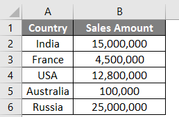
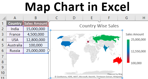
Let’s take a simple example of a map chart just to get an overview of how this works in Excel. Suppose we have data as shown below, which contains our sales values for different countries.
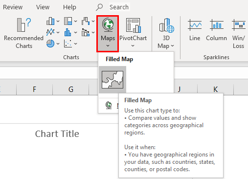
Step 1: Click anywhere on the table and go to the ribbon placed on the upper pane. Select Inset, and you can see the Maps option in the chart options.
Step 2: Click on the Maps and select Filled Map. You will see a blank graph coming up. See the screenshots below.
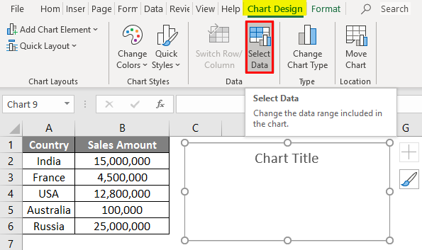
Step 3: On the Design tab, click on the Select Data option. It will allow you to select the data for Map Chart.
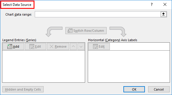
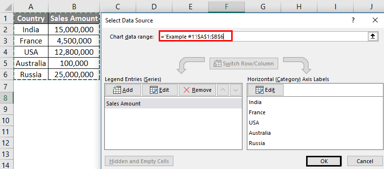
Step 4: A new pop-up window named “Select Data Source“. Here, you will add your data.
Step 5: Under Chart Data Range, select the data from cell A1 to cell B6. Excel is smart enough to populate the sales values into series and Country into a category. Click the OK button once you are done editing the data.
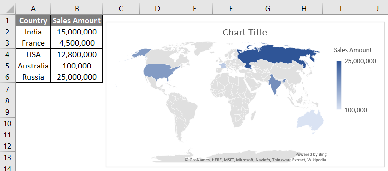
Step 6: You will see a map graph, as shown in the image below. It highlights that area where your sales have happened (on the world map, you can say).
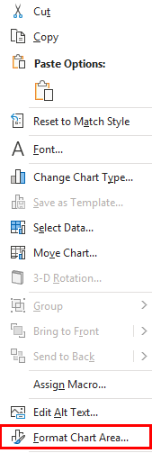
Step 7: Now, Right-Click on the chart area to see a list of operations available for this chart. Out of all those operations, select the Format Chart Area option, which is situated at the bottom-most part of the operations list. Click on the Format Chart Area option. It allows you to format the chart area.
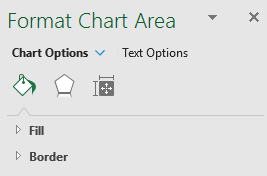
Step 8: This will open up a new pane called Format Chart Area. Here you can customize the Fill color for this chart, resize the area of this chart, or add labels to the chart and the axis. See the supportive screenshot below:
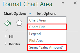
Step 9: Click on the navigation down arrow available beside the Chart Options. It will open up several chart options. Click on Chart Title and add the “Country-Wise Sales” title for this chart. Also, select the last option available, Series “Sales Amount”. This allows you to make customized changes to series data (numeric values in this case).
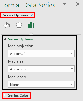
Step 10: Once you click on Series “Sales Amount”, it will open up Series Options, using which you can customize your data. Like under Series Options, you can change the Projection of this map; you can set the Area for this map and add Labels to the map (remember each series value has a country name labeled). However, the most interesting and important feature is, we can change the color of series values.
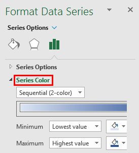
Step 11: Under Series Options, click on the Series Color option. It will open up a list of default colors used while creating this map chart. It ideally chooses the following color combination by default.
Minimum and Maximum in these formatting options mean that the minimum series value will have a light color, and the Maximum series value will have a dark color to give a better understanding through the graph itself (No need to go to the values table).
We are going to customize this sequential two-color setting.
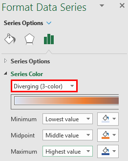
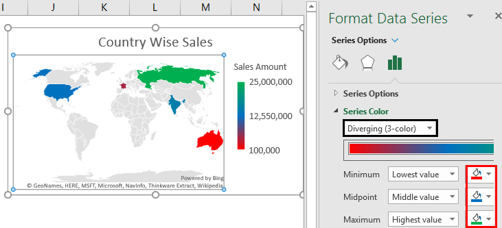
Step 12: Click the dropdown and select the Diverging (3-Color) option under Series Color. It allows you to differentiate your series into three patterns: Minimum, Midpoint, and Maximum (based on the series’s values and colors).
Step 13: Choose the color shown in the screenshot for each Minimum, Midpoint, and Maximum series value and see the change in the graph.
This Diverging (3-color) system works more decently than the Sequential (2-color) system, and you can easily identify the areas with the lowest, medium, and highest sales happen.
This is it from this article on map charts. Here we tried to cover how to create a map chart in Excel 2016 and have seen some customization options available with map charts. Let’s wrap things up with some points to be remembered.
Things to Remember About Map Charts in Excel
- The Map Charts are generated online based on the geocoding and region information. Therefore, it becomes more important to provide as smallest possible region information as possible to get adequate data. Having said that, every time you generate a map chart, the system suggests how many regions (in terms of percentage can be covered). Adding small region details such as city, county, and state allows the map to have a better projection of the region, and your chart looks more accurate.
- It is mandatory to have a licensed version of Microsoft Excel because this feature currently is not associated with pirated/mirror versions. If you have a mirror version, you might not be able to see the option to add a map chart under Insert.
- In this article, the Microsoft Office 365 version of Excel is used. If you are using Excel 2013, there are some different Add-Ins you have to enable to work with Map Charts (It is beyond the scope of this article).
Recommended Articles
This is a guide to Map Chart in Excel. Here we discuss the Steps to Create a Map Chart in Excel, practical examples, and a downloadable Excel template. You can also go through our other suggested articles –
