Updated March 16, 2023
Definition of Minitab boxplot
The following article provides an outline for the Minitab boxplot. A box plot, often known as a box and whisker plot, visualizes the dataset’s distribution and center. It’s a standardized method of presenting facts. A data column is considered numerical by Minitab if all of the entries in its cells are integers. The complete data column is categorical if one or more columns are non-numerical (text, symbols), and the field label is changed from C2 to C2-T. For example, dates are interpreted as numeric entries with blanks, and the column title is modified from C2 to C2-D. It might be time-consuming to reverse such data type change; therefore, be cautious while entering the data. Alter data types by navigating to data> Change Data Type.
What is a boxplot?
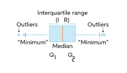
A boxplot is a graphic that displays a five-number report and helps to show descriptive data. It allows us to investigate the distributional properties of a set of scores and their level. The important focus of the chart (the “box”) depicts the interquartile range, which is the middle section of the data. The first quartile (the 25% mark) and the third quartile are located at the container’s ends (the 75 percent mark). The minimum (the least number in the set) is at the left of the chart, while the max is at the extreme right. Lastly, the mean is represented by a vertical bar in the middle of the box. Any data value below the lower bound is referred to as a lower-side outlier, while any data value over the upper bound is referred to as a higher-side outlier.
How to Create Minitab boxplot?
Box plots are often used to display overall response characteristics for a group. They’re an excellent approach to seeing the range and other features of a vast firm’s responses. For data processing, Minitab will be used. On the right side of the vertebral column, numerical data is associated. Minitab will treat figures separated by commas as text rather than numbers. The data for the sample should be chosen at random. For example, random samples are used in statistics to make generalizations or assumptions about a population. The answers may not reflect the population if the data was not obtained randomly.
Steps:
Collect the information. Sort the information from smallest to largest. Calculate the information set’s median. The first and third quartiles should be determined. Make a storyline arc for the story. Write the first, second, and third quartiles on the plot point. Draw horizontal lines connecting the quartiles to form a box. Make a note of any outliers.
Creating a data set:
Adding data consists of two moves: column headings and data entry. Unfortunately, Minitab has a limited ability to modify data types.
The box inside a boxplot moves out from the lower quartile (Q 1) to the top quartile (Q 2). (Q2). The median is represented by the lines inside the box (Q). The lower whisker travels from the bottom quartile (Q1) to the lowest quartile (Q2), which is not an outlier, and the higher whisker travels from the highest quartile (Q2) to the highest quartile (Q3), which is not an outlier. On the boxplot, potential outliers are denoted by a *. Measured variables that are 1.5/QR just below the lower quartile or 1.5/QR above the upper quartile, where IR stands for interquartile range, are considered outliers.
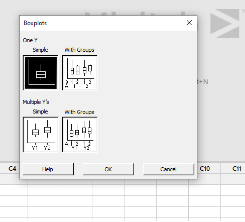
In the Minitab spreadsheet, type the data into the columns. Next, right-click on the graph and select the right arrow boxplot. Boxplots will open the window automatically. Then choose one of the choices below:
- If the data only has one factor, choose Only Yrightarrow (for example, the fruit color in a market).
- Rightarrow a large number of Y’s. If there are several parameters, it’s simple (for example, the fruit’s color and size in a market).
- If any type variable classifies only a single variable, select Only Y right arrow with Groups (for instance, if a fruit groups colour).
- If categorical variables group several variables, use Many Y’s right arrows with Group (for example, the colour of fruit in a market organized by nation and fruits category). Then press the OK button.
Note:
If our data collection contains outliers, the box and whiskers graphic may not reflect the minimum or maximum value. Instead, one and a half times the interquartile range (1.5*IR) is represented at the ends of the whiskers.
Minitab boxplot Example
Different examples are mentioned below:
Example #1
Step-1:
Consider the following sample of 15 guys’ ages in centimeters in a class:
50,52,54,56,58,60,62,64,66,68,70,72,74,76,80
In Minitab, enter the following data in the first column:
Step-2:
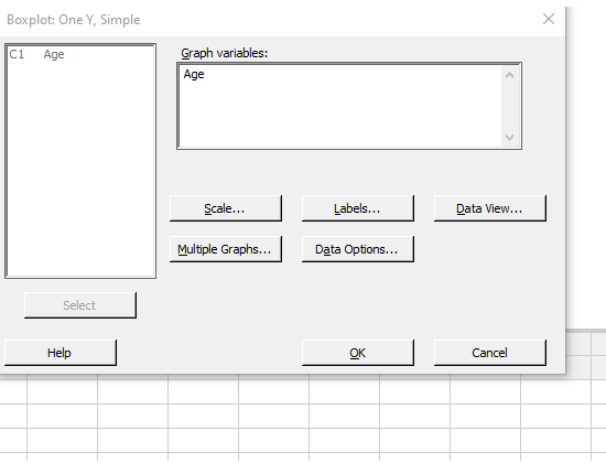
Right-click on the graph and select the right arrow boxplot.
A pop-up window named boxplots will appear, as illustrated below. Just Select Y -> right arrow Simple (because there is only a single variable in our case).
Step-3:
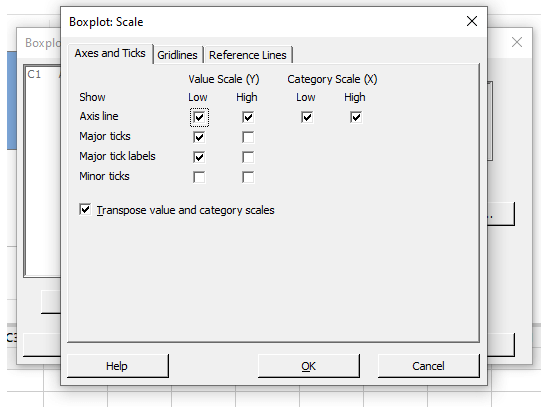
Select the Scale box for a horizontal boxplot, mark “Transpose value and category scales” as seen below, then hit OK.
Step-4:
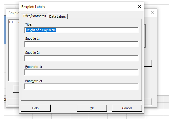
Select the Labels tab and type in the graph’s following modifications as shown below, then click OK.
Step-5:
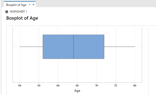
Since both whiskers are around the same length and the middle line is placed in the center of the box, the age range is nearly symmetrical without any outliers.
Example #2
Consider Statistical Data for an example to calculate the values:
| Team1 | 20 | 30 | 35 | 40 | 45 | 50 |
| 52 | 54 | 55 | 60 | 62 | 70 | |
| Team2 | 21 | 31 | 34 | 42 | 46 | 56 |
| 61 | 80 | 82 | 83 | 84 | 85 |
Step-1:
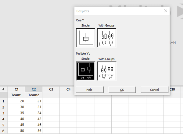
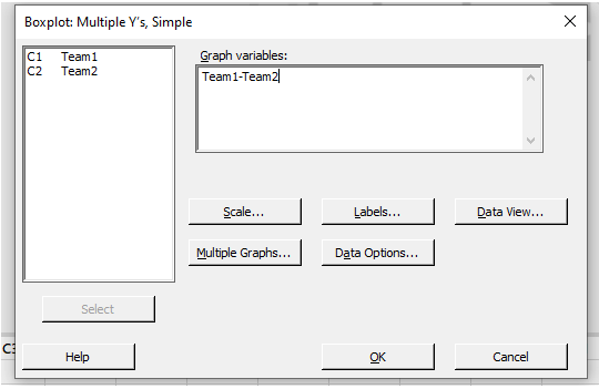
Open Minitab and enter the data for Team 1 in C1 and 2 in C2. Below is a snippet of the data that was entered into Minitab. First, choose “Boxplot…” from the “Graph” menu. Next, select “Simple” under “Multiple Y’s” and click the “OK” button.
Step-2:
Pick both C1 and C2 from the left-hand box in the box below “Graph variables:”
Step-3:
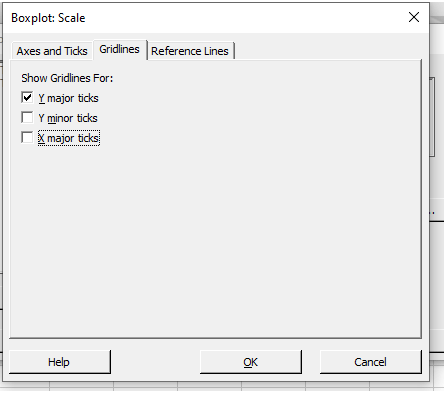
Select “Scale” from the drop-down menu. Click in the box near the bottom of the window next to “Transpose value and category scales.” Next, check the box next to “Ymajor ticks” and click “OK” on the “Gridlines” tab.
Step-4:
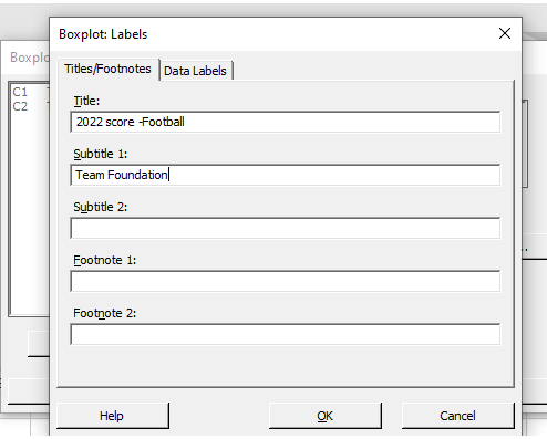
Select “Labels” from the drop-down menu. On “Title:” write a description of the data, such as “2022 score-Football.” Start giving: Team Foundation” is included under “Subtitle 1:” Within this window, click “OK,” and even in the window below, click “OK.”
Step-5:
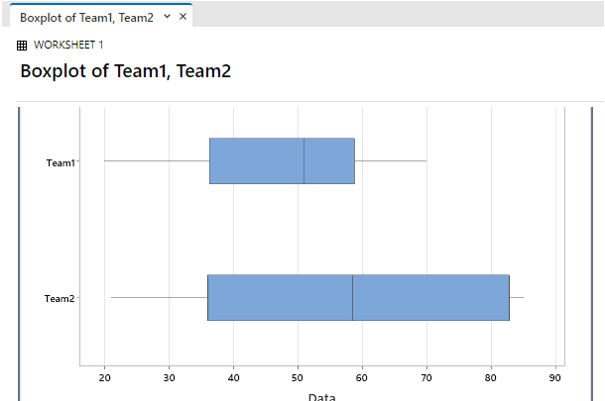
The final result is shown here:
Conclusion
Therefore we have provided the working of Boxplot in Minitab with different scenarios. The boxplot interpretation is shown in the screenshots.
Recommended Article
This is a guide to the Minitab boxplot. Here we discuss the definition, What a boxplot is, How to Create a Minitab boxplot, and examples along with code implementation and output. You may also have a look at the following articles to learn more –
