Updated April 1, 2023

Introduction to Pandas autocorrelation_plot
Pandas autocorrelation_plot chart should be possible utilizing the autocorrelation_plot() technique for the plotting module. This capacity produces the Autocorrelation plot for time arrangement. Autocorrelation plots are a normally utilized apparatus for checking arbitrariness in an informational collection.
This arbitrariness is determined by processing autocorrelation for information esteems at different delays. It shows the properties of a kind of information known as a period arrangement. These plots are accessible in most universally useful measurable programming programs. It tends to be plotted utilizing the pandas.plotting.autocorrelation_plot().
Syntax and Parameters
Pandas.plotting.autocorrelation_plot(ax=None, series, **kwargs)Where,
Series represents the time series data that has to be plotted.
Ax represents the boundary which is a matplotlib axis object. Its default esteem is None.
This function returns the object class back to the program.
How does the autocorrelation plot work in Pandas?
Now we see the various examples of how the autocorrelation plot works in Pandas.
Example #1
Code:
import numpy as np
import pandas as pd
import matplotlib.pyplot as plt
space = np.linspace(-4 * np.pi, 4 * np.pi, num=90)
s = pd.Series(0.6 * np.random.rand(90) + 0.2 * np.sin(space))
x = pd.plotting.autocorrelation_plot(s)
plt.show()
x.plot()
Output:
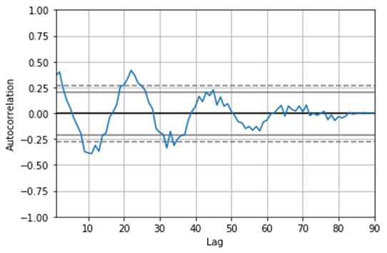
In the above program, we first import all the necessary libraries that are required to execute the code. Then, we create the time series and assign values to it. After creating the time series, we use the pandas autocorrelation_plot() function to plot the curve, and thus the program is executed, and the output is as shown in the above snapshot.
Example #2
Code:
import numpy as np
import pandas as pd
import matplotlib.pyplot as plt
info = np.array([11.0, 22.0, 9., 19.0,
9.0, 20.0, 17.0,20.0,
5.0, 9.0, 19.0, 15.0,
6.0, 4.0, 6])
x = pd.plotting.autocorrelation_plot(info)
plt.show()
x.plot()
Output:
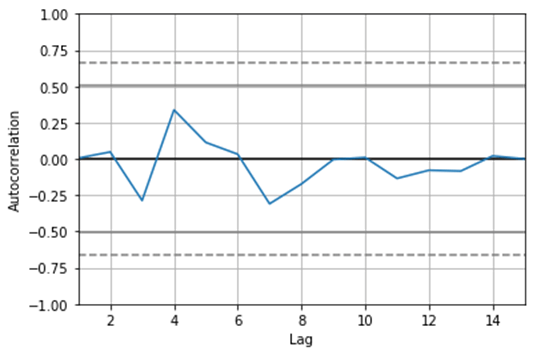
In the above program, similar to the previous one, we import all the necessary libraries first, which are essential in the execution of the program. Now we create an array of time series and assign the values to it. After creating the time series, we use the autocorrelation_plot in pandas to plot the curve, and finally, the program is executed, and the plotted graph is as shown in the above snapshot.
A fascinating thing to note here is that frequency = None. This means it isn’t known whether the information is gathered constantly, by day, my moment, and so on. Notwithstanding, just by eyeballing the files, we can see that it would seem that the information was gathered constantly. You will go over datasets where the Date and Time were recorded as discrete segments at the hour of information assortment. A straightforward yet slick stunt to set them as information file may be:
- Connect the two sections, however, with a space between them.
- Convert this connected section to a Timestamp utilizing to_datetime().
- Set this connected section as the file utilizing set_index().
Keep in mind that supplanting missing information with medians or means is not such a smart thought regarding time-arrangement information. For example, better choices exist, for example, forward filling, in the reverse filling, direct addition, mean of closest neighbors. At last, taking a gander at our informational collection subsequent to fixing the recurrence type and crediting missing qualities, we find that our dataset is equivalent to previously (no new lines were included. You may be asking why there are still some invalid qualities, particularly toward the start of the dataset. The explanation is that these have been forward filled, but since the incentive in the absolute first line was invalid, we cannot perceive any distinction.
Resampling utilizing pandas autocorrelation plot just alludes to a conglomeration of information over a specific time span. Its exhibition is like the gathering by work in SQL; for example, information is the initial part into time receptacles, and some calculation is performed on each container. For example, given our day by day information, we can resample (or container) it continuously or year and create some pertinent insights, for example, least, greatest, or mean qualities. This is very like the resampling cycle that we simply learned. The thing that matters is that the canisters over which some accumulating capacities are performed) are covering.
Conclusion – Pandas autocorrelation_plot
Hence, we would like to conclude by stating that in all these datasets, interestingly, all examples (or columns in your dataset), as a rule, are free of one another. What sets these datasets separated from time-arrangement information is that each line speaks to a point in time in the last mentioned, so normally, there is some inalienable requesting the information. When working with time arrangement and Pandas autocorrelation_plot, it turns out to be a lot simpler in the event that we have the Datecolumn spoken to as a Timestamp. The timestamp is the primary panda’s information structure for working with dates and times. The panda’s work to_datetime() can assist us with changing over a string to a legitimate date/time design.
Recommended Articles
We hope that this EDUCBA information on “Pandas autocorrelation_plot” was beneficial to you. You can view EDUCBA’s recommended articles for more information.


