Updated April 18, 2023

Introduction to Pandas bar plot
Pandas bar plot plots the chart vertically in the type of rectangular bars. Python is an incredible language for doing information examination, principally as a result of the phenomenal biological system of information-driven python bundles. Pandas is one of those bundles and makes bringing in and examining information a lot simpler. There are alternate way works for the caring boundary to plot(). Direct capacities for .bar() exist on the DataFrame.plot object that goes about as coverings around the plotting capacities.
Syntax and parameters
pandas.plot.bar(y=None, x=None, keywords)Where,
- X means it allows the plotting of one section versus another. If not determined, the list of the DataFrame is utilized. It can be mark or position, discretionary.
- Y means it allows the plotting of one section versus another. If not determined, all mathematical sections are utilized. It can be mark or position, discretionary.
- Keywords are all Extra watchword contentions.
- It returns matplotlib.axes.Axes or np.ndarray.
How does the bar plot work in pandas?
Now we see various examples of how the bar plot works in pandas dataframe.
Example #1
Code:
import pandas as pd
import matplotlib.pyplot
import numpy as np
df = pd.DataFrame(np.random.rand(8, 3), columns =['s', 'p', 'a'])
df.plot.bar()
print(df.plot.bar())
Output:
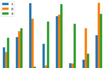
In the above program, we first import the pandas and numpy libraries and then use the matpolib library to invoke the pyplot to plot the bar graphs. Then we define the data frame, assign the values to plot the x and z axes and assign the coordinates’ columns. Now, we use the bar plot function to plot the graph of the given coordinates. The program is implemented, and the output is as shown in the above snapshot.
Example #2
Code:
import pandas as pd
import matplotlib.pyplot
import numpy as np
df = pd.DataFrame(np.random.rand(8, 10),
columns =['s', 'p', 'a', 'n', 'd', 'a', 'n', 'a', 'r', 'a'])
df.plot.bar()
print(df.plot.bar())
Output:
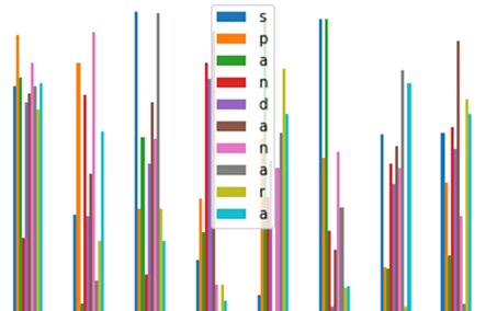
In the above program, we plot the bar graph for various coordinates. First, as in the previous program, we import the matpolib, pandas, and numpy libraries. Now we create the dataframe and assign the coordinates and also assign the columns for these coordinates. Now, we use the bar plot function to plot these values, and the program is implemented, and the output is as shown in the above snapshot.
The benefit of bar plots (or “bar diagrams”, “segment outlines”) over other graph types is that the natural eye has advanced a refined capacity to analyze the length of articles instead of point or region. Fortunately for Python clients, alternatives for representation libraries are copious, and Pandas itself has tight coordination with the Matplotlib perception library, permitting figures to be made straightforwardly from DataFrame and Series information objects. This blog entry centers around the utilization of the DataFrame.plot capacities from the Pandas perception API.
The easiest bar graph you can make is where you definitely know the numbers you need to show on the outline, without any fundamental. Pandas handily accomplished this plot by making a Pandas “Arrangement” and plotting the qualities, utilizing the kind=”bar” contention to the plotting order. For instance, say you needed to plot the number of mince pies eaten at Christmas by every individual from your family on a bar diagram. (I have no clue about for what reason you’d need to do that!) Imagine you have two guardians (ate 10 every), one sibling (a genuine mince pie devil, ate 42), one sister (sneered 17), and yourself (additionally with an inclination for the mince pie happy flavors, ate 37). To make this diagram, place the ages inside a Python list, transform the rundown into a Pandas Series or DataFrame, and afterwards plot the outcome utilizing the Series.plot order.
Of course, the file of the DataFrame or Series is put on the x-hub, and the qualities in the chose segment are delivered as bars. Each panda bar graph works along these lines; extra sections become another arrangement of bars on the outline. Note that the plot order here is really plotting each section in the dataframe; there incidentally turns out to be just one. No outline is finished without a named x and y pivot and possibly a title as well as a subtitle. With the Pandas plot(), the naming of the pivot is accomplished utilizing the Matplotlib punctuation on the “plt” object imported from pyplot.
Conclusion
Finally, we conclude by stating that the capacity to deliver a bar plot rapidly and effectively from information in Pandas DataFrames is a vital ability for any information researcher working in Python. Nothing beats the bar plot for quick information investigation and examination of variable qualities between various gatherings or building a story around how gatherings of information are made. Regularly, we will, in general, wind up with a plenitude of bar diagrams in exploratory information examination fill in just as in dashboard perceptions.
Recommended Articles
We hope that this EDUCBA information on “Pandas bar plot” was beneficial to you. You can view EDUCBA’s recommended articles for more information.


