Updated April 13, 2023

Introduction to Pandas DataFrame.plot()
The following article provides an outline for Pandas DataFrame.plot(). On top of extensive data processing the need for data reporting is also among the major factors that drive the data world. For achieving data reporting process from pandas perspective the plot() method in pandas library is used. The plot() method is used for generating graphical representations of the data for easy understanding and optimized processing. This acts as built-in capability of pandas in data reporting arena.
Syntax:
DataFrame.plot(x=None, y=None, kind='line', ax=None, subplots=False, sharex=None, sharey=False, layout=None, figsize=None, use_index=True, title=None, grid=None, legend=True, style=None, logx=False, logy=False, loglog=False, xticks=None, yticks=None, xlim=None, ylim=None, rot=None, fontsize=None, colormap=None, table=False, yerr=None, xerr=None, secondary_y=False, sort_columns=False, **kwds)Arguments:
| Parameter | Description |
| x | The columns argument mentions the set of columns to be considered as the x axis in the plotting process. The default value of the argument is None. |
| y | The columns argument mentions the set of columns to be considered as the y axis in the plotting process. The default value of the argument is None. |
| kind | The kind argument is used to mention the type of graph to be used as a process of this plotting process.
|
| ax | The Index argument mentions the axes object, the default value of this argument is none. |
| subplots | This is another boolean argument which is used to apply separate subplots for each and every column in place. |
| sharex | This is another boolean argument when the subplots=True, some among the x axis labels are set as invisible and x axis is shared, defaulting to True if ax is None otherwise False when an ax is passed in. |
| sharey | This is another boolean argument when the subplots=True, some among the y axis labels are set as invisible and y axis is shared, defaulting to True if ay is None otherwise False when an ay is passed in. |
| layout | This is a tuple type based on which the subplots are laid upon. |
| figsize | This mentions the size value in inches. |
| use_index | This uses the index as ticks for the x axis. |
| title | This is used for setting the title value for the graph. The value mentioned in the title will be in the top of the graph. |
| grid | A boolean argument with the default value as None, this is used to maintain the axis grid lines. |
| legend | Place the legend on the subplots of the axis. |
| style | The style argument holds values in list or dict. This argument is used to represent the style of line for each column. |
| logx | X axis level log scaling , this is a boolean argument and the default value is false. |
| logy | Y axis level log scaling, this is a boolean argument and the default value is false. |
| loglog | The loglog is used to maintain the log scaling in both x axis and y axis levels. This is a boolean argument and the default value is false. |
| xticks | The Xticks are associated with a value using this xticks argument. This argument takes input in the form of sequence. |
| yticks | The yticks are associated with a value using this yticks argument. This argument takes input in the form of sequence. |
| xlim | 2-tuple/list. |
| ylim | 2-tuple/list. |
| rot | The default value is None and this argument holds value in integer format. This mentions the rotation value for the ticks. |
| fontsize | The xticks and yticks are associated with a fontsize using this argument. The default value is None and this argument holds value in integer format. |
| colormap | The colormap is used for selecting colors from. This argument is ofstring type. |
| colorbar | This is of boolean type, when set to true it is helpfull in plotting the colorbar. |
| position | The bar and plot layout specific alignments. |
| table | When set to true it maps a table using the data associated to the dataframe. So the matplotlib’s default layout will be used to meet this data. If a Series or DataFrame is passed, use passed data to draw a table. |
| yerr | The error bars will be displayed for more detail, corresponds to y axis. |
| xerr | The error bars will be displayed for more detail. corresponds to x axis. |
| stacked | Bar plots. |
| sort_columns | The plot ordering is determined based on the column names used. |
| secondary_y | Determines which column to plot. |
| mark_right | On using the secondary_y axis automatically markings are placed on the column labels. |
| *kwds | keywords. |
Examples of Pandas DataFrame.plot()
Given below are the examples mentioned:
Example #1
Code:
import pandas as pd
import matplotlib.pyplot as plt
Core_Dataframe = pd.DataFrame( {
'name': ['Alan Xavier', 'Annabella', 'Janawong', 'Yistien', 'Robin sheperd', 'Amalapaul', 'Nori'],
'city': ['california', 'Toronto', 'Osaka', 'Shanghai',
'Manchester', 'california', 'Osaka'],
'age': [51, 38, 23, 63, 18, 51, 63],
'py-score': [82.0, 73.0, 81.0, 30.0, 48.0, 61.0, 84.0] })
print("   THE CORE DATAFRAME ")
print(Core_Dataframe)
print("")
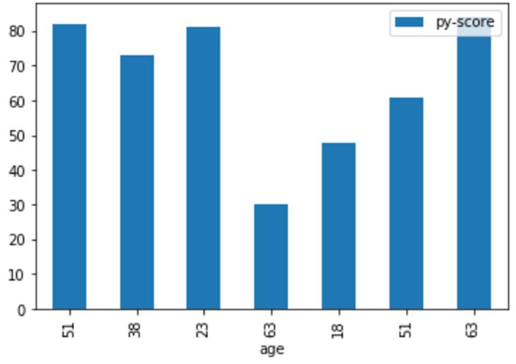
Core_Dataframe.plot(x ='age', y='py-score', kind = 'bar')
plt.show()
Output:
Explanation:
- In this example the core dataframe is first formulated. pd.dataframe() is used for formulating the dataframe.
- Every row of the dataframe are inserted along with their column names. Once the dataframe is completely formulated it is printed on to the console.
- We can notice at this instance the dataframe holds random people information and the py_score value of those people. The key columns used in this dataframe are name, age, city and py-score value.The generated plot bar graph is printed onto the console.
Example #2
Code:
import pandas as pd
import matplotlib.pyplot as plt
Core_Dataframe = pd.DataFrame({'A' :  [ 3.67, 6.66, 14.5, 13.4, 21.44, 10.344],
'B' :  [ 2.345, 745.5, 12.4, 13.4, 22.35, 10.344  ]})
print("   THE CORE DATAFRAME ")
print(Core_Dataframe)
print("")
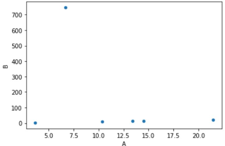
Core_Dataframe.plot(x ='A', y='B', kind = 'scatter')
plt.show()
Output:
Explanation:
- In this example the core dataframe is first formulated. pd.dataframe() is used for formulating the dataframe.
- Every row of the dataframe are inserted along with their column names. Once the dataframe is completely formulated it is printed on to the console.
- A typical float dataset is used in this instance. The Plotted graph is printed on to the console.
Conclusion
In this article we can notice from the above drafted examples that how easily graphs can be very sophisticatedly generated with the plot() function.
Recommended Articles
We hope that this EDUCBA information on “Pandas DataFrame.plot()” was beneficial to you. You can view EDUCBA’s recommended articles for more information.


