Updated March 27, 2023
Pie Chart in Power BI
Pie charts in Power BI are mostly used for visualizing the percentage contribution for various categories in order to assess the performance of these categories. The pie charts are handy tools as they allow very quick and effective decision making owing to the insights they provide. Power BI provides an easy and quick approach to build pie charts.
How to Design Pie Chart in Power BI?
To understand the concept of Pie charts in Power BI, we shall go through a demonstration which is based on the Distribution Unit Volume dataset. The dataset contains Volume distributed across various cities in India. City, represented by city codes, is the lowest area in the hierarchy of distribution area. A distribution unit is composed of many cities while the region has various distribution units under it. Important dimensions are the Distribution Unit, Region and Mode, while Distribution Volume is the measure present in the dataset. Dimension Mode represents the mode of distributing the products.
To Design Power BI Pie Chart you need data to work with, so you can download the excel workbook template from the below link which is used for this example.
Let’s go through a step-by-step procedure to create and use pie charts in Power BI. The steps in detail are as follows.
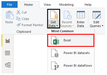
- Step 1: Load the dataset into Power BI. For that click on Get Data Menu under Home Tab. From the drop-down menu of Get Data, select appropriate data source type. In this case, it is Excel, so clicked on Excel as shown in the below screenshot.
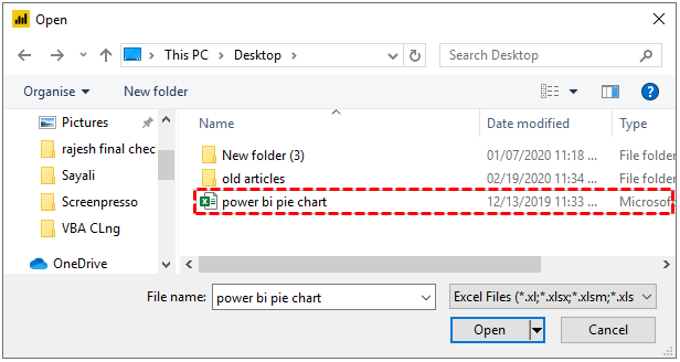
- Step 2: Select the data source file from the location it is stored.
- Step 3: When the file is getting loaded we get a message that shows that a connection is getting established.
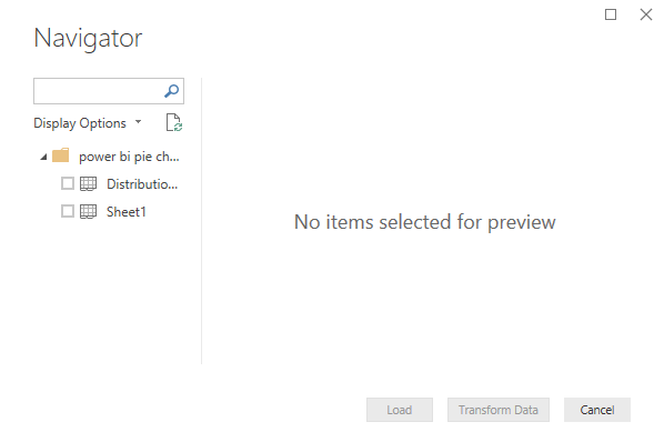
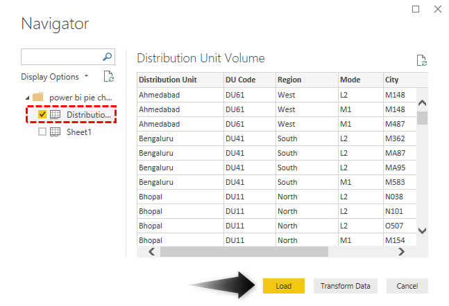
- Step 4: Once the connection gets established, we are navigated to the “Navigator” pane. Click on the appropriate sheet amongst all the available sheets in the workbook. In this case, the data for our analysis is present in the “Distribution Unit Volume” sheet, so, click on it.
- Step 5: When we select a sheet, its content are displayed on the right-hand side as can be seen in the following screenshot. Click on the Load button highlighted in yellow to load the data into Power BI.
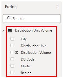
- Step 6: When the data gets successfully loaded into Power BI, the dimensions and measure present in the dataset can be seen in the Fields section as highlighted in the below screenshot.
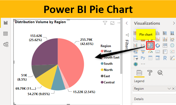
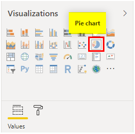
- Step 7: Now to work with pie chart, first click on the pie chart symbol in the Visualizations section. This is as highlighted in the following screenshot.
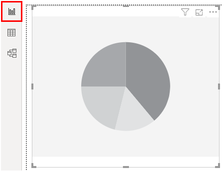
- Step 8: When we click on the pie chart symbol in Visualizations section, we get the pie chart layout. We will have to bring the requisite dimension and measure for the creation of a meaningful pie chart in the layout.
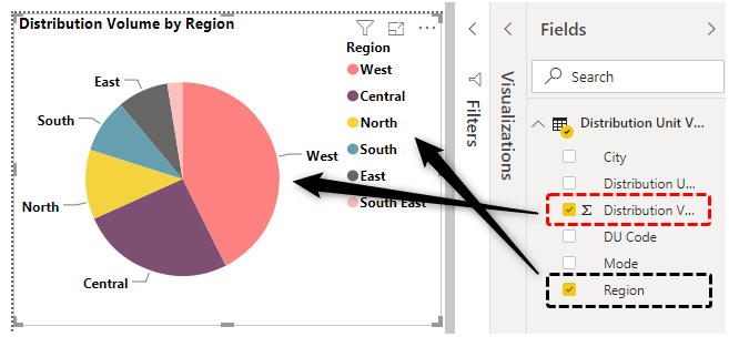
- Step 9: To create a pie chart of Region with Distribution Volume being the measure involved, select Region dimension and Distribution Volume measure as can be seen in Fields section on the right-hand side of the below screenshot. When we select the requisite fields, we get a pie chart as can be seen on the left-hand side in the below screenshot.
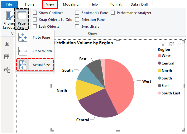
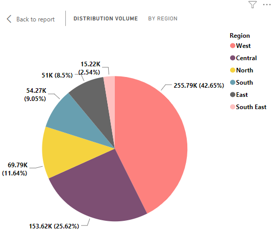
- Step 10: The default size for pie chart and its elements is small. We can zoom the visualization by selectin “Actual Size” option (View -> Page View -> Actual size). The following screenshot shows the pie chart with a fairly good size that we obtained using the approach mentioned. Note, Power BI pie charts are special because as can be seen in the following screenshot, we get both figures viz. percentage contribution of the dimension (Region in this case) as well as the absolute value of the measure. So, Power BI pie charts are quite insightful.
Observe carefully the above pie chart, and we find that the size of sectors goes on decreasing if we move clockwise and vice versa. We can also say, the data is getting sorted in descending order if we move clockwise, and in ascending order if we move anti-clockwise.
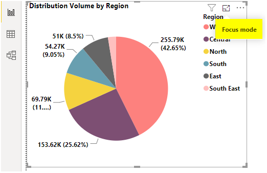
- Step 11: We can increase the size of the default pie chart visualization by clicking on the “Focus mode” option as can be seen in the below screenshot.
- Step 12: In order to understand certain concepts, we will restore to earlier condition. Just press CTRL + Z to go to previous condition of the pie chart.
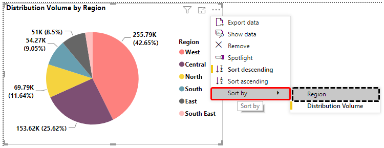
- Step 13: Now, click on “More options” for the pie chart, and we get to see various options. Most of these options are self-explanatory, but they still must be explored by selecting and testing them one-by-one. Now, we will sort the result, for that go to Sort By in the bottom and click on Region, as illustrated in the following screenshot.
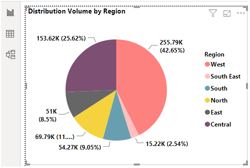
- Step 14: The above procedure sorts the pie chart result in the reverse alphabetical of Region labels as can be seen below.
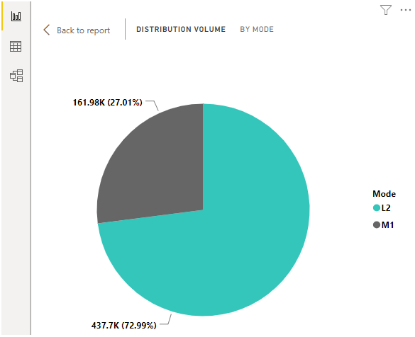
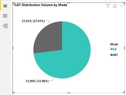
- Step 15: We created another pie chart for Mode dimension as shown below. The pie chart gives us an idea about the percentage share of different modes of distribution. As we can see Mode L2 has the highest share in distribution volume.
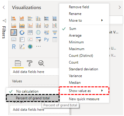
- Step 16: Now we know that the pie chart in Power BI provides absolute as well as percentage contribution figures for a measure. What if we intend to have percentage contribution figures only? For that, in the values section, click on Distribution Volume measure, and in the pop-up menu, in “Show value as”, select “Percent of grand total”.
- Step 17: Now observe the screenshot subsequent to the below one. At both places, we got the same value.
Things to Remember
- In Power BI, we need not perform any extra step in order to obtain percentage contribution values in pie chart, as they are provided by Power BI automatically.
- Other variants of pie chart such as donut chart and gauge chart are not dependent on pie chart in Power Bi, rather they are available as ready-made charts.
Recommended Articles
This is a guide to Power BI Gantt Chart. Here we discuss how to Design Pie Chart in Power BI with an example and downloadable template. You may also look at the following articles to learn more –
