Report in Power BI
Reports are those elements of any BI and analytics tool that renders the very analytics characteristic to the tool. Power BI offers a convenient and effective methodology to build reports which can be used to drive excellent data analysis. The various functionalities provided by Power BI makes it one of the most favorite BI tools. Reports enable the stakeholders to dig deeper into data to reach the insights which help them in decision making.
Creating Analysis Report in Power BI
We will now go through a step-by-step procedure to create a report in Power BI. For this demonstration, we are going to use the “Product Region Sales” dataset. The dataset contains sales and profit percentages for various products given region wise. Product and Region are dimensions, while Sales and “Profit in %” are measures present in the dataset. Let’s proceed.
To create Power BI Reports you need data to work with, so you can download the excel workbook from the below link which is used for this example.
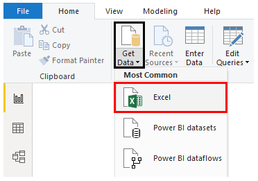
Step 1: Now to create Parameters in Power BI, first we need to upload this data in Power BI. For loading the requisite data, click on Get Data drop-down menu in the Home tab. From the drop-down menu select the requisite data source type. In this case, it is “Excel”, so we clicked on it.
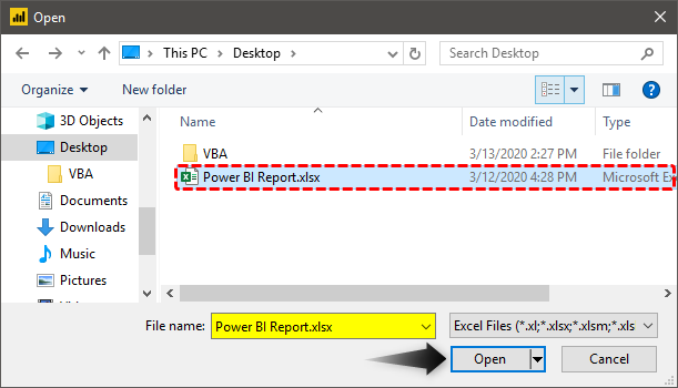
Step 2: Now, select the file containing requisite data as shown below.
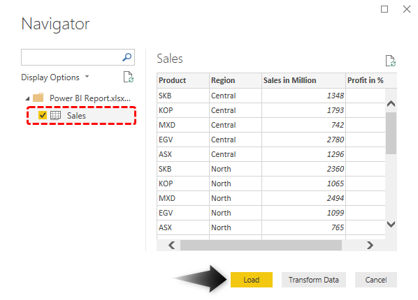
Step 3: Selecting the file, navigates us to the Navigator pane. From the pane, select the requisite sheet. In this case, it is Sales. Finally, click on the Load button to load the data into Power BI.
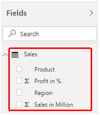
Step 4: When the data gets loaded, the requisite dimensions and measures can be seen in the Fields section as highlighted in the following screenshot.
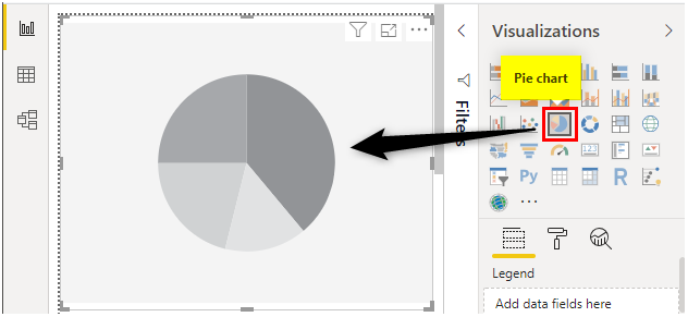
Step 5: To begin with the creation of a report, click on the Pie Chart symbol in the Visualizations section. When we click on the Pie chart symbol, the Pie chart layout gets created as shown by the following screenshot. With Pie chart analysis we intend to understand each region’s contribution to total sales. Power BI offers us insight into contribution in terms of both, total as well as percentage.
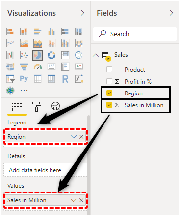
Step 6: Now, in the Fields section, drag Region dimension in legend field and “Sales in Million” into value field measure. This will create a pie chart for the region with insight into sales contribution.
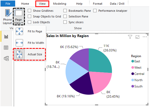
Step 7: The pie chart that gets created can be seen as shown by the following screenshot.
Note, the screenshot is the zoomed view of the visualization which can be obtained by clicking on “Actual View” option (View -> Page View -> Actual Size).
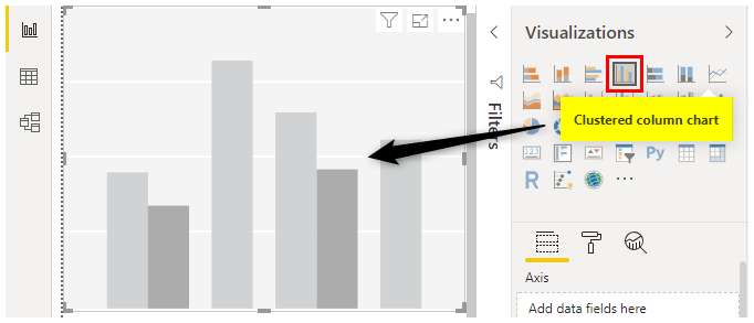
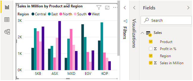
Step 8: Next, we will create a clustered column chart. This chart shall enable us to analyze the performance of various product types by region. In order to bring it into analysis, click on “Clustered column chart” option in Visualizations.
Step 9: In the Fields section, select the first Region dimension, then “Sales in Million” measure and finally, Product dimension, in this order. Selecting the fields in proper order will give us the clustered column chart as shown by the screenshot subsequent to the below one.
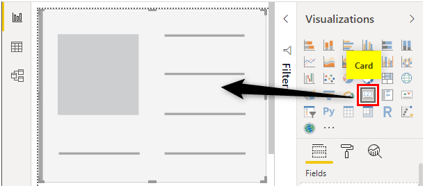
Step 10: Click on “Card” visualization.
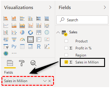
Step 11: Working with card visualization is quite simple. Just click on the measure which we want to be brought into the analysis. In this case, we are interested in the “Sales in Million” measure, so we checked it in the Fields section.
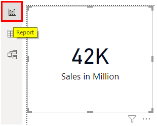
Step 12: The following screenshot shows the “Sales in Million” measure in the analysis. It must be noted that the aggregate function applied over the measure plays a significant role. In this case, it is Sum, and we got total sales. We can have Average also, however, in this case, we are more interested in analyzing the overall total sale and the corresponding average profit percentage.
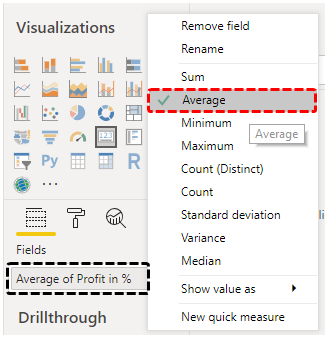
Step 13: We will also bring an average “Profit in %” measure into the analysis by following the above procedure. By default the aggregate function over the measure is Sum. In order to change it to Average, go to the drop-down menu of the corresponding measure in the Fields section, and click on Average.
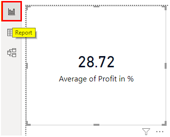
Step 14: Automatically, in the Card, the display text gets changed to “Average of Profit in %”.
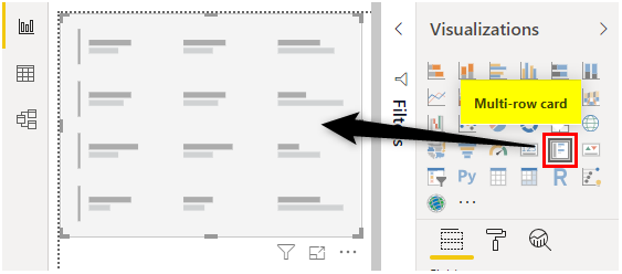
Step 15: Till now, we are done with three analyses. The fourth analysis that we would like to bring into the analysis is the “Multi-row card”. This analysis type can be considered similar to a table that offers us insight into data through figures. We will create this analysis for various products in order to under the total sales and average profit percentages by the Product dimension. By driving the product-wise analysis, we will complete the analysis for the Sales dataset.
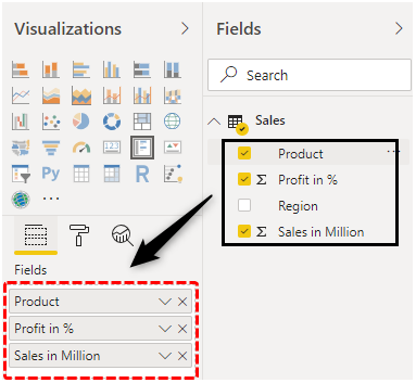
Step 16: Next, in the Fields section, select the Product dimension and both “Profit in %” and “Sales in Million” measures as highlighted in the below screenshot.
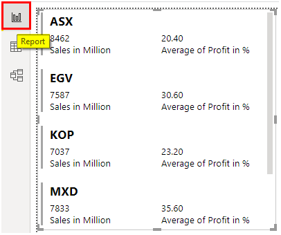
Step 17: Following the above procedure gives us the Multi-row card with requisite details as shown by the following screenshot.
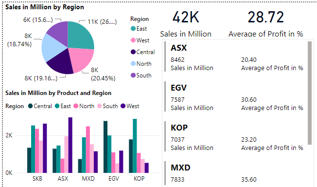
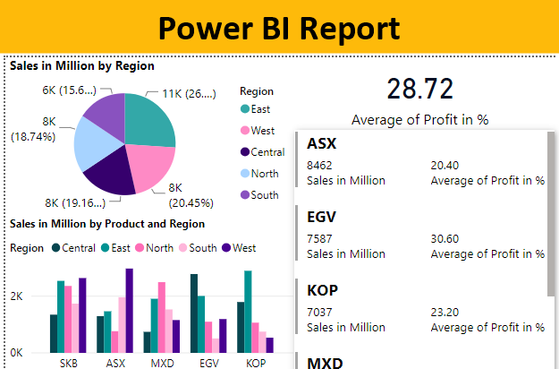
Step 18: Note, in the above step, we changed the aggregate function for the “Profit in %” measure by following the requisite steps mentioned in the preceding section. When we are finally done with the analysis, we should properly examine the report. So, let’s have a glimpse of the report that we successfully created using the above steps. This is as shown by the following screenshot.
Note: I have done so much of formatting to this table, you can download the Power BI dashboard file from below link and apply each formatting technique as applied.
Things to Remember
- A report should be created in Power BI only after proper planning and studying the dataset and its elements i.e. dimensions and measures.
- Various types of visualizations are provided by Power BI, each of which has a specific purpose. So, the selection of visualization should be based on the context and it should best serve the purpose of insight generation.
Recommended Articles
This is a guide to Power BI Report. Here we discuss how to create a Report in Power BI for Analysis along with an example and downloadable template. You may also look at the following articles to learn more –
