Updated June 12, 2023

Introduction to Pure CSS slider
Pure CSS Slider is defined as a rich slider that helps add text links or any other elements on the slider container that allows creating arrow navigation and fulfills the customer needs while very easy to understand. Additionally, it is user-friendly and helps to fit the website layout with a side-by-side scroll. CSS slider is very responsive and does support all devices.
Syntax
There is no format syntax here, but it takes a different form when creating a box and image placer. Let’s look at this,
<div class = "slider name"> </div>
// To have CSS Styles
.slidername
{ // width and height declaration ;
}
// Next buttons to be clicked
.slider
{ transform : ….
}
How to Create a Slider in Pure CSS?
Before we start, this article should have a follow-up on the basic understanding of CSS and the functional image slider. The potential of Pure CSS is to create a well-formed animation on the Slider of images. Here it uses a checkbox for active slides and the navigation purpose.CSS3, along with the transition effect, uses a slideshow.
When we change a CSS value in the code, instant changes occur. We have a Transition property with four categories to get back to the old state from the new state.
- Transition-property
- Transition-duration
- Timing Function
- Transition-delay
The animation should be implemented as a slider part to see how to create a slider in Pure CSS. The slider acts as a container in which an image is placed. Generally, a sliding concept portion moves left to right, and the image is placed in front. If the respective object is resized, the images are pulled apart. To accommodate properly, we need to make a few arbitrary changes. The first step is to define the main wrapper in <div> element and define buttons or checkboxes to handle the slide part. To define a keyframe interval, it is obvious to use translateX and translate property.
Examples
In the following section, we shall see the code implementation in CSS and HTML and animation effects.
Example #1
Simple Slider with the text
.html
<section class="demoslide">
<div class="s_container sli">
<img src="https://chrome.google.com/webstore/detail/spring-flowers-hd-wallpap/eaamhhinficbcjelgmkdpmigmombilna"/>
<div class="t_cont">
<p> hi,this is an image which has tulip flowers to view.</p>
</div>
<imgsrc="https://chrome.google.com/webstore/detail/spring-flowers-hd-wallpap/eaamhhinficbcjelgmkdpmigmombilna"/>
<p> This Image has an nature feel </p>
<img src="https://www.superiorwallpapers.com/images/lthumbs/2016-07/11961_Red-and-pink-flowers-wonderful-nature.jpg"/>
</div>
</section>
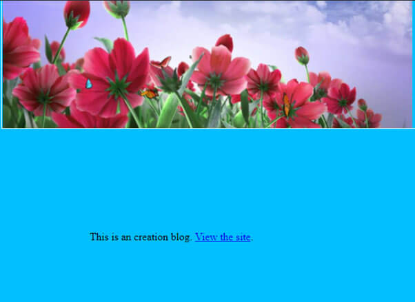
<p class="p">This is an creation blog. <a href="http://www.sitepoint.com/you-dont-need-javascript-for-that" target="_blank">View the site</a>.</p>
.css
body{padding: 4em;background-color: #00bfff;}
html {box-sizing: border-box;}
*, *:before, *:after {box-sizing: inherit;}
.demoslide {
width: 700px;
margin: 0.1 auto;
overflow: hidden;
border: solid 1.5px white;
}
.s_container {
width: 3000px;
font-size: 0.5;
transition: 1s ease;
height: 500px;
}
.s_container:hover {
animation-play-state: paused;
}
img, .t-cont {
width: 615px;
height: auto;
display: inline-block;
font-size: 14px;
text-align: center;
}
.t-cont {
height: 215px;
position: relative;
}
p {
position: relative;
top: -42%;
padding: 4px;
}
.sli {
animation: slide 22s ease infinite;
}
@keyframes sli {
0% {
transform: translateX(0%);
}
11.5% {
transform: translateX(0%);
}
22% {
transform: translateX(-22%);
}
36.1% {
transform: translateX(-22%);
}
45% {
transform: translateX(-45%);
}
60.5% {
transform: translateX(-46%);
}
71% {
transform: translateX(-71%);
}
87.5% {
transform: translateX(-75%);
}
95% {
transform: translateX(-71%);
}
100% {
transform: translateX(0);
}
}
.p {
margin-top: 150px;
text-align: center;
}
Explanation
In the above code snippets, we had set the position to absolute and relative, with background images and expanding the area with size. All elements have a default starting point set.
Output:
Example #2
.html
<ul class="demotwo">
<li>
<input type="checkbox" id="sli1" name="image" checked>
<label for="sli1"></label>
<img src="https://static.one.io/wp-content/uploads/sites/28/2018/02/holland-tulip-season-aaatttt.jpg" alt="box 1">
</li>
<li>
<input type="checkbox" id="sli2" name="image2">
<label for="sli2"></label>
<img src="https://www.pexels.com/photo/red-dahlia-flower-60597/" alt="box 2">
</li>
<li>
<input type="checkbox" id="sli3" name="image3">
<label for="sli3"></label>
<img src="https://www.pexels.com/photo/red-dahlia-flower-60597/" alt="box 3">
</li>
<li><a href="http://cssslider.com/">
<input type="checkbox" id="sli4" name="image4">
<label for="sli4"></label>
<img src="https://www.pexels.com/photo/red-dahlia-flower-60597/" alt="box 4"></a>
</li>
</ul>
.css
* {
margin: 0.1;
padding: 0.1;
}
html {
background-color: #ffcccc;
background-image: radial-gradient(oval, hsla(0,0%,100%,.2), hsla(0,0%,0%,.72)),
linear-gradient(left, transparent 48%, hsla(0,0%,0%,.02) 48%);
background-position: 45% 70%, 51% 52%;
background-repeat: no-repeat, repeat;
background-size: 140% 140%, 2em 2em;
font-size: 90%;
min-height: 95%;
}
.demotwo {
background-color: #00ffbf;
box-shadow: inset 1 1 3px hsla(0,0%,0%,.3),
0 2px 3px hsla(0,0%,100%,.70),
0 -2px 2px 3px hsla(0,0%,0%,.2);
height: 17.1em;
left: 51%;
margin: -6.775em -12em;
padding: .4em;
position: absolute;
top: 45%;
width: 22em;
}
.demotwo:before {
background-color:   #996666 ;
bottom: -2em;
box-shadow: inset 1 1px 2px 2px hsla(0,0%,90%,.1),
inset 0 -1px 2px hsla(0,0%,0%,.5),
0 6px 49px hsla(0,0%,0%,.21),
0 15px 15px -12px hsla(0,0%,0%,.2),
0 28px 22px -16px hsla(0,0%,0%,.12),
0 35px 21px -16px hsla(0,0%,0%,.2);
content: '';
left: -2.1em;
position: absolute;
right: -2.1em;
top: -2.1em;
z-index: 0;
}
.demotwo:after {
background-color: #fff5e5;
bottom: -1.5em;
box-shadow: 0 2px 1px hsla(0,0%,100%,.2),
0 -1px 1px 1px hsla(0,0%,0%,.4),
inset 0 2px 3px 1px hsla(0,0%,0%,.2),
inset 0 4px 3px 1px hsla(0,0%,0%,.2),
inset 0 6px 3px 1px hsla(0,0%,0%,.1);
content: '';
left: -1.5em;
position: absolute;
right: -1.5em;
top: -1.5em;
z-index: -1;
}
.demotwo li {
box-shadow: 0 -1px 0 2px hsla(0,0%,0%,.03);
list-style:none;
position: absolute;
}
.demotwo input {
display: none;
}
.demotwo label {
background-color: #111;
background-image: linear-gradient(transparent, hsla(0,0%,0%,.25));
border: .2em solid transparent;
bottom: .5em;
border-radius: 100%;
cursor: pointer;
display: block;
height: .5em;
left: 24em;
opacity: 0;
position: absolute;
transition: .25s;
width: .5em;
visibility: hidden;
z-index: 10;
}
.demotwo label:after {
border-radius: 100%;
bottom: -.2em;
box-shadow: inset 0 0 0 .2em #111,
inset 0 2px 2px #000,
0 1px 1px hsla(0,0%,100%,.25);
content: '';
left: -.2em;
position: absolute;
right: -.2em;
top: -.2em;
}
.demotwo:hover label {
opacity: 1;
visibility: visible;
}
.demotwo input:checked + label {
background-color: #bfff00;
}
.demotwo:hover li:nth-child(1) label {
left: .8em;
}
.demotwo:hover li:nth-child(2) label {
left: 2.5em;
}
.demotwo:hover li:nth-child(3) label {
left: 3em;
}
.demotwo:hover li:nth-child(4) label {
left: 4em;
}
.demotwo img {
height: 17.75em;
opacity: 1;
transition: .22s;
width: 23em;
vertical-align: top;
visibility: hidden;
}
.demotwo li input:checked ~ img {
opacity: 1.2;
visibility: visible;
z-index: 8;
}
Explanation
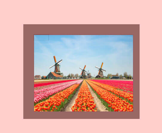
The above code has more slide images to slide with. Therefore the output looks like
Output:
Conclusion
Coming to an end, the outline of this article is all about pure CSS in modern Browsers, and we explored creating CSS and its styles. And we have used a lot of CSS properties that support new-version browsers too.
Recommended Articles
We hope that this EDUCBA information on “Pure CSS Slider” was beneficial to you. You can view EDUCBA’s recommended articles for more information.


