Updated March 27, 2023

Introduction to React Native Border Style
React Native Border Style refers to the property which helps in the styling of element’s four borders. The value of this property varies from 1 to 4. Border Style property can be used to specify a border around a box in the uniform style, with 1 value. And with the help of 2, 3 or 4 values, the sides around the box can be defined independently.
In this topic, we are going to learn about React-Native Border Style The examples of different border styles around the box are defined below as:
- border-style: dotted solid double dashed
- border-style: dotted solid double
- border-style: dotted solid
- border-style: dotted
How to Create Border Style in React Native?
Here are the following ways to create border style in react native with syntax and examples mentioned below.
1. Create borders using color, width and style properties
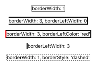
To set a border, you must first set borderWidth. borderWidth is the size of the border, and it’s always a number. You can either set a borderWidth that applies to the entire component or choose which borderWidth you want to set specifically (top, right, bottom, or left). You can combine these properties in many different ways to get the effect you like.
See below figure for some examples.
Various combinations of border style settings are as follows:
As you can see, you can combine border styles to create combinations of border effects. The next listing shows how easy this is to do.
Setting various border combinations
Code:
import  React,  {  Component  }  from  'react';
import  {  StyleSheet,  Text,  View}  from  'react-native';
export  default  class  App  extends  Component<{}>  { render() {
return (
<View  style={styles.container}>
<Example  style={{borderWidth:  1}}>
<Text>borderWidth:  1</Text>
</Example>
<Example  style={{borderWidth:  3,  borderLeftWidth:  0}}>
<Text>borderWidth:  3,  borderLeftWidth:  0</Text>
</Example>
<Example  style={{borderWidth:  3,  borderLeftColor:  'red'}}>
<Text>borderWidth:  3,  borderLeftColor:  'red'</Text>
</Example>
<Example  style={{borderLeftWidth:  3}}>
<Text>borderLeftWidth:  3</Text>
</Example>
<Example  style={{borderWidth:  1,  borderStyle:  'dashed'}}>
<Text>borderWidth:  1,  borderStyle:  'dashed'</Text>
</Example>
</View>
);
}
}
const  Example  =  (props)  =>  (
<View  style={[styles.example,props.style]}>
{props.children}
</View>
);
const  styles  =  StyleSheet.create({ container:  {
flex:  1,
justifyContent:  'center', alignItems:  'center'
},
example:  {
marginBottom:  15
}
});
When only borderWidth is specified, borderColor defaults to ‘black’ and borderStyle defaults to ‘solid’. If borderWidth or borderColor is set at the component level, those properties can be overridden by using a more specific property like borderWidthLeft; specificity takes precedence over generality.
2. Using border-radius to create shapes
Another border property that can be used to great effect is borderRadius. A lot of objects in the real world have straight edges, but seldom does a straight line convey any sense of style. You wouldn’t buy an automobile that looked like a box. You want your car to have nice curved lines that look sleek. Using the borderRadius style gives you the ability to add a bit of style to your applications. You can make many different, interesting shapes by adding curves in the right spots.
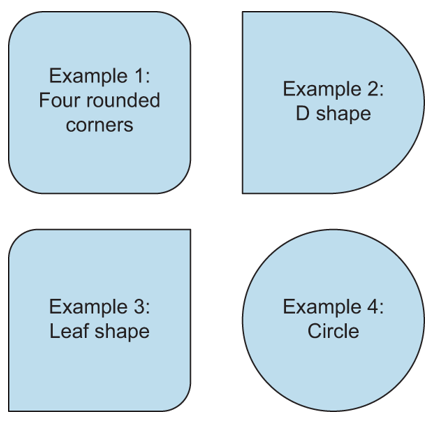
With border Radius, you can define how rounded border corners appear on elements. As you may suspect, borderRadius applies to the entire component. If you set borderRadius and don’t set one of the more specific values, like borderTopLeftRadius, all four corners will be rounded. Look at Figure 2 to see how to round different borders to create cool effects.
Examples of various border-radius combinations.
- Example 1: a square with four rounded
- Example 2: a square with the right two corners rounded, making a D
- Example 3: a square with the opposite corners rounded, which looks like a
- Example 4: a square with a border-radius equal to half the length of a side, which results in a circle.
Creating the shapes in Figure 2 is relatively simple, as shown in Coding 2. Honestly, the trickiest part about this code is making sure you don’t make the text too big or too long.
Setting various border-radius combinations
Code:
import  React,  {  Component  }  from  'react';
import  {  StyleSheet,  Text,  View}  from  'react-native';
export  default  class  App  extends  Component<{}>  { render() {
return (
<View  style={styles.container}>
<Example  style={{borderRadius:  20}}>
<CenteredText>
Example  1:{"\n"}4  Rounded  Corners
</CenteredText>
</Example>
<Example  style={{borderTopRightRadius:  60,
borderBottomRightRadius:  60}}>
<CenteredText>
Example  2:{"\n"}D  Shape
</CenteredText>
</Example>
<Example  style={{borderTopLeftRadius:  30,
borderBottomRightRadius:  30}}>
<CenteredText>
Example  3:{"\n"}Leaf  Shape
</CenteredText>
</Example>
<Example  style={{borderRadius:  60}}>
<CenteredText>
Example  4:{"\n"}Circle
</CenteredText>
</Example>
</View>
);
}
}
const  Example  =  (props)  =>  (
<View  style={[styles.example,props.style]}>
{props.children}
</View>
);
const  CenteredText  =  (props)  =>  (
<Text  style={[styles.centeredText,  props.style]}>
{props.children}
</Text>
);
const  styles  =  StyleSheet.create({ container:  {
flex:  1, flexDirection:  'row', flexWrap:  'wrap', marginTop:  75
},
example:  {
width:  120,
height:  120,
marginLeft:  20,
marginBottom:  20, backgroundColor:  'grey', borderWidth:  2, justifyContent:  'center'
},
centeredText:  { textAlign:  'center', margin:  10
}
});
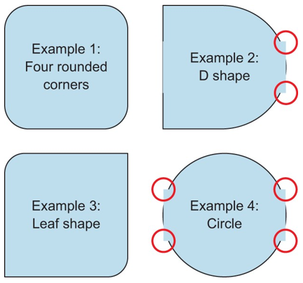
Pay particular attention to the style that centers the text. You got lucky by using margin: 10. If you used padding: 10, the background of the text component would occlude the underlying border stroke of the View component (see Figure 3).
Figure 3 This is what Figure 2 would look like if centeredText style used padding: 10 instead of margin: 10 to position the text. The small circles highlight the points at which the bounding box of the Text component overlaps the border of the View component.
By default, a Text component inherits the background color of its parent component. Because the bounding box of the Text component is a rectangle, the background overlaps the nice rounded corners. Obviously, using the margin property solves the problem, but it’s also possible to remedy the situation another way. You could add backgroundColor: ‘transparent’ to centeredText style.
Making the text component’s background transparent allows the underlying border to show through and look normal again, as in Figure 2.
Conclusion – React-Native Border Style
Adding a border around a component is the best way to give screen elements a concrete, real feeling. On the basis of the above discussion, we got to know that how we can create borders with the color, width and style properties and Using border-radius to create shapes.
Recommended Articles
This is a guide to React-Native Border Style. Here we discuss the basic concept, how we can create Border Style in React Native Border Style with Syntax and Examples. You may also have a look at the following articles to learn more –


