Updated March 30, 2023

Introduction to React Native Bottom Sheet
Bottom sheets are additional surfaces majorly used in mobile apps. There are three types of bottom sheets: Standard, modal, and expanding. Standard bottom sheets are used to display content that is complementary to the primary content on screen. Thus, they are always visible while the user interacts with the primary content. Modal bottom sheets work as an alternative to the dialog boxes on mobile apps; they also provide additional information, items, and icons. For interacting with the primary content, the modal bottom sheets need to be closed. Expanding bottom sheets show longer information or items; here, the sheet is a small surface that can be expanded to locate a particular task. Expanding bottom sheets offer a standard sheet with some extra space, and it is quite similar to a modal bottom sheet. In this article, we will discuss about bottom sheets and their implementation in mobile applications. In this topic, we are going to learn about React’s native bottom sheet.
Syntax:
- Importing Bottom Sheet in React Native
import { BottomSheet } from 'react-native-btr';- Using Bottom Sheet in React Native
<BottomSheet
visible={visible}
onBackButtonPress={toggleBottomNavigationView}
onBackdropPress={toggleBottomNavigationView}
>
In the syntax above, one can use different items, including icons, buttons, texts, and style, according to the stylesheet’s need.
Working of React Native Bottom Sheet with Example
Different examples are mentioned below:
Example #1
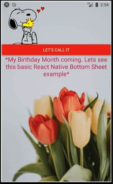
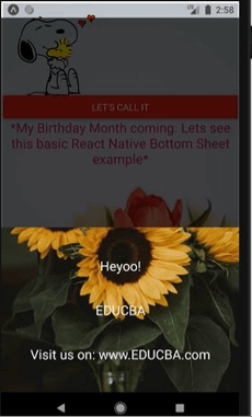
In the example below is the basic example of React Native Bottom Sheet. BottomSheet is used to display the textual items in the bottom panel and the button “LET’S CALL IT” is used to toggle the BottomSheet.
Files used for the successful implementation of the code are:
App.js
import React
, { useState } from 'react';
import { SafeAreaView
, StyleSheet
, View
, Text
, Button
, ImageBackground
, Image } from 'react-native';
import { BottomSheet } from 'react-native-btr';
import Icon from 'react-native-vector-icons/FontAwesome';
const styles = StyleSheet.create({
docker: {
flex: 1,
margin: 2,
justifyContent: 'center',
alignItems: 'center',
backgroundColor: '#E0F7FA',
},
bottomstyling: {
backgroundColor: '#fff',
width: '100%',
height: 250,
justifyContent: 'center',
alignItems: 'center',
},
});
const HumariApplication = () => {
const [visible, setVisible] = useState(false);
const toggleBottomNavigationView = () => {
setVisible(!visible);
};
return (
<SafeAreaView style={styles.docker}>
<ImageBackground
source={{
uri:
'https://images.pexels.com/photos/2058498/pexels-photo-2058498.jpeg?auto=compress&cs=tinysrgb&dpr=1&w=500',
}}
style={{flex: 1}}
>
<Image
source={{
uri:
'https://pngimg.com/uploads/snoopy/snoopy_PNG98.png',
}}
style={{
height: 130,
marginTop: 10,
width: 150,
}}
/>
<Button
color="#db0d17"
onPress={toggleBottomNavigationView}
title="Let's Call it"
/>
<Text
style={{
fontSize: 20,
marginBottom: 20,
textAlign: 'center',
color: '#b3154a',
}}>
*My Birthday Month coming. Lets see this basic React Native Bottom Sheet example*
</Text>
<BottomSheet
visible={visible}
onBackButtonPress={toggleBottomNavigationView}
onBackdropPress={toggleBottomNavigationView}
>
<ImageBackground style={styles.bottomstyling}
source={{
uri:
'https://images.pexels.com/photos/1390433/pexels-photo-1390433.jpeg?auto=compress&cs=tinysrgb&dpr=1&w=500',
}}
>
<Text
style={{
textAlign: 'center',
padding: 20,
fontSize: 20,
color: "#f5f6f7",
}}>
Heyoo!
</Text>
<Text
style={{
textAlign: 'center',
padding: 20,
fontSize: 20,
color: "#f5f6f7",
}}>
EDUCBA
</Text>
<Text
style={{
textAlign: 'center',
padding: 20,
fontSize: 20,
color: "#f5f6f7",
}}>
Visit us on: www.EDUCBA.com
</Text>
</ImageBackground>
</BottomSheet>
</ImageBackground>
</SafeAreaView>
);
};
export default HumariApplication;
Output:
On code execution:
On “LET’S CALL IT” button
Example #2
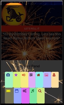
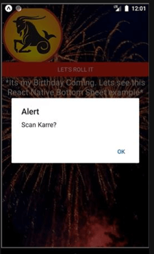
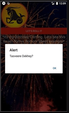
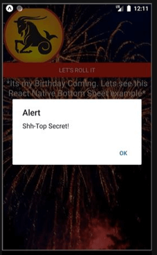
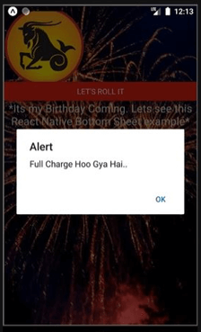
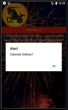
In the example below, BottomSheet is used to display the textual icon button develop and present in the bottom panel and the button “LET’S ROLL IT” is used to toggle the BottomSheet. Each Iconbutton displays a different alert text in the form of a pop-up on the screen.
Files used for the successful implementation of the code are:
App.js
import React
, { useState } from 'react';
import { SafeAreaView
, StyleSheet
, View
, Text
, Button
, ImageBackground
, Image } from 'react-native';
import { BottomSheet } from 'react-native-btr';
import Icon from 'react-native-vector-icons/FontAwesome';
const styles = StyleSheet.create({
docker: {
flex: 1,
margin: 2,
justifyContent: 'center',
alignItems: 'center',
backgroundColor: '#E0F7FA',
},
bottomstyling: {
backgroundColor: '#fff',
width: '100%',
height: 250,
justifyContent: 'center',
alignItems: 'center',
},
});
const HumariApplication = () => {
const [visible, setVisible] = useState(false);
const toggleBottomNavigationView = () => {
setVisible(!visible);
};
return (
<SafeAreaView style={styles.docker}>
<ImageBackground
source={{
uri:
'https://images.pexels.com/photos/10967/pexels-photo-10967.jpeg?auto=compress&cs=tinysrgb&dpr=1&w=500',
}}
style={{flex: 1}}
>
<Image
source={{
uri:
'https://pngimg.com/uploads/capricorn/capricorn_PNG82.png',
}}
style={{
height: 130,
marginTop: 10,
width: 150,
}}
/>
<Button
color="#db0d17"
onPress={toggleBottomNavigationView}
title="Let's Roll it"
/>
<Text
style={{
fontSize: 20,
marginBottom: 20,
textAlign: 'center',
color: '#e8e8d1',
}}>
*Its my Birthday Coming. Lets see this React Native Bottom Sheet example*
</Text>
<BottomSheet
visible={visible}
onBackButtonPress={toggleBottomNavigationView}
onBackdropPress={toggleBottomNavigationView}
>
<ImageBackground style={styles.bottomstyling}
source={{
uri:
'https://images.pexels.com/photos/1234390/pexels-photo-1234390.jpeg?auto=compress&cs=tinysrgb&dpr=1&w=500',
}}
>
<Text
style={{
textAlign: 'center',
padding: 20,
fontSize: 20,
}}>
Desi Panel
</Text>
<View
style={{
flex: 1,
flexDirection: 'column',
justifyContent: 'space-between',
}}>
<View style={{ flex: 1, flexDirection: 'row' }}>
<Icon.Button
raised
name='camera'
color="#3b5998"
backgroundColor="#a9fcc2"
onPress={() => {
toggleBottomNavigationView();
alert('Click-Shlick Karee?');
}}
/>
<Icon.Button
raised
name='star'
color="#9b3bdb"
backgroundColor='#d6fc7c'
onPress={() => {
toggleBottomNavigationView();
alert('Taare Dekhey?');
}}
/>
<Icon.Button
raised
name='volume-up'
color="#e33419"
backgroundColor="#f5f184"
onPress={() => {
toggleBottomNavigationView();
alert('Awaaz Badhaey?');
}}
/>
<Icon.Button
raised
name='qrcode'
color="#0a0a0a"
backgroundColor="#dda2f5"
onPress={() => {
toggleBottomNavigationView();
alert('Scan Karre?');
}}
/>
<Icon.Button
raised
name='home'
color="#871713"
backgroundColor="#94f7e9"
onPress={() => {
toggleBottomNavigationView();
alert('Ghar Chale?');
}}
/>
<Icon.Button
raised
name='photo'
color='#d42f84'
backgroundColor="#b6b7fc"
onPress={() => {
toggleBottomNavigationView();
alert('Tasveere Dekhey?');
}}
/>
<Icon.Button
raised
name='user-secret'
color='#b31d29'
backgroundColor="#ffdda3"
onPress={() => {
toggleBottomNavigationView();
alert('Shh-Top Secret!');
}}
/>
</View>
<View style={{ flex: 1, flexDirection: 'row' }}>
<Icon.Button
raised
name='battery'
color='#f2ff03'
backgroundColor="#747559"
onPress={() => {
toggleBottomNavigationView();
alert('Full Charge Hoo Gya Hai..');
}}
/>
<Icon.Button
raised
name='calendar-o'
color='#0c20c2'
backgroundColor="#9aa5fc"
onPress={() => {
toggleBottomNavigationView();
alert('Calender Dekhey?');
}}
/>
<Icon.Button
raised
name='gears'
color='#3d0947'
backgroundColor="#d852f2"
onPress={() => {
toggleBottomNavigationView();
alert('Challo Settings Kartey Hai?');
}}
/>
<Icon.Button
raised
name='music'
color='#0e7329'
backgroundColor="#87f5a4"
onPress={() => {
toggleBottomNavigationView();
alert('Ganne Bajaey?');
}}
/>
<Icon.Button
raised
name='search'
color='#940f27'
backgroundColor="#d0f587"
onPress={() => {
toggleBottomNavigationView();
alert('Search Karre?');
}}
/>
</View>
</View>
</ImageBackground>
</BottomSheet>
</ImageBackground>
</SafeAreaView>
);
};
export default HumariApplication;
Output:
- On code execution:
- On clicking “LET’S ROLL IT”
- On clicking “Camera Icon”
- On clicking “Star Icon”
- On clicking the “Volume-up Icon”
- On clicking “QR Scanner Icon”
- On clicking the “Home Icon”
- On clicking “Photo Icon”
- On clicking the “Secret-detective button”
- On clicking “Battery Icon”
- On clicking the “Calendar Icon”
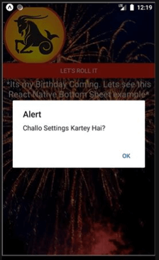
- On clicking the “Settings Icon”
- On clicking “Music Icon”
- On clicking “Search Icon”
Conclusion
On the basis of the above article, we understood the concept of bottom sheets. This article explains React native bottom sheets using various examples. The examples will help the readers to implement bottom sheets in their application according to the requirements.
Recommended Articles
This is a guide to the React native bottom sheet. Here we discuss the introduction, syntax, and working of a bottom sheet in react native along with examples and code implementation. You may also have a look at the following articles to learn more –
