Updated April 5, 2023

Introduction to React Native Box Shadow
Shadow is an attribute which beautifies any object. Shadows are very much used in the field of web development and app development for the same purpose. The developers use it to beautify different objects used one the website. These shadows give a natural depth to the object and provide a nice customer experience. React Native provides the option of creating shadows for the objects. Box Shadow is a property used for providing shadows to different shapes; it helps in styling the shadows through various attributes like opacity, color, intensity and many more. React Native Box Shadow is available only for the iOS platform.
Syntax:
1. For the iOS platform.
<boxShadow>
shadowColor: "#b97ee0",
shadowRadius: 4.65,
shadowOffset: {
height: 4,
width: 0,
},
shadowOpacity: 10,
</boxShadow>
2. For the Android platform.
<boxShadow>
elevation: 8,
</boxShadow>
For styling the Box Shadow in React Native, only the elevation feature is supported in the Android platform, while in the iOS platform, we can style the box-shadow in many ways by setting the opacity, color, height, width, radius, etc. of the shadow.
Examples of React Native Box Shadow
Given below are the examples mentioned:
Example #1 – Basic React Native Box Shadow Usage.
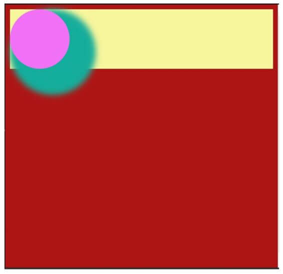
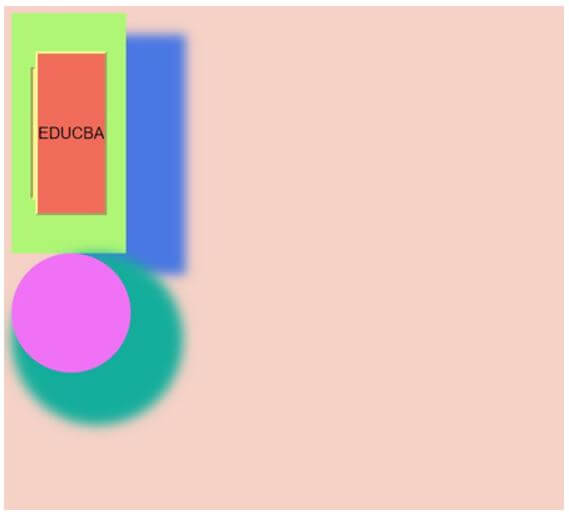
A circular box is developed in the code below and #15ad9b colored shadow is developed around that circular box which is foggy in nature. Through,
boxShadow: “22px 22px 10px 22px #15ad9b”,
The first 22px defines the shadow around the circular box, the second 22px defines the intensity of the shadow, 10px also helps in defining the intensity of the shadow around the box, and the last 22px helps in defining the area of the shadow around the circular box.#15ad9b is for defining the color of the shadow as per the requirement.
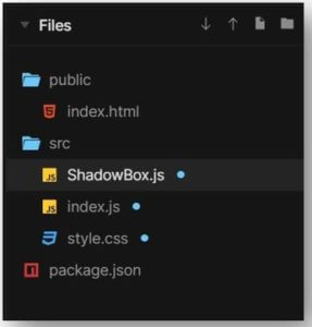
Key components for the proper execution of the code are:
a. ShadowBox.js
import React from "react";
import Radium from "radium";
let Click = () => <div style={styles.root}></div>;
export default Radium(Click);
const styles = {
root: {
height: 100,
background: "#f071f5",
boxShadow: "22px 22px 10px 22px #15ad9b",
borderRadius: 100/2,
width: 100,
}
};
b. index.js
import React from "react";
import Button from "./ShadowBox";
import Radium from "radium";
import "./style.css";
import { render } from "react-dom";
let EduCBA = () => (
<div style={styles.cash}>
<div>
<Button />
</div>
</div>
);
const styles = {
cash: {
background: "#f7f69c",
},
};
render(<EduCBA />, document.getElementById("root"));
EduCBA = Radium(EduCBA);
c. style.css
body,
html {
background: #ad1515;
height: 100%;
}
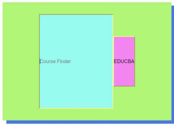
Output:
Example #2 – With Search Bar.
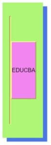
A rectangular button is developed with blue shadow in the code below; similar to example 1, we have defined the styling of the shadow using box-shadow. The shadow so developed follows along to the expansion of the button to the search bar.
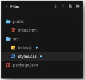
Key components for the proper execution of the code are:
a. index.js
import React
, { useState
, useRef
} from "react";
import ReactDOM from "react-dom";
import styled from "styled-components";
import "./styles.css";
const Click = styled.button`
border-bottom-left-radius: 100/2;
background-color: #f285ef;
color: "#f56e94";
cursor: ${props => (props.barOpened ? "pointer" : "none")};
border-color: #faf591;
line-height: 10;
pointer-events: ${props => (props.barOpened ? "auto" : "none")};
`;
const Responses = styled.input`
&::placeholder {
color: #757d7b;
}
background-color: #96faee;
border-bottom-left-radius: 100/2;
line-height: 19;
color: #2264c7;
border-color: #faf591;
width: 50%;
&:focus,
&:active {
outline: none;
}
margin-left: ${props => (props.barOpened )};
`;
const Rex = styled.form`
width: ${props => (props.barOpened
? "10"
: "2rem")};
background-color: #aff576;
display: flex;
box-shadow: 10px 9px #4977e3;
justify-content: center;
border-bottom-left-radius: 100/2;
height: 20;
cursor: ${props => (props.barOpened
? "auto"
: "pointer")};
padding: 2rem;
align-items: center;
border-color: #faf591;
`;
function Pikachu() {
const [barOpened
, setBarOpened] = useState(0);
const [input
, setInput] = useState("");
const inputFocus = useRef();
return (
<div className="Rex">
<Rex
barOpened={barOpened}
onClick={() => {
setBarOpened(true);
inputFocus.current.focus();
}}
<Responses
onChange={e => setInput(e.target.value)}
ref={inputFocus}
value={input}
barOpened={barOpened}
placeholder="Course Finder"
/>
<Click barOpened={barOpened}>
EDUCBA
</Click>
</Rex>
</div>
);
}
ReactDOM.render(<Pikachu />, document.getElementById("root"));
b. styles.css
.App {
font-family: 'Times New Roman'
, Times
, serif;
}
* {
margin: 10;
padding: 0;
}
Output:
Example #3 – Usage for Advance Purpose.
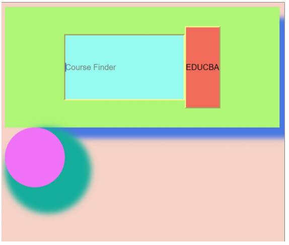
Both of example 1 & 2 are merged together to understand the usage of Box Shadow in the complex scenario.
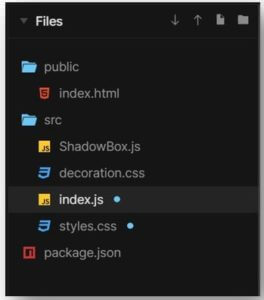
Key components for the proper execution of the code are:
a. ShadowBox.js
import React from "react";
import Radium from "radium";
let Click = () => <div style={styles.root}></div>;
export default Radium(Click);
const styles = {
root: {
height: 100,
background: "#f071f5",
boxShadow: "22px 22px 10px 22px #15ad9b",
borderRadius: 100/2,
width: 100,
}
};
b. decoration.css
body,
html {
background: #f5d1c6;
}
c. index.js
import React
, { useState
, useRef
} from "react";
import "./decoration.css";
import ReactDOM from "react-dom";
import Button from "./ShadowBox";
import styled from "styled-components";
import "./styles.css";
const Click = styled.button`
border-bottom-left-radius: 100/2;
background-color: #f06b59;
color: "#f56e94";
cursor: ${props => (props.barOpened ? "pointer" : "none")};
border-color: #faf591;
line-height: 10;
pointer-events: ${props => (props.barOpened ? "auto" : "none")};
`;
const styles = {
cash: {
},
};
const Responses = styled.input`
&::placeholder {
color: #757d7b;
}
background-color: #96faee;
border-bottom-left-radius: 100/2;
line-height: 8;
color: #2264c7;
border-color: #faf591;
width: 50%;
&:focus,
&:active {
outline: none;
}
margin-left: ${props => (props.barOpened )};
`;
const Rex = styled.form`
width: ${props => (props.barOpened
? "1"
: "2rem")};
background-color: #aff576;
display: flex;
box-shadow: 50px
18px
9px #4977e3;
justify-content: center;
border-bottom-left-radius: 100/2;
height: 20;
cursor: ${props => (props.barOpened
? "auto"
: "pointer")};
padding: 2rem;
align-items: center;
border-color: #faf591;
`;
function Pikachu() {
const [barOpened
, setBarOpened] = useState(0);
const [input
, setInput] = useState("");
const inputFocus = useRef();
return (
<div className="Rex">
<Rex
barOpened={barOpened}
onClick={() => {
setBarOpened(true);
inputFocus.current.focus();
}}
>
<Responses
onChange={e => setInput(e.target.value)}
ref={inputFocus}
value={input}
barOpened={barOpened}
placeholder="Course Finder"
/>
<Click barOpened={barOpened}>
EDUCBA
</Click>
</Rex>
<div style={styles.cash}>
<div>
<Button />
</div>
</div>
</div>
);
}
ReactDOM.render(<Pikachu />, document.getElementById("root"));
d. styles.css
.App {
font-family: 'Times New Roman'
, Times
, serif;
}
* {
margin: 10;
padding: 0;
}
Output:
Conclusion
We went through multiple examples to see its application according to the different requirements of the React Native application. We came across the styling through Box Shadow and how it helps in providing a better user experience in the application.
Recommended Articles
This is a guide to React Native Box Shadow. Here we discuss the introduction and syntax of React Native Box Shadow along with examples. You may also have a look at the following articles to learn more –
