Updated April 3, 2023
Introduction to React Native Button Styles
Buttons are an important part of a website or an application. Buttons provide a way to interact with the application or website for getting the required information. React Native also provides the option for setting up buttons and styling them according to the requirements. React Native Button element is used to enhance the user experience in the React Native application. Button elements work after it is pressed in the React Native application. For the styling of buttons in React Native, one can use the Stylesheet and accordingly can use TouchableOpacity element, TouchableHighlight element, and TouchableNativeFeedback element for the styling of a button in the React Native.
Syntax of React Native Button
Syntax of the react-native button are given below:
1. Button element
This element is used for importing the basic button in the React Native application.
<Button>
Hello
</Button>
2. TouchableOpacity element
The opacity of the element is changed on the pressing with the usage of this element.
<TouchableOpacity>
<Text style = {styles.likhit}>
Example 2
</Text>
</TouchableOpacity>
3. TouchableHighlight element
With the usage of this element, the underlying color is shown when it is pressed.
<TouchableHighlight>
<Text style = {styles.likhit}>
Magic
</Text>
</TouchableHighlight>
4. TouchableNativeFeedback element
This element is for ink animation when it is pressed.
<TouchableNativeFeedback>
<Text style = {styles.gabs}>
Magic Button
</Text>
</TouchableNativeFeedback>
Working of React Native Button Styles
Working and examples of react-native button styles are given below:
Example #1 – Basic Button Style in React Native
We have used the default Button element to create the basic button in the code below.
1. App.js
import React
, { Component } from 'react'
import { Button } from 'react-native'
const EDUCBA = () => {
constbuttonclick = () => false
return (
<Button
onPress = {buttonclick}
title = "Basic React Native Basic Button"
color = "#7627b8"
/>
)
}
export default EDUCBA
2. index.js
import React from "react";
import ReactDOM from "react-dom";
import Rahul from "./App";
constrootElement = document.getElementById("root");
ReactDOM.render(
<React.StrictMode>
<Rahul />
</React.StrictMode>,
rootElement
);
Output:
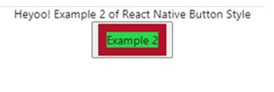
Example #2 – Button styling using Stylesheet
We have used the default TouchableOpacity element to style and create the basic button in the code below.
1. App.js
import React from 'react'
import { TouchableOpacity
, StyleSheet
, View
, Text
, Button } from 'react-native'
const EDUCBA = () => {
return (
<View style = {styles.almirah}>
<Text>
Heyoo! Example 2 of React Native Button Style
</Text>
<button>
<TouchableOpacity>
<Text style = {styles.likhit}>
Example 2
</Text>
</TouchableOpacity>
</button>
</View>
)
}
export default EDUCBA
const styles = StyleSheet.create ({
almirah: {
flex: 1,
flexDirection: 'column',
justifyContent: 'center',
alignItems: 'center',
},
likhit: {
borderColor: '#b01328',
backgroundColor: '#2bd64d',
borderWidth: 10,
}
})
2. index.js
import React from "react";
import ReactDOM from "react-dom";
import Rahul from "./App";
constrootElement = document.getElementById("root");
ReactDOM.render(
<React.StrictMode>
<Rahul />
</React.StrictMode>,
rootElement
);
Output:
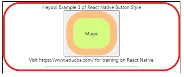
Example #3
We have used the default TouchableHighlight element to style and create buttons in the code below.
1. App.js
import React from 'react'
import { View
, TouchableHighlight
, Text
, StyleSheet
, Button } from 'react-native'
const EDUCBA = (props) => {
return (
<View style = {styles.almirah}>
<Text>
Heyoo! Example 3 of React Native Button Style
</Text>
<button>
<TouchableHighlight>
<Text style = {styles.likhit}>
Magic
</Text>
</TouchableHighlight>
</button>
<Text>
Visit https://www.educba.com/ for training on React Native.
</Text>
<Text>
-------------------------------------------------
</Text>
</View>
)
}
export default EDUCBA
const styles = StyleSheet.create ({
almirah: {
flex: 1,
flexDirection: 'column',
justifyContent: 'center',
alignItems: 'center',
borderRadius: 100/2,
borderWidth: 5,
borderColor: '#ed231c',
},
likhit: {
backgroundColor: '#d4fc83',
borderWidth: 20,
borderColor: '#fcc083',
padding: 35,
borderRadius: 100/2,
}
})
2. index.js
import React from "react";
import ReactDOM from "react-dom";
import Rahul from "./App";
constrootElement = document.getElementById("root");
ReactDOM.render(
<React.StrictMode>
<Rahul />
</React.StrictMode>,
rootElement
);
Output:
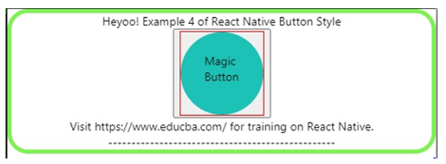
Example #4
We have used the default TouchableNativeFeedback element to style and create the basic button in the code below.
1. App.js
import React from 'react'
import { View
, TouchableNativeFeedback
, Text
, StyleSheet
, Button } from 'react-native'
consteducba = (props) => {
return (
<View style = {styles.almirah}>
<Text>
Heyoo! Example 4 of React Native Button Style
</Text>
<button color = "#7627b8">
<TouchableNativeFeedback>
<Text style = {styles.gabs}>
Magic Button
</Text>
</TouchableNativeFeedback>
</button>
<Text>
Visit https://www.educba.com/ for training on React Native.
</Text>
<Text>
-------------------------------------------------
</Text>
</View>
)
}
export default educba
const styles = StyleSheet.create ({
almirah: {
flex: 1,
flexDirection: 'center',
justifyContent: 'center',
alignItems: 'center',
borderRadius: 100/4,
borderWidth: 5,
borderColor: '#7ef250',
},
gabs: {
padding: 25,
borderColor: '#db213d',
backgroundColor: '#1dc2b7',
borderRadius: 100/2,
width: 100,
height: 100,
}
})
2. index.js
import React from "react";
import ReactDOM from "react-dom";
import Rahul from "./App";
constrootElement = document.getElementById("root");
ReactDOM.render(
<React.StrictMode>
<Rahul />
</React.StrictMode>,
rootElement
);
Output:
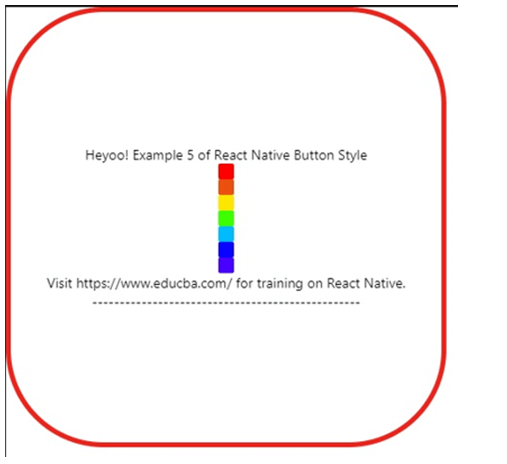
Example #5
We have used the default Button element to style and create 7 colorful buttons in the code below.
1. App.js
import React from 'react'
import { View
, Text
, StyleSheet
, Button } from 'react-native'
const EDUCBA = (props) => {
return (
<View style = {styles.almirah}>
<Text>
Heyoo! Example 5 of React Native Button Style
</Text>
<Button color = '#ff0000'/>
<Button color = '#eb500e'/>
<Button color = '#ffe600'/>
<Button color = '#3cff00'/>
<Button color = '#00bbff'/>
<Button color = '#0905ff'/>
<Button color = '#4800ff'/>
<Text>
Visit https://www.educba.com/ for training on React Native.
</Text>
<Text>
-------------------------------------------------
</Text>
</View>
)
}
export default EDUCBA
const styles = StyleSheet.create ({
almirah: {
flex: 1,
flexDirection: 'column',
justifyContent: 'center',
width: 450,
height: 450,
alignItems: 'center',
borderRadius: 100,
borderWidth: 5,
borderColor: '#ed231c',
},
})
2. index.js
import React from "react";
import ReactDOM from "react-dom";
import Rahul from "./App";
constrootElement = document.getElementById("root");
ReactDOM.render(
<React.StrictMode>
<Rahul />
</React.StrictMode>,
rootElement
);
Output:
Conclusion
In this article, we came to know about the styling of buttons in React Native. We have discussed different elements used for the styling of the button along with their working and usage in the examples. In the examples above we have developed various buttons in React Native from the basic button to the advance buttons using the elements discussed.
Recommended Articles
This is a guide to React Native Button Styles. Here we also discuss the introduction, syntax, and working of the react-native button along with different examples and its code implementation. You may also have a look at the following articles to learn more –

