Updated June 6, 2023

Introduction to React to Native DatePicker
The following article provides an outline for React Native DatePicker. A DatePicker displays a choice in the form of a calendar supplied to users, from where one can choose the desired date or time according to their needs. Choosing a date is also connected through the text box, which displays the selected date and time, which also helps ease the option to choose. For different libraries, one can select various CDN links. React Native Community provides the choice of both DatePicker and TimePicker to developers for both Android and iOS. In the article below, we have implemented different DatePicker using different React Native Libraries.
Syntax
1. Syntax of using basic DatePicker.
<DatePicker showToday onChange={onChange("DatePicker")} />2. Syntax of using range DatePicker.
<RangeDatePicker onChange={onChange("Range DatePicker")} />3. Syntax of using DatePicker with TimePicker.
<DatePicker
includeTime
showToday
onChange={onChange("DatePicker include time")}
/>
Working on React Native DatePicker
There are three picker modes as follows:
- Datetime Mode: This mode provides a date time picker by react native, which can choose the date and time simultaneously. The present-day will be displayed as ‘Today”.
- DatePicker Mode: This mode provides a datepicker by react native, which has the option of choosing the year, month, and date. The order of the date-month-year is adjusted according to the respective locale.
- TimePicker Mode: This mode is used if only time is needed to be displayed. The AM/PM is added according to the locale and the user settings. Time intervals can be added to show the time at equal intervals.
Examples
Here are the examples as follows:
Example #1 – Basic React Native DatePicker
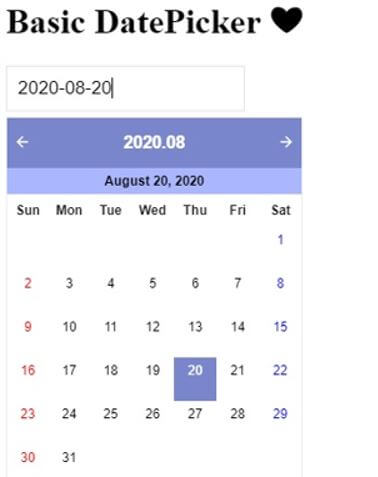
In the following example, we have displayed a basic date picker. One can choose the date directly through the calendar or enter the preferred date in the box.
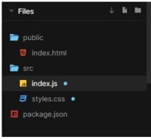
The files used to implement the codes below are:
a. index.js
import React from "react";
import ReactDOM from "react-dom";
import { DatePicker
, RangeDatePicker } from "@y0c/react-datepicker";
import "@y0c/react-datepicker/assets/styles/calendar.scss";
import "dayjs/locale/ko";
import "dayjs/locale/en";
import "./styles.css";
const Panel = ({ header, children }) => (
<div style={{ height: "100px" }}>
<h1>{header} {'\u2764'}</h1>
<div>{children}</div>
</div>
);
function App() {
const onChange = title => (...args) => console.log(title, args);
return (
<div className="App">
<Panel header="Basic DatePicker">
<DatePicker showToday onChange={onChange("DatePicker")} />
<h2>{'\u2740'}{'\u2740'}{'\u2740'}{'\u2740'}{'\u2740'}{'\u2740'}{'\u2740'}{'\u2740'}{'\u2740'}{'\u2740'}{'\u2740'}{'\u2740'}</h2>
</Panel>
</div>
);
}
const rootElement = document.getElementById("root");
ReactDOM.render(<App />, rootElement);
b. styles.css
.App {
font-family: 'Times New Roman'
, Times
, serif;
}
Output:
Example #2 – Range Date Picker
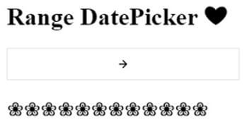
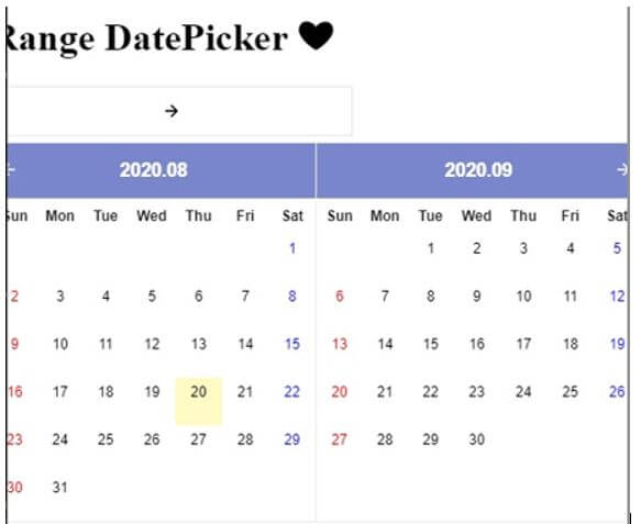
In the example below, one can choose the date from the range of dates displayed in the calendar.
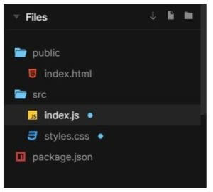
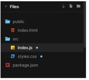
The files used to implement the code below are:
a. index.js
import React from "react";
import ReactDOM from "react-dom";
import { DatePicker
, RangeDatePicker } from "@y0c/react-datepicker";
import "@y0c/react-datepicker/assets/styles/calendar.scss";
import "dayjs/locale/ko";
import "dayjs/locale/en";
import "./styles.css";
const Panel = ({ header, children }) => (
<div style={{ height: "100px" }}>
<h1>{header} {'\u2764'}</h1>
<div>{children}</div>
</div>
);
function App() {
const onChange = title => (...args) => console.log(title, args);
return (
<div className="App">
<Panel header="Range DatePicker">
<RangeDatePicker onChange={onChange("Range DatePicker")} />
<h2>{'\u2740'}{'\u2740'}{'\u2740'}{'\u2740'}{'\u2740'}{'\u2740'}{'\u2740'}{'\u2740'}{'\u2740'}{'\u2740'}{'\u2740'}{'\u2740'}</h2>
</Panel>
</div>
);
}
const rootElement = document.getElementById("root");
ReactDOM.render(<App />, rootElement);
b. styles.css
.App {
font-family: 'Times New Roman'
, Times
, serif;
}
Output:
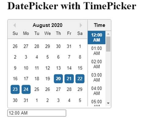
Example #3 – DatePicker with TimePicker
Type 1:
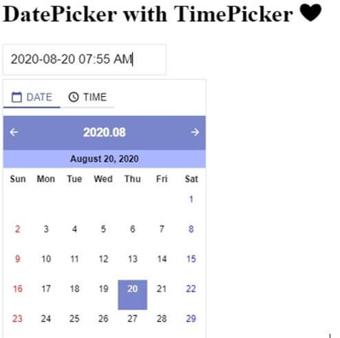
In the example below, one can pick the date from the Date menu on the top and the time from the Time menu. Or directly can enter the desired date and time in the box.
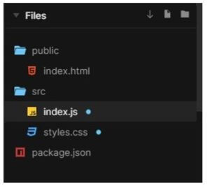
The files used to implement the code below are:
a. index.js
import React from "react";
import ReactDOM from "react-dom";
import { DatePicker
, RangeDatePicker } from "@y0c/react-datepicker";
import "@y0c/react-datepicker/assets/styles/calendar.scss";
import "dayjs/locale/ko";
import "dayjs/locale/en";
import "./styles.css";
const Panel = ({ header, children }) => (
<div style={{ height: "100px" }}>
<h1>{header} {'\u2764'}</h1>
<div>{children}</div>
</div>
);
function App() {
const onChange = title => (...args) => console.log(title, args);
return (
<div className="App">
<Panel header="DatePicker with TimePicker">
<DatePicker
includeTime
showToday
onChange={onChange("DatePicker include time")}
/>
</Panel>
</div>
);
}
const rootElement = document.getElementById("root");
ReactDOM.render(<App />, rootElement);
b. styles.css
.App {
font-family: 'Times New Roman'
, Times
, serif;
}
Output:
Type 2:
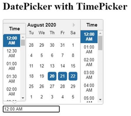
In the example below, one can choose the date and time simultaneously.
The files used to implement the code below are:
a. index.js
import React from "react";
import ReactDOM from "react-dom";
import DatePicker from "react-datepicker";
import moment from "moment";
import "react-datepicker/dist/react-datepicker.css";
import "./styles.css";
class Example extends React.Component {
constructor(props) {
super(props);
this.state = {
startDate: moment("2020-08-20"),
endDate: moment("2020-08-24")
};
}
handleChange = (
{
startDate
, endDate
}
) => {
startDate = startDate || this.state.startDate;
endDate = endDate || this.state.endDate;
if (startDate.isAfter(endDate)) {
endDate = startDate;
}
this.setState({ startDate, endDate });
};
handleChangeStart =
startDate => this.handleChange(
{
startDate
}
);
handleChangeEnd =
endDate => this.handleChange(
{
endDate
}
);
render() {
return (
<div className="row">
<div>
<h1>DatePicker with TimePicker</h1>
<DatePicker
selected={this.state.startDate}
selectsStart
inline
showTimeSelect
startDate={this.state.startDate}
endDate={this.state.endDate}
onChange={this.handleChangeStart}
timeFormat="hh:mm A"
timeIntervals={60}
/>
</div>
<div>
<DatePicker
selected={this.state.startDate}
selectsStart
onChange={this.handleChangeStart}
showTimeSelect
showTimeSelectOnly
dateFormat="hh:mm A"
/>
</div>
</div>
);
}
}
const rootElement = document.getElementById("root");
ReactDOM.render(<Example />, rootElement);
b. styles.css
.react-datepicker__time-list {
padding: 0 !important;
}
Output:
Example #4 – With CANCEL and OK buttons
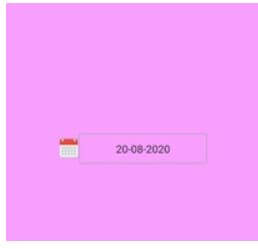
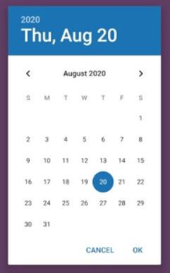
In the example below, we have developed a Date picker from which one can choose the desired date, and it also has a CANCEL button to cancel the action taken by the user and an OK button to approve the action taken by the user.
The files used to implement the code below are:
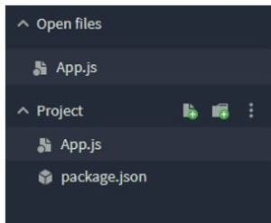
a. App.js
import React
, { Component } from 'react';
import { View
, StyleSheet } from 'react-native';
import DatePicker from 'react-native-datepicker';
export default class MyDatePicker extends Component {
constructor(props) {
super(props);
this.state = { date: '20-08-2020' };
}
render() {
return (
<View style={styles.container}>
<DatePicker
style={{ width: 200 }}
date={this.state.date}
mode="date"
placeholder="select date"
format="DD-MM-YYYY"
minDate="01-01-2020"
maxDate="01-01-2030"
confirmBtnText="Confirm"
cancelBtnText="Cancel"
customStyles={{
dateIcon: {
position: 'absolute',
left: 0,
top: 3,
marginLeft: 0.2,
},
dateInput: {
marginLeft: 30,
},
}}
onDateChange={date => {
this.setState({ date: date });
}}
/>
</View>
);
}
}
const styles = StyleSheet.create({
container: {
flex: 1,
alignItems: 'center',
justifyContent: 'center',
marginTop: 40,
padding: 12,
backgroundColor: '#f79eff',
},
});
Output:
Recommended Articles
We hope that this EDUCBA information on “React Native DatePicker” was beneficial to you. You can view EDUCBA’s recommended articles for more information.
