Updated March 27, 2023
Introduction to React Native Flexbox
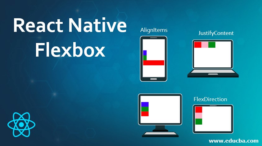
Flexbox in react native gives developers the power to decide the layout for child components, basically, it has algorithm which makes it suitable for all types of screen sizes, flexbox is all about the three important attributes like flexDirection (this attribute allows us to define alignment of element vertically or horizontally), justifyContent(allow us to distribute element inside the containers), alignItems(its work is similar to the justifyContent attribute only difference is it will be also used for distribution of element to the secondary axis), these are the attributes which make it perfect, suitable and fitted on any device with any configuration and size.
Properties to React Native Flexbox
React Native Flexbox contains three important properties. We will learn about the properties with examples to implement:
1. flexDirection
This attribute is basically made for the primary axis of the layout. It allows developers to use the style for components in the primary axis. It supports the property row and column to arrange its children components. In case if we do not define or specify the value for flexDirection it will take column as the flexDirection.
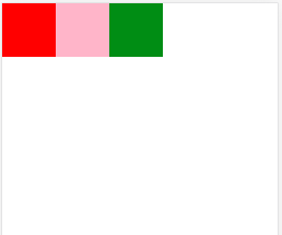
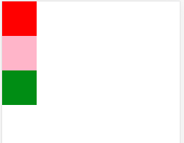
Below is the example with row flexDirection.Here we are defining the main View component and inside it, we are passing three more component views with different colors and the same height and width. With the help of flex, we got all the components in rows wise with fitting on the screen. We can also use the same example with a column as the flexDirection. Please see the below examples along with the screen of output.
Example with Row
Code:
import React, { Component } from "react";
import { StyleSheet, View } from "react-native";
export default class FlexDirectionExample extends Component {
render() {
return (
<View style={flexStyles.containerStyle}>
<View style={flexStyles.powderblueStyle} />
<View style={flexStyles.skyblueStyle} />
<View style={flexStyles.steelblueStyle} />
</View>
);
}
}
const flexStyles = StyleSheet.create({
containerStyle: {
flex: 1,
flexDirection: "row" // here we are settin row as the flexdirection
},
powderblueStyle: {
width: 70,
height: 70,
backgroundColor: "red"
},
skyblueStyle: {
width: 70,
height: 70,
backgroundColor: "pink"
},
steelblueStyle: {
width: 70,
height: 70,
backgroundColor: "green"
}
});
Output:
Example with Column
Code:
import React, { Component } from "react";
import { StyleSheet, View } from "react-native";
export default class FlexDirectionExample extends Component {
render() {
return (
<View style={flexStyles.containerStyle}>
<View style={flexStyles.powderblueStyle} />
<View style={flexStyles.skyblueStyle} />
<View style={flexStyles.steelblueStyle} />
</View>
);
}
}
const flexStyles = StyleSheet.create({
containerStyle: {
flex: 1,
flexDirection: "column" // here we are setting column as the flex direction
},
powderblueStyle: {
width: 70,
height: 70,
backgroundColor: "red"
},
skyblueStyle: {
width: 70,
height: 70,
backgroundColor: "pink"
},
steelblueStyle: {
width: 70,
height: 70,
backgroundColor: "green"
}
});
Output:
2. justifyContent
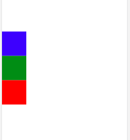
This attribute specifies the distribution of the children’s components towards the primary axis. It allows developers to distribute the children’s components at the start, in the end, at the center, and in space also. In the below example we are defining one main view component inside justiFyContentExample where we are defining three more view components which are children to the main View components. As we have discussed that we can define the layout for the children components, here we are setting the location and position of the other three components View inside from the main view components. For better understanding follow the example below along with the screen of output. In the output screen, we can see three children’s components with different colors are visible in a vertical way.
Code:
import React, { Component } from "react";
import { StyleSheet, View } from "react-native";
export default class JustifyContentExample extends Component {
render() {
return (
<View style={flexStyles.containerStyle}>
<View style={flexStyles.blueStyle} />
<View style={flexStyles.greenStyle} />
<View style={flexStyles.redStyle} />
</View>
);
}
}
const flexStyles = StyleSheet.create({
containerStyle: {
flex: 1,
flexDirection: "column", // setting components towards horizontally`.
justifyContent: "center" //putting components at the center
},
blueStyle: {
width: 70,
height: 70,
backgroundColor: "blue"
},
greenStyle: {
width: 70,
height: 70,
backgroundColor: "green"
},
redStyle: {
width: 70,
height: 70,
backgroundColor: "red"
}
});
Output:
3. alignItems
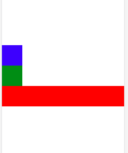
This attribute is mainly for the secondary axis. It specifies the alignments of any children component inside another component towards the secondary axis. How does it work? its flow is very simple, in case if the primary axis has been set as row then the secondary axis will be a column and in case if primary axis has been set as a column, in that case, the secondary axis will be rowing. With this attribute, we can align the children’s components toward the start, end, center, and stretch.
In the below example we are using the attribute alignItems attribute and we are setting its value to stretch, which means in it will expand upto the screen size. We have been learned in the introduction part itself that we can decide the position of children component from the parent component, so here in this example from one parent view component, we are deciding three children components alignment. The way how we are showing the use of stretched parameter of alignments, In the same way, we can set alignments to the end, center, and start. Please see the below example along with the screen of output.
Code:
import React, { Component } from "react";
import { StyleSheet, View } from "react-native";
export default class AlignItemsExample extends Component {
render() {
return (
<View style={flexStyles.containerStyle}>
<View style={flexStyles.blueStyle} />
<View style={flexStyles.greenStyle} />
<View style={flexStyles.redStyle} />
</View>
);
}
}
const flexStyles = StyleSheet.create({
containerStyle: {
flex: 1,
flexDirection: "column", // setting flex direction as the column`.
justifyContent: "center", //setting justify center
alignItems: "stretch" //setting alignItem as the stretched
},
blueStyle: {
width: 60,
height: 60,
backgroundColor: "blue"
},
greenStyle: {
width: 60,
height: 60,
backgroundColor: "green"
},
redStyle: {
/*width: 60,*///here we are not mentioning the width so it will stretched upto size of window
height: 60,
backgroundColor: "red"
}
});
Output:
Advantages of Using React Native Flexbox
There are various advantages of using flexbox with react native some of the importance are given below.
- We can control many children’s components from a parent component, So here control means deciding the layout of the children’s components and shape.
- It is very simple to use because to achieve the same look and feel that we can do with flexBox we need to write more complex code.
- Almost all the platform now supports the Flexbox so need to worry about support
- It perfectly works with any screen size.
Conclusion
From this tutorial we learned about flexBox, it gives power to developers or designers for making the beautiful layout for components, it allows parent components to decide the layout for the children components.
Recommended Articles
This is a guide to React Native Flexbox. Here we discuss important properties, advantages, and examples to implement React Native Flexbox. You can also go through our other related articles to learn more –
