Updated April 1, 2023

Introduction to React Native Grid
A grid layout can be defined as a layout in which components are arranged in form of rows and columns thus providing an easy way of allocating components on user interface without use of positioning and floating values, in order to use grid layout we need to include dependency of react native grid.
Syntax:
Now we will see the basic syntax. Here is the code syntax:
// import react component
import React, { Component } from 'react';
// import stylesheet and view
import { StyleSheet, View } from 'react-native';
// import react grid library
import Grid from 'react-native-grid-component';
// create class
class <ClassName> extends Component {
renderItem = (data, i) => (
// render style on component
);
renderPlaceholderItem =
// write logic to render placeholder item
/>;
render() {
return (
<Grid
style={styles.list}
renderItem={this.renderItem} // call method to render style to item
renderPlaceholder={this.renderPlaceholderItem } // call method to render placeholder item
data={<Data in form of array to be rendered into a grid>}
numColumns={<set number of columns in grid>}
/>
);
}
}
The above syntax shows how to use grid in react native. It first requires importing grid into our code after we add dependency of react grid into our project. In the render method we have used Grid tag and specified different properties of grid. Here <ClassName> represents name of react class, <Data> represents data in form of array which will be populated into grid in form of rows and columns. Number of columns required in the grid can be set using numColumns property. There are some other properties used in the above syntax and explanation of them is provided later in the article.
How Grid Works in React Native?
As you can see from the above syntax, in order to use grid we need to add react native grid dependency into our react native project. Dependency can be added by running the below command:
npm install react-native-grid-componentAfter the above command runs successfully, we can import dependency into our project and use it as per our requirement. The following parameters are availabl:
| Property Name | Is Required/Optional | PropertyType |
| data | Required | Array |
| renderItem | Required | function(data: anydata, n: number) =>ReactElement |
| renderPlaceHolder | Optional | Function(n: number) =>ReactElement |
| numColumns | Optional | Number |
| keyExtractor | Optional | Function(item: object , n: number) => string |
| sections | Optional | Boolean |
In the above table we have listed different properties available in grid tag in react native. Here is a brief description of each of the above properties:
- data: This is an array of data that would be rendered on the grid in form of rows and columns.
- renderItem: Function takes one input at a time from data and transforms it into formatted component to render on User interface.
- renderPlaceHolder: This is an optional component whose type is a function taking a number as input and perform desired logic to return react element.
- keyExtractor: An item is always associated with a key, this is used to extract key corresponding to react component.
- numColumns: This is an integer value that represents the number of columns required in a react grid.
- Sections: This is a Boolean property which is set when we list of data needs to be broken down into logical units of data.
Example
Now we will see react native code example as shown below:
Code:
import React, { Component } from 'react';
import { StyleSheet, View } from 'react-native';
import Grid from 'react-native-grid-component';
const COLOR_COUNT = 10;
export default class App extends Component {
constructor(props) {
super(props);
this.state = {
data: addColorOnGrid(COLOR_COUNT),
refreshing: false,
};
}
dorenderItem = data => (
<View style={[{ backgroundColor: data }, styles.item]} />
);
dorenderPlaceholder = () => <View style={styles.item} />;
render() {
return (
<Grid
style={styles.list}
renderItem={this.dorenderItem}
renderPlaceholder={this.dorenderPlaceholder}
data={this.state.data}
// define number of columns on grid
numColumns={3}
keyExtractor={(item, n) => n.toString()}
refreshing={this.state.refreshing}
// do actions on refresh
onRefresh={() => {
this.setState({
data: addColorOnGrid(COLOR_COUNT),
refreshing: false,
});
}}
/>
);
}
}
const styles = StyleSheet.create({
item: {
flex: 2,
height: 120,
margin: 1.5,
},
list: {
flex: 2,
},
});
// Helper functions
// thanks materialuicolors.co
const colors_arr = [
'#2196F3',
'#03A9F4',
'#00BCD4',
'#009688',
'#4CAF50',
'#8BC34A',
'#CDDC39',
'#FFEB3B',
'#FFC107',
'#FF9800',
'#FF5722'
];
function addColorOnGrid(length) {
return Array.from(Array(length)).map(
() => colors_arr[Math.floor(Math.random() * colors_arr.length)]
);
}
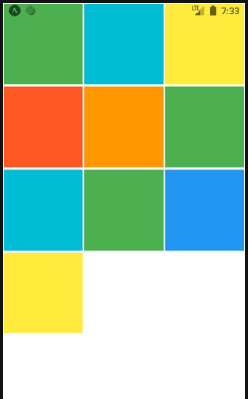
Output:
After executing above code we will see the below output on mobile screen. The grid shown above contains three columns as defined in above code.
Recommended Articles
This is a guide to React Native Grid. Here we also discuss the Introduction, syntax and working of React Native Grid along with example and code implementation. You may also have a look at the following articles to learn more –


