Updated April 7, 2023

Introduction to React Native Keep Awake
There are many instances while using a smartphone when we have to adjust the screen timeout. Screen timeout is a very useful feature in the phone where we can manage the time interval after which the screen will go to sleep. React native also provides a package called to keep awake where we can design our app in such a way that the screen will be active for the amount of time the user wants to keep the app awake. The user can keep the app awake till the time they push the power button, and this feature helps the user while navigating through maps or watching videos.
Syntax:
1. Syntax to import keep awake in React Native.
import { activateKeepAwake
, deactivateKeepAwake } from 'expo-keep-awake';
2. Syntax to use keep awake in React Native.
_activate = () => {
activateKeepAwake();
alert('Screen Will be Awaken Now!');
};
_deactivate = () => {
deactivateKeepAwake();
alert('Screen Time is Back to Normal!');
};
Examples of React Native Keep Awake
Given below are the examples mentioned:
Example #1
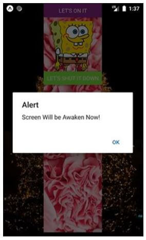
The below code explains the keep awake feature working where 2 buttons enable and disable the keep awake feature.
- Let’s on it: For enabling the keep awake feature.
- Let’s shut it down: For disabling the keep awake feature.
a. App.js
import React from 'react';
import { activateKeepAwake
, deactivateKeepAwake } from 'expo-keep-awake';
import { Button
, View
, Text
, ImageBackground
, StyleSheet
, Image
} from 'react-native';
export default class KeepAwakeExample extends React.Component {
_activate = () => {
activateKeepAwake();
alert('Screen Will be Awaken Now!');
};
_deactivate = () => {
deactivateKeepAwake();
alert('Screen Time is Back to Normal!');
};
render() {
return (
<ImageBackground
source={{
uri:
'https://images.pexels.com/photos/1669072/pexels-photo-1669072.jpeg?auto=compress&cs=tinysrgb&dpr=1&w=500',
}}
style={{flex: 1}}
>
<View style={{ flex: 1
, alignItems: 'center'
, justifyContent: 'center' }}>
<ImageBackground
source={{
uri:
'https://images.pexels.com/photos/4623061/pexels-photo-4623061.jpeg?auto=compress&cs=tinysrgb&dpr=1&w=500',
}}
style={{flex: 1}}
>
<Button
color="#841584"
onPress={this._activate}
title="Let's On It"
/>
<Image
source={{
uri:
'https://pngimg.com/uploads/spongebob/spongebob_PNG63.png',
}}
style={{
height: 130,
marginTop: 10,
width: 150,
}}
/>
<Button
onPress={this._deactivate}
color="#8af547"
title="Let's Shut It Down"
/>
</ImageBackground>
</View>
</ImageBackground>
);
}
}
Output:
i. On the code execution:
ii. On clicking “Let’s-on-it” button:
iii. On clicking “Let’s Shut It Down” button:
Example #2
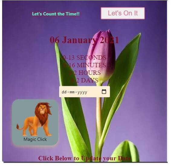
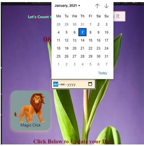
In the below code, we have used keep awake in based calendar application using 2 submit type buttons, “Let’s On It” and “Let’s Shut It Down”. The button “Let’s On It” enables the keep awake feature for an infinite time until the “Let’s Shut It Down” button is clicked to disable the keep awake feature, and every feature of the calendar application is explained below in the output images.
a. App.jsx
import React
, { Component } from "react";
import { View
, Text
, ImageBackground
, StyleSheet
, Image
, TouchableOpacity
} from 'react-native';
import { activateKeepAwake
, deactivateKeepAwake } from 'expo-keep-awake';
import styled from "styled-components";
import Clock from "./Countdown";
import moment from "moment";
import "./styles.css";
const decoration = StyleSheet.create({
titleee: {
fontSize: 28,
fontWeight: 'bold',
textAlign: 'center',
padding: 10,
color: '#a8f740',
},
button: {
backgroundColor: '#859a9b',
alignContent: 'center',
borderRadius: 20,
padding: 10,
height: 140,
marginBottom: 20,
width: 140,
shadowColor: '#f7f560',
shadowOffset: { width: 0
, height: 5 },
shadowRadius: 10,
shadowOpacity: 0.35,
},
docker: {
flex: 1,
padding: 10,
},
styletext:{
textAlign: 'center',
textDecorationColor: "yellow",
color: '#47f5d2',
textShadowColor: "red",
textShadowRadius: 10,
margin: 24,
fontWeight: "bold",
padding: 20,
marginVertical: 4,
textSize: 30,
},
});
const TimeWrapper = styled.section`
text-align: center;
input {
padding: 0.5em;
margin: 0.5em;
background: papayawhip;
border: none;
border-radius: 3px;
}
`;
const Button = styled.button`
color: palevioletred;
font-size: 1em;
margin: 1em;
padding: 0.25em 1em;
border: 2px solid palevioletred;
border-radius: 3px;
`;
export default class KeepAwakeExample extends React.Component {
_activate = () => {
activateKeepAwake();
alert('Screen Will be Awaken Now!');
}
handleClick() {
this.changeDeadline();
}
_deactivate = () => {
deactivateKeepAwake();
alert('Screen Time is Back to Normal!');
}
constructor(props) {
super(props);
this.state = {
deadline: "January 6, 2021",
newDeadline: ""
};
}
changeDeadline() {
this.setState({ deadline: this.state.newDeadline });
}
render() {
return (
<ImageBackground
source={{
uri:
'https://images.pexels.com/photos/36729/tulip-flower-bloom-pink.jpg?auto=compress&cs=tinysrgb&dpr=1&w=500',
}}
style={{flex: 1}}
>
<View style={{ flex: 1
, alignItems: 'center'
, justifyContent: 'center' }}
>
<TimeWrapper className="App">
<Text style={decoration.styletext}>
Let's Count the Time!!</Text>
<Button
color="#841584"
type="submit"
onPress={this._activate}
title="Let's On It"
>
Let's On It
</Button>
<h2>{moment(this.state.deadline).format("DD MMMM YYYY")}</h2>
<Clock deadline={this.state.deadline} />
<input
type="date"
placeholder="new date"
onChange={event => {
this.setState({ newDeadline: event.target.value });
}}
/>
<TouchableOpacity
style={decoration.button}
onPress={()=>{alert("Oops!! you clicked me")}}
>
<ImageBackground
source={{
uri: 'https://pngimg.com/uploads/lion/lion_PNG23267.png'
}}
style={{flex: 1}}
>
</ImageBackground>
<Text>Magic Click<Pop-up>
</Pop-up></Text>
</TouchableOpacity>
<h4>Click Below to Update your Date</h4>
<Button
type="submit"
onClick={() => this.handleClick()}>
Submit Date
</Button>
<Button
onPress={this._deactivate}
type="submit"
color="#8af547"
title="Let's Shut It Down"
>
Let's Shut It Down
</Button>
</TimeWrapper>
</View>
</ImageBackground>
);
}
}
b. Countdown.jsx
import React
, { Component } from "react";
import styled from "styled-components";
const ClockWrapper = styled.div`
display: flex;
flex-direction: column;
`;
var moment = require("moment");
moment().format();
class Clock extends Component {
constructor(props) {
super(props);
this.state = {
days: 0,
hours: 0,
minutes: 0,
seconds: 0
};
}
leadingZero(num) {
return num < 10 ? "0" + num : num;
}
componentDidMount() {
this.getTimeUntil(this.props.deadline);
setInterval(() => this.getTimeUntil(this.props.deadline), 1000);
}
render() {
return (
<ClockWrapper>
<div>{this.leadingZero(this.state.seconds)} SECONDS</div>
<div>{this.leadingZero(this.state.minutes)} MINUTES</div>
<div>{this.leadingZero(this.state.hours)} HOURS</div>
<div>{this.leadingZero(this.state.days)} DAYS</div>
</ClockWrapper>
);
}
getTimeUntil(deadline) {
const time = Date.parse(
deadline) - Date.parse(
new Date()
);
const days = Math.floor(
time / (
1000
* 60
* 60
* 24
));
const hours = Math.floor(
(
time / (
1000
* 60
* 60
)
) % 24);
const minutes = Math.floor(
(
time / 1000 / 60
) % 60);
const seconds = Math.floor(
(
time / 1000
) % 60);
this.setState({
days: days,
hours: hours,
minutes: minutes,
seconds: seconds
});
}
}
export default Clock;
c. index.js
import React from "react";
import ReactDOM from "react-dom";
import Application from "./App";
const rootElement = document.getElementById("root");
ReactDOM.render(
<Application />
, rootElement
);
d. styles.css
.App {
font-size: 20px;
font-family: 'Times New Roman'
, Times
, serif;
color: #80081c;
text-align: center;
}
Output:
i. On code execution:
ii. On clicking “calendar icon”:
iii. On setting the desired date:
iv. On clicking “Magic Click” button:
Conclusion
On the basis of the above article, It takes the reader through different examples for understanding the implementation according to the app’s requirements. This article also explains the working and syntax.
Recommended Articles
This is a guide to React Native Keep Awake. Here we discuss the introduction, syntax and examples of React Native Keep Awake with code implementation. You may also have a look at the following articles to learn more –


