Updated April 5, 2023

Introduction to React Native SafeAreaView
The following article provides an outline for React Native SafeAreaView. SafeAreaView is used to render the content in between the device’s safe area boundaries. This feature is only available for devices with iOS version 11 or its advanced versions. SafeAreaView provides padding to show the areas of the view which are not covered by the toolbars, navigation bars, tab bars and other ancestor views. In addition to this, SafeAreaView also shows the physical limitation of the Phone’s display, such as its size, rounded corners or camera notch. This is a cool option that React Native provides; it makes the application look perfect on the screen.
Syntax:
<SafeAreaView style={{ flex: 1 }}>
<Image>
<View style={{ flex: 1 }}>
<Text>
<Button>
</Button>
</Text>
</View>
</Image>
</SafeAreaView>
Within the SafeAreaView, we can insert Image, View, Text, Button, etc., which help in providing the best user experience in the React Native application.
Examples of React Native SafeAreaView
Given below are the examples mentioned:
Example #1
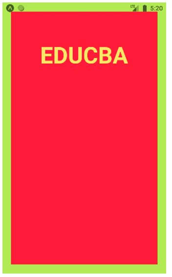
Below we have displayed a basic example where we have styled the Safeareaview using “padding, backgroundColor, borderWidth and borderColor; we have displayed the desired text “EDUCBA” within that Safeareaview.
For the proper execution of the code, the files needed are:
App.js
import React from 'react';
import { StyleSheet
, Text
, SafeAreaView } from 'react-native';
const decoration = StyleSheet.create({
tex: {
flex: 1,
padding: 20,
marginTop: 20,
fontWeight: "bold",
textAlign: "center",
color: "#f7f068",
fontSize: 50,
},
rex: {
flex: 1,
padding: 20,
backgroundColor: "#fa003a",
borderWidth: 20,
borderColor: "#b4fa57",
},
});
const Result = () => {
return (
<SafeAreaView style={decoration.rex}>
<Text style={decoration.tex}>
EDUCBA</Text>
</SafeAreaView>
);
}
export default Result;
Output:
Example #2
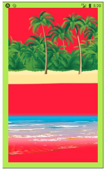
We have styled the SafeAreaView similarly to example 1. Here in the place of text, we have displayed image within the SafeAreaView, directly importing them using their respective URLs.
For the proper execution of the code, the files needed are:
App.js
import React from 'react';
import { StyleSheet
, Text
, SafeAreaView
, Image } from 'react-native';
const decoration = StyleSheet.create({
rex: {
flex: 1,
backgroundColor: "#fa003a",
borderWidth: 20,
borderColor: "#b4fa57",
},
wex:{
flex: 1,
}
});
const Result = () => {
return (
<SafeAreaView style={decoration.rex}>
<Image
source={{ uri: 'http://pngimg.com/uploads/beach/beach_PNG83.png'}}
style={decoration.wex}
/>
<Image
source={{ uri: 'http://pngimg.com/uploads/beach/beach_PNG60.png' }}
style={decoration.wex}
/>
</SafeAreaView>
);
}
export default Result;
Output:
Example #3
Here again, the styling is similar to previously discussed examples. This example is the mixture of previously discussed examples where we have displayed a Text firstly, then an Image and lastly, again a Text, from Top-to-Bottom.
For the proper execution of the code, the files needed are:
App.js
import React from 'react';
import { StyleSheet
, Text
, SafeAreaView
, Image } from 'react-native';
const decoration = StyleSheet.create({
tex: {
flex: 1,
padding: 20,
marginTop: 20,
fontWeight: "bold",
textAlign: "center",
color: "#f7f068",
fontSize: 50,
},
rex: {
flex: 1,
padding: 20,
backgroundColor: "#fa003a",
borderWidth: 20,
borderColor: "#b4fa57",
},
wex:{
flex: 1.1,
padding: 50,
}
});
const Result = () => {
return (
<SafeAreaView style={decoration.rex}>
<Text style={decoration.tex}>
EDUCBA
</Text>
<Image
source={{ uri: 'http://pngimg.com/uploads/husky/husky_PNG48.png' }}
style={decoration.wex}
/>
<Text style={{ fontSize: 16 }}>
EDUCBA(Corporate Bridge Consultancy Pvt Ltd)is an initiative to provide the world’s best skill based education, it was initiated by IIM and IIT Graduates. There are more than 1,000,000 members from 70+ countries who have received skill based training from EDUCBA. EDUCBA provides step by step, online learning plan with more than 5000 courses and 500 above learning paths designed by top professionals of the industry. The trainings are totally job oriented, which aims to skill the participants and make them job ready. EDUCBA has a vision to provide skill based trainings anytime & anywhere and to make the participants job ready EDUCBA allows enrollments 24 hours a day, 7 days a week and 365 days a year. The courses are self paced, so learn at your preferred place, time and pace.The participants can make their own preffered schedule for their study.
</Text>
</SafeAreaView>
);
}
export default Result;
Output:
Example #4
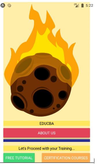
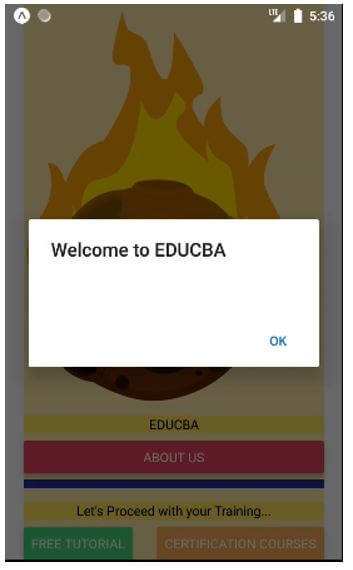
Below example is an advanced version of Safeareaview usage in React Native where we have used 3 buttons in the Safeareaview; the first button is centre aligned when the next 2 buttons adjust themselves according to the text inserted in them. We have styled the Safeareaview using justifyContent, marginHorizontal and backgroundColor. We have also inserted a PNG image with no background at the top. Text is also inserted before every button whose background is styled using textAlign, marginVertical and backgroundColor.
For the proper execution of the code, the files needed are:
App.js
import React from 'react';
import { StyleSheet
, Button
, View
, SafeAreaView
, Text
, Alert
, Image } from 'react-native';
const decoration = StyleSheet.create({
spacer: {
marginVertical: 6,
borderBottomColor: '#292a8c',
borderBottomWidth: 10,
},
fixtext: {
flexDirection: 'row',
justifyContent: 'space-between',
},
heading: {
textAlign: 'center',
marginVertical: 8,
backgroundColor: "#fced62"
},
docker: {
flex: 1,
justifyContent: 'center',
marginHorizontal: 20,
backgroundColor: "#fff1ab",
},
wex:{
flex: 1,
width: 300,
height: 200,
},
});
const Whole = () => (
<SafeAreaView style={decoration.docker}>
<Image
source={{ uri: 'http://pngimg.com/uploads/meteor/meteor_PNG37.png'}}
style={decoration.wex}
/>
<View>
<Text style={decoration.heading}>
EDUCBA
</Text>
<Button
color="#d6315a"
title="ABOUT US"
onPress={() => Alert.alert('Welcome to EDUCBA')}
/>
</View>
<Spacer />
<View>
<Text style={decoration.heading}>
Let's Proceed with your Training...
</Text>
<View style={decoration.fixtext}>
<Button
color="#4eed78"
title="Free Tutorial"
onPress={() => Alert.alert('Welcome to free Trial Courses')}
/>
<Button
color="#f2ab55"
title="Certification Courses"
onPress={() => Alert.alert('Welcome to Certified Courses ')}
/>
</View>
</View>
</SafeAreaView>
);
const Spacer = () => (
<View style={decoration.spacer} />
);
export default Whole;
Output:
Output on the PROPER execution:
Output on “ABOUT US” press:
Output on “FREE TUTORIAL” press:
Output on “CERTIFICATION COURSES” press:
Conclusion
On the basis of the article, we saw the concept of SafeAreaView in React Native. We saw how to apply this while making iOS applications on React Native. This article provides multiple examples to explain the working of SafeAreaView, which will help the readers in applying the concept to their application development projects.
Recommended Articles
This is a guide to React Native SafeAreaView. Here we discuss the introduction and syntax of React Native SafeAreaView along with examples respectively. You may also have a look at the following articles to learn more –
