Updated March 31, 2023

Introduction to React Native Shadow
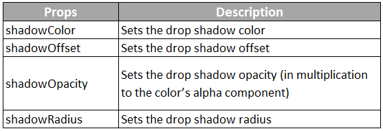
Shadows are used to provide cues about surface edges, the direction of movement, and depth. The only way to determine the surface’s shadow is through its relationship to other surfaces and by its elevation. As shadows tell us about the degree of elevation among surfaces, therefore they should be used consistently throughout the product. There are different props that are used for a shadow in React-Native, these are as follows:
Attributes
Attributes that are supported in React Native for:
1. BorderShadow
- Width: Its value is set as the same as the child
- Color: It is the color of shadow, it doesnot support RGBA now; to set the color, opacity is
- Border: It is the width of the shadow, and it cannot be less than
- Opacity: It is the opacity of the
- Style: It is the style that is added to the wrapper
- Side: “bottom” or “top” wherever one want to display the
- Inset: “false” or “true”, it is similar to CSS-shadow: color
2. BoxShadow
- Width: Its value is set as the same as the child
- Color: It is the color of shadow, it doesnot support RGBA now; to set the color, opacity is
- Border: It is the width of the shadow, and it cannot be less than
- Opacity: It is the opacity of the
- Style: It is the style that is added to the wrapper
- Height: Its value is set as the same as the child
- Radius: Its value is set as the same as the border radius of child
- X: The offsetX of
- Y: The offsetY of
Syntax:
shadowColor: "#000", shadowOffset:{ width: 0,
height: 2,
},
shadowOpacity: 0.25,
shadowRadius: 3.84,
elevation: 5,
How does it work?
Below are the steps:
Step 1: Firstly plugin is installed by running the command
yarn add react-native-shadowStep 2: Configuring the project to support the SVG component
yarn add react-native-svg@X.X.XStep 3: importing {BoxShadow} from ‘react-native-shadow’ and setting object
const shadowOpt = {
width:100,
height:100,
color:"#000",
border:2,
radius:3,
opacity:0.2,
x:0,
y:3,
style:{marginVertical:5}
}
Step 4: Create a shadow element and set an object to the setting.
render = () => {
return (
<View>
<Shadow setting={shadowOpt}>
<View style={{width:100,height:100}}/>
</Shadow>
</View>
)
}
Examples to Implement Shadow in React Native
Below are a few examples of implementing shadow in React Native:
Examples #1 – Drop Shadow Effect Text
Code:
import React, { Component } from 'react'; import { StyleSheet,
View,
Text } from 'react-native';
export default class App extends Component<{}>
{
render()
{
return(
<View style = { styles.MainContainer }>
<Text style={styles.TextShadowStyle}> Welcome To Application </Text>
</View>
);
}
}
const styles = StyleSheet.create(
{
MainContainer:
{
flex: 1,
justifyContent: 'center', alignItems: 'center',
},
TextShadowStyle:
{
textAlign: 'center', fontSize: 30, textShadowColor: '#1ee9b3',
textShadowOffset: { width: 2, height: 6 }, textShadowRadius: 5
}
});
Output:
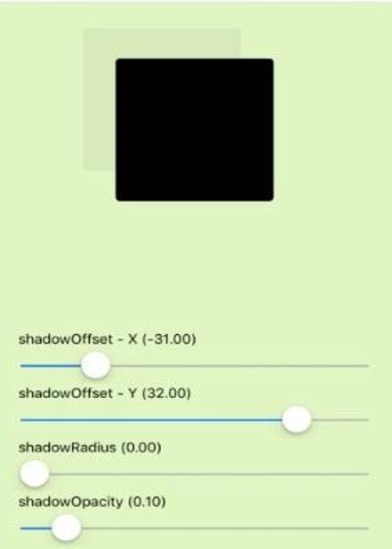
Examples #2 – Simple Shadow
Code:
import React, { useState } from "react";
import { Text, View, StyleSheet, Slider } from "react-native";
function ShadowPropSlider({ label, value, ...props }) { return (
<>
<Text>
{label} ({value.toFixed(2)})
</Text>
<Slider step={1} value={value} {...props} />
</>
);
}
export default function App() {
const [shadowOffsetWidth, setShadowOffsetWidth] = useState(0); const [shadowOffsetHeight, setShadowOffsetHeight] = useState(0); const [shadowRadius, setShadowRadius] = useState(0);
const [shadowOpacity, setShadowOpacity] = useState(0.1);
return (
<View style={styles.container}>
<View
style={[ styles.square,
{
shadowOffset: {
width: shadowOffsetWidth, height: -shadowOffsetHeight
},
shadowOpacity,
shadowRadius
}
]}
/>
<View style={styles.controls}>
<ShadowPropSlider label="shadowOffset - X" minimumValue={-50} maximumValue={50} value={shadowOffsetWidth}
onValueChange={val => setShadowOffsetWidth(val)}
/>
<ShadowPropSlider label="shadowOffset - Y" minimumValue={-50} maximumValue={50} value={shadowOffsetHeight}
onValueChange={val => setShadowOffsetHeight(val)}
/>
<ShadowPropSlider label="shadowRadius" minimumValue={0} maximumValue={100} value={shadowRadius}
onValueChange={val => setShadowRadius(val)}
/>
<ShadowPropSlider label="shadowOpacity" minimumValue={0} maximumValue={1}
step={0.05}
value={shadowOpacity}
onValueChange={val => setShadowOpacity(val)}
/>
</View>
</View>
);
}
const styles = StyleSheet.create({ container: {
flex: 1,
justifyContent: "space-around", backgroundColor: " #e1f5c1", padding: 8
},
square: {
alignSelf: "center", backgroundColor: "black", borderRadius: 4,
height: 150, shadowColor: "grey", width: 150
},
controls: { paddingHorizontal: 12
}
});
Output:
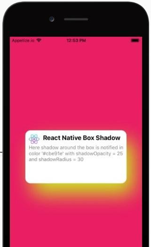
Example #3 – Adding Shadow Around the Box
Code:
import * as React from 'react'; import { Text,
View, StyleSheet,
Image } from 'react-native';
import Constants from 'expo-constants';
const profileImg ="https://reactnativemaster.com/wp- content/uploads/2019/11/React-native-master-logo-only.png"
export default class App extends React.Component { render() {
return (
<View style={styles.container}>
<View style={styles.card}>
<View style={styles.header}>
<Image style={styles.profileImg} source={{uri: profileImg}} />
<Text style={{fontWeight:"bold",fontSize:18}}>React Native Box Shadow</Text>
</View>
<Text style={{color:"gray"}}>Here shadow around the box is notified in color '#cbe91e' with shadowOpacity = 25 and shadowRadius = 30
</Text>
</View>
</View>
);
}
}
const styles = StyleSheet.create({ container: {
flex: 1,
justifyContent: 'center',
paddingTop: Constants.statusBarHeight, backgroundColor: '#e91e63',
padding: 8, alignItems:"center"
},
card:{
height:150, width:"80%",
backgroundColor:"white", borderRadius:15, padding:10, elevation:10, shadowColor: '#cbe91e',
shadowOffset: { width: 20, height: 30 }, shadowOpacity: 25,
shadowRadius: 30,
},
profileImg:{ width:30, height:30, borderRadius:50, marginRight:10,
},
header: { flexDirection:"row",
}
});
Output:
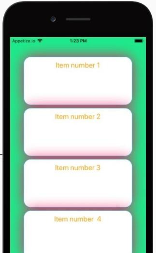
Example #4 – Styling Shadow for Trail of Boxes
Code:
import React, { Component } from 'react';
import { StyleSheet, Text, View } from 'react-native'; import styled from 'styled-components';
const Container=styled.View` flex:1;
padding:50px 0;
justify-content:center; background-color:#1ee98a;
align-items:center
const Title=styled.Text` font-size:20px;
text-align:center; color:orange;
const Item=styled.View` flex:1;
border:1px solid #1eafe9; margin:4px 0;
border-radius:20px;
box-shadow:0 0 20px #e91e63; background-color:#fff; width:80%;
padding:10px;
export default class App extends Component { render() {
return (
<Container>
<Item >
<Title >Item number 1</Title>
</Item>
<Item >
<Title >Item number 2</Title>
</Item>
<Item >
<Title >Item number 3</Title>
</Item>
<Item >
<Title >Item number 4</Title>
</Item>
</Container>
);
}
}
Output:
Conclusion
On the basis of the above discussion, we got to know that how we can develop shadow effects in React- Native mobile applications. We got to know about the different attributes supported for BoxShadow and BorderShadow. We implemented a shadow effect for Text, for box, and as well as for the border. The syntax of developing a shadow effect is very simple in React-Native. So with a bit of coding one can develop a great user interface with a shadow effect. This effect is basically used to monitor the movement and to get an idea about surface edges.
Recommended Articles
This is a guide to React Native Shadow. Here we discuss the introduction, attributes, working and examples of Shadow in react native along with different examples and code implementation. You may also look at the following articles to learn more –


