Updated April 6, 2023
Introduction to React Native Slider
Slider is defined as the component of React Native which is used for selection of a single value from a range of values. In our mobile phone we can see the slider to increase or decrease the volume or brightness. Sliders come very handy as compared to buttons and increasing or decreasing of volume or brightness or anything can be performed very easily and efficiently with the help of Sliders. React Native offers variety of sliders like Multiple Slider, Awesome Slider, Custom Slider, etc. Some of the different props used to build up the Slider are mentioned in the table below:
| Props | Description |
| style | It is used in styling and designing of the slider. |
| disable | Its default value is FALSE and if it is set to TRUE, then the slider can’t be moved. |
| maximumValue | Its default value is 1. It is the maximum value of the slider at the initial stage. |
Syntax:
- Syntax to import Slider:
import Slider from '@react-native-community/slider'
<Slider maximumValue={100} minimumValue={0} step={1} value='initial value' />- Syntax to import Intro Slider:
<AppIntroSlider slides={Data related to the slides like FlatList} onDone={Handler for done button click} showSkipButton={default not}
onSkip={Handler for skip button click} />
How does Slider Work in React Native?
Below we learn how slider work in react native:
1. Installing Slider Library
Code:
npm install @react-native-community/slider –saveor
yarn add @react-native-community/slider2. Using Slider Library
Code:
import React, { Component } from 'react';
import { Slider, View, Text, StyleSheet } from 'react-native';
export default class App extends Component { constructor(props) {
super(props); this.state = {
sliderValue: '10',
};
}
render() { return (
<View style={styles.container}>
<Text style={{ color: '#000000' }}>
Slider Value is : {this.state.sliderValue}
</Text>
<Slider maximumValue="100" minimumValue="0" step="1"
value={this.state.sliderValue}
onValueChange={sliderValue => this.setState({ sliderValue })}
/>
</View>
);
}
}
const styles = StyleSheet.create({ container: {
flex: 1,
padding: 19, justifyContent: 'center', backgroundColor: '#ffef8a',
},
});
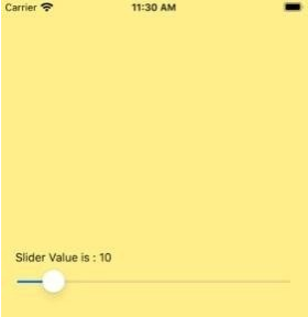
Output:
Image 1
Examples
Below are the Examples mentioned:
1. Multiple Sliders
Code:
import React, {Component} from 'react';
import {Slider, Platform, StyleSheet, Text, View} from 'react-native';
export default class App extends Component{ constructor(props) {
super(props); this.state = {
singleSliderValues: [], multiSliderValues: [],
}
}
render() { return (
<View style={styles.container}>
<Text style={styles.title}>Slide Right to Raise Volume of Ringtone</Text>
<Slider min={0} max={9}
LRpadding={45} callback={this.multiSliderValueCallback} single={false}
/>
<Text style={styles.title}>Slide Right to Raise Notification Sound</Text>
<Slider min={0} max={9}
LRpadding={45} callback={this.singleSliderValueCallback} single={true}/>
<Text style={styles.title}>Slide Right to Raise Volume of Alarm</Text>
<Slider min={0} max={9}
LRpadding={45} callback={this.multiSliderValueCallback} single={false}
/>
</View>
);
}
singleSliderValueCallback =(values)=> { this.setState({singleSliderValues : values})
}
multiSliderValueCallback = (values) => { this.setState({multiSliderValues : values})
}
multiSliderValueCallback = (values) => { this.setState({multiSliderValues : values})
}
}
const styles = StyleSheet.create({ container: {top:50,backgroundColor: '#baff52',},
title:{ padding:25, fontSize:19,
}
})
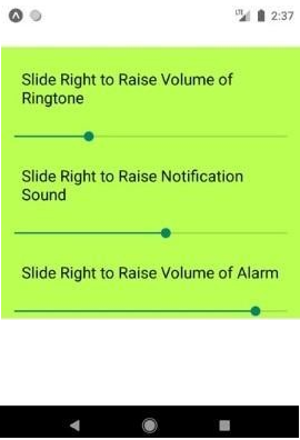
Output:
Image 2 shows different multi sliders. These are the basic version of the multi sliders in React Native.
Image 2
2. Basic Intro Slider
Code:
import React from 'react';
import { StyleSheet, View, Text } from 'react-native';
import AppIntroSlider from 'react-native-app-intro-slider';
export default class App extends React.Component { constructor(props) {
super(props); this.state = {
showRealApp: false,
};
}
_onDone = () => {this.setState({ showRealApp: true });};
_onSkip = () => {this.setState({ showRealApp: true });
};
render() {
if (this.state.showRealApp) {
return (<View style={{ flex: 1, justifyContent: 'center', alignItems: 'center', padding: 51,}}>
<Text>
This will be your screen displayed when you click Done button at last or Skip from any slide
</Text>
</View>
);
} else {
return (
<AppIntroSlider slides={slides}
onDone={this._onDone}
showSkipButton={true}
onSkip={this._onSkip}
/>
);
}
}
}
const styles = StyleSheet.create({ image: {width: 199,height: 199,},
text: {
color: '#575446',
fontSize: 21,
},
title: { fontSize: 29,fontWeight: 'bold', color: '#f5f3eb',backgroundColor: 'transparent', textAlign: 'center',marginTop: 16,},});
const slides = [
{key: 's1',
title: 'Flight Booking', titleStyle: styles.title,
text: 'Flat 75% off on Your First Flight Booking', image: {
uri:'http://aboutreact.com/wp- content/uploads/2018/08/flight_ticket_booking.png',},imageStyle: styles.image, backgroundColor: '#4295ed',},
{
key: 's2',
text: 'Best Mobile Recharge offers',
title: 'Mobile Recharge both PrePaid and PostPaid', titleStyle: styles.title,
textStyle: styles.text, image: {
uri:'http://aboutreact.com/wp- content/uploads/2018/08/mobile_recharge.png',
},
imageStyle: styles.image, backgroundColor: '#db4cf5',
},
{
key: 's3',
title: 'Amazing Deals', titleStyle: styles.title,
text: ' Amazing Deals on all services by us', image: {
uri: 'http://aboutreact.com/wp- content/uploads/2018/08/best_deals1.png',
},
imageStyle: styles.image, backgroundColor: '#fadd4b',
},
{
key: 's4',
title: 'Great Offers on UPI Payments', titleStyle: styles.title,
text: 'Enjoy Great offers on our all UPI paymets', image: {
uri: 'http://aboutreact.com/wp- content/uploads/2018/08/discount1.png',
},
imageStyle: styles.image, backgroundColor: '#ff4f6f',
},
{
key: 's5',
title: 'Train Booking', titleStyle: styles.title,
text: ' 15% off on every Train booking', image: {
uri:'http://aboutreact.com/wp- content/uploads/2018/08/train_ticket_booking.png',
},
imageStyle: styles.image, backgroundColor: '#89fa55',
},
{
key: 's6',
title: 'Bus Booking', titleStyle: styles.title,
text: 'Super Saving Offers on all Bus Bookings',
image: { uri:'http://aboutreact.com/wp- content/uploads/2018/08/bus_ticket_booking.png',
},
imageStyle: styles.image, backgroundColor: '#eb0000',
},
];
Output:
Image 3, Image 4, Image 5, Image 6, Image 7 and Image 8 shows the different slides of an app intro slider while Image 9 shows the window that will appear when ‘Skip’ from any slide or ‘Done’ from last slide is been clicked.
Image 3 and Image 4
Image 5 and Image 6
Image 7 and Image 8
Image 9
Conclusion
We came across various sliders in our day-to-day life and these sliders help us in making our work much easier. With the help of slider, one can reach from minimum to maximum value within seconds just with a gesture over the screen. On the basis of the above discussion, we got to know what React Native Slider is and also got to know about different props that can be used to develop a Slider. We have also discussed about the syntax and working. The examples shared above shows how different sliders like basic slider, multiple sliders, app intro slider, etc. can be efficiently developed in React Native. React Native has a variety of options to develop sliders in a very efficient and easy manner which helps in providing the best user interface for mobile applications.
Recommended Articles
This is a guide to React Native Slider. Here we discuss the introduction, syntax, and working along with examples and code implementation. You can also go through our other suggested articles to learn more –


