Updated March 29, 2023
Introduction to React Native Swiper
A Swiper can be defined as the most latest free mobile touch slider, which comes with amazing native behavior and with hardware accelerated transitions. It is majorly used in mobile native/ hybrid applications, mobile websites, and mobile web applications. The major drawback of Swiper is that it is not compatible with call platforms so it is a present-day touch slider that is majorly focused on present-day platforms or applications to bring the best user experience and user interface. In the Iconic Framework, Swiper is a default slider component. Framework7, which is a fully-featured framework for building Android & iOS applications, consists of Swiper and other great components. It acts as the best platform to develop swipers, and they can be developed very efficiently to React Native. In this topic, we are going to learn about React Native Swiper.
Syntax of importing React Native Swiper
import React, { Component } from "react";
import Swiper from "react-native-custom-swiper";
OR
import React from "react";
import {View,Text,StyleSheet} from "react-native";
import Swiper from "react-native-web-swiper";
How to Create Swiper in React Native?
Here are the following examples of creating Swiper.
Example #1
Simple Swiper in React Native
Code:
import React, { Component } from 'react';
import { StyleSheet,
View,
Text } from 'react-native';
import Swiper from 'react-native-swiper';
export default class App extends Component { render() {
return (
<Swiper style={styles.wrapper} showsButtons>
<View style={styles.slide1}>
<Text style={styles.text}>Slide1</Text>
</View>
<View style={styles.slide2}>
<Text style={styles.text}>Slide2</Text>
</View>
</Swiper>
);
}
}
const styles = StyleSheet.create({ wrapper: {
},
slide1: { flex: 1,
justifyContent: 'center', alignItems: 'center',
},
slide2: { flex: 1,
justifyContent: 'center', alignItems: 'center',
},
text: {
color: '#0a0a0a', fontSize: 25, fontWeight: 'bold'
}
});
Output:
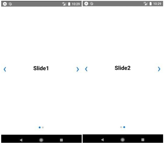
Image 1 and Image 2 shows how a simple Swiper has been developed in React Native-based application.
Image 1 and Image 2
Example #2
Swiper with Background Colours
Code:
import React, { Component } from 'react'; import { StyleSheet
, View
, Text } from 'react-native';
import Swiper from 'react-native-swiper';
export default class App extends Component { render() {
return (
<Swiper style={styles.wrapper} showsButtons>
<View style={styles.slide1}>
<Text style={styles.text}>Welcome to Swiper</Text>
</View>
<View style={styles.slide2}>
<Text style={styles.text}>You are beautiful</Text>
</View>
<View style={styles.slide3}>
<Text style={styles.text}>You are amazing</Text>
</View>
</Swiper>
);
}
}
const styles = StyleSheet.create({ wrapper: {
},
slide1: { flex: 1,
justifyContent: 'center', alignItems: 'center', backgroundColor: '#caff75'
},
slide2: { flex: 1,
justifyContent: 'center', alignItems: 'center', backgroundColor: '#fffa73'
},
slide3: { flex: 1,
justifyContent: 'center', alignItems: 'center',
backgroundColor: '#6cf5d9'
},
text: {
color: '#6e596d', fontSize: 25, fontWeight: 'bold'
}
});
Output:
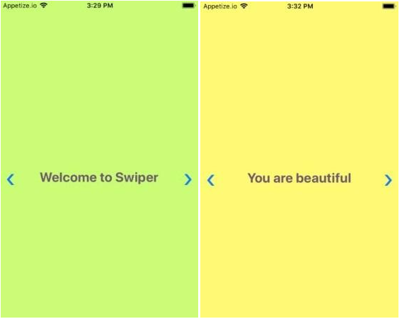
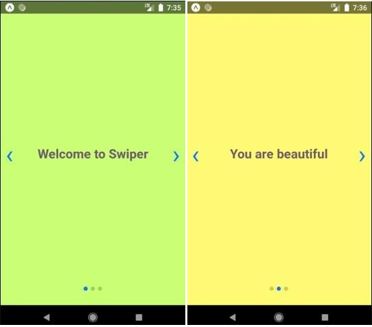
Image 3, Image 4, and Image 5 show how Swiper with different background colors works in the iOS-based platform. Image 6, Image 7, and Image 8 show how Swiper with different background colors works in the Android-based platform.
Image 3 and Image 4
Image 5
Image 6 and Image 7
Image 8
Example #3
Swiper with Swiping through Prev and Next Buttons
Code:
import React from "react";
import {View,Text,StyleSheet} from "react-native"; import Swiper from "react-native-web-swiper";
const styles = StyleSheet.create({ container: {
flex: 1
},
slideContainer: { flex: 1,
alignItems: "center", justifyContent: "center"
},
slide1: {
backgroundColor: "#ffbb45"
},
slide2: {
backgroundColor: "#3bbceb"
},
slide3: {
backgroundColor: "#ed3b9d"
},
});
export default class Screen extends React.Component { render() {
return (
<View style={styles.container}>
<Swiper>
<View style={[styles.slideContainer,styles.slide1]}>
<Text>Slide A</Text>
</View>
<View style={[styles.slideContainer,styles.slide2]}>
<Text>Slide B</Text>
</View>
<View style={[styles.slideContainer,styles.slide3]}>
<Text>Slide C</Text>
</View>
</Swiper>
</View>
)
}
}
Output:
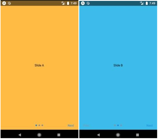
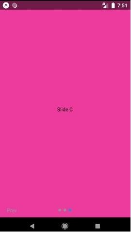
Image 9, Image 10 and Image 11 shows a swiper with Prev and Next button to swipe through next and previous slides.
Image 9 and Image 10
Image 11
Example #4
Swiper with Modal
Code:
import React, { Component } from "react";
import { Text, View, Modal, Dimensions } from "react-native"; import Swiper from "react-native-swiper";
import { Button } from "react-native-elements";
var width = Dimensions.get("window").width; var height = Dimensions.get("window").height;
export default class extends Component { constructor(props) {
super(props); this.state = {
items:[
{ css: thisstyles.slide1, title: "Hello! Welcome to Swiper" },
{ css: thisstyles.slide2, title: "Display 1" },
{ css: thisstyles.slide3, title: "Display 2" },
{ css: thisstyles.slide4, title: "Display 3" }
],
modalVisible: false
};
}
componentDidMount() {
}
toggleModalVisible = () => {
this.setState({ modalVisible: !this.state.modalVisible });
};
renderFullScreen() {
if (!this.state.modalVisible) { return null;
}
return (
<Modal
isVisible={this.state.visible} backdropOpacity={0.1} swipeDirection="left" onSwipe={this.closeModal} onBackdropPress={this.closeModal}
>
<View style={thisstyles.modalFullScreen}>
<Text>Component and text are present here</Text>
<Swiper style={thisstyles.wrapper} showsButtons={true}>
{this.state.items.map((item, key) => { console.log("item", item);
return (
<View key={key} style={item.css}>
<Text style={thisstyles.text}>{item.title}</Text>
</View>
);
})}
</Swiper>
</View>
</Modal>
);
}
render() { return (
<Swiper style={thisstyles.wrapper} showsButtons={true}>
{this.state.items.map((item, key) => { console.log("item", item);
return (
<View key={key} style={item.css}>
<Text style={thisstyles.text}>{item.title}</Text>
{this.renderFullScreen()}
<Button
title="modal"
onPress={() => this.toggleModalVisible()} icon={{ name: "close", type: "bold" }}
/>
</View>
);
})}
</Swiper>
);
}
}
const thisstyles = { modalFullScreen: {
height: height, width: width
},
wrapper: {}, slide1: {
flex: 1,
justifyContent: "center", alignItems: "center", backgroundColor: "#c769fa"
},
slide2: { flex: 1,
justifyContent: "center", alignItems: "center", backgroundColor: "#f369fa"
},
slide3: { flex: 1,
justifyContent: "center", alignItems: "center", backgroundColor: "#fa6994"
},
slide4: { flex: 1,
justifyContent: "center", alignItems: "center", backgroundColor: "#ffe263"
},
text: {
color: "#615e4f", fontSize: 25, fontWeight: "italic"
}
};
Output:
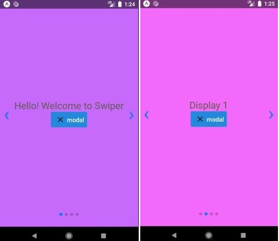
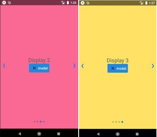
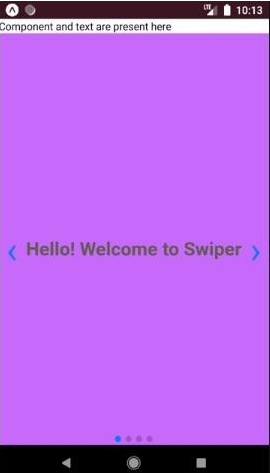
Image 12, Image 13, Image 14, and Image 15 shows a swiper with the modal present, and Image 16 shows the window that will appear with text at the top when the modal is clicked.
Image 12 and Image 13
Image 14 and Image 15
Image 16
Conclusion
On the basis of the above discussion, we got to know that Swipers are just the upgraded versions of the sliders, and we also got to know about different types of Swipers that can be developed in a based application. We have developed various types of Swipers like:
- Simple Swiper
- Swiper with Background Colour
- Swiper with Prev and Next Button
- Swiper with Modal
Although many more swipers can also be developed in React-Native-based applications like Swiper with gif, Swiper with Animations, etc. One can develop swipers very easily and too efficiently in React Native. It provides various options to develop these Swipers and also provides the best user interface and user experience.
Recommended Articles
This is a guide to React Native Swiper. Here we discuss the introduction, syntax, and examples to Create Swiper in React Native along with code implementation. You may also have a look at the following articles to learn more –

