Updated April 3, 2023
Introduction to React-Native Switch
React-Native Switch is a component controlled by Boolean which assigns its value to true or false. To update the value prop in respect of the component to reflect user actions, on Value Change callback method of React-Native Switch is used. If there is no update in the valueprop the component won’t be able to give the expected result for user action instead it will continuously provide the supplied value. The props of the Switch are disabled, trackColor, ios_backgroundColor, onValueChange, testID, thumbColor, tintColor, value. The major used props of the Switch are on Value Change (invoked with the change in switch value) and value (switchvalue).
Syntax to import the Switch in React Native:
import { Switch} from 'react-native'
<Switch
onValueChange={ (value) =? this.setState({ toggled: value })}
value={ this.state.toggled }
/>
Syntax to use Render in the Switch:
<Switch onValueChange= {handlerHere} value = {Pre decided value ifany}/>How Switch Component works in React-Native?
The working of switch component in react native is defined in the following steps:
Step 1: For logic, HomeContainer component is used, and in the code below presentational component is created with the help of new file SwitchExample.js.
Step 2: To toggle switch items in SwitchExamplecomponent, the value has been passed from the state and functions. For updating the state Toggle functions are used. Switch component takes two props. When a user presses the switch, the onValueChange prop will trigger the toggle functions. To the state of the HomeContainer component, the value prop is bounded. If Switch is pressed, the state will be updated and one can check the values in the console, before that values bounded to default.
Logic and Presentation of Switch in the Application
Given below is the coding for logic and presentation of switch in the application:
Code:
import React, { Component } from 'react'
import {StyleSheet, Switch, View, Text} from 'react-native'
export default class SwitchExample extends Component {
state = {
switchValue: false
};
render() {
return (
<View style={styles.container}>
<Text style={styles.textStyle}>This is an Example of
Switch</Text>
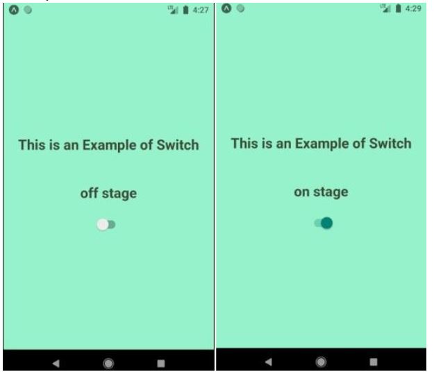
<Text style={styles.textStyle}>{this.state.switchValue ? 'on stage' :'off stage'}</Text>
<Switch
value={this.state.switchValue} onValueChange
={(switchValue)=>this.setState({switchValue})}/>
</View>
);
}
}
const styles = StyleSheet.create({ container:{
flex:1,
alignItems: 'center', justifyContent: 'center', backgroundColor: '#96f2ca',
},
textStyle:{
margin: 25,
fontSize: 24, fontWeight: 'bold', textAlign: 'center', color: '#3a4a35'
}
})
Output:
Examples of React Native Switch
Given below are the examples:
Example #1
React Native Switch.
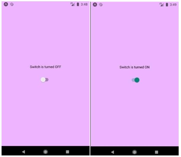
In the example below, initially the Switch value is set to “FALSE” and display TEXT with “OFF”. When there is change of the value of Switch to “TRUE” by calling onValueChange the component of TEXT will reset to“ON”.
Code:
import React from 'react';
import { Switch
,Text
,View
, StyleSheet } from 'react-native';
export default class App extends React.Component{ state = { switchValue: false };
toggleSwitch = value =>{ this.setState({ switchValue: value});
};
render() { return (
<View style={styles.container}>
<Text>{this.state.switchValue ? 'Switch is turned ON' : 'Switch is turned OFF'}</Text>
<Switch
style={{ marginTop: 31 }} onValueChange={this.toggleSwitch} value={this.state.switchValue}
/>
</View>
);
}
}
const styles = StyleSheet.create({ container: {
flex: 1,
justifyContent: 'center', alignItems: 'center', backgroundColor: '#edb5ff',
},
});
Output:
Example #2
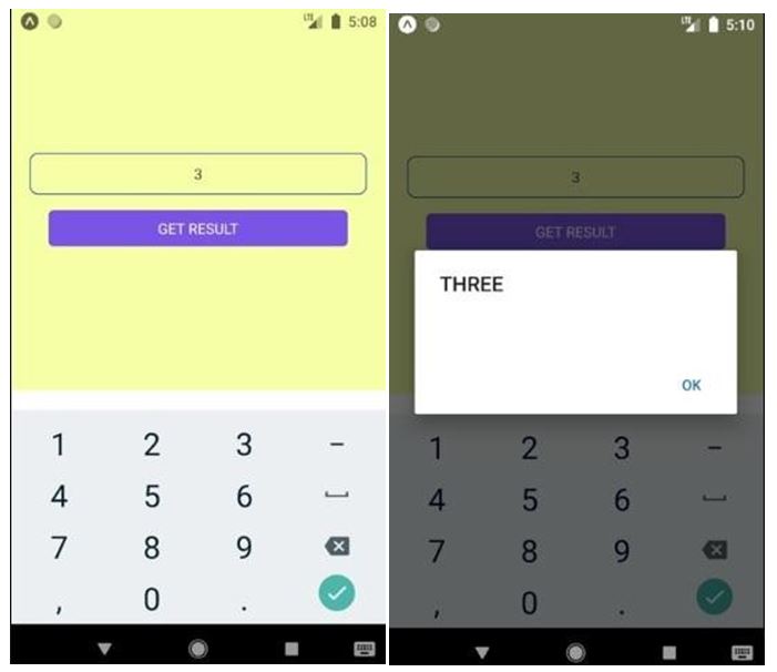
Using Switch Case Statement in React Native.
Code:
import React, { Component } from 'react';
import { Platform, StyleSheet, View, TextInput, TouchableOpacity, Alert, Text } from 'react-native';
export default class App extends Component { constructor(){
super(); this.state={
TextInput_Data : ''
}
}
checkSwitch=(param)=>{ switch(param) {
case '1':
this.ONE(); break;
case '2':
this.TWO(); break;
case '3':
this.THREE(); break;
case '4':
this.FOUR(); break;
default:
Alert.alert("NUMBER NOT FOUND");
}
}
ONE=()=>{
Alert.alert("ONE");
} TWO=()=>{
Alert.alert("TWO");
}
THREE=()=>{
Alert.alert("THREE");
}
FOUR=()=>{
Alert.alert("FOUR");
}
render() { return (
<View style={styles.MainContainer}>
<TextInput
placeholder="Enter Value Here"
onChangeText={data =>this.setState({ TextInput_Data: data })} style={styles.textInputStyle} underlineColorAndroid='transparent'
keyboardType = {"numeric"}
/>
<TouchableOpacityonPress={this.checkSwitch.bind(this, this.state.TextInput_Data)} activeOpacity={0.6} style={styles.button} >
<Text style={styles.TextStyle}> GET RESULT </Text>
</TouchableOpacity>
</View>
);
}
}
const styles = StyleSheet.create({ MainContainer: {
flex: 1,
paddingTop: (Platform.OS) === 'ios' ?20 : 0, justifyContent: 'center',
alignItems: 'center', backgroundColor: '#f6ffa6', marginBottom: 20
},
textInputStyle: { height: 40,
width: '90%', textAlign: 'center', borderWidth: 1, borderColor:'#033ea3', borderRadius: 8,
marginBottom:15
},
button: { width: '80%',
padding: 8, backgroundColor:'#7a53e6', borderRadius:5, justifyContent: 'center', alignItems:'center'
},
TextStyle:{
color:'#ffffff', textAlign:'center',
}
});
Output:
Example #3
Customisable Switch Component for React Native.
Code:
import React, { Component } from 'react'; import { StyleSheet
,Text
,View
, Switch
, Alert } from 'react-native';
export default class App extends Component { constructor() {
super(); this.state = {
SwitchOnValueHolder: false
}
}
ShowAlert = (value) =>{ this.setState({
SwitchOnValueHolder: value
})
if (value == true) {
Alert.alert("You have truned ON the Switch.");
}
else {
Alert.alert("You have turned OFF the Switch.");
}
}
render() { return (
<View style={styles.container}>
<Text style={styles.text}> It is a Switch </Text>
<Switch
onValueChange={(value) =>this.ShowAlert(value)} style={{ marginBottom: 10 }} value={this.state.SwitchOnValueHolder} />
</View>
);
}
}
const styles = StyleSheet.create({ container: {
flex: 1,
justifyContent: 'center', alignItems: 'center', backgroundColor: '#afff63',
},
text: { fontSize: 19,
color: '#000000',
},
});
Output:
Below image shows the window that will appear when Switch is turned ON and Switch is turned OFF respectively.
When Switch is in ONstate:
When Switch is in OFFstate:
Conclusion
Here we got to know that the Switch value can be set to ON when the value prop is set to TRUE and the Switch value can be set to OFF when the valueprop is set to FALSE which is also the default value of valueprop. We have also seen the working of the Switch in React-Native from creating a file then to logic then finally to presentation. We also got to know about how to develop a simple switch, developing switch using a switch case statement and also developing a customizable switch. In React-Native switch can be developed very easily and very efficiently.
Recommended Articles
This is a guide to React-Native Switch. Here we discuss the introduction, how switch component works in react-native and examples. You may also have a look at the following articles to learn more –


