Updated April 20, 2023

Introduction to React Native Theme
The following article provides an outline for React Native Theme. Themes are one of the essential parts of any application or website. Themes help us to change the colors, graphics of any application according to our choice or comfort. It also supports different themes for its applications. The themes can be used to define custom colors according to the brand. In recent times, users are spending a great amount of time in front of a screen and it affects our eyes. The Dark theme has helped to decrease the effect caused by the screen to our eyes. Dark Theme is being considered as one of the best technology up-gradation lately. It also supports the light theme or the dark theme, which the user can choose according to the daytime or their preferences.
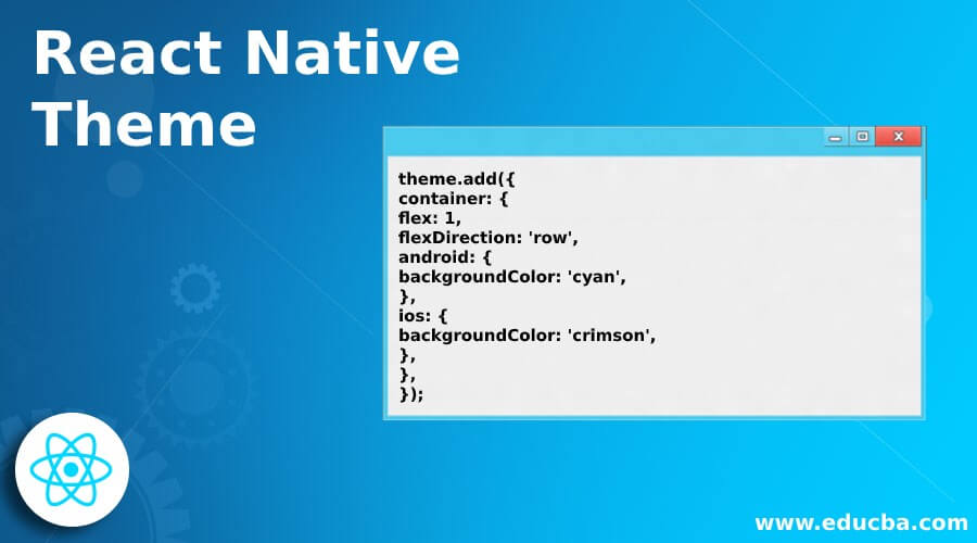
Syntax to Add Theme :
theme.add({
container: {
flex: 1,
flexDirection: 'row',
android: {
backgroundColor: 'cyan',
},
ios: {
backgroundColor: 'crimson',
},
},
});
Themes in React Native
Given below are the themes:
1. Light and Dark Themes
Lately, the operating systems have provided the in-built dark and light modes and this has forced the app developers to provide the modes in their apps itself to fulfill the user expectations. The users have now understood the benefits of Dark Mode and having it in the OS itself has increased the benchmark for the apps. So, now it also provides built in Dark and light themes in React Navigation.
2. Basic Themes
The theme prop can be changed dynamically which helps in the automatic up-gradation of all the components to the new theme. We can define custom colors according to our choices. These custom colors define the different themes of an application.
Examples
Given below are the examples mentioned:
Example #1
Basic Example of React Native Theme.
In the example below, we have used ThemeProvider to set the theme colors of the primary props and the secondary props. The ThemeProvider is imported from ‘styled-components’.
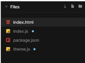
The files used in to implement the code below are:
a. index.html
<div id="root"></div>b. index.js
import React from 'react';
import { render } from 'react-dom';
import styled
, { ThemeProvider } from 'styled-components';
import theme from "./theme";
const Title = styled.h1`
color: ${ props => {
if (props.primary) return props.theme.colors.primary;
if (props.secondary) return props.theme.colors.secondary;
return props.theme.colors.text;
}};
font-size: ${props => {
if (props.xl) return props.theme.fontSize.xl;
if (props.lg) return props.theme.fontSize.lg;
if (props.md) return props.theme.fontSize.md;
if (props.sm) return props.theme.fontSize.sm;
return props.theme.fontSize.nm;
}};
font-weight: ${props => props.thin ? "normal" : "bold"};
text-transform: ${props => {
if (props.capitalize) return "capitalize";
if (props.uppercase) return "uppercase";
return "none";
}}
const App = () => (
<ThemeProvider theme={theme}>
<div>
<Title primary xl>Heyoo Rahul</Title>
<Title secondary lg>Welcome to EduCBA!</Title>
<Title sm uppercase bold>We are best training providers on latest Emerging technologies!</Title>
</div>
</ThemeProvider>
);
render(<App />, document.getElementById('root'));
c. theme.js
export default {
colors: {
primary: "crimson",
secondary: "LightGreen",
text: "blue"
},
fontSize: {
xl: "1.4rem",
lg: "4.8rem",
md: "2.3rem",
nm: "1rem",
sm: "1.75rem"
}
}
Output:
Example #2
Dark Theme.
In the example below, we have used MuiThemeProvider, createMuiTheme to provide the theme to the application. Users can toggle between different themes, i.e. light theme and dark theme with the help of the button in the bottom-left of the screen.
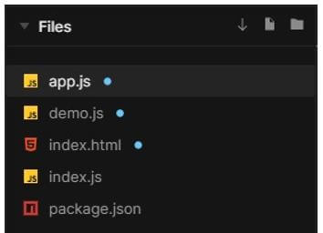
The files used in to implement the code below are:
a. app.js
import React
, { useState } from "react";
import { Image
, StyleSheet
, Text
, View } from "react-native";
import { MuiThemeProvider
, createMuiTheme } from "@material-ui/core/styles";
import Demo from "./demo";
const App = () => {
const [theme, setTheme] = useState({
palette: {
type: "light"
}
});
const toggleDarkTheme = () => {
let newPaletteType = theme.palette.type === "light" ? "dark" : "light";
setTheme({
palette: {
type: newPaletteType
}
});
};
const muiTheme = createMuiTheme(theme);
return (
<MuiThemeProvider theme={muiTheme}>
<Image
accessibilityLabel="Teatro Solís"
source={{
uri: "https://cdn.educba.com/images/website_logo_transparent_background_white.png"
}}
resizeMode="contain"
style={styles.image}
/>
<Demo onToggleDark={toggleDarkTheme} />
</MuiThemeProvider>
);
};
const styles = StyleSheet.create({
image: {
width: "100%",
height: 250,
resizeMode: "contain"
}
});
export default App;
b. demo.js
import React from "react";
import Paper from "@material-ui/core/Paper";
import Typography from "@material-ui/core/Typography";
import Card from "@material-ui/core/Card";
import CardContent from "@material-ui/core/CardContent";
import CardActions from "@material-ui/core/CardActions";
import Button from "@material-ui/core/Button";
const Demo = ({ classes, onToggleDark }) => (
<Card>
<CardContent>
<Typography color="textSecondary" gutterBottom>
Welcome to Our Website
</Typography>
<Typography variant="h5" component="h2">
EduCBA
</Typography>
<Typography color="textSecondary">Best Training Providers</Typography>
<Typography component="p">
We provide trainings on latest emerging Technologies.
<br />
{' Contact us-for further assistance'}
</Typography>
</CardContent>
<CardActions>
<Button variant="contained" color="default" onClick={onToggleDark}>
Click for Eye Friendly Theme
</Button>
</CardActions>
</Card>
);
export default Demo;
c. index.html
<body>
<link rel="stylesheet" href="https://fonts.googleapis.com/css?family=Roboto:300,400,500" />
<link rel="stylesheet" href="https://fonts.googleapis.com/icon?family=Material+Icons" />
<div id="root"></div>
</body>
d. index.js
import React from "react";
import ReactDOM from "react-dom";
import App from "./app";
ReactDOM.render(<App />, document.querySelector("#root"));
Output:
Example #3
Example with Toggling between theme and text color simultaneously.
In the example below, the text color and theme color both change when the “Click to see Magic” button is clicked.
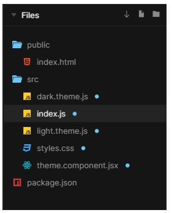
The files used to implement the code are:
a. dark.theme.js
export const darkTheme = {
name: "dark",
properties: {
"--theme-primary-color": "#f549de",
"--widget-color": "#d2f252",
"--dashboard-footer-text-color": "#7c7d78"
}
};
b. index.js
import React from "react";
import ReactDOM from "react-dom";
import "./styles.css";
import { ThemeProvider } from "./theme.component";
import { lightTheme } from "./light.theme";
import { darkTheme } from "./dark.theme";
class App extends React.Component {
constructor(props) {
super(props);
this.state = { theme: lightTheme };
this.toggle = this.toggle.bind(this);
}
toggle() {
this.setState({
theme: this.state.theme.name === "light" ? darkTheme : lightTheme
});
}
render() {
return (
<div className="App">
<ThemeProvider theme={this.state.theme}>
<h1>Magic Site</h1>
<h2>If you belive in Magic, You are on the right site, Here Magic Happens!</h2>
<button onClick={this.toggle}>Click to see Magic</button>
<h3>HOPE</h3>
<h4>YOU</h4>
<h5>LIKE</h5>
<h6>IT</h6>
<h3>.....................................</h3>
<h4>{'\u2720'}{'\u2720'}{'\u2720'}{'\u2720'}{'\u2720'}{'\u2720'}{'\u2720'}</h4>
</ThemeProvider>
</div>
);
}
}
const rootElement = document.getElementById("root");
ReactDOM.render(<App />, rootElement);
c. light.theme.js
export const lightTheme = {
name: "light",
properties: {
"--theme-primary-color": "#d2f252",
"--widget-color": "#7c7d78",
"--dashboard-footer-text-color": "#d2f252"
}
};
d. styles.css
.App {
font-family: 'Times New Roman'
, Times
, serif;
text-align: center;
color: var(--dashboard-footer-text-color);
background-color: var(--widget-color);
}
e. theme.component.jsx
import React from "react";
export class ThemeProvider extends React.Component {
componentDidMount() {
this.updateTheme(this.props.theme);
}
componentDidUpdate(prevProps) {
if (this.props.theme !== prevProps.theme) {
this.updateTheme(this.props.theme);
}
}
updateTheme(theme) {
console.log(theme);
if (!theme.properties) {
return;
}
for (const [prop, value] of Object.entries(theme.properties)) {
document.documentElement.style.setProperty(prop, value);
}
}
render() {
return <div>{this.props.children}</div>;
}
}
Output:
Conclusion
On the basis of the above article, we can see the concept of themes in React native. We went through the different kind of themes React native supports like the Dark and the light theme and the basic themes which can be created using custom colors. The examples shown above will help you to know the application of themes.
Recommended Articles
This is a guide to React Native Theme. Here we discuss the introduction, syntax, and themes of React Native along with examples respectively. You may also have a look at the following articles to learn more –


