Updated April 4, 2023
Introduction to React Native Toggle Button
While making a website, a developer has to understand the importance of different objects which would be shown to the user and how the user can interact with it. Users generally like a website where they can do stuff and interact with the website getting responses from a click of theirs. Toggle button is one such object which is used for toggling between two options. Developers generally keep them on the website as on/off buttons, true or false button, male or female button, and many others. Toggle buttons are also used for options related to groups. For emphasizing groups of related toggle buttons, we have to share the groups in a common container.
Syntax:
Below is the syntax used to develop a toggle button in React Native.
………
const Toggle = styled.button`
height: 50px;
width: 110px;
position: relative;
border-radius: 20px;
cursor: pointer;
outline: none;
border: 3px solid white;
background-color: ${props => (props.on ? "#4cd137" : "#353b48")};
……
<Toggle on={on} onClick={() => toggle(!on)} />
……
Working of Toggle buttons in React Native
There are various methods of using toggle buttons in react native. One such method is to do it using constructors, where one has to initiate a state initially. For doing it, we can use this.state which is an object. Here, the properties can be chosen by the developers. One such property is, textDisplay: false which means that no text is available initially before toggling the button. For updating the initial state of the object, this.setState is the only way. It helps React native in re-rendering the application and updating the DOM. Here, we require the current state which is having false as textDisplay for updating the state. For that we need to pass a function in this.setState using the currentState. For creating a button which toggles, we will add an attribute onClick to the render() method for joining the toggle function leading to the correct operation of the toggle button.
Example #1
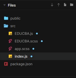
Files used to execute the code properly are:
In the EDUCBA.js file, we have imported the EDUCBA.scss file which includes the formatting of the toggle button such as height, width, background color, display, and many other. Here, the onChange, className, Id is defined for its usage in index.js.
[i] EDUCBA.js
import React from "react";
import "./EDUCBA.scss";
const EDUCBA = (
{
isOn
, handleToggle
}
) => {
return (
<>
<input
checked={isOn}
onChange={handleToggle}
className="react-switch-checkbox"
id={`react-switch-new`}
type="checkbox"
/>
<label
className="react-switch-label"
htmlFor={`react-switch-new`}
>
<span className="react-switch-button" />
</label>
</>
);
};
export default EDUCBA;
[ii] EDUCBA.scss
In this file, we have provided all the attributes to trhe toggle button like its alignment, height, the space between texts, background color, border radius, width, display, positioning and many others. This would help in creating an attractive toggle button according to the requirement of the website.
.react-switch-checkbox {
&:checked + .react-switch-label .react-switch-button {
left: 110%;
transform: translateX(-90%);
}
height: 0;
visibility: hidden;
width: 0;
}
.react-switch-label {
justify-content: space-between;
transition: background-color 0.4s;
align-items: center;
border-radius: 90px;
height: 60px;
width: 90px;
background: #9419d1;
display: flex;
position: relative;
cursor: pointer;
&:active .react-switch-button {
width: 40px;
}
& .react-switch-button {
content: '';
position: absolute;
height: 100%;
left: 0;
width: 50%;
top: 0;
background: #f5e8a2;
border-radius: 90px;
transition: 0.4s;
}
}
[iii] app.scss
body {
padding: 10;
margin: 10;
}
.App {
height: 50vh;
display:flex;
background-color: #29d998;
align-items: center;
border-radius: 90px;
width: 50vw;
justify-content: center;
}
[iv] index.js
Now, in index.js we have to do the final job. Here we have imprted EDUCBA.js. Now here we set the initial value of the toggle button and how it would react once the state is changed.
import React
, { useState } from "react";
import ReactDOM from "react-dom";
import Switch from "./EDUCBA";
import "./app.scss";
function App() {
const [value
, setValue] = useState(false);
return (
<div className="App">
<Switch isOn={
value
} handleToggle={
() => setValue(
!value
)
} />
<Switch isOn={
value
} handleToggle={
() => setValue(
!value
)
} />
</div>
);
}
const rootElement = document.getElementById("root");
ReactDOM.render(<App />, rootElement);
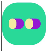
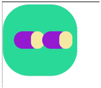
Output:
On code execution –
On clicking any one toggle button –
Example #2
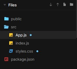
Files used to execute the code properly are:
[i] App.js
Here, in the file App.js we have imported styles.css. Now here we have define the background color of the webpage. Moreover, the style attributes of the toggle button is also defined here.
import React
, { useState } from "react";
import "./styles.css";
import ReactDOM from "react-dom";
import styled
, { createGlobalStyle } from "styled-components";
const GlobalStyle = createGlobalStyle`
body {
background-color: #b6f211;
color: #bcf7de;
}
`;
const Toggle = styled.button`
height: 50px;
width: 110px;
position: relative;
border-radius: 20px;
cursor: pointer;
outline: none;
border: 3px solid white;
background-color: ${props => (props.on ? "#4cd137" : "#353b48")};
&::after {
position: absolute;
content: "";
top: 4.5px;
transform: translate(${props => (props.on ? 5.5 : -44)}px);
will-change: transform;
transition: transform 0.2s ease-out;
height: 36px;
width: 36px;
border-radius: 90px;
background: #f0df4d;
border: 1.5px solid #f0df4d;
outline: none;
}
`;
const App = () => {
const [on
, toggle] = useState(false);
return (
<div style={{
backgroundImage: `url("https://images.pexels.com/photos/931177/pexels-photo-931177.jpeg?auto=compress&cs=tinysrgb&dpr=1&w=500")`
, height:'280px'
, width: '300px'
}}
className="App">
<div className="App">
<GlobalStyle />
<h1>Toggling Button</h1>
<Toggle on={on} onClick={() => toggle(!on)} />
</div>
</div>
);
};
export default App;
[ii] index.js
Now, here in the index.js file we have executed the toggle button with all of the design formattings and attributes defined earlier.
import React from "react";
import ReactDOM from "react-dom";
import App from "./App";
const rootElement = document.getElementById("root");
ReactDOM.render(
<React.StrictMode>
<App />
</React.StrictMode>,
rootElement
);
[iii] style.css
.App {
font-family: 'Gill Sans'
, 'Gill Sans MT'
, Calibri
, 'Trebuchet MS'
, sans-serif;
text-align: center;
border-radius: 90px;
}
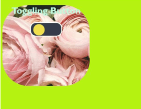
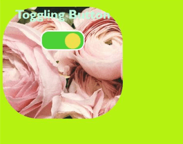
Output:
On code execution –
On clicking the toggle button –
Conclusion
On the basis of the above article, we understood the concept of toggle buttons in React Native. Toggle buttons are very much important for a website as it makes a website more interactive for a user. In this article, we also went through a couple of examples that would help beginners in understanding the concept of the toggle button in React Native.
Recommended Articles
This is a guide to React Native Toggle Button. Here we discuss the Introduction, Working of Toggle buttons in React Native, examples with code implementation, limitations. You may also have a look at the following articles to learn more –
