Updated March 30, 2023

Introduction to React Native UI Components
The following article provides an outline for React Native UI Components. We all know in this 21st Century, everyone is so much addicted to their smartphones, and it has increased the demand for more mobile apps with advanced technologies and frameworks. This has encouraged mobile developers to build revolutionary apps. It has also increased the demand for Cross-Platform App Development as it supports the developers to create apps for different platforms. React Native has been the most used Cross-Platform for Developers. Just like React, React Native also helps us to create user interfaces using different components. User Interface toolkits and Component libraries have been time-efficient for the developers to create different applications quickly.
Syntax of Various React Native UI Components
The different syntax is mentioned below:
1. NativeBase Component
React Native NativeBase Component has been the most used user interface component library, which provides multiple components for React Native. We can also use third-party libraries, which can help the project.
import React, { Component } from 'react';
import { Container
, Button
, Text } from 'native-base';
export default class GeneralExample extends Component {
render() {
return (
<Container>
<Button>
<Text>
Button
</Text>
</Button>
</Container>
);
}
}
2. React Native Elements
React Native Elements is a customisable user interface toolkit built using JavaScript.
import { Button } from 'react-native-elements'
<Button title='Click to Proceed!' onPress={someMethod} />
3. Lottie wrapper for React Native
React Native Lottie helps the app developers to add animations in the apps without even recreating them.
import Animation from 'lottie-react-native';
export default class lottieloader extends Component {
componentDidMount() {
this.animation.play();
}
4. React Native Vector Icons
React Native Vector icons provide icon sets. The icons are very much easy to integrate into our apps.
import Icon from 'react-native-vector-icons/FontAwesome';
const myIcon = <Icon name="rocket" size={30} color="#900" />;
5. React Native Maps
React Native Maps provides map components for our Android or iOS applications.
import MapView from 'react-native-maps';
<MapView
initialRegion={{
latitude: 37.78825,
longitude: -122.4324,
latitudeDelta: 0.0922,
longitudeDelta: 0.0421,
}}
/>
6. React Native Gifted Chat
React Native Gifted Chat helps us in providing a chat user interface for our application.
import { GiftedChat } from 'react-native-gifted-chat'
<GiftedChat
text={customText}
onInputTextChanged={text => this.setCustomText(text)}
/* ... */
/>
7. Shoutem
React Native Shoutem provides us with a set of components which are composable and customizable. It is used to create components without manually defining the styles.
import { StyleProvider } from '@shoutem/theme';
import {
Card,
Image,
View,
Subtitle,
Caption,
} from '@shoutem/ui';
const theme = {
'shoutem.ui.View': {
'.h-center': {
alignItems: 'center',
},
'shoutem.ui.Card': {
'shoutem.ui.View.content': {
'shoutem.ui.Subtitle': {
marginBottom: MEDIUM_GUTTER,
},
8. Nachos UI Kit
Nachos User Interface Kit provides us with 30+ pre-coded components.
import React from 'react'
import { View } from 'react-native'
import { Button } from 'nachos-ui'
const App = () => {
return (
<View>
<Button>Button</Button>
</View>
)
}
Examples
Given below are the examples mentioned:
Example #1
Basic React Native Vector Icons.
Code:
import * as React from 'react';
import { View, StyleSheet } from 'react-native';
import MaterialCommunityIcons from 'react-native-vector-icons/MaterialCommunityIcons'
import Constants from 'expo-constants';
export default class App extends React.Component {
render() {
return (
<View style={styles.container}>
<MaterialCommunityIcons name='facebook' size={99} color='#164bb5'/>
</View>
);
}
}
const styles = StyleSheet.create({
container: {
flex: 2,
justifyContent: 'center',
alignItems: 'center',
paddingTop: Constants.statusBarHeight,
backgroundColor: '#daff99',
padding: 9,
},
});
Output:
Example #2
Basic NativeBase Component.
- assets folder
- components folder
- App.js
a. Components inside assets folder
- expo.symbol.white.png
b. Components inside components folder
- AssetExample.js
i. expo.symbol.white.png
ii. AssetExample.js
import * as React from 'react';
import { Text
, View
, StyleSheet
, Image } from 'react-native';
export default class AssetExample extends React.Component {
render() {
return (
<View style={styles.container}>
<Text style={styles.paragraph}>
To import the Local files and assets to editor you have to drag and drop them
</Text>
<Image style={styles.logo} source={require("../assets/expo.symbol.white.png")}/>
</View>
);
}
}
const styles = StyleSheet.create({
container: {
alignItems: 'center',
justifyContent: 'center',
backgroundColor: '#995177',
},
paragraph: {
margin: 25,
marginTop: 1,
fontSize: 15,
fontWeight: 'bold',
textAlign: 'center',
color: '#995177',
},
logo: {
backgroundColor: "#db1284",
height: 129,
width: 129,
}
});
iii. App.js
import React, { Component } from 'react';
import { Platform } from 'react-native';
import {Container
, Header
, Title
, Content
, Button
, Icon
, Text
, Right
, Body
, Left
, Picker
, Form,
} from 'native-base';
export default class NativeBase extends Component {
constructor(props) {
super(props);
this.state = {
branches: [
{ province: 'state 1', id: 1 },
{ province: 'state 2', id: 2 },
{ province: 'state 3', id: 3 },
{ province: 'state 4', id: 4 },
{ province: 'state 5', id: 5 },
],
selected1: 1,
};
}
onBranchSelected(value) {
this.setState({
selectedBranch: value,
});
}
render() {
return (
<Container>
<Header>
<Left>
<Button transparent>
<Icon name="arrow-back" />
</Button>
</Left>
<Body>
<Title>Selecting Option</Title>
</Body>
<Right />
</Header>
<Content>
<Form>
<Picker
style={{ width: 199, height: 39 }}
iosHeader="Branch"
Header="Branch"
mode="dropdown"
textStyle={{ color: '#fc92d0' }}
placeholder="Select branch"
headerBackButtonText="Geri"
selectedValue={this.state.selectedBranch}
onValueChange={value => this.onBranchSelected(value)}>
{this.state.branches.map((branches, i) => {
return (
<Picker.Item
label={branches.province}
value={branches.id}
key={i}
/>
);
})}
</Picker>
</Form>
</Content>
</Container>
);
}
}
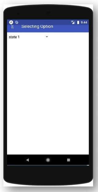
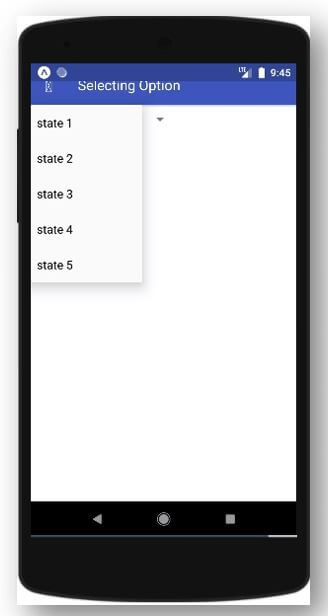
Output:
Example #3
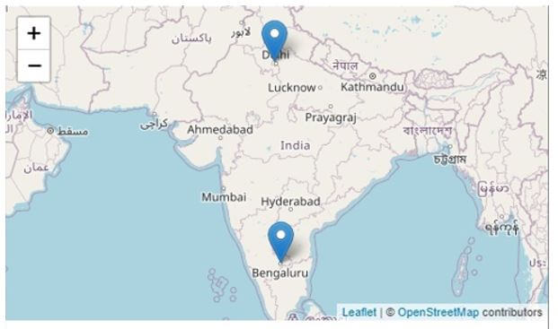
React Native Map.
Components inside src folder:
- index.js
- react-leaflet.js
- react-map-gl.js
- simple-react-map.js
- css
i. index.js
import React from "react";
import ReactDOM from "react-dom";
import ReactMapGl from "./react-map-gl";
import SimpleReactMap from "./simple-react-map";
import ReactLeaflet from "./react-leaflet";
import { Router, Link } from "@reach/router";
import "./style.css";
let Home = () => (
<ul>
<li>
<Link to="react-map-gl">Basic Notification of React Native Map</Link>
</li>
<li>
<Link to="simple-react-map">Simple React Native Map</Link>
</li>
<li>
<Link to="react-leaflet">Advance React Native Map</Link>
</li>
</ul>
);
class App extends React.Component {
render() {
return (
<Router>
<Home path="/" />
<ReactMapGl path="react-map-gl" />
<SimpleReactMap path="simple-react-map" />
<ReactLeaflet path="react-leaflet" />
</Router>
);
}
}
const rootElement = document.getElementById("root");
ReactDOM.render(<App />, rootElement);
ii. react-leaflet.js
import React, { Component } from "react";
import { Map
, TileLayer
, Marker
, Popup } from "react-leaflet";
import styled from "styled-components";
const cities = [
{
name: "BG",
latitude: 12.972442,
longitude: 77.580643,
color: "#f21b49"
},
{
name: "DL",
latitude: 28.7041,
longitude: 77.1025,
color: "#3ab5f2"
}
];
const CitiInfo = styled.div`
height: 101px;
width: 101px;
display: flex;
align-items: center;
justify-content: center;
color: ${props => props.color};
`;
const bounds = [[12.972442, 77.580643], [28.7041, 77.1025]];
export default class SimpleExample extends Component {
render() {
return (
<Map
bounds={bounds}
boundsOptions={{
padding: [41, 41]
}}
style={{
height: 301,
width: "100%"
}}
>
<TileLayer
attribution='&copy <a href="http://osm.org/copyright">OpenStreetMap</a> contributors'
url="https://{s}.tile.openstreetmap.org/{z}/{x}/{y}.png"
/>
{cities.map(city => (
<Marker
key={city.name}
position={[city.latitude, city.longitude]}
onClick={() => console.log("onClick")}
>
<Popup closeButton={false}>
<CitiInfo color={city.color}>{city.name} MAP</CitiInfo>
</Popup>
</Marker>
))}
</Map>
);
}
}iii. react-map-gl.js
import React from "react";
import ReactMapGL
, { Marker
, Popup
, NavigationControl } from "react-map-gl";
import styled from "styled-components";
const TOKEN =
"pk.eyJ1IjoiaHVjaGVuc2NiIiwiYSI6ImNqdHpnbGZ5ejFneXEzeW81a3B3anJkZGoifQ.RjMCIQBbS0dlzTl85EogQw";
const CitiMarker = styled.div`
background-color: ${props => props.color};
width: 21px;
height: 21px;
border-radius: 21px;
opacity: 0.8;
transition: opacity 0.4s;
cursor: pointer;
:hover {
opacity: 0.8;
}
`;
const CitiInfo = styled.div`
height: 101px;
width: 101px;
background: lightpink;
display: flex;
align-items: center;
justify-content: center;
color: ${props => props.color};
`;
const cities = [
{
name: "MY",
latitude: 4.2105,
longitude: 101.9758,
color: "#b440de",
},
{
name: "KL",
latitude: 3.139,
longitude: 101.6869,
color: "#e64c63",
},
];
const center = {
latitude:
(Math.min(...cities.map(c => c.latitude)) +
Math.max(...cities.map(c => c.latitude))) /
2,
longitude:
(Math.min(...cities.map(c => c.longitude)) +
Math.max(...cities.map(c => c.longitude))) /
2,
};
export default class Map extends React.Component {
state = {
viewport: {
latitude: center.latitude,
longitude: center.longitude,
zoom: 7,
},
popupInfo: null,
};
updateViewport = viewport => {
this.setState({ viewport });
};
render() {
return (
<ReactMapGL
{...this.state.viewport}
width="100%"
height={401}
onViewportChange={this.updateViewport}
mapboxApiAccessToken={TOKEN}
>
{cities.map(c => (
<Marker
key={c.name}
latitude={c.latitude}
longitude={c.longitude}
offsetLeft={-10}
offsetTop={-10}
>
<CitiMarker
color={c.color}
onMouseEnter={() => {
this.setState({
popupInfo: c,
});
}}
/>
</Marker>
))}
{this.state.popupInfo && (
<Popup
anchor="left"
longitude={this.state.popupInfo.longitude}
latitude={this.state.popupInfo.latitude}
closeButton={false}
>
<CitiInfo color={this.state.popupInfo.color}>
{this.state.popupInfo.name}
</CitiInfo>
</Popup>
)}
<div style={{ position: "absolute", left: 11, top: 11 }}>
<NavigationControl
showCompass={false}
onViewportChange={this.updateViewport}
/>
</div>
</ReactMapGL>
);
}
}
iv. simple-react-map.js
import React from "react";
import {
ComposableMap,
ZoomableGroup,
Geographies,
Geography,
Markers,
Marker,
} from "react-simple-maps";
const GEOGRAPHY =
"https://raw.githubusercontent.com/zcreativelabs/react-simple-maps/master/examples/simple-markers/static/world-50m.json";
const wrapperStyles = {
width: "100%",
maxWidth: 981,
margin: "0 auto",
};
const cities = [
{
name: "MY",
latitude: 4.2105,
longitude: 101.9758,
color: "#b1d450",
},
{
name: "KL",
latitude: 3.139,
longitude: 101.6869,
color: "#ff7c78",
},
];
const center = {
latitude:
(Math.min(...cities.map(c => c.latitude)) +
Math.max(...cities.map(c => c.latitude))) /
2,
longitude:
(Math.min(...cities.map(c => c.longitude)) +
Math.max(...cities.map(c => c.longitude))) /
2,
};
class SimpleReactApp extends React.Component {
render() {
return (
<div style={wrapperStyles}>
<ComposableMap
projectionConfig={{ scale: 9001 }}
width={1001}
height={801}
style={{
width: "100%",
height: "auto",
}}
>
<ZoomableGroup center={[center.longitude, center.latitude]}>
<Geographies geography={GEOGRAPHY}>
{(geographies, projection) =>
geographies.map((geography, i) => (
<Geography
key={i}
geography={geography}
projection={projection}
style={{
default: {
fill: "#fff0b5",
stroke: "#83679c",
strokeWidth: 0.76,
outline: "none",
},
hover: {
fill: "#eaffab",
stroke: "#ba5491",
strokeWidth: 0.76,
outline: "none",
},
pressed: {
fill: "#a3ffd6",
stroke: "#a13747",
strokeWidth: 0.76,
outline: "none",
},
}}
/>
))
}
</Geographies>
<Markers>
{cities.map((city, i) => (
<Marker
key={i}
marker={{ coordinates: [city.longitude, city.latitude] }}
style={{
default: { fill: city.color },
hover: { fill: city.color },
pressed: { fill: city.color },
}}
>
<circle cx={0} cy={0} r={10} />
</Marker>
))}
</Markers>
</ZoomableGroup>
</ComposableMap>
</div>
);
}
}
export default SimpleReactApp;
v. style.css
body {
margin: 0;
}
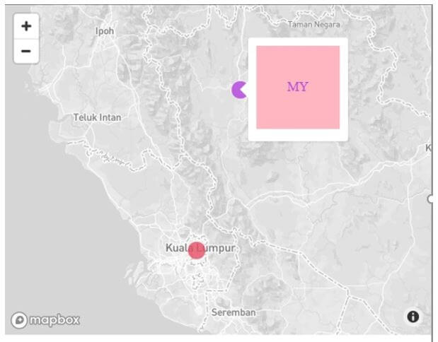
Output:
After code execution:
After clicking “Simple React Native Map”:
After clicking “Advance React Native Map”:
Conclusion
Based on the above discussion, we got to know about various components of React Native UI. We have also seen about the syntaxes of these UI components and how to use them in your code to provide a great User experience and User Interface. We have also developed various basic level React Native applications with the help of some React Native UI components.
Recommended Articles
This is a guide to React Native UI Components. Here we discuss the introduction, syntax, and examples of React Native UI Components along with code implementation. You may also have a look at the following articles to learn more –

