Introduction to Statistics With Python
Statistics are essential in data analysis, providing the necessary tools for transforming raw data into actionable insights. By leveraging statistical methods, we can extract meaning from massive datasets, identify hidden trends and patterns, and draw reliable conclusions even in uncertain and messy data. With its extensive libraries like SciPy and Pandas, Python has become famous for statistical analysis due to its user-friendly syntax and powerful computational capabilities. In this section, we’ll explore how statistics helps us make sense of data and how Python can perform various statistical computations, including measures of central tendency, dispersion, hypothesis testing, and correlation analysis.
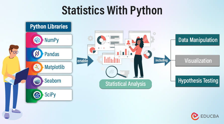
Table of Contents
Importance of Statistics in Data Analytics
Statistics enables us to comprehend data by furnishing techniques for summarizing, interpreting, and deriving conclusions. Whether confronted with extensive datasets or diminutive samples, statistical methods help reveal patterns, trends, and correlations within the data.
Key Aspects of Statistics:
- Descriptive Statistics: Summarizing and delineating the primary characteristics of a dataset, such as central tendency, dispersion, and distribution.
Example: Suppose we possess a dataset comprising monthly daily temperature recordings. Descriptive statistics would enable us to compute the average temperature, pinpoint the days with the highest and lowest temperatures, and illustrate the temperature distribution through a histogram.
- Inferential Statistics: Concluding and making predictions about a larger population based on insights derived from a subset of data, utilizing methodologies such as hypothesis testing and confidence intervals.
Example: Within a medical study, researchers might gather a patient sample to assess the efficacy of a novel treatment. Inferential statistics would empower them to deduce whether the treatment exhibits a significant variance from a placebo, relying on the observed outcomes, and gauge the treatment’s effect magnitude and confidence interval.
- Data Visualization: Visual representation of data through charts, graphs, and plots facilitates insight generation and effective communication of findings.
Example: Employing a line chart to visualize sales data over time can help identify seasonal trends and sales patterns. Furthermore, generating a scatter plot to depict the correlation between advertising expenditures and sales revenue can offer insights into the efficacy of marketing campaigns.
- Decision Making: Offering a framework for informed decision-making across diverse domains such as business, healthcare, finance, and research.
Example: Statistical analysis can aid a business manager in establishing optimal pricing strategies and leveraging market demand and competitor pricing data. Similarly, statistical models can support healthcare professionals in evaluating the effectiveness of various treatment options, enabling evidence-based decisions for patient care.
Role of Python in Statistical Analysis
Python’s versatility and extensive array of libraries render it an optimal selection for statistical analysis endeavors. In statistical computing, some key reasons for preferring Python include:
- Ease of Use: Python’s straightforward and intuitive syntax renders it accessible to users with diverse levels of programming expertise, facilitating swift development and prototyping of statistical models and analyses.
- Wide Range of Libraries: Python boasts an abundance of libraries tailored explicitly for statistical computing, including NumPy, Pandas, Matplotlib, and Seaborn. These libraries provide comprehensive data manipulation, analysis, and visualization tools, ensuring robust statistical capabilities.
- Integration with Other Tools: Python integrates with other data science tools and frameworks, such as Jupyter Notebooks, scikit-learn, and TensorFlow. These tools allow for streamlined workflows and interoperability across different stages of the data analysis pipeline.
- Community Support: Python benefits from a sizable and dynamic community comprising developers, data scientists, and statisticians who actively contribute to the ecosystem. They develop and maintain open-source libraries, exchange best practices, and offer support through forums and online communities.
Essential Python Libraries for Statistics
Python’s effectiveness in statistical analysis stems from its robust ecosystem of specialized libraries designed for various tasks. Let’s examine some Python libraries commonly utilized in statistical computations:
1. NumPy
NumPy serves as a foundational library for Python numerical computing. It facilitates the handling of multidimensional arrays and offers a comprehensive suite of mathematical functions optimized for efficient operations on these arrays. Features of NumPy include:
- Efficient array operations for manipulating large datasets.
- Mathematical functions encompassing linear algebra, Fourier analysis, and random number generation.
- Integration with C/C++ and Fortran code for performance optimization.
2. Pandas
Pandas stand out as a potent library for data manipulation and analysis within Python. It introduces essential data structures like DataFrame and Series, simplifying structured data handling. Pandas find extensive applications in data cleaning, transformation, and aggregation tasks. Features of Pandas comprise:
- Data alignment and management of missing data.
- Robust indexing and slicing functionalities for selecting subsets of data.
- There is native support for reading and writing data from diverse file formats, including CSV, Excel, and SQL databases.
3. Matplotlib
Matplotlib is a comprehensive library for crafting static, animated, and interactive visualizations within Python. It offers an extensive array of plotting functions enabling the creation of diverse plots, including line plots, bar charts, histograms, scatter plots, and more. Matplotlib’s versatility renders it suitable for a broad spectrum of visualization tasks. Features of Matplotlib encompass:
- Support for crafting publication-quality figures with customizable styles and settings.
- Seamless integration with Jupyter Notebooks facilitates interactive plotting.
- Extensibility via various backends, permitting integration with GUI toolkits and web applications.
4. Seaborn
Seaborn is a high-level statistical data visualization library built on top of Matplotlib. It simplifies the creation of complex statistical plots with minimal code through its easy-to-use interface. Seaborn simplifies visualizations with built-in statistical estimation and color palettes. Features of Seaborn include:
- Specialized functions for visualizing categorical, relational, and distributional data.
- Automatic estimation and plotting of linear regression models.
- Integration with Pandas data structures, allowing for seamless data manipulation and visualization.
5. SciPy
Scipy is a crucial component of scientific computing in Python, furnishing an extensive array of functionalities spanning optimization, integration, interpolation, and statistical analysis. It extends the capabilities of NumPy, augmenting Python’s prowess for scientific and engineering tasks. Key attributes of Scipy comprise:
- Statistical functions facilitating hypothesis testing, probability distributions, and descriptive statistics.
- Integration algorithms are adept at tackling ordinary and partial differential equations and optimization challenges.
- Interpolation techniques for effectively approximating data points and crafting seamless curves.
Mastering these libraries is vital to unleashing Python’s full potential for statistical computing. They serve as the foundation for data manipulation, analysis, and visualization tasks in Python.
Categories of Statistics
Statistics encompasses various techniques and methods for analyzing and interpreting data.
Descriptive statistics
Descriptive statistics summarize and delineate a dataset’s primary attributes. This category offers insights into the data’s characteristics without extrapolating any inferences beyond the dataset. Components of descriptive statistics include:
- Measures of Central Tendency
Descriptive statistics encompass measures such as the mean, median, and mode measures representing a dataset’s central or typical value.
- Mean: To calculate the mean or average, all values in a dataset are summed and then divided by the total number of values. It represents the typical value within the dataset.
For instance, in a dataset of exam scores (80, 85, 90, 95, 100), the mean score is calculated as follows:
Mean score = (80 + 85 + 90 + 95 + 100) / 5 = 90.
- Median: The median denotes the central value within a sorted dataset. An even number of values will have two middle values, so we calculate the median as the average of those two values. It signifies the values below and above, in which 50% of the data resides.
For example, Imagine a dataset representing the incomes of households: (30,000, 40,000, 50,000, 60,000, 70,000). The median income is 50,000.
- Mode: The mode denotes the most frequent value in a dataset. It signifies the most common value within the dataset.
Suppose we have a dataset representing the number of siblings per student: (0, 1, 2, 2, 3, 3, 3, 4). The mode, indicating the most common number of siblings, is 3.
- Measures of Dispersion
Measures of dispersion quantify the spread or variability of data points around the central tendency.
- Variance: Variance quantifies the extent to which values in a dataset deviate from the mean. It’s the average of the squared differences from the mean.
Suppose we have a dataset representing the heights of students in a class: (160 cm, 165 cm, 170 cm, 175 cm, 180 cm). First, calculate the mean height: (160 + 165 + 170 + 175 + 180) / 5 = 170 cm. Then, calculate the variance using the formula:
Variance =
Where represents each data point, represents the mean, and is the number of data points.
Substituting the values:
Variance =
Variance =
Variance = = 50
- Standard deviation: One derives the standard deviation as the square root of the variance. It indicates the average distance of data points from the mean.
= √Variance
For the same dataset, the standard deviation would be the square root of 50, which is approximately 7.07 cm.
- Range: Range is the difference between a dataset’s maximum and minimum values. It provides a simple measure of variability.
Using the same height dataset, the range will be.
- Visualization Techniques
Visualization techniques help represent data visually, making extracting insights about its distribution and patterns easier.
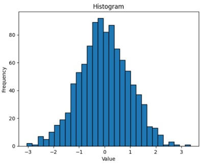
- Histograms: Histograms are graphical representations of numerical data distributions. We segment the data into bins, and the bars depict the frequency of values within each bin.
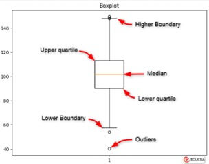
- Box Plots (Box and Whisker Plots): Box plots offer a visual synopsis of data distribution, showcasing the median, quartiles, and outliers within a dataset. They enable comparisons between various groups or datasets.
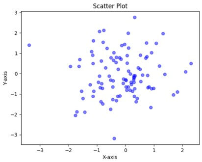
- Scatter Plots: Scatter plots illustrate Data points on a two-dimensional graph depicting the relationship between two variables. They are valuable tools for identifying patterns, trends, and correlations between variables.
Inferential Statistics
Inferential statistics encompass making inferences and predictions about a population derived from a sample of data. This category expands beyond the observed data to conclude the underlying population characteristics. Components of inferential statistics include:
- Hypothesis testing
Hypothesis testing evaluates if differences or relationships in sample data are statistically significant, indicating actual differences or relationships in the population. It involves establishing a null hypothesis H0 and an alternative hypothesis H1, collecting data, computing a test statistic, and comparing it with a critical value or p-value to decide on the null hypothesis. Inferential statistics encompass t-tests, ANOVA, and chi-square tests to assess hypotheses and determine the significance of observed differences or relationships. For example, a pharmaceutical company testing a new drug’s effect on blood pressure may set H0 as no effect and H1 as a reduction in blood pressure. Through data analysis, they determine support for H1 over H0.
- Confidence Intervals
Confidence intervals offer a range of values wherein population parameters, like means or proportions, are estimated to reside within a specified confidence level. For instance, a 95% confidence interval for a population’s mean blood pressure could be (120 mmHg or 130 mmHg), suggesting 95% confidence that the actual population mean lies within this interval.
- Correlation and Regression Analysis
Correlation analysis evaluates the strength and direction of the link between two variables, typically denoted by the correlation coefficient r. Conversely, regression analysis delves into the connection regression analysis, which studies the link between one or more independent factors and a dependent variable, the ability to forecast the dependent variable based on the values of the independent variables. These methods aid in grasping data patterns and trends, facilitating predictions about forthcoming observations or outcomes.
Consider a study probing the correlation between study hours and student exam scores. By gathering data on study hours and corresponding exam scores from a student sample, researchers can calculate the correlation coefficient to quantify the relationship’s strength and direction. Moreover, they can conduct regression analysis to forecast exam scores based on study hours, shedding light on how changes in one variable (study hours) impact another (exam scores).
Practical Example
Case Study 1: Analyzing Survey Data
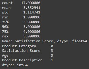
Imagine a company conducting a customer satisfaction survey for evaluating the quality of its products and services. Analysts can use Python and Pandas to clean and preprocess the survey data, calculate descriptive statistics (such as mean satisfaction scores for different product categories), and visualize trends and patterns using Matplotlib.
Data Cleaning with Pandas
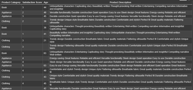
We have survey data of categories (e.g., Clothing, Appliance, Book) with their Satisfaction scores.
This data has some null values, so we will use the Pandas library to handle missing data, remove duplicates, and transform data types to ensure data quality and consistency.
Code:
import pandas as pd

# Load the survey data from a CSV file
df = pd.read_csv('survey_data.csv')

# Descriptive statistics for a specific column (e.g., satisfaction score)
satisfaction_scores = df['Satisfaction Score']
print(satisfaction_scores.describe())  # Mean, median, standard deviation, etc.

# Explore missing values
print(df.isnull().sum())  # Count missing values in each column

# Handle missing values (e.g., remove rows with missing values)
df.dropna(inplace=True)  # Removes rows with any missing values (be cautious, might lose data)
Output:
Visualization with Matplotlib
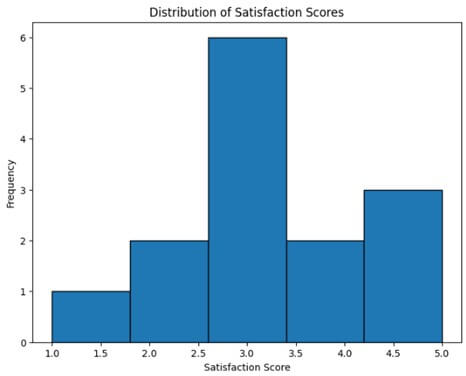
After completing data cleaning, we cannot show the output as shown above, so let’s make a histogram to visualize the following data.
Code:
#Visulization of data using matplotlib showing the representation of the number of satisfaction scores using histogram
import matplotlib.pyplot as plt
plt.figure(figsize=(8, 6))
plt.hist(df["Satisfaction Score"], bins=5, edgecolor="black")  # Adjust bins as needed
plt.xlabel("Satisfaction Score")
plt.ylabel("Frequency")
plt.title("Distribution of Satisfaction Scores")
plt.show()
Output:
Case Study 2: Sales Trend Analysis
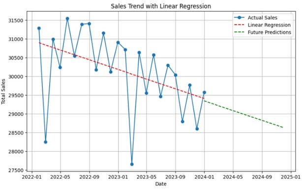
Consider a retail company scrutinizing sales data to pinpoint trends and patterns. Leveraging Python libraries such as Pandas and Matplotlib, analysts can preprocess sales data, compute metrics like monthly or yearly sales totals, visualize trends via line charts or time series plots, and employ statistical methodologies like linear regression to predict future sales trends.
Time Series Analysis with Pandas
Import the following libraries.
import pandas as pd
import numpy as np
import matplotlib.pyplot as plt
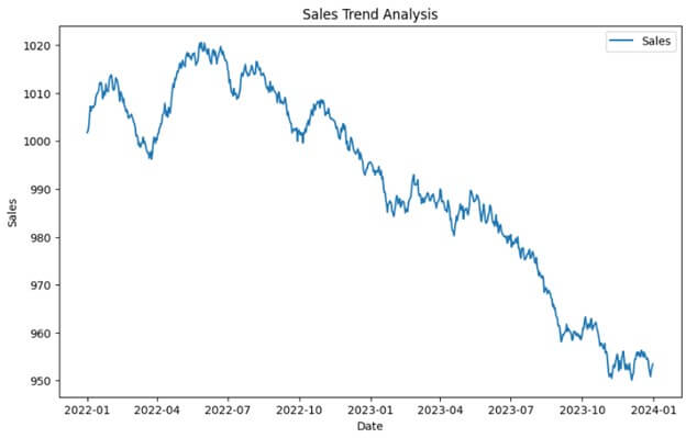
For the Sales Trend demonstration, let us Generate synthetic sales data.
# Generate synthetic sales data
np.random.seed(0)
dates = pd.date_range(start='2022-01-01', end='2023-12-31', freq='D')
sales = 1000 + np.random.randn(len(dates)).cumsum()
sales_data = pd.DataFrame({'Date': dates, 'Sales': sales})
Output:
In the following visualization, we can see the sales trend data for each day. However, analyzing this data will be difficult and time-consuming, so we will resample it using Pandas.
# Convert the Date column to datetime format and set it as the index
sales_data['Date'] = pd.to_datetime(sales_data['Date'])
sales_data.set_index('Date', inplace=True)
# Resample the data to monthly frequency and calculate the total sales for each month
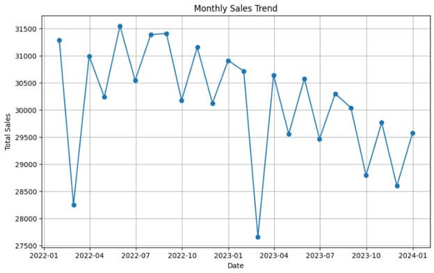
monthly_sales = sales_data.resample('M').sum()
Plotting the monthly sales data
# Plot the monthly sales data
plt.figure(figsize=(10, 6))
plt.plot(monthly_sales.index, monthly_sales['Sales'], marker='o', linestyle='-')
plt.title('Monthly Sales Trend')
plt.xlabel('Date')
plt.ylabel('Total Sales')
plt.grid(True)
plt.show()
Output:
Linear Regression with Scikit-Learn
Now, we have monthly sales trend data. We can use this data to prepare a linear regression model to predict future sales.
Code:
# Prepare the data for linear regression
X = np.arange(len(monthly_sales)).reshape(-1, 1)  # Convert index to numeric values
y = monthly_sales['Sales']
# Train the linear regression model
model = LinearRegression()
model.fit(X, y)
# Make predictions for future sales
future_months = 12  # Predict sales for the next 12 months
future_index = np.arange(len(monthly_sales), len(monthly_sales) + future_months).reshape(-1, 1)
future_predictions = model.predict(future_index)
# Plot the linear regression line and future predictions
plt.figure(figsize=(10, 6))
plt.plot(monthly_sales.index, monthly_sales['Sales'], marker='o', linestyle='-', label='Actual Sales')
plt.plot(monthly_sales.index, model.predict(X), linestyle='--', color='red', label='Linear Regression')
plt.plot(pd.date_range(start=monthly_sales.index[-1], periods=future_months, freq='M'), future_predictions, linestyle='--', color='green', label='Future Predictions')
plt.title('Sales Trend with Linear Regression')
plt.xlabel('Date')
plt.ylabel('Total Sales')
plt.legend()
plt.grid(True)
plt.show()
Output:
Conclusion
Python’s suite of libraries—NumPy, Pandas, Matplotlib, and Seaborn—facilitates comprehensive statistical analysis. Descriptive statistics summarize data, while inferential statistics draw predictions. Practical applications, like survey analysis and time series forecasting, demonstrate Python’s efficacy. Its versatility empowers analysts to extract insights and make informed decisions across various domains, ensuring data-driven strategies. With Python’s extensive ecosystem and intuitive syntax, statistical computations become accessible. Analysts harness their capabilities to navigate complex datasets, uncover patterns, and derive actionable insights. Python is a formidable ally in statistical analysis, enabling analysts to tackle real-world challenges with confidence and precision.
Frequently Asked Questions (FAQs)
Q1. How does Python support time series analysis?
Answer: Python’s libraries like Pandas provide features to manage time series data, encompassing tasks like resampling, calculating rolling averages, and conducting seasonal decomposition. These tools empower analysts to discern trends and patterns unfolding over time.
Q2. Can Python be integrated with other tools or languages for statistical analysis?
Answer: Python’s seamless integration with tools and languages like R, SQL, and Excel enables a versatile and comprehensive data analysis and manipulation approach.
Q3. Does Python support advanced statistical techniques beyond basic analysis?
Answer: Indeed, Python boasts libraries like Statsmodels and Scikit-learn, which offer sophisticated statistical methodologies, including regression analysis, time series analysis, and various machine learning algorithms.
Recommended Articles
We hope that this EDUCBA information on “Statistics With Python” was beneficial to you. You can view EDUCBA’s recommended articles for more information,
