Updated May 22, 2023

Effective Tips For Adobe InDesign Users
It is arduous to rate a few features as the best from an ocean of powerful tools Adobe InDesign software offers. Though the usage of the software and its tools vary from Industry to Industry, some common features serve the purpose of almost everyone using InDesign.
We brought a set of tools and features together to compile a list of quick tips that comes in handy for the users. The list will help you to find the most common and useful tools and quickly fix your designs irrespective of the Industry you are working in.
10 Adobe InDesign Tips and Tricks For Users Work
Below are the Tips and Tricks For Users Work:
1. Power of Math to achieve precision resizing
How many times have you manually tried to fit those images and frames to the perfect size? It is a tedious job, and how hard you may try to get it done, you are far from perfection when you try to resize objects with a mouse or Wacom tablet.
When resizing objects, math is the best way to save the day. Adobe InDesign applies Math calculations to simplify the task of resizing and defining the dimensions of layouts and objects exactly in the size you wanted to make them. You can calculate and resize designs within a Transform Palette or Control Palette.
You can find the transform palette at Window > Object & Layout > Transform.
To find the Control palette follow the instruction below: Window > Control
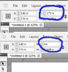
In both cases, you can use the numbers on your keyboard, as simple as using a calculator while working. To increase the size of an object twice its size, use the multiple symbols (*) and find the précised result.
For example: To increase the size of a frame twice. Select the edge, and in the width and height column, use original dimensions * 2 and hit enter. Immediately, you will find the dimensions resized precisely.
Remember to enable Constraint proportions for the scaling option to achieve proportionate width and height dimensions while the object is enlarged.
2. Sync your text well with the Story Editor
Are you still stuck with the old school Quark tricks and creating more and more text frames on the pasteboard to get over the overflow text? Say goodbye to the tiresome days. It’s time to know the Story Editor – one of the dominating features of Adobe InDesign software to take control over the overflowing text frames.
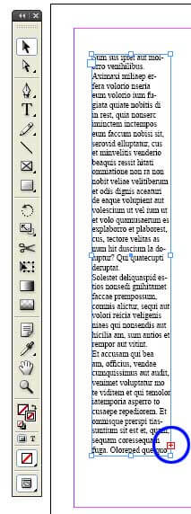
Here is a brief note for those users who need to learn about Overflow text. It is the long-form of text that won’t fit into the text frames. InDesign indicates overflowing text content in a red+ symbol at the lower right corner of the text frame.
The red+ symbol only indicates the extra text in the overset text box, which is not displayed due to a lack of space in the text frame. On the other hand, the Story Editor tool can show you the hidden text content so you can plan the change in the text frame of your layout. Over that, Story Editor helps you to handle complex text documents easily.
3. Toggle between Text and Frame with Swap Swatch Panel
Traditionally, selecting the text content in a frame is a process. First, you should choose the structure, double-click on the frame to select the text, and then make the required changes.
The method is fine if you want to select and edit the text frame and apply a stroke or other effect. But, if you’re going to change the color of a text, you should follow through with the process repeatedly. The option is to use the type tool and select the entire text to change the color.
For Adobe InDesign users, using multiple tools to get the job done is okay. With the help of the swap swatch tool, toggling between the text frame and the text is made so simple that it is just a click away. Press the letter J to toggle between both objects.
4. Rounded Corners
Remember the painful days when drawing rounded edges was a manual job. Our designers used to import vectors and objects with rounded corners from other software.
But, the days of labor are over with the introduction of Live Corners in the Adobe InDesign software.
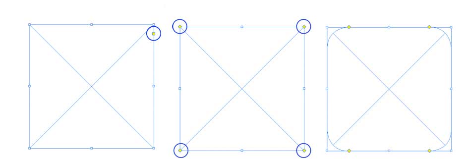
Draw an object with sharp or rigid corners as a rectangle or a square.
You will find a yellow box attached to the object. Click on the yellow square to activate the rounded corner boxes on all sides of the square.
Click on the square and drag it horizontally to the center of the court to obtain the curvature at all the object’s edges.
If you want to leave out any corners, hold shift first and then start to click and drag.
To find more options for adding corner effects, use Object > Corner Options.
5. Find Changes
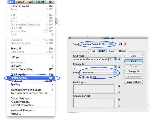
We know Adobe InDesign documents have a lot of text, and it is a humdrum job to check for the mistakes, gaps, and errors from the ocean of letters in each document. InDesign found a solution for the longing problem. The classic Find Changes feature made it easy to check the draft for mistakes before you forward it to the proofreader.
With the help of the Find Changes tool, find out double spaces, unwanted symbols, and mistakes in the typo. You can also replace a logo or a word with your intended text or symbols.
For example, convert the minus symbols into hyphens. Or correct the common spelling mistake throughout the document in one go.
6. The Scripting advantage in Adobe InDesign
The longing worry of the designing community is the inability to design with the help of code. Most designers need to be scripting experts, but many can use codes and tags. It offers the advantage of doing routine stuff quickly, which saves more time and completes the design job relatively in less time.
With Adobe InDesign, anything that is done manually can be done on codes. And the best thing is that you need not be a hardcore coder to use the InDesign codes for a script. By simply copying and pasting the script into a respective folder in the InDesign folder, designers can quickly achieve the intended results.
By default, InDesign ships with numerous scripts already installed with the software. Access the scripts panel through the Window > Utilities > Scripts command and review the sample scripts.
7. Quick Apply
Designing is a tedious craft. The more you work on it, the more beautiful it is, and just like every other art, finishing is a job that demands more and more time. Small jobs like aligning the text or applying styles and colors to objects and resizing take as much time as designing the layout, and in many cases, they may take longer than the actual job.
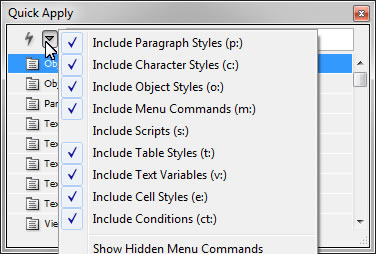
InDesign’s attempt to minimize the time invested in designing went successful with the Quick Apply feature. As the name speaks for itself, the feature access menu commands and applies styles quickly. Press Ctrl + enter or cmd + enter to launch soon, use, and type the intended menu or style. Enter to apply the technique to the object.
8. Eyedropper copier
The eyedropper functionality, introduced in Adobe Illustrator to copy the color, fill, and stroke from one object to another, was an overnight success. Now, mimicking the settings of one thing to the other is just a click away. Immediately, the same feature is used in Adobe InDesign, which helps the designers much better than the former.
Do the following to copy and apply the style from one parent object to the children’s things.
Select the children elements that you want to affect.
Choose the eyedropper tool and click on the parent object.
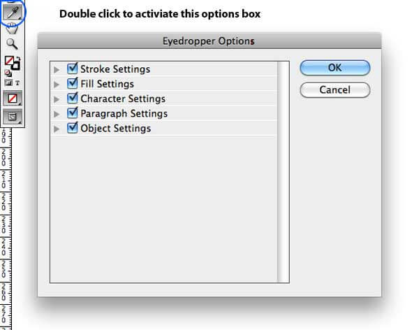
You can continue the process by double-clicking on the eye dropper tool in InDesign. An options box appears with various selection and de-selection options.
9. Stacked Frames
If your document is overwhelming with a heavy load of images, text, frames, and all sorts of objects on top of each other, it is surely a tough job for you to manage them all while designing. With the help of the stacked frames feature, you can move through the whole bunch of objects one by one at a time.
To use the stacked frame feature, hold ctrl/cmd, and click on the topmost object you want to start the selection. Hold the mouse bottom until Adobe InDesign digs deep to select the last thing you need.
10. Preview Mode
When you look at the document on your screen, all you find is the frame edges, mess, and guides scrambled everywhere on your pasteboard. But, it is different from how the document will look at its final stage. If you intend to look better at your record without wasting paper and follow the process to create a PDF file, InDesign has got you covered.
At a press of the key W, InDesign will take you to the preview mode removing the gray out guides, frame edges, and every component that won’t be present in the final document.
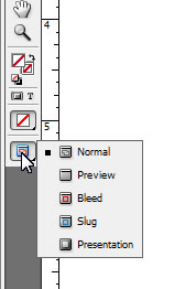
Another way to look at the final document is by the press and holding the Preview icon in the toolbar. It displays multiple preview modes, including slug, bleeds, and new presentation modes.
InDesign is a huge software with numerous options that can come in handy to designers and layout artists from diverse industries. The article intends to present some of the easiest and most effective tools that will come to use by as many professionals as possible. The features discussed will let you explore more possibilities outside of InDesign.
Recommended Article
This has been a comprehensive guide to Adobe InDesign Users . Here we have discussed the 10 Adobe InDesign Tips and Tricks For Users Work. You may also look at the following articles to learn more –
