Updated March 2, 2023

Introduction to Tkinter Scale
Python Tkinter scale option allows to design a scale widget that is flexibly scrollable and lists among the most used ones for designing a scale item in python oriented user interfaces; These scale items can be established in both horizontal and vertical manner in the widget and on top of this, the value which gets associated in the scale widget can be flexibly retrieved, processed and presented in return in the most precise manner.
Syntax:
Scale(master,option=value,)Attributes of the Python Tkinter Scale
Following are the attributes of the Python Tkinter scale
| Entry Widget Attributes | |
| Option | Description |
| activebackground | This represents the background color of the scroll element when the mouse cursor is placed on top of the element. The color assignated will be displayed at the hover instance. |
| bg | For scale widgets, the great option or the argument represents the color of the backgroud for the elements residing outside the trough. Here trough represents the actual scale area, and the color assignated here most probably hits the value display area. |
| bd | This represents the width of the area around and in place of the scale, so it will be including the width value for both the slider and the trough area. |
| troughcolor | This argument mentions the trough area color in the scale widget. |
| command | A method or a specific procedure will be called upon when there is some movement through the slider. However, the method or procedure used here can hold one valid argument. This is because the slider’s quick movement may not produce integrated outcomes. |
| cursor | Setting the cursor option in the scale widget allows the widget to represent the mouse icon set when the mouse cursor is placed on top of the slider in the scroll bar or, namely, the scale widget area. |
| digits | The digits argument in the scale widget represents the floating points that must be added to the value displayed in the trough area. The precision starts from 4, so assigning the value four will allow adding a floating point to the digit. The number of floating points increases as the digit value has increased. |
| font | The font option represents the type of font to be used in the label part of the slider. |
| Fg | The fg option is used to represent the color of the font to be used in the label part of the slider. |
| label | The label option is used for tagging a displayable label to the scale widget. The label text is very much customizable. |
| length | The scale widget’s length can be set using this length argument. The higher value assignated here, the lengthier the widget is. The default value of the length argument is 100 pixels. |
| orient | The orient argument is used to represent the positional orientation of the widget. The default values used here are the “horizontal” and the “vertical.” The “horizontal” value assigns the scale horizontally, whereas the value “vertical” places the scale vertically. Therefore, the default value of the orient parameter is “vertical.” this argument largely helps place the scale widget in a customizable position of the user interface panel. |
| relief | Mentions the type of border to be placed around the label entity of the scale widget. The default value of this parameter is FLAT. |
| repeatdelay | This represents the holding time of the slider so that it is ok enough to slide across the scroll area. |
| sliderlength | Mentions the slider length used in the scale widget’s scroll area. Normally the length of this argument is 30 pixels. |
| resolution | Changing the scale in whole units is not very regularly possible. Setting this value represents the smallest increase for every value when slid across the scale. For example, if from_=2.0 and to=3.0, and you set resolution=0.5, the scale will have 5 possible values: 2.0, 2.25, 2.5, 2.75, and 3.0. |
| tickinterval | Similar to resolution, The tick intervals allow setting each tick on the multiples of the values placed for it. |
| Methods | |
| Methods | Description |
| get() | The get method is used for retrieving the value of the scale. |
| set() | The set method helps to set the given value to the scale |
Example of Tkinter Scale
An example of the python Tkinter scale is given below:
Code:
from tkinter import *
def Scale_select():
selected_value = "Value = " + str(var.get())
label.config(text = selected_value)
root = Tk()
var = DoubleVar()
scale_widget_variable = Scale( root,
activebackground = "red",
bg="grey",
bd=10,
digits=5,
troughcolor="yellow",
fg="Black",
label="Acurracy Score",
length=150,
orient="horizontal",
resolution=10,
variable = var )
scale_widget_variable.pack()
button = Button(root, text="Display scale value", command=Scale_select)
button.pack()
label = Label(root)
label.pack()
root.mainloop()
Output:
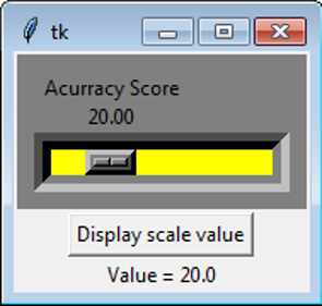
Explanation
The scale widget in the Tkinter is used for building scrollable scale items in user interfaces. In this example, the widget is declared using the below attributes,
- active background: red
- background: grey
- background-size: 10
- digits: 5
- trough color: yellow
- foreground color: Black
- label: Accuracy Score
- length: 150
- orient: horizontal
- resolution: 10
- variable: var
We can also notice a button variable has also been declared; in this context, this button variable is responsible for pulling the value set in the scale widget and getting it displayed as a label item below. Both the button and the scale items are perfectly packed. Next, the scale_select() is called in the command section. In this method, scale_select is responsible for precisely selecting the value associated with the scale widget. Finally, the method gets () is used for retrieving the value from the scale widget. The retrieved value is stored in a variable called ‘selected_value.’ this variable is used as input for the label item using the config() method. The config() method of the label item can intake these variables using its ‘text’ argument. So anything associated with this ‘text’ argument or option, more specifically, will be displayed as the label’s content. More importantly, to mention the Scale widget, the button widget, and the label widget in this example are instantiated using the Tkinter object ‘root.’ The label gets packed, and the root gets executed using the mainloop().
Recommended Articles
We hope that this EDUCBA information on “Tkinter Scale” was beneficial to you. You can view EDUCBA’s recommended articles for more information.

