Updated October 10, 2023
Web Designs with Awesome Typography App
A website has many components, and many of us might differ in our choices of components that make the website look visually appealing. The themes, colors, and pictures are all contributing factors, but the Typography app enhances the feel and sets the tone of a website.
Pictures and themes can speak a lot about our website, but in the end, your website viewers rely on the information written on your website to understand its web design services fully. Also, it would help if you kept in mind that your website should be in trend, i.e., whatever the current style is, your website should be designed around that style. The trend is that the design should be as minimum as possible; hence, Web Typography app design now plays a crucial role.
It is nothing but how the web design type is displayed, type meaning, whatever is written. The font, size, spacing, color, everything comes under Typography. It is important to note that no matter how exquisite is the theme of your website or how attractive the colors are, it is the typography app that makes it one of a kind.
But just like the numerous mistakes you can commit while designing a website using images, themes, etc., you must follow specific guidelines for using a typography app to avoid apparent issues.
- Do not try and do too much. Use, at the most, 2-4 font types or faces in your design. Using Font types more than that will make your website messy and cluttered instead of giving it a clean and beautiful appearance.
- Maintain a proper hierarchy. This helps your viewers to have an easy way through your website. The text and elements are aligned and arranged to set the mood and directions to be followed while using your website.
There is only one important rule: “CONTENT IS KING!” Make the content your priority, and everything else will fall around it. Many tools are available online to help you with your typography skills. Typekit Practice is one of the tools you should start with. The lessons are so designed that you will be an expert Typography Professional in no time. Modular Scale, Wordmark.it, Hoefler & Co., FontFace Ninja, Google Fonts, and many more tools are out there to make your Typography skills experience the best you can have.
List of websites with excellent typography
Below are some of the websites with fantastic typography.
1. The New Yorker – App-inspired websites
Achieving the look and feel of being old and traditional yet beautiful is difficult, but The New Yorker helps you do that perfectly. It is an online magazine that is easy to access and very stylish. The use of evergreen colors like red, black, and white with a tinge of grey makes it look like a printed magazine. Also, the use of readable and elegant font with colors contrasting the background makes The New Yorker one of the best Typography skills-inspired websites.
2. Moresoda
A black background needs a pop of colors to make it look trendy. Moresoda sets the trend by using eye-catching colors like bright pink, cyan, and light green along with black in the background, and there is only one color that would go with all of these if you wish to write something on the page, and that is white. Just a few sentences here and a couple of words there make Moresoda a neat and trend-setting website.
3. Good
The name of the website itself says a lot about its style! A clean, readable font accompanied by the minimal use of colors and excellent spacing and placement make the site look good!
Black, grey, and white is a classic combination, and keeping things reasonably simple is a considerable risk that the creators of the Good website were ready to take, and it paid off. The large font size of the bold headings will grab your attention, and the story that goes with it, though relatively smaller in comparison, is crystal clear. So, Good, in that sense, has done a great job!
4. Information Highwayman
You can put the best-looking background images on your website to enhance its look, but sometimes, a beautiful typography app enhances the background and does the job for you!
But what if you have a blank canvas? How do you make a blank page look attractive? The answer is simple again. Use your web design skills in the art of the Typography app. Information Highwayman has nothing in the background. It is empty, white as a sheet of paper, and no fancy-looking font is used either, but the simple use of fonts and colors in the text makes it a beautiful and stylish website. The simplicity of Information Highway is breathtakingly gorgeous!
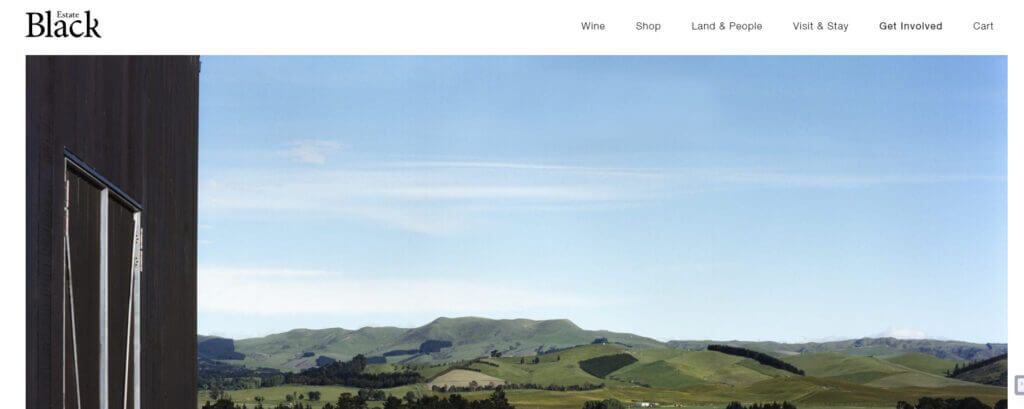
5. Black Estate
Black Estate does justice to its name by giving its viewers a website with a strikingly dark background… in black! And we all would agree that black and white is a classic combination. It is everybody’s go-to combination and, therefore, is a safe and intelligent choice.
The white letters take the website to a higher level of elegance and beauty. Not only is everything distinctly visible, but you don’t need anything else to make it more alluring. The use of a sophisticated font is all that is required. “Black Beauty” often describes a beautiful individual with a darker complexion. On websites, Black Estate is the “Black Beauty.”
6. Elysium Burns
Elysium Burns is the perfect example of sophistication and style! This website has a lot of elements in it, but each element is distinct and clear. It is not very colorful, but using different font styles and font sizes for other functionalities makes this website look good instead of a mess.
There is a different font for the company name, another for headings, another for sub-headings, and an entirely different one for the content that falls under these headings. A lot is going on in a single page regarding the design point of view, but all of these combine to make sense.
7. Type Daily
If the word Type in Type Daily doesn’t make it obvious, it is; Type Daily is a website that links to other type-related websites online. The design is straightforward. There are just links to other websites in bright green that pop out in a slightly dark background which changes to a lovely shade of orange when you hover over it. Simple but effective!
8. Erratic Wisdom Best Typography app
Ever heard the phrase “Bold is Beautiful!” Well, Erratic Wisdom hits the mark with this phrase. The latest post in Bold typography skills against a Black background with small white dots forming a grid gives this site a modern aura. The entire website, on the other hand, reverses the background combination. There is a black grid forming dots on a white page.
Erratic Wisdom is modern and, let us say, unpredictable in its design.
9. Analog
The first page of this website reads- “Analog is a company of friends who make websites. It is a cooperative where imagination, design, and engineering thrive: good people doing good work.”
Yes, excellent work, indeed. When the website’s theme is appreciated by the use of the type that goes with it, the result is a perfect website. Contrasting colors with aesthetic text makes Analog an intelligently engineered website.
10. Switch Mediaworks
You know the infamous saying, “Action speaks louder than words.” Let’s change this a bit: “Design speaks louder than words.” Why saturate a web page by inserting many elements when a few lines and a couple of images do the perfect job?
A visual treat that is what Switch Mediaworks offers to its viewers. The Classic color combination, modern typography skills, and the car of your dreams on the front page are the greatness of this website.
11. A List Apart
A-List Apart is similar yet different from a lot of websites out there. It has a minimum design that might seem familiar, but the placement and spacing of elements make it a good-looking website. Appropriate assigning of font size, use of colors, and spacing set A List Apart, a class APART! It is designed at its best!
12. Jason Santa Maria
Less is More! How accurate is this statement? Jason Santa Maria plays around with this philosophy of Lee is more. Not many elements, not many colors. Just Bold and attractive headings to the articles and Jason Santa Maria becomes an inspiring website. It is unique, fresh, and attention-seeking in its design in its simplicity.
13. Helveticons
Sometimes, you look at something and suddenly become a kid again. Some things remind you of your childhood, just like the logo of Helveticons. It’s like that image on the geometry box you used to carry to your mathematics tuitions or arts and drawing classes.
There is a bright yellow page, like a sheet of paper when opened after it has been folded into four that is against a light grey background with typography techniques in white and black. That is exactly like a geometry box I used to own. Helevticons is a website designed to relate with you in ways that go through your eyes and straight to your heart!
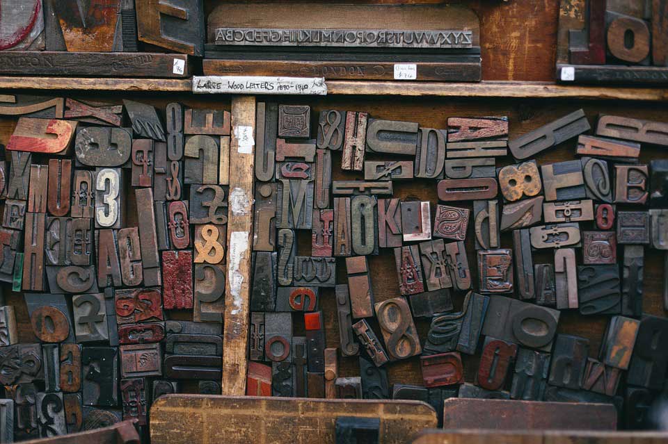
Image source: pixabay.comLike these designs? Then be creative when you design your dazzling websites. Web designing is all about these little details and features. Hopefully, these 13 awesome websites will inspire you to create an amazing-looking website with Typography techniques that will further intensify its beauty!
14. Canva
While not specifically a typography app, Canva is a popular graphic design tool that includes a wide range of fonts and text manipulation features. It’s available on the web and as a mobile app.
Recommended Articles
This has been a guide to the Typography app. Here we discuss Web Designs with Awesome Typography Apps with the list of websites with excellent typography. These are the following external links related to the typography app.


