How to Present Data Clearly and Effectively?
In the data-driven world, presenting information clearly is essential. Whether in reports, dashboards, or charts, how data is displayed significantly impacts audience understanding. Visual hierarchy and color in data presentation play a crucial role in making information accessible, engaging, and easy to interpret. This article explores these key elements and how to use them effectively for impactful data visualization.
Importance of Visual Hierarchy in Data Presentation
The placement of design components to direct the viewer’s attention to the most crucial information first is known as visual hierarchy.
Key Principles of Visual Hierarchy:
- Size and Scale: Larger elements naturally attract more attention. A bold heading or a significant data point stands out immediately.
- Positioning: The placement of information affects its perceived importance. Viewers usually first notice content placed at the top or center of a visual.
- Contrast: Using color, size, or weight differences helps highlight essential details. For example, darker shades can emphasize key numbers, while lighter tones can serve as background elements.
The Role of Color in Data Presentation
Thoughtful dashboard colors are more than just aesthetics—they play a crucial role in improving clarity, guiding attention, and adding meaning to data visualization. Using color helps differentiate categories, highlight trends, and improve comprehension.
Psychological Impact of Color:
- Red: Signals urgency, danger, or a negative trend.
- Green: Represents growth, success, or positive change.
- Blue: Conveys trust, stability, and professionalism.
- Yellow: Denotes caution and energy or highlights specific elements.
Increased Accessibility
Using color wisely makes data more accessible to a wider audience, including individuals with color blindness or visual impairments. Strong contrast and alternative indicators (such as patterns or text labels) improve readability.
Storytelling Through Data
Good data visualization is about presenting facts while telling a story. Color and hierarchy help structure that story by making data points stand out in a clear order, allowing the narrative to unfold as the viewer navigates through the presentation.
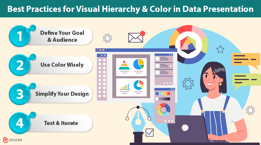
Best Practices for Visual Hierarchy and Color in Data Presentation
Follow these key best practices to create effective and visually appealing data presentations, ensuring clarity, accessibility, and impact.
- Define Your Goal and Audience: Before designing your visualization, understand the purpose of your presentation and the audience who will view it. This helps guide decisions on how to arrange data and choose colors.
- Use Color Wisely: Use color to group related items, highlight trends, and distinguish differences. Apply soft colors for background elements and vibrant ones for key data points.
- Simplify Your Design: A clear visual hierarchy means reducing unnecessary elements. Too many colors, fonts, or data points can distract from the main message. Keep the design simple to improve focus.
- Test and Iterate: Before finalizing your presentation, gather feedback to see if the visual hierarchy and color choices effectively convey the intended message. Sometimes, small adjustments can make a big difference in how the data is perceived.
Final Thoughts
The art of visual hierarchy and color in data presentation is not just about creating visually appealing graphics—it is about enhancing the clarity, accessibility, and impact of your message. When used correctly, these elements can transform complex data into clear, meaningful insights that resonate with your audience. By structuring key information, utilizing color wisely, and following best practices, you can significantly enhance the effectiveness of your data presentations, making them more visually appealing, informative, and engaging.
Recommended Articles
We hope this guide on visual hierarchy and color in data presentation helps you create more engaging and effective visualizations. Check out these recommended articles for additional insights on improving your data storytelling skills.
