Updated March 14, 2023

Introduction to Visualization in R
Data Visualization in R, data is the new oil to run the industry. But it is available in a large number. We need to analyze the data but analyzing data is not enough, we have to pass on important key points to the stakeholders. Generally, these stakeholders don’t have time to read and understand the terminology we use to analyze our data, so the best option left to us is to present our analysis in the form of visuals.
Benefits of Visualization in R
- Easy to Understand
- No prior knowledge required to understand visuals
- Visualized data is processed faster
- On point information in comparison to traditional reports
- Assists in decision making
There are “n” numbers of data visualization methods, but to understand that which visualization techniques suits best with the data is the most important part because visualization techniques are pre-fitted in the R libraries. Passing code for the visualization is not a tough task. In general, data visualization means showcasing data in the form of some diagram, graph basically the pictorial representation of the data.
Visualization Techniques in R
In this article, we will cover some visualization techniques that are most common and generally fits with every type of data.
- Histogram
- Bar Chart
- Scatter plot
- Box Plot
- Multiple Box Plot
We will work on some already exits dataset in R known as “Air Quality”. This dataset contains daily air quality measurements in New York from May to September. It consists of 153 observations of 6 variables i.e. Ozone (Mean ozone in parts per billion), Solar.R(Solar Radiation), Wind(Average wind speed in miles per hour), Temp(maximum daily temperature in Fahrenheit), Month and Day.
For more information about the dataset, we will use Str().
Code:
Visual = airquality

str(Visual)
Output:
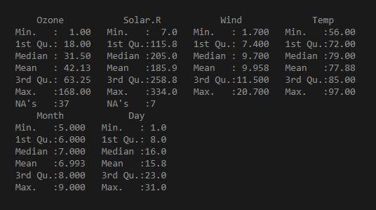
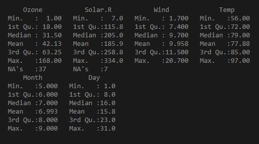
Statistical structure of dataset we use looks like:
Code:
Visual = air quality

summary(Visual)
Output:
Generally used libraries in R for graphical representation are ggplot, ggplot2, etc.
1. Histogram
We will use a histogram when we have continuous data with some frequency distribution.
Advantages:
1. Summarize large data sets graphically
2. Tell us about the data spreads (skewness, outliers)
a. We will see the histogram for variable solar radiation in data set Air quality:
Code:
Visual = airquality

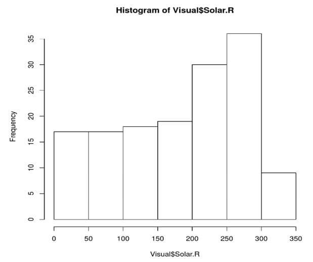
hist(Visual$Solar.R)
Output:
Explanation: This is the basic histogram of the solar radiation variable.
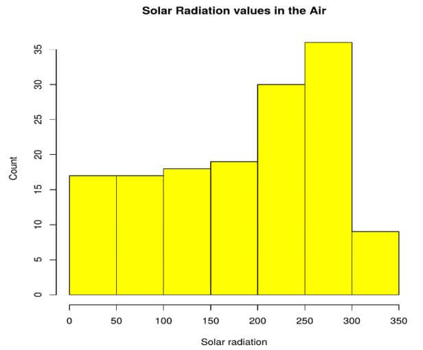
b. Now let’s suppose we want to add legends, name of the histogram, color to the bars of the histogram. For all these things our new code looks like:
Code:
Visual = airquality

hist(airquality$Solar.R, main = 'Solar Radiation values in the Air',ylab='Count',xlab = 'Solar radiation', col='yellow')
Output:
2. Barplot
A bar graph or bar chart is a graph or chart that presents categorical data with rectangular bars with heights or lengths proportional to the values that they represent in the dataset.
Advantages:
1. Show each variable in an individual bar with the frequency
2. Helps to identify trends if any, better than raw data
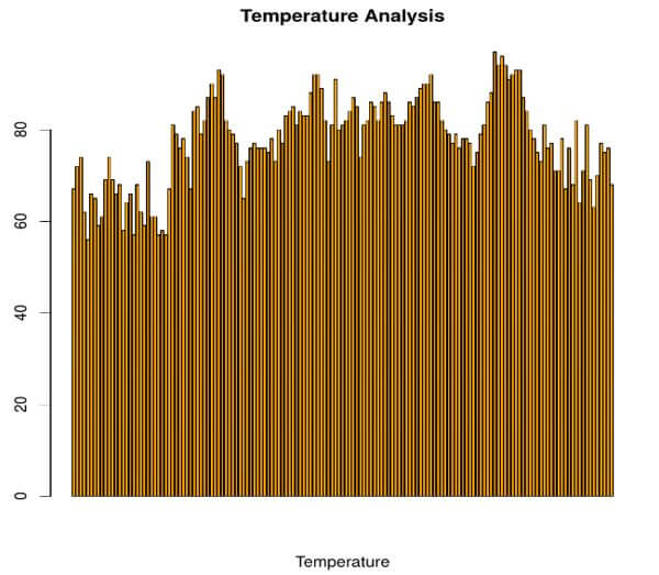
Let’s consider a situation wherein we want to know the temperature in our time frame from May to September (here we are using the same data “Air Quality”). Like is there any trend or not:
Code:
Visual = airquality

barplot(Visual$Temp, main = 'Temperature Analysis',xlab = 'Temperature', col= 'Orange')
Output:
3. Scatter Plot
It shows the relationship between two variables.
Advantages:
1. Understanding of observation and reading is very easy and straight forward.
2. Helps to identify the relationship between two variables.
3. Range of data i.e. Maximum point, the minimum point.
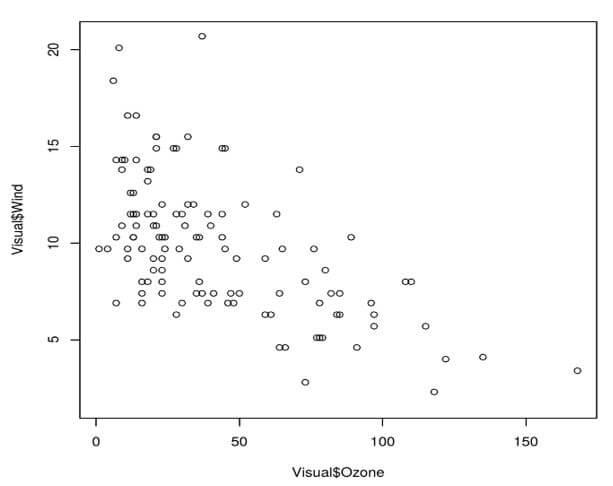
a. Here we will see the relationship between the Ozone variable and the wind variable:
Code:
Visual = airquality

plot(Visual$Ozone, Visual$Wind)
Output:
Explanation: It is clearly visible from the plot that ozone and wind have a negative correlation.
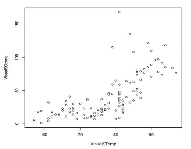
b. Let’s see another relationship between the temp variable and the ozone variable:
Code:
Visual = airquality

plot(Visual$Temp, Visual$Ozone)
Output:
Explanation: Temp and Ozone variables have a positive correlation.
4. Box plot
Recall the code (Summary()) which we pass to know the statistical description of the dataset, Box plot helps to see that description graphically.
Code:
Visual = airquality

summary(Visual)
Output:
Advantages:
1. Graphically display a variable’s location.
2. Graphically display of a spread of the variables data points.
3. Provide some indication of the data’s symmetry and skewness.
4. Show Outliers, if any
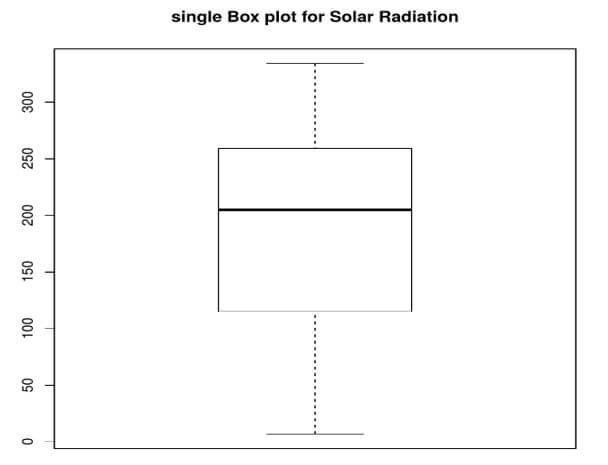
Code:
Visual = airquality

boxplot(airquality$Solar.R,main='single Box plot for Solar Radiation')
Output:
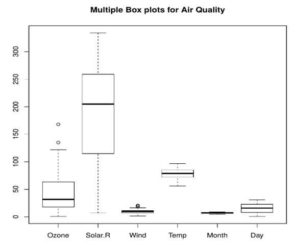
5. Multiple Box plot
Code:
Visual = airquality

boxplot(airquality, main='Multiple Box plots for Air Quality')
Output:
Conclusion
It is very easy to understand the features of the dataset when the outcomes are in the shape of some visuals. Like in histogram we can see which variable has the highest frequency by just spending a few seconds in observing the graph or by seeing the scatter plot we can see how our variables spread looks like. But the only problem is we have to understand which type of visuals we have to use with which type of datasets.
Recommended Articles
This is a guide to Visualization in R. Here we discuss an introduction to Visualization in R, benefits and some techniques with query example. You can also go through our other related articles to learn more –

