Updated April 11, 2023

Introduction to Vue.js datepicker
datepicker is defined as a component of vue as a calendar component that is used to support single dates, multiple dates, date range selection within the given calendar, and the process of picking up the selected data or range of dates in the calendar is known as date picker. In Vue.js, generally, datepicker is provided and defined within the v-calendar such as a calendar component within the simple Vue.js application and this datepicker can also be used for disabling and supporting dates in the calendar component either using inline mode or translations, etc.
Working of datepicker in Vue.js with Examples
In this article, we will see datepicker which is used by the user for the selection of dates or months for representing the visual picture of a selection of dates in a calendar and therefore it is a standalone component or we can say this datepicker as a vuetify component for selecting a range of dates or disabling dates or supporting single date or double dates, etc.
To install the datepicker we need to run the below statement:
npm i vueye-datepicker –saveLet us see how datepicker is created using Vue.js and component API plugin. Now we will see how datepicker has two variations such as portrait which is the default variation and landscape variation and there are various props used to display the datepicker in the requested requirement of the user. In portrait variation by default, the input events are emitted but whereas for reactive prop we can easily update the datepicker model after click events.
Example:
First, we have to write HTML file.
Code:
<div id="educba_app">
<v-app id="inspire">
<v-row justify="center">
<v-date-picker v-model="date" color="black" format="dd/mm/yyyy"/>
</v-date-picker>
</v-row>
</v-app>
</div>
Then the Vue.js file would be written as:
Code:
new Vue({
el: '#educba_app',
vuetify: new Vuetify(),
data () {
return {
picker: new Date().toISOString().substr(0, 10),
}
},
})
Output:
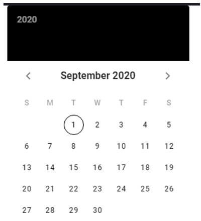
So when we run these codes we would get an output as below:
In the above screenshot, firstly in the Html file we have to v-date-picker directive which is a standalone vue component where we can get a calendar and the date picked by default is today’s date so when we click on any date on the given calendar then we will get the date, day and month if we are using the of v-model value as picker as shown in the second screenshot the default value for v-model is “date” and in the first screenshot, we can see it will just show the year on the top and the picked date with month in the middle and this is done by having v-model value as either date, year or month.
In the above we saw we can change color, format, models, etc to make the datepicker more interactive so there many different props available at the Vue.js components to change or alter the look and feel of the datepicker in the vuetify component.
Now let us see a few props that are used with these datepickers to make it more users friendly.
- Color: This is a common prop used in the datepicker app. This prop can be declared using the string type or number or codes of any color the user wants to display on the app.
Example:
“red”, #4425ef, etc.
- Format: This prop is used to specify the format for date, day, and month.
Example:
dd/mm/yyyy or yyyy-mm-dd or mm/dd/yyyy, etc.
- Dark: This prop is a Boolean type that will return in true or false and by default, it takes “false” value. This prop will give you dark themes for the app development.
- Disabled: This prop is used to disable the interaction with picker and it takes Boolean values with default value as “false”.
There are many more props but the above-mentioned are mostly used by the users.
Where each prop is to be declared we use directives ad we will see what are they:
- v-model is a prop in datepicker to bind the variables or dates selected by the user and the default value is “null” where this can have the values in “date” or “string” or “number” types.
- md-disabled-dates this is another prop with this directive to use in the Html file for disabling dates on the owner’s request so this can take values in either array which will disable all inside dates or functions where the date to be disabled is passed as the parameter.
- md-immediately prop is used where the user wants to select the date and close the datepicker without asking the acknowledgment for closing the dialogue box of the datepicker.
So we will see how we can disable any date in the calendar using datepicker with its props and their respective directives.
So below is the code for disabling the particular date.
Code:
<template>
<div>
<md-datepicker v-model="selectedMonth" :md-disabled-dates="disabledDates" />
</div>
</template>
<script>
export default {
name: 'DisabledDatesDatepicker',
data: () => ({
selectedDate: null,
disabledDates: date => {
const day = date.getDay()
return day === 6 || day === 0
}
})
}
</script>
Output:
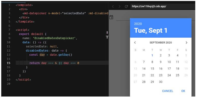
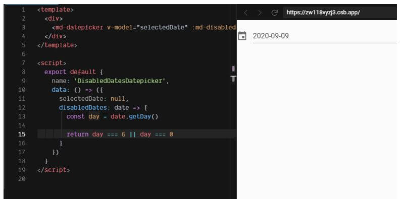
In the above, we can see we are using a disabled prop with its directive md-disabled-dates to disable the selected month or date. So in the above screenshots we can see in the first screenshot it will display a small calendar symbol at the top left corner when we click a calendar appears and the date which user selects will be displayed as seen in the second screenshot.
Thus in this article, there are various other props and their directives that can be used such as month pickers, themes, internationalization, range, show-minute, show-hour, etc.
Conclusion
In this article, we conclude that datepicker is a standalone vuetify component used to support or disable the dates or months or years by the user in the vue app with this component. In this article, we saw how we can install the datepicker and how to create datepickers with various props along with its various directives and we also saw few examples of simple datepicker and we also saw an example of how to disable a particular date or month or year.
Recommended Articles
This is a guide to Vue.js datepicker. Here we discuss the introduction and working of datepicker in Vue.js with examples. You may also have a look at the following articles to learn more –


