Updated April 11, 2023

Introduction to Vue.js modal
The Node js provides a Vue.js modal component to the user. Basically in Vue.js modal we defined collection logic and it provides an easy way to utilize them within the program and it also increases the speed of application. The Vue.js modal is capable of making communication between the JavaScript and CSS to make a successful event. The Vue.js modal supports a number of use cases from user notification to complete event as well as provides small features to the user and it is helpful to sub components, size and variant as well as also helpful for accessibility of components.
Syntax
Given below is the syntax:
<div>
<b-button v-b-modal.modal-1> My First demo modal </b-button>
<b-modal id="modal-01" title="Welcome in my first demo modal">
<p class="my-4"> Hi from demo modal!</p>
</b-modal>
</div>
Explanation:
- In the above syntax we use < b-modal > and it has by default ok and cancel buttons in the footer. This button can be modified by using different props on the component. We can also modify the size of the button, disable buttons and hide the cancel button by selecting different variants of props. <b-modal> is supported by default setting in the header.
- We are also able to change the modal title by using model-title. Important point here is that when we use the modal-footer at that time by default, the ok and cancel button is not present. On the other hand when we use the modal-header at that time the close button is not present. We can perform different operations by using Vue.js modal.
How does modal work in Vue.js?
- We must install Node.js 10.x and above on our system and you can verify by using node –v command in your terminal.
- We must install the latest version of Vue on your system.
- We must install the Vue CLI 3.0 version on your system.
- We require basic knowledge about Node.js.
- We require basic knowledge about Vue.js modal.
- We also require CSS knowledge for design purposes.
- We require basic knowledge about Vue.js and components.
Let’s see how we can implement Vue.js modal with example as follows:
Example:
For reusable components by using Vue.js modal as follows:
Modal.vue:
<script>
export default {
name: 'modal',
methods: {
close() {
this.$emit('close');
},
},
};
</script>
<template>
<transition name="modal-fade">
<div class="modal-backdrop">
<div class="modal"
role="dialog"
aria-labelledby="modalTitle"
aria-describedby="modalDescription"
>
<header
class="modal-header"
id="modalTitle"
>
<slot name="header">
This is the header of vue.js Modal!
<button
type="button"
class="btn-close"
@click="close"
aria-label="Close Modal App"
>
</button>
</slot>
</header>
<section
class="modal-body"
id="modalDescription"
>
<slot name="body">
Hi welcome in vue.js modal!
</slot>
</section>
<footer class="modal-footer">
<slot name="footer">
This is the a footer of vue,js modal
<button
type="button"
class="btn-green"
@click="close"
aria-label="Close Modal App"
>
Close Modal
</button>
</slot>
</footer>
</div>
</div>
</transition>
</template>
<style>
.modal-backdrop {
position: fixed;
top: 0px;
bottom: 0;
left: 0;
right: 0;
background-color: rgba(0, 0, 0, 0.3);
display: flex;
justify-content: center;
align-items: center;
}
.modal {
background: #FFEEEE;
box-shadow: 4px 4px 30px 2px;
overflow-x: auto;
display: flex;
flex-direction: column;
}
.modal-header,
.modal-footer {
padding: 10px;
display: flex;
}
.modal-header {
border-bottom: 1px solid #eeeeee;
color: #4AAE9B;
justify-content: space-between;
}
.modal-footer {
border-top: 2px solid #eeeeee;
justify-content: flex-end;
}
.modal-body {
position: relative;
padding: 30px 20px;
}
.btn-close {
border: 2px solid #ae4a57;;
font-size: 25px;
padding: 25px;
cursor: pointer;
font-weight: bold;
color: #4AAE9B;
background: transparent;
}
.btn-green {
color: white;
background: #4AAE9B;
border: 2px solid #ae4a57;
border-radius: 4px;
}
</style>
Explanation:
- Here, we have created component and the name of component is Modal. Let us create template the template consist div and slot tag respectively. We know that when we use modal at that time it has by default header, footer and body but when we use slot it provides more flexibility. Slot provides reusability functionality that means we can use the same modal with different types of body content. Here slot provides more than one slot in same component.
- See here vue modal works unexpected, so we can make sooth by using transition. Vue provides a wrapper component called transition. Wrapper class allows us to use CSS. For design purpose we style tag in with different property of style. Finally we make modal accessible. Then we make some changes in the App.vue file as follows:
App.vue:
<script>
import Modal from './components/Modal.vue';
export default {
name: 'app',
components: {
Modal,
},
data () {
return {
isModalVisible: false,
};
},
methods: {
showModal() {
this.isModalVisible = true;
},
closeModal() {
this.isModalVisible = false;
}
},
};
</script>
<template>
<body >
<div id="app">
<button
type="button"
class="btn"
@click="showModal"
>
Click here to open Modal!
</button>
<modal
v-show="isModalVisible"
@close="closeModal"
/>
</div>
</body>
</template>
Explanation:
- In this file we import Modal.vue component after that we used a template in which we used div tag for button with name and make it accessible by using modalisvisible property of modal then we also used close modal by using closeModal property of modal. We also used data and methods to modal accessibility. Here we used different modal functions.
- In the above example we implement Vue.js modal by using component. Illustrate the end result of the above declaration by using the use of the following snapshot.
- In the first screenshot we showed a simple button as shown in below:
Output:
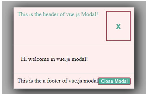
After that when we clicked on the above button then open a pop up screen and it show some option like close modal close symbol as shown in below screenshot.
See in above screenshot we use by default header and footer with body and when we click on Close Modal button or close symbol then popup is close and again show Click here to open Modal button.
Conclusion
From the above article we have seen the basic syntax of Vue.js modal. We have also seen how we can implement them in node js with examples. From this article we have seen how we can handle Vue.js modal as well as components in node js and we are able to perform different operations by using Vue.js modal.
Recommended Articles
This is a guide to Vue.js modal. Here we discuss the introduction, syntax and working of a model in Vue.js along with an example and code implementation. You may also have a look at the following articles to learn more –


