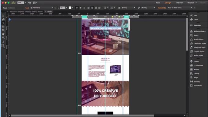
What is Adobe Muse?
Adobe Muse is an application that web designers like to create a website without you needing to learn how to code; Adobe Creative Suite creates this. Basically, there are many applications to design websites from scratch, but Adobe Muse stands first on the priority of web designers because of its site planning and page setting up along the master page, and layouting is very easy and user-friendly. Application menus update automatically about the beauty of the structure of website best relationship pages to impress your clients with dynamic user experience on sites. It saves time with updating new and suitable HTML codes, Syntax, and images suitable to the site and creating interesting blogs. Publishing of the latest modified website for website hosting immediately once the site is ready.
New and Different in software
Adobe Muse is the best and quick designing application from Adobe. The latest version of the adobe muse is 18.1, which was released in March 2018; a few new updates and things that make the application to be used by web designers are: –
1. The user-friendly interface everything is on fingertips every modification can be done using selecting, dragging and dropping without coding.
2. The designer can Copy attribution from one website page to the new developing site or within a page by right click and selecting copy attribution and pasting it where required
- Character styles
- Paragraph styles
- Bullet styles
- Link styles
3. Show Widget part while editing.
4. Design in progress websites can be saved and opened using Adobe Muse cloud login.
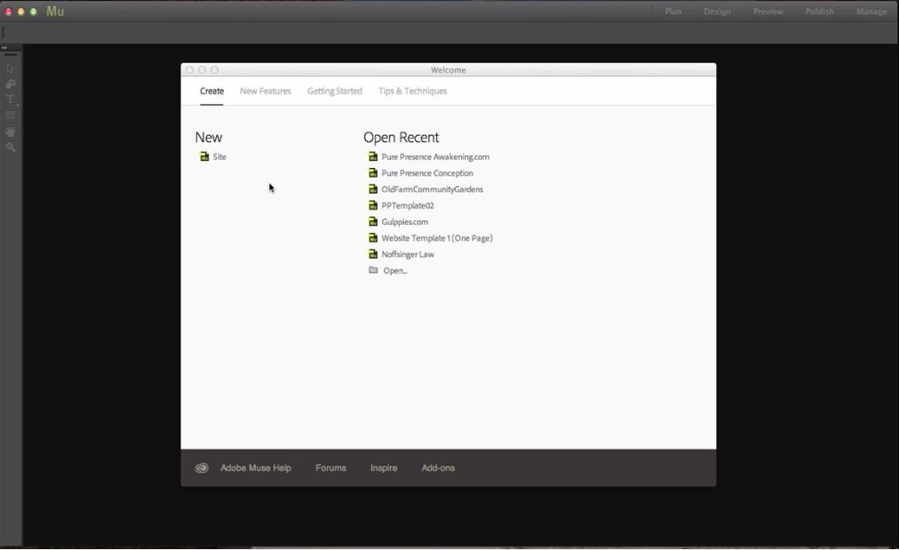
5. New Start screen interface has the option to review previous websites, learn how to make websites and connect to help.
6. Creating of the backup file after file conversion.
7. Many more.
Adobe Muse tools
The website developing program with handy coding with good visual layouts.
- When Adobe muse is opened, the app default screen apprises like this.
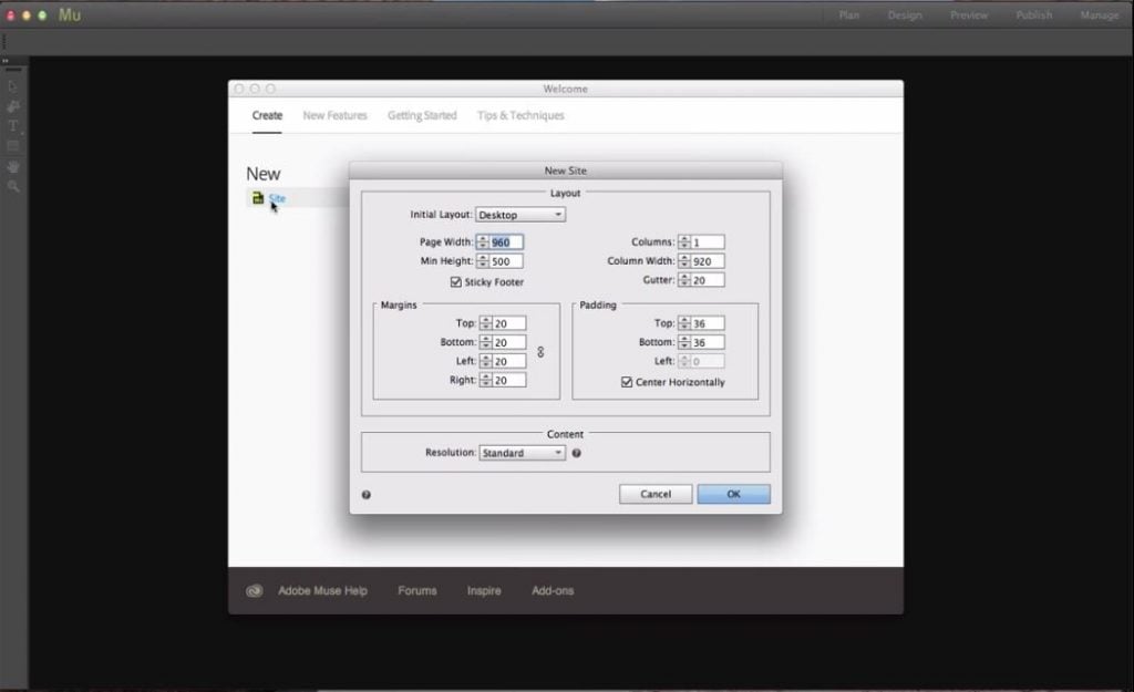
- To create a new site, go to New and click on site. Then site size and detail of a web page can be set with the purpose of the website for phone, tablet to desktop, then page width and height, Columns to frame content equally, padding and margins set their pixel values. Set resolution to the standard which is compatible with many operations and computes which loads website fast is its slow people may leave the page because of slow loading.
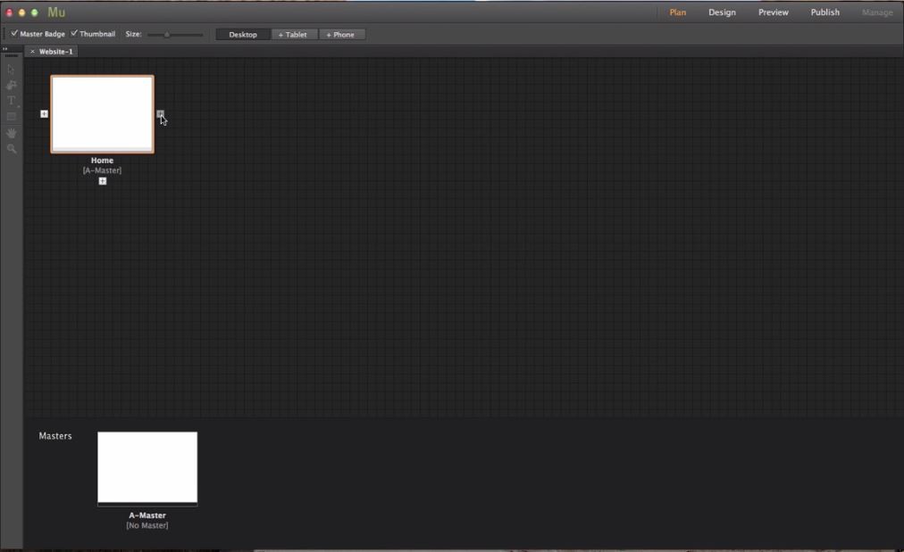
- Once the website is open, we can see a home page and master page called A Master.
Adding pages is really simple besides the home page; we have a “+” button; by clicking it, a new page gets added.
- Adding subpages can be done by clicking “+” bottom of the page.
- We have few elements which are constant on all pages of the website site as Background color, Logo, Contact info and many more for doing this, edit the A-Master page so the edits will be applied to all the pages in it.
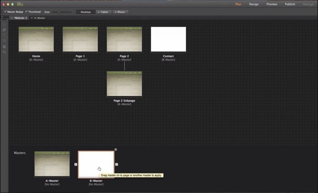
- To create other master page click on “ + ” beside the A-Master page.
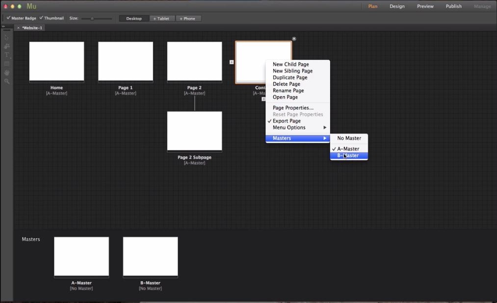
- To change pages from A master to B master, select the page right-click and select masters, and from there, select to which master page u want the page to be.
Let start with the tool for that Double click on A Master; The blow is the Tool Bar which contains tools like Select tool, Crop tool, Text tool, Rectangular tool, Hand tool, and Magnifying tool.
Tool Bar
- Selection tool: To select multiple components in the webpage like text, image, log, graphics, etc., and modify them.
- Crop tool: To crop web images contains and the website to the required article size as per design.
- Text tool: To Add text to the website.
- Rectangular tool: To select or create square or rectangular columns and rows in the website
- Hand tool: To pan within the webpage.
- Magnifying tool: To zoom in and out on a webpage. The right side tools box has 9 tools in it.
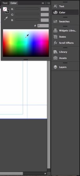
- Text: It helps in changing the front, size and text setup in the webpage.
- Colour: Make color swabs to the resting or new rectangular articulate pages.
- Swatches: The default colors with come with.
- Widgets library: Many tools can be used by drag and dropping on to the web page.
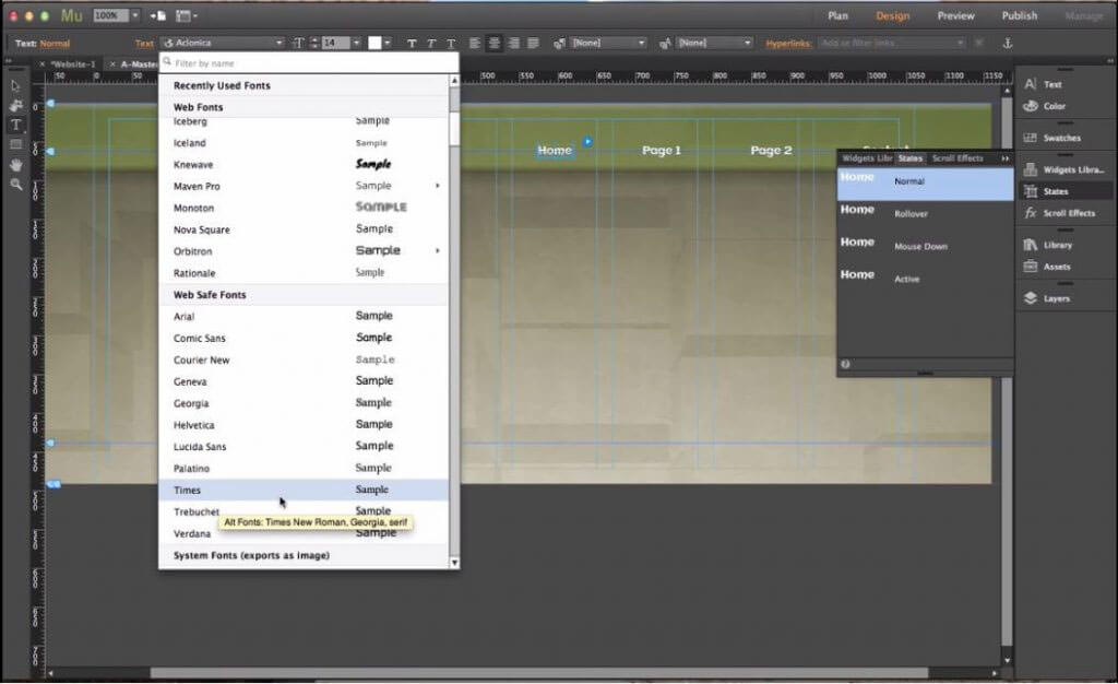
- States: If we want to have state, rollover, and normal state, it helps users know they can click and get more info.
- Scroll effects: website scrolling and interactive sites for more fun.
- Library: for a few more images and additional wedges from sources.
- Asserts: when we applied an image to the website, the image path will automatically be updated, and images are stored in asserts folder. It’s easy to publish websites as images are already rotted.
- Layers: In Adobe Muse, layers are the same way how we use them in Photoshop and Illustrator to set and work on different layers for page design. Double click on the layer to rename it. The pages will be automatically updated by adding content.
Page designing tool
Below are the designing tools:
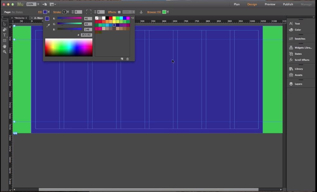
- Browser fill: Helps in setting the complete browser with a solid color as green in the below image.
- Page Fill: Helps fill the web page to be filled with the respective color example violet in the below image.
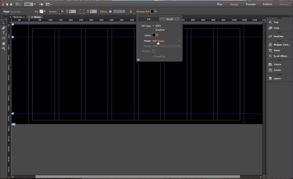
- To set a Background image for the webpage, Click on Browse Image and select Add image and select the image which you want to set as a background for the page.
- Once the image is uploaded, Fitting and Position options will be enabled by which the background image can be set by scaling or orienting as required.
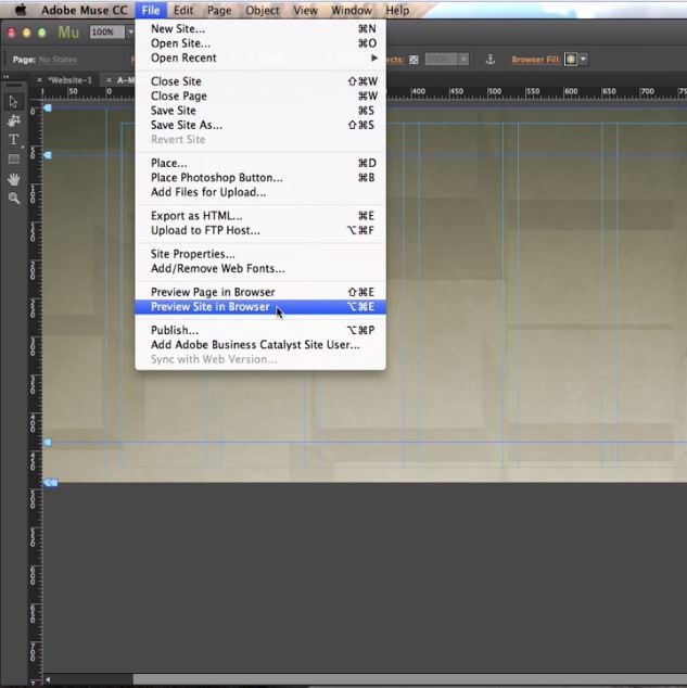
- To check the background is suitable to the browser or not, we can preview it in the browser by
- Clicking the file and selecting the preview site in the browser, the default browser will open the site for review.
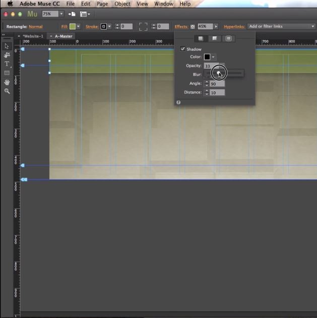
- Select the rectangle tool and select the portion for giving information
- Click Effects which can add effects to the rectangular section which is selected
- Shadowing, opacity, angle distance and Blur and few more potions to make the section look visually good.
- Select File and select place, and upload images to the page article.
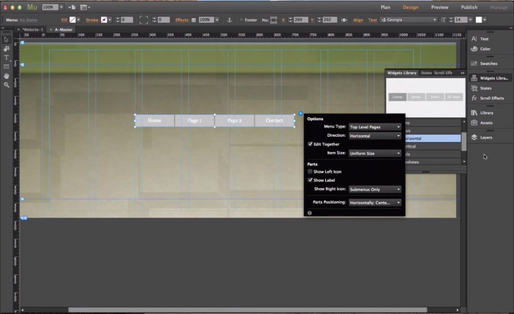
- To Add, Home, and all the menu buttons, go to widgets and select menu sample and drag on to the page to have them and start editing as required.
- By using states, the text typed can be edited to the required front size and many more.
- Select View and enable Smart Guides so that the tool snaps images and text to the nearest guideline area.
- To make the website bigger as per adding contents than expected, then right-click on the page and disable the footer item.
As we have edited the A-Master page, all the pages which are linked with A Master received similar content as per the above image.
Creating a simple project/illustration in Adobe Muse
Let’s design the new website on Adobe Muse
- Select a suitable template of the website available online, which really saves the time of preparing the website’s basic structure.
- Change the texts and contents as per new requirements from the template.
- Change Background, Text, Images, and Logo if required into the required color.
- Use wizards to add new options or edit existing ones.
- To increase and adjust contents, drag the corner curser of each content after selecting.
- Add contact, map, and social media directing links at the bottom of the page.
- Review the complete webpage and finalize it.
- Open it on the browser and check how it looks.
Recommended Articles
This has been a guide to know What is Adobe Muse. Here we have discussed the basic concepts and the characteristics of Adobe Muse Tools. You may also look at the following articles:
