Introduction to Data Visualization
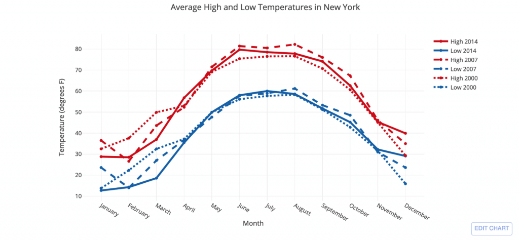
The representation of data or information in graphical means so that the viewer can easily understand the process of trends in the data is called data visualization. Any visual elements are used so that the trends, outliers, and patterns can be understood and studied from the data. Different tools used for data visualization include charts, maps, and graphs, and so on. Tools are designed in such a way to easily understand and grasp the information provided by the data rather than going through the entire process of scanning the excel sheets so that time is saved for the analyst.
Pie Charts
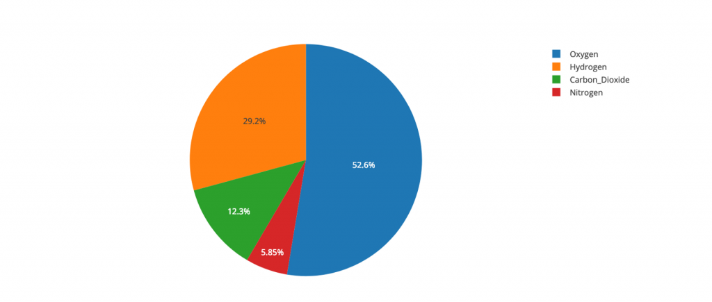
One of the most ubiquitous charts in use is the pizza chart or the pie chart.
The proportion of Gases in a mixture
Commonly used during elections to show which party has got the lions to share of votes, this chart, although extremely popular, has some glaring disadvantages. Statisticians like Edward Tufte, Leland Wilkinson, and Gerald van Belle have expressed their disinclination towards the use of pie charts. The most conclusive evidence against pie charts has probably been provided by Stephen Few, the founder of Perceptual Edge. In his article, “Save the Pie for the Dessert,” published in the Visual Business Intelligence Newsletter, Stephen explains why, to the surprise of his colleagues and students, he feels that pie charts are an ineffective means of visualizing data.
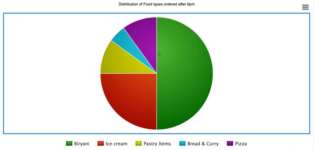
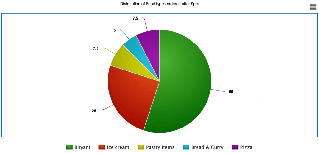
Take a look at the pie chart below.
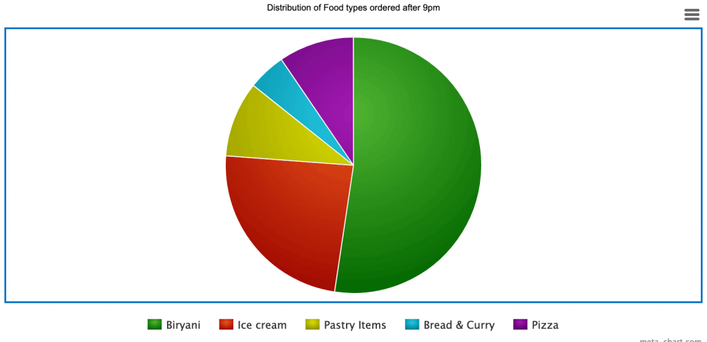
In this graph depicting the proportion of food items ordered after 9 pm, it is easy to estimate the percentage belonging to Ice Cream — 25%. However, after slight modification, it is no longer possible to easily ascertain the percentage of orders going for ice creams.
Although the percentage of ice creams is still the same at 25%, it is difficult to understand from the diagram above. In the previous diagram, it was easy to guess the percentage because the shade for ice cream began at the 6 o’clock position and stretched till the 9 o’clock position. As our eyes are trained to see the clocks at 12, 3, 6, and 9 — a pie chart is also easier to interpret if its regions adhere to the 4 clock positions. An avid pie chart supporter would come forward and suggest that this problem could easily be avoided by using labels and marking the percentage against each region.
Pie chart with data labels.
But then again, in order to map the value with the item, our eyes have to keep shifting focus from the legend at the bottom of the graph to the labels on the chart.
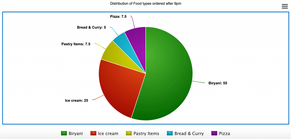
The solution to that would be to attach the item name also, along with the values — to get something similar to this:
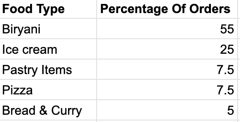
Perfect, you’d say. But then I ask you — Now that we have attached the names of the items along with the values, how is the pie chart above different from the table below:
Clean table with data sorted on Percentage of order.
Does this information not look much better than the labels and legends scattered across the pie chart. What is the use of a pie chart, then? Visualizations are supposed to add value; they are agents of conclusions; they are supposed to make the data expose its secrets. But in this case, the pie chart does not fulfill its promise.
Enter the Bar Chart of Data Visualization
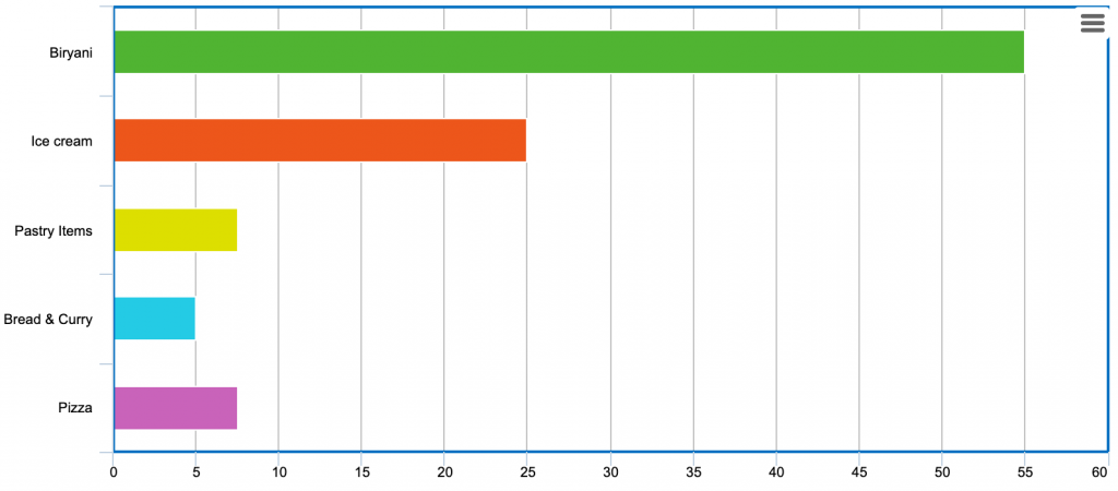
The leaner and much more elegant alternative to the pie chart is the bar chart, which is able to express all that the pie says and much more without making a mess of labels and legends.
Bar chart depicting the same — easy to compare, contrast, and conclude.
This is the same information now presented gently to the observer. Besides showing the individual values, this graph enables us to quickly compare the popularity of each food item and even compare the relative difference in value between consecutive items. Same data would have been available through the table, but our brains are better at processing images than deciphering the text.
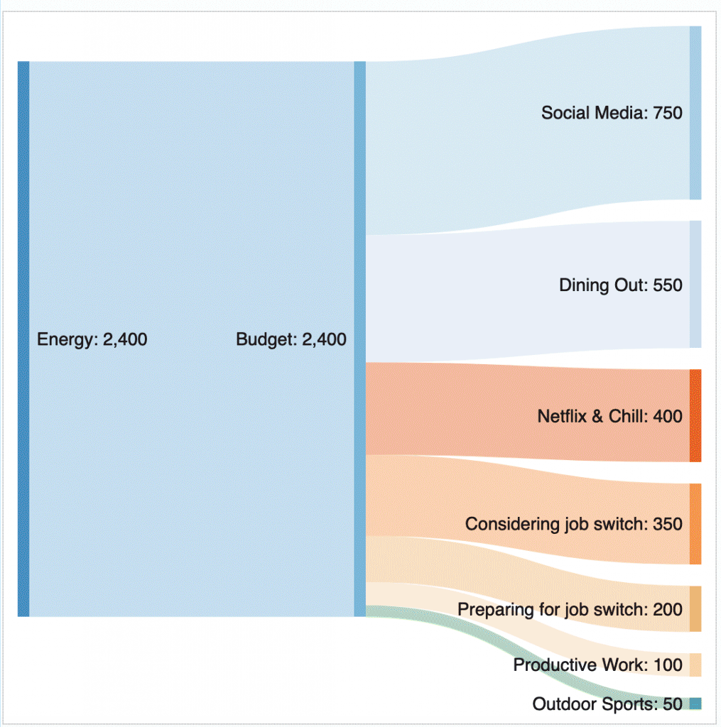
This is why the use of the pie chart has reduced over time. Although a favorite visual in the media industry, this has been replaced by better and more sophisticated representations. Besides line graphs, pies, and bar charts, there is a myriad of other charts that come in handy. One interesting graph, though not widely popular among casual users, is the Sankey Diagram — now being reinvented by several Data Visualization Tools of 2025 to represent complex flows of data intuitively.. This diagram is used to express the distribution and flow of matter. The matter in question could be energy, money, or even water.
Sankey Diagram of the energy flow and distribution of a typical IT employee.
Above is a fictitious Sankey diagram expressing how and where most of the Energy of an IT employee is distributed.
Newer Tools
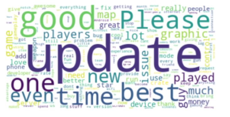
With the advent of social media and the different platforms where people can write out their feelings, reviews, and opinion, one data visualization tool that has become quite common is the word cloud. Word clouds help us find out what people are talking about.
A very real, live word cloud representation of the user reviews of PUBG at the google play store.
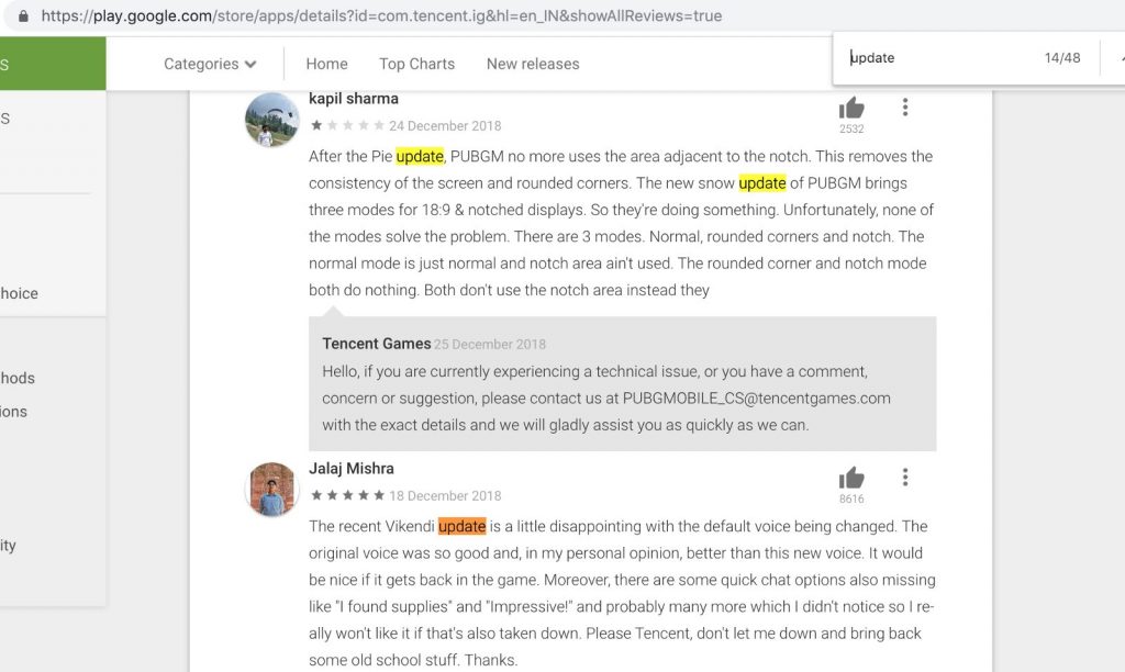
If we look at the word cloud here, which has been built from the top 80 reviews of the game PUBG at the google play store, we see that the overall response to the game is “good,” some people even calling it the “best.” However, it seems like there is an issue with some “updates”s that the people are pleading with the game creators to rectify. Indeed, when we check the play store reviews on that day, we see the same thing reflected.
The issue with updates. Also, see if you can find an occurrence of the word “please” here.
Future
This is just scratching the tip of the iceberg. Libraries like Plotly and D3 have taken data visualization to a different level. This has happened because the demand too has changed. How would you visualize a smart city on a dashboard? A giant screen on which the vitals of an entire city can be displayed.
The traffic, power usage, the health conditions of different areas, air quality, and a host of other parameters need to be displayed on a single page. This requirement begs a different approach to data visualization So we have learned that what is data visualization with the help of this concept. We can no longer stick with charts and graphs. A novel approach is required where graphs meet art and imagination, creating an enriching visual experience, That discussion begs a different article altogether. Till next time.
Recommended Articles
This article is a helpful guide on what is Data Visualization. Here we have discussed the basic concepts with charts and graphs so that you can easily understand data visualization. You may also look at the following article to learn more –
